Reflection on 4.3, Graphic Design Projects(Fundamentals), UX (Mobile App).

Technological developments mean that design today has little limitations. During the 4.3 user experience section of the graphic design projects (fundamentals) module, I used a new technology to me at the time, Figma. However, after being introduced to more technologies I believe I could elevate my app design further.
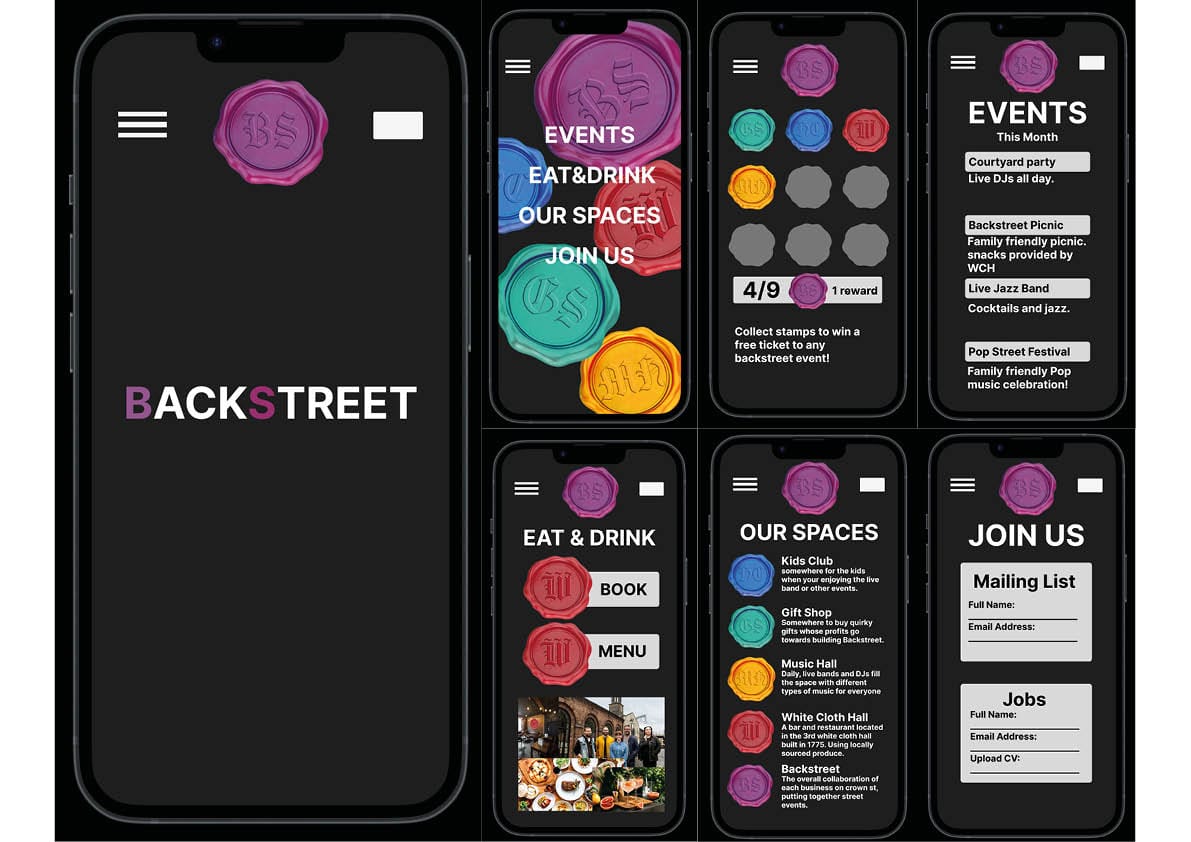
My 4.3 project was called 'BACKSTREET', an area behind the corn exchange in Leeds that held a music hall, restaurant, gift shop, kids club and events area. The app allows people to see what events are on, acquire details on the restaurant, collect stamps for prizes and more.
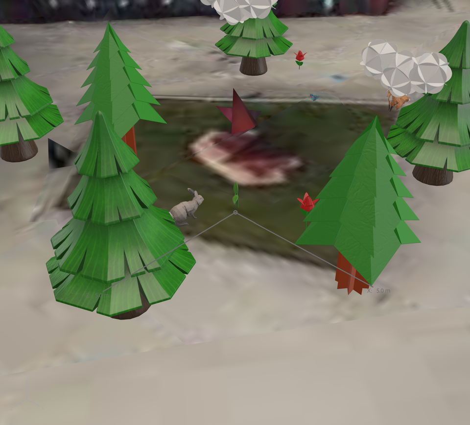
When thinking about how I could improve my mobile app with new technologies, I thought of AR. I was introduced to Adobe Aero, and experimented using AR with a location anchor. If I was to go back to the project I would implement this technology as a section of the app where you are able to hold the camera up and have the different wax stamps, that I designed, plastered on buildings and roads in the events area. These stamps could correlate to the different sections of 'BACKSTREET'. I would also make these iterative, for example as you go close to the restaurant stamp, it would show the resturant menu.
This would overall make the app more interactive, attracting people in a marketing way as people may download the app to see what the user experience is like. Another factor is as it is on a location anchor, it would attract more people to the location, therefore bringing more people to 'BACKSTREET'. I also think this would attract to audiences who are more in touch with modern technology which is good as the target audience of my mobile app was families and students.
After reflecting on my previous design and thinking through improving and polishing my mobile app it excites me as now I can implement the new technologies I am learning into future designs.

