5.2.5 Research task: Brutalist Websites dot com
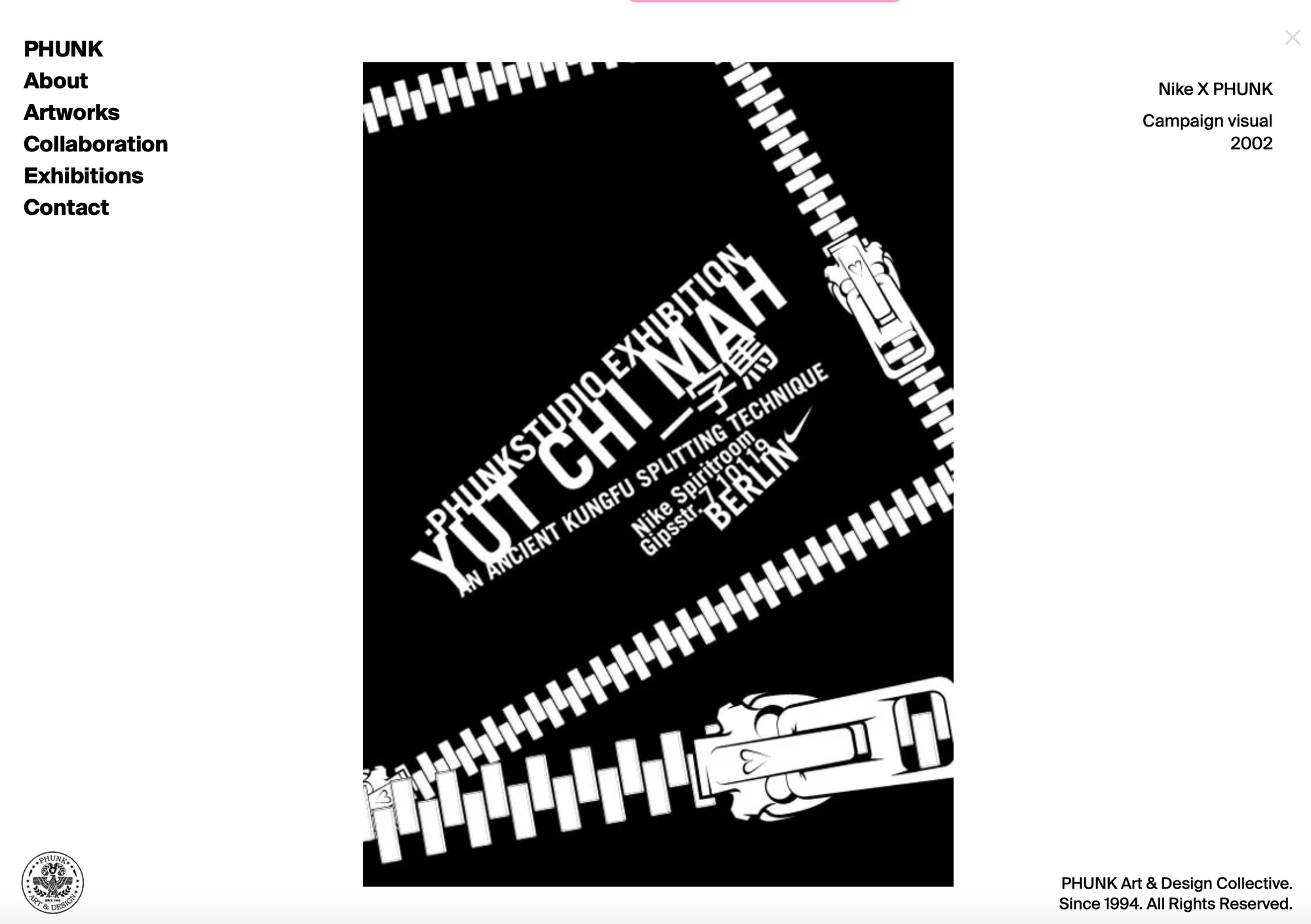
The first website I looked at from brutalistwebsites.com was Phunk. At first glance, the site appeared quite confusing due to its unconventional design, where the images change dynamically as you scroll. This lack of initial clarity aligns with the brutalist web design ethic of prioritising bold, experimental visuals over immediate usability. However, once I got used to this design, I found the experience to be quite engaging, the scrolling interaction became an enjoyable way to explore the collection of various artworks. The ability to click on each image to access more detailed information about the specific piece only enhanced the browsing experience. From a critical point of view, the design effectively highlights the studio's creativity, drawing attention to their work in an interactive, memorable way. While is may initially challenge traditional web design principles such as clarity and ease of use, it ultimately succeeds in creating a visually compelling experience that reflects the unique identity of the studio.
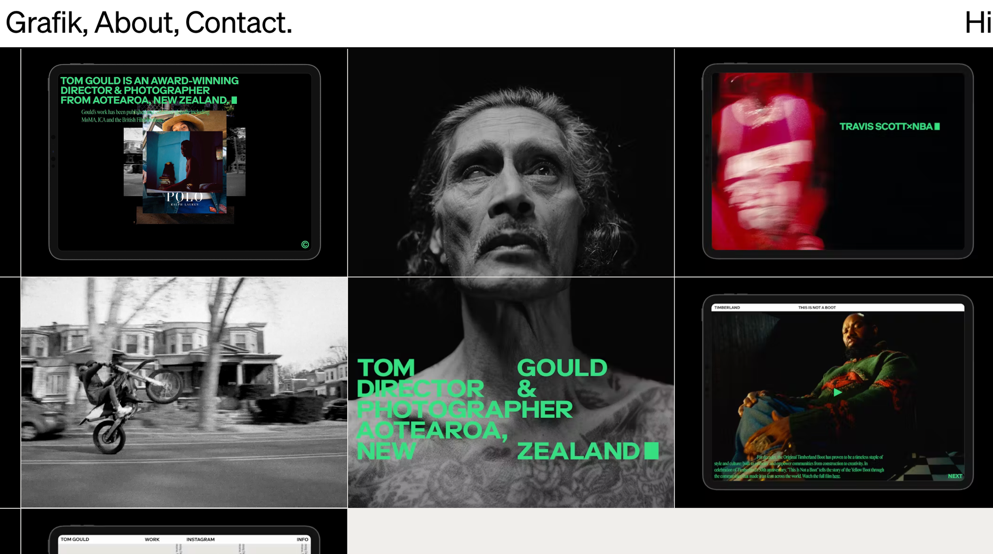
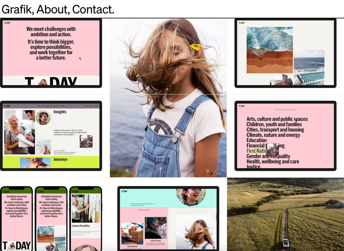
The second website I looked at was Grafik, which stood out to me for its clean, editorial aesthetic and user-friendly design. Unlike some of the other brutalised websites I explored, this site felt approachable and well-structured, aligning more closely with traditional web design principles such as clarity and ease of navigation. What struck me immediately was the typographic animation that greets you upon opening the website. This subtle yet engaging touch gives the impression that the website is introducing itself to you, creating a welcoming and interactive first impression. This animation sets the tone for the rest of the experience, reflecting the professionalism and creativity of the brand.
The layout was intuitive, making it easy to explore and engage with the content without feeling too overwhelmed. This ease of navigation is a departure from the chaotic design choices often seen on brutalist websites, showing how brutalist elements can be adapted to create a polished, user-friendly experience.
Overall, the Grafik website balances a modern editorial design approach with a touch of brutalist simplicity, effectively showcasing its content while maintaining an inviting and professional atmosphere.
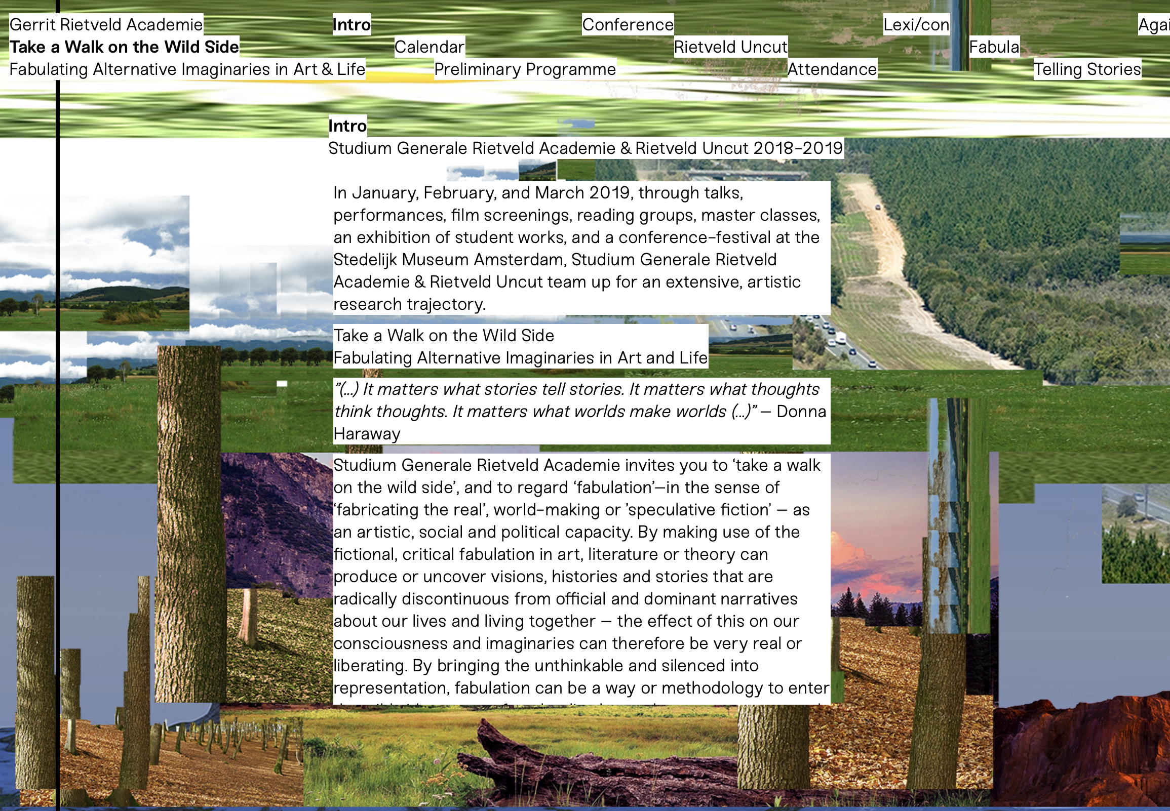
The final website I looked at was Take a Walk on the Wild Side. Unlike the other websites I explored, I found this one to be an incredibly challenging experience. Its design choices - layered animations, bold colours and overlapping typography - created an overwhelmingly chaotic aesthetic that caused navigation to be difficult and frustrating. The website's use of bright, clashing colours combined with separately positioned images and varied typography contributed to an overall sense of display. While these elements may align with the brutalist design, they came at the cost of usability and accessibility. The lack of visual hierarchy made it hard to focus and understand the contents, ultimately discouraging me from exploring any further.
This website highlights one of the key risks of brutalist web design: sacrificing user experience and functionality for the sake of artistic experimentation. In contrast to the other two websites I analysed, this example demonstrated how brutalism can alienate users when taken to an extreme.
While some of the websites showcased bold creativity and originality, others seemed to compromise usability for the sake of aesthetic experimentation. This exploration allowed me to appreciate the balance between innovative design and functional user experience.
