5.2 Process Document
Stepping into this module I find emerging technologies daunting and have never had the urge to experiment with them. However, I am hoping by the end I have at least explored a wide range of technological skills that I can take with me into future projects and software that I will be able to utilise throughout my design journey.
Jitter
Solar Systems Experiment
My first experiment was with the software Jitter, which allows you to create short animated designs with ease. To introduce myself to the software, I opened a saved file from Figma straight into Jitter which allowed for an easy transfer of already completed designs. For my first introduction I followed a tutorial and tried to play around with all the available features - working on timing, animation styles and effects.
This software was a perfect start of experiencing emerging technologies as it allows you to access simple design features without the need for heavy and advanced programmes and techniques. It gave me a chance to experiment with how simple movement can change a design made from basic shapes, such as circles, and create something that captures the attention of an audience that 2D design doesn't always manage to.
At this point in experimenting I didn't struggle with any aspect of Jitter as it was such a simplistic design structure - however I did find when animating that timing was something that I struggled with, especially overlapping movements to create fluidity.
Leeds Graphics Experiment
Continuing on from my original introduction to Jitter I began experimenting with typography - animating a short video for Leeds Graphic Design. Again this was in the experimental stages of the software and gave me the opportunity to play around with all the available software.
I began to try and get the type to interact with each other, rather than remaining as separate moving sections on the screen, which required me to delve more into the timing aspect of the programme. Doing one design at a time and layering up movement and effects, adjusting the timing by minuscule seconds did start feeling monotonous and repetitive. However, once I managed to perfect each detail I could use animations such as move combined with an elastic effect to create a push and pull technique - giving the illusion that the type was interacting with each other to create more fluidity within the animation.
At this point I realised that being limited to 4.4 seconds was quite challenging when trying to incorporate more advanced techniques into a system designed for simplicity. With such a small timeframe it was also difficult to condense a story element of the design, even with just typography, so much that the audience would still grasp the message I was trying to deliver. However at this point of experimentation I was beginning to feel more confident in my abilities to create a simplistic piece with elements of storytelling within the typographic interaction, that would invite people into a piece that was once just static and grabbing their attention.
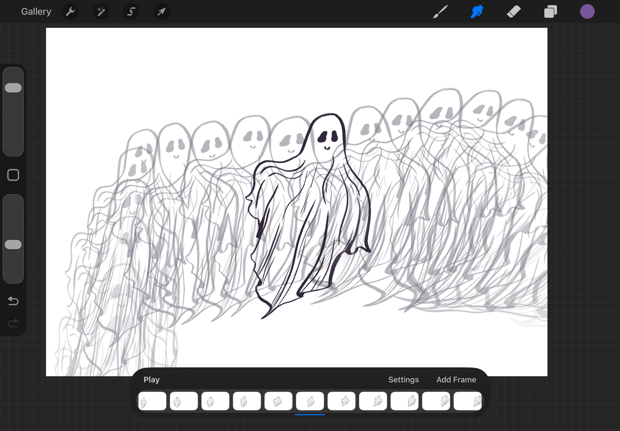
Autism in Women - Awareness Design
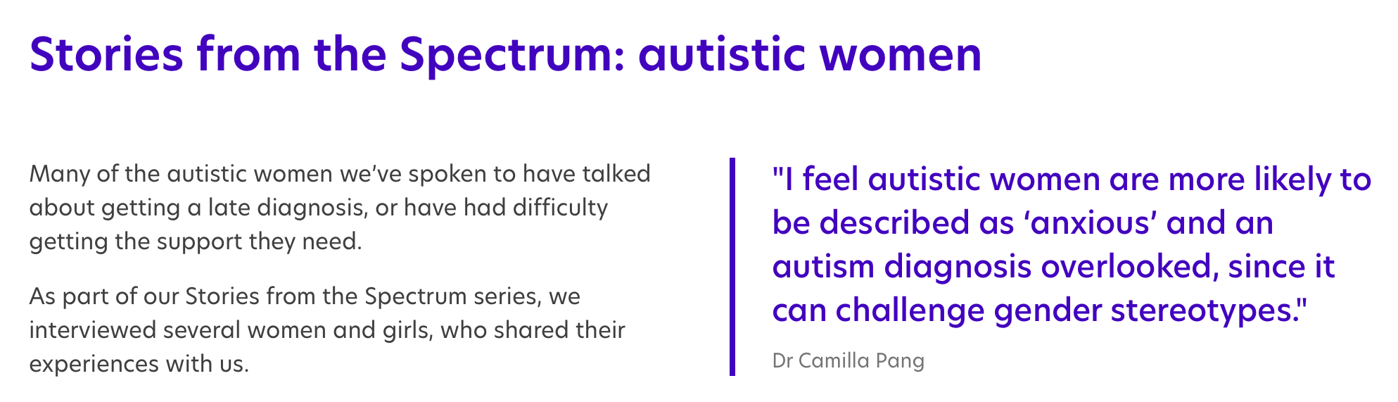
Using the Final brief, I decided to return to Jitter as it is something I really enjoyed but felt like I hadn't fully finished exploring. Combining data interpretation with visualisation, I focused on a data set of women with autism and found that the number of women who were undiagnosed was still extremely high considering that data showed the ratio of men to women with autism was 2:1 and current studies state 1 in 100 women are autistic.
I wanted to create a short promotional piece that highlighted the data I found and condense it into a simple design that would be easier to understand from an audience perspective - with this I felt that Jitter would be perfect as its time constraints meant I couldn't make the design to complicated and would have to compact the data into such a small timeframe.
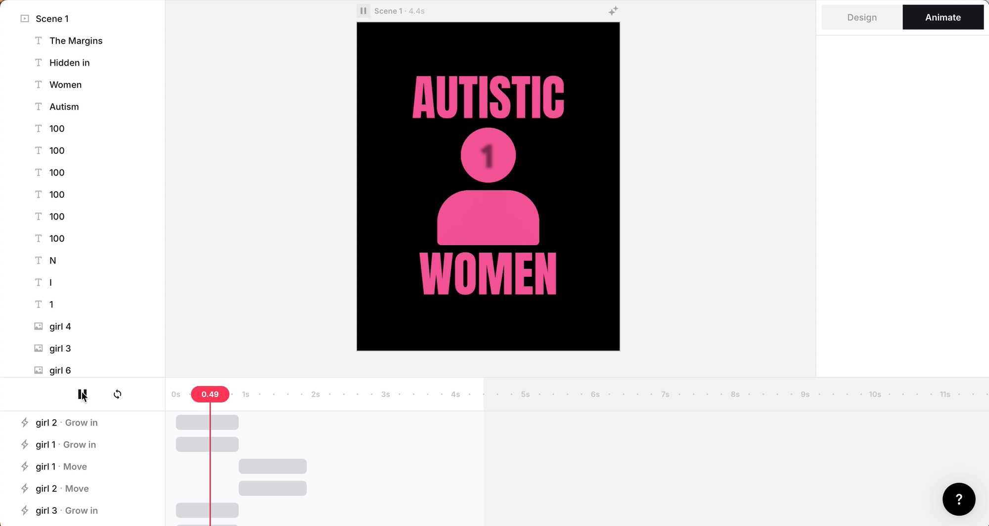
This was exponentially harder than my first two experiments as it required more stand alone elements of the animation. Labelling my pieces was vital in the design process as it allowed me to keep track of such a high volume of small intricate pieces with various movements. I found keeping track of each individual movement the hardest challenge as I couldn't relabel the movement sequences themselves - I did uncover a new element of the software, sequencing, which gives the ability to compact repetitive movements together on one line. However, when experimenting with sequencing I found that I lost the fluidity of certain elements and it made editing each individual piece harder further down the line when my ideas changed.
In this iteration I wanted to experiment further with the idea of interaction within such a simple design software and expand my knowledge of what was possible within such a stripped back animation software. I feel this piece is the most evident of how much storytelling and movement you can condense into a short reel of design.
Jitter is a great way of introducing motion without the complexity of higher end software, giving the feeling of less pressure to create a large piece of work when it isn't necessarily required for the story you want to convey. To me it felt enjoyable due to its simplicity and I felt less pressure than I usually do when creating with motion software.
Overall it showed me that motion design doesn't need to be complex to create an effective piece that captivates while also informing the audience and that the small, simple movement can further enhance the meaning behind the design rather than being a purely aesthetic choice - by limiting abilities you effectively create more complex solutions that can challenge and enhance areas of design and will definitely be something I take with me to future projects.
Maxon 1
Typographic Experimentation
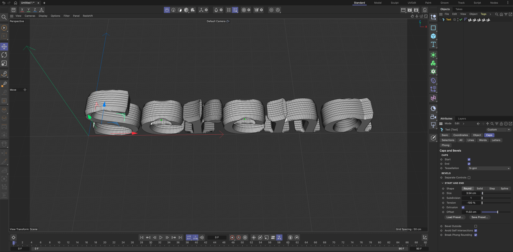
In Maxon 1 I experimented with 3D typographic design forms, utilising the available tools to merge and transform the shapes of type. I focused on the typography being an object rather than legibility so I can fully play around with what's on offer within the software.
I personally found this software extremely overwhelming and the idea of starting in such an open design plane is something I struggle to grasp - 3D software has never felt as grounding to me as 2D work and it never feels like I'm fully in control. Even with a detailed step-by-step tutorial I was finding it difficult to manipulate areas and isolate parts of the design which made me feel like I wasn't fully in control of the software at times.
However using this software gave me a new perspective of typography that I had never thought to look at before, actually thinking about its structure and how type can take up the area of a space. Looking at typography through a new lens helped me to disassociate from what I knew about letterform from a flat traditional layout.
Once I had the original base of the typography I could focus my attention on manipulating the surrounding area to further enhance what was already there. This transformed the open blank canvas that I initially found overwhelming into something that I could build and enhance with the various tools on offer.
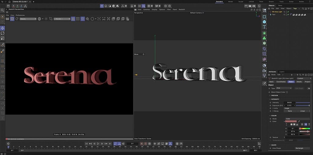
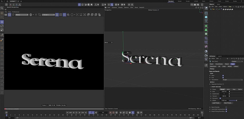
I explored lighting, texture and colour tools to try and enhance the legibility of the letters, transforming it from an experimental phase to a legible piece.
I found the lighting controls extremely easy to manipulate, using the set structure of the software and moving it to create different effects. Colour and texture also gave life to a flat 3D shape, fully showcasing the lighting effects and allowing me to see the full shape of the base I had built giving me the opportunity to refine my work to suit the environment.
Using Maxon 1 showed me how the typographic shape and form can be used to communicate emotion and tone when combined with lighting, colour and texture. These tools, although originally daunting, gave me the opportunity to break the boundaries on traditional letterforms and push what I knew about it beyond the restraints that traditional methods hold.
Overall I personally don't see myself using Maxon 1 in a majority of my projects, however it may come in useful when I need to convey a tone and within specific 3D plane that can't be achieved using conventional methods.
Adobe After Effects
Tracking Tool Experiment
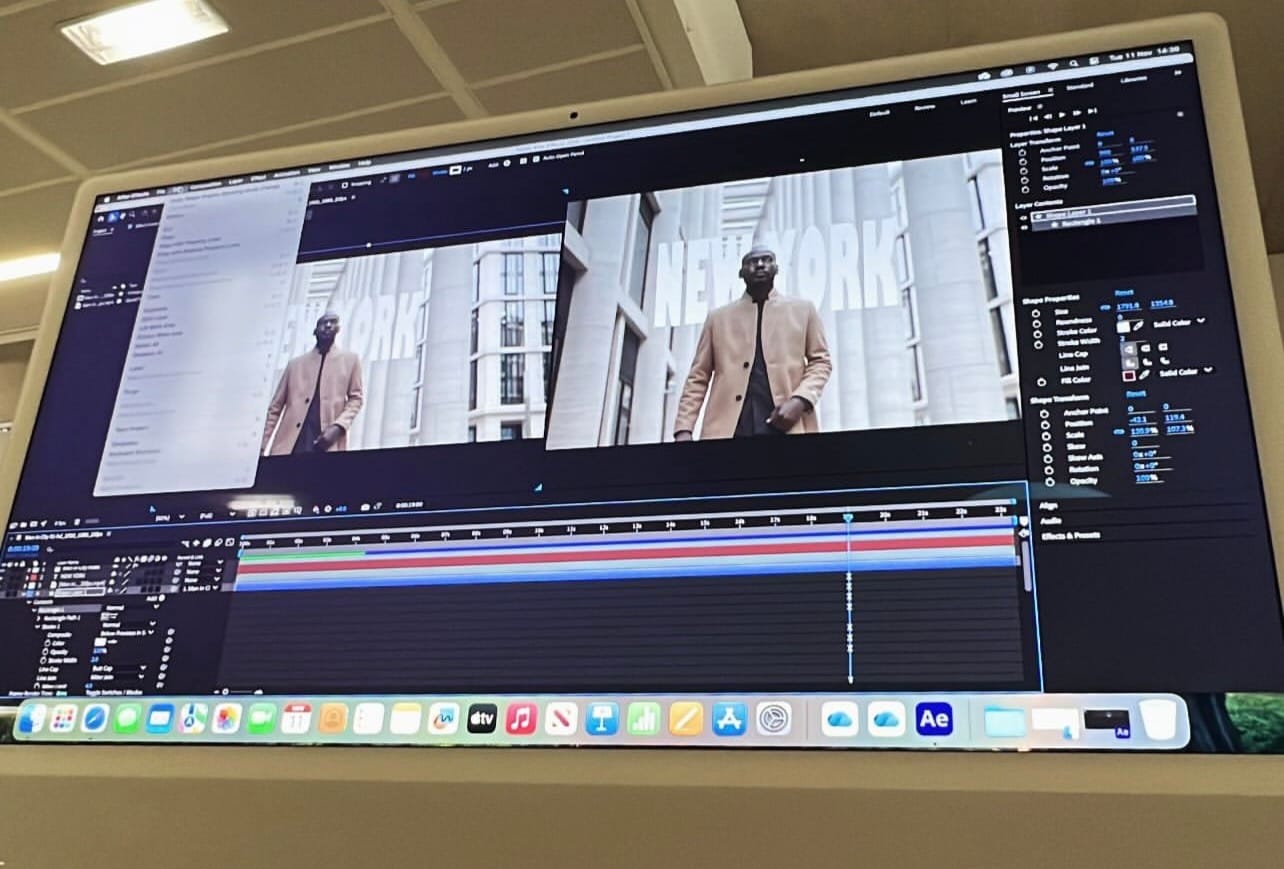
In Adobe After Effects I utilised motion tracking software to attach graphics and text to moving images. This gave me the opportunity to experiment with layering design ideas on top of existing video footage that would allow me to build and transform it into a high end piece of design.
My first experiment was cutting and layering a person behind text. AE is something I have consistently struggled with and I find it a difficult software to use - simple tasks seem to require I high amount of refining work to get it to a decent level. However, cutting the person out and creating a separate layer was quite a simple task that I managed to complete with ease. Layering the text behind took more work to refine as I struggle with anchoring elements so they work with the surrounding area. I feel in this initial draft I managed to make the text appear integrated within the motion graphic with a seamless effect - similar to a title or location screen in film and Tv shows.
To further enhance my skills I tracked a moving object using the same technique however as this was for digital enhancement it didn't have to be as perfected and outlined. I found this process far easier than the previous method of tracking and with the more simplistic approach it allowed me to further understand anchoring points of the tracking and how to control the tools.
As you can see in the video I couldn't quite get the tracking to line up at the start and although a frustrating issue I actually preferred the way it bounces into tracking when I was digitally enhancing the design.
With these experiments it was clear that it required more precision and focus to create effective yet simple results in digital motion work - however the extra effort is worth the pay off of a more refined result and helps to create a more immersive outcome. This is a skill I will continue to build on so I have the basic fundamentals of Adobe After Effects.
Digital Enhancement Experiment
I moved onto digitally enhancing my tracking work by adding visual enhancements based on my research on
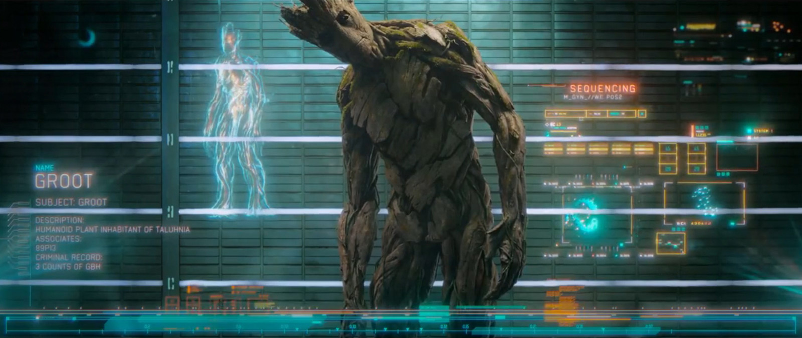
which inspired me to pull tech elements from their to create a tracking programme with a sci-fi element.
Using basic shapes combined with layering, timing and visual effects helped me understand how the emerging technologies can help with enhancing the world that surrounds the designs - creating a desired mood and atmosphere that is easy for the audience to understand and pick up on.
For me the difficult part of visual enhancement was knowing where to stop and at what point the piece started looking too complex and busy. Although a simple design I wanted it to enhance and support the concept without distracting from the original video.
Again Adobe After Effects is a complex and busy software which I did find overwhelming, however adding design elements on top of tracking felt more natural for me - this combined with my passion for film graphics made my skill building way more enjoyable.
Overall I am pleased with how Adobe After Effects works and with more skill building I feel that I could create more advanced, refined pieces. The only disheartening thing is how much time I put in to the project for very little pay off in the design but I would consider diving deeper and attempting more in depth tutorials in future projects.
Procreate
Illustrated Animation
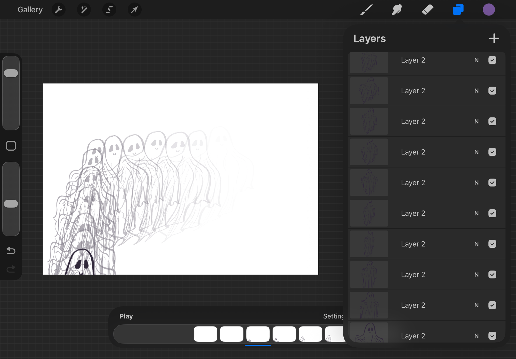
Procreate was something I have used before to create designs however I have never used it to create an illustrative animation. I explored using frame-by-frame animation to turn a hand-drawn design into a fluid movement.
Working in Procreate felt intuitive as it was the most similar process to the traditional style of designing that I am used to. I also liked that I could see the process of each frame and animation as it allowed me to take control and refine each section immediately.
The bridge between digital and traditional didn't feel as long with this software and I could feel the connection with what I was designing and the technology. This allowed me to create an almost seamless animation in my experiments.
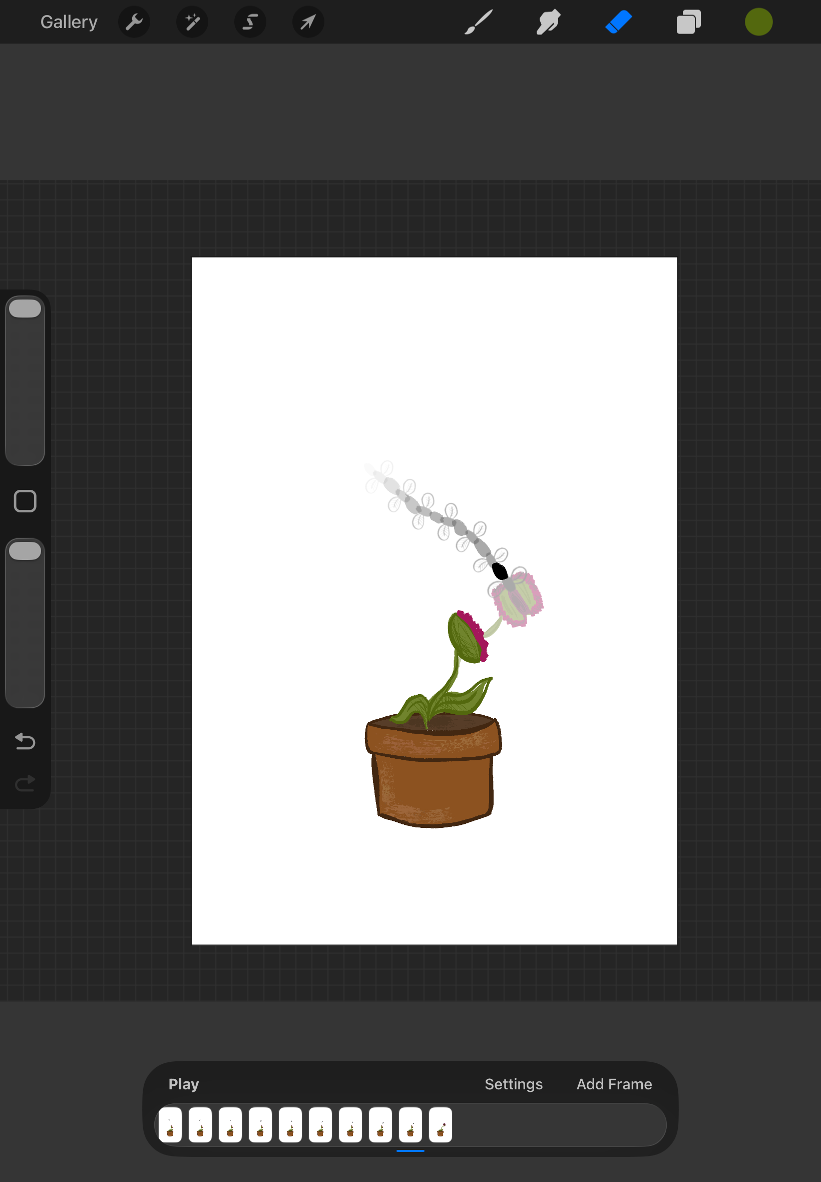
One challenge that I found impacted the experience was how time intensive it was, to create a fluid movement it required multiple redraws of each frame with slight changes to give it a more refined look. This made it hard to maintain consistency between frames which are evident in the results.
But overall the experience for me was extremely enjoyable and I managed to build my skills to a fairly high level in a short time frame. It felt like a more personal experience with a connection between designer and the software itself, which made for a very calm and enjoyable experience overall despite the challenges.
It's analog-style made for some interesting experiments with the tools, by adding colour and texture with different brushes I could bring even more life and character into the animation. Unlike the other technologies I have used, Procreate made room for imperfection and showed me that perfection isn't always the desired result - adding character into the style of animation is what makes the design complete.
Procreate is definitely something I will be using in future designs and where I will focus my skill based learning. I would like to attempt to incorporate imagery into my animations and perhaps use this for promotional content.
Figma
Design System Experiment - Failed
Figma is something I have never been able to grasp and one that I struggle with immensely - my goal for Figma was to delve into the technical elements to create a working design system, however I completely failed.
I started with a clear layout and flow to make the work easier to test and adjust during the process which did ultimately work. Even following a tutorial I only managed to create the base of a design with a week of attempting to build my skills.
Figma was very structured and logical which helped me focus on my intentions within the technology side of the design but ultimately this didn't help me develop any simple skills or understand the tools fully.
Perhaps with further development and dedicating more time on this software will help me develop the tools and skills I need to extend beyond the visuals and into the more interactive side of Figma's software. But overall the interface didn't work with my design process and wouldn't be something I would use currently but will instead build further tools to enhance my experience and allow me to be less frustrated.
Overall Reflection
At the start of this project I was reluctant to engage with emerging technologies, however throughout my experiments I was pushed outside my comfort zones in turn allowing me to find elements of softwares that I do believe will benefit my design processes.
I noticed a clear contrast between the more expressive and simplified software of Procreate/Jitter and the more structured tools of Figma/After Effects. While naturally I gravitated more towards the expressive tools finding them easier to navigate and to engage with fully, I feel that there is a place where I can use the more systematic and advanced softwares but in turn need to dedicate more time to refining my skills within the tools.
Moving forward, I aim to combine what I've learned in each approach and combining my traditional skills while utilising the tools each software provides to enhance my future projects and create a bridge between motion and still image.