Media Diet
Stranger Things (2016)
Title Sequence
Where: Netflix
Who made it?
- Duffer Brothers - Matt and Ross Duffer had creative input
- Imaginary Forces - Created the title sequence
- Karin Fong and Michelle Dougherty - Directors
- Kyle Dixon & Michael Stein - Music
How was it made?
- Inspired by Stephen King covers and 1980s film titles
- Achieved digitally by simulating film grain, jitter, letter erosion and practical-camera imperfections
- Custom type built in 3D (Cinema 4D), composited and graded in After Effects
Creating custom 3D type in Cinema 4D primarily involves using Text objects with an Extrude generator or the dedicated MoText object, and, for highly customised designs, importing vector paths from design software like Adobe Illustrator - Google AI
- Minimal animation with all emotion comes from subtle glow and timing with the score
What caught my attention?
The use of visual language to induce a state of nostalgia onto the audience. With the show being set in the 80’s they have to convey this through visual language throughout the show - costume, typography, music. Especially with the title sequence which sets the audience up or the whole show - use of graphic design and mix of synth to convey the time period.
Helpful link:
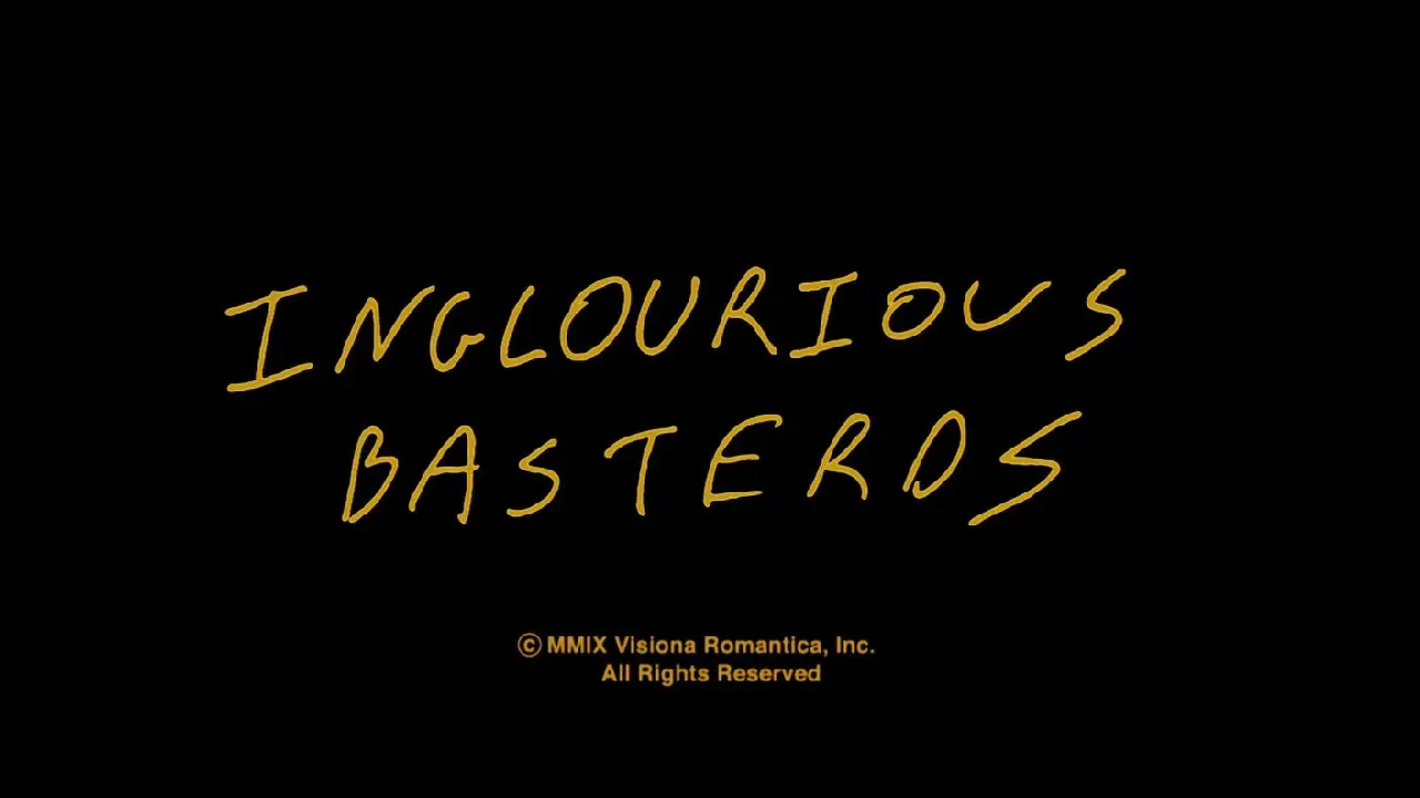
Inglourious Basterds (2009)
Title Cards
Where: Netflix
Who made it?
- Quentin Tarantino - Director
- Robert Richardson - Director of Photography
- David Wasco - Production Design
- Mark Paul - Motion Graphics Designer who designed the title sequence
- Marco Bittner Rosser - Art Director
- Anna B. Sheppard - Costume Design
How was it made?
- In this film it’s a homage to 60’s spaghetti-western posters and grindhouse cinema
Grindhouse cinema refers to a type of film programming, exhibition, and content popular in the mid-20th century that featured low-budget, adult-oriented horror, splatter, and exploitation films.
- The chapter-card typography was created digitally but styled to echo letterpress and film-optical titles
- Heavy use of slab-serif and stencil typefaces, overprinted grain, and strong colour contrast
- Motion-graphics overlays and end titles were composited in After Effects and Flame, using scanned texture plates and film grain from Tarantino’s archive to blend seamlessly with 35 mm footage
- The distinctive hand-painted signage, posters and Nazi-propaganda ephemera were produced practically by the art department then enhanced in post
What caught my attention
Something I love about this film is Tarantino’s use of titles throughout the film - my favourite thing in the entire world! You can see his use of typography in the title sequence as well as his character introductions. The use of graphic design and typography within films is something I’m very interested in so it always catches my eye - within his films even the graphic design and text is a use of storytelling.
Helpful links:
 Vincent Frei
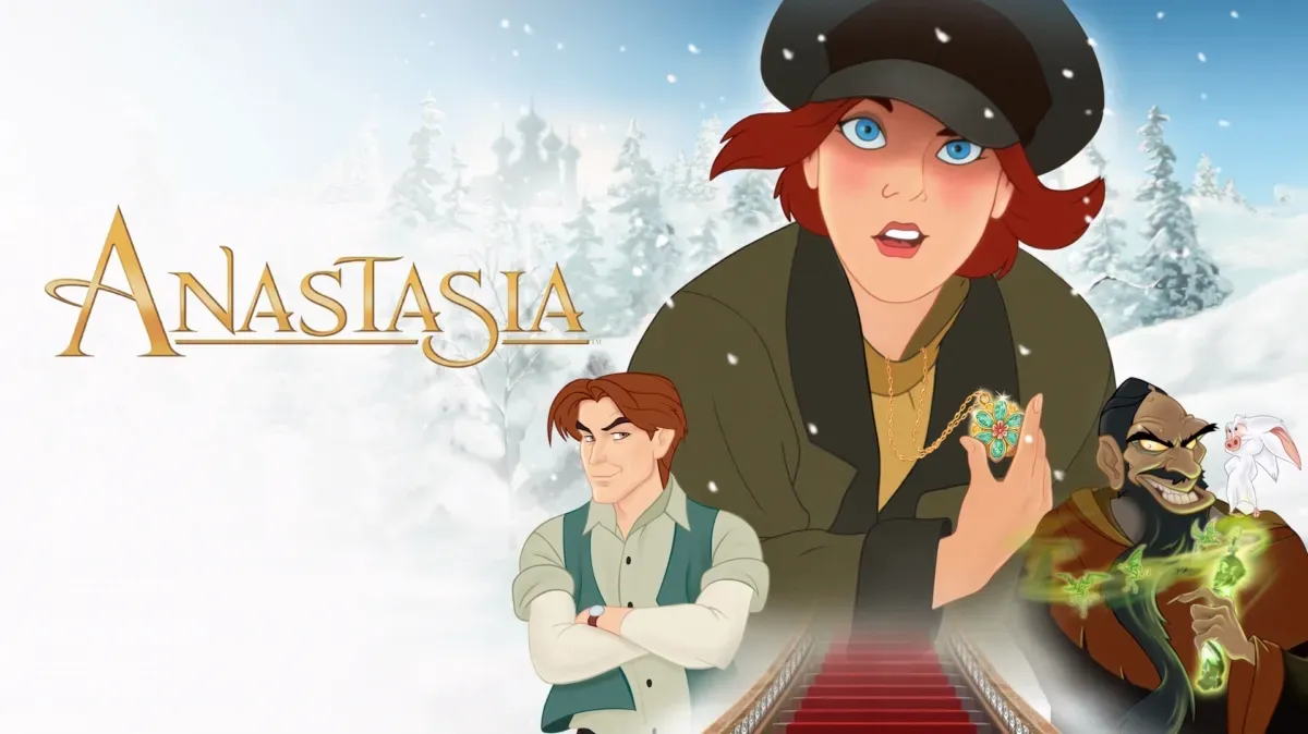
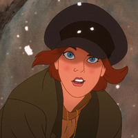
Anastasia (1997)
Film
Where: Disney +
Who made it?
- Don Bluth and Gary Goldman - Directors
- Fox Animation Studios (Phoenix, Arizona) - Producers
- Don Bluth, Len Simon, and Andreas Deja - Key animators
- Pacific Title Digital and in-house Fox CG team - VFX and digital compositing
How was it made?
- Character animation was drawn by hand on paper, scanned into the digital system, and coloured using Toon Boom and Animo software (early digital ink and paint)
- Backgrounds were traditionally painted, but many scenes used 3D CGI environments created in Alias/Wavefront PowerAnimator (a precursor to Maya)
- The ballroom dance sequence is the most famous hybrid: characters animated in 2D, moving within a 3D-rendered ballroom, with dynamic camera moves impossible to achieve in flat 2D space
- Layers were composited digitally, giving the illusion of real cinematic depth - a technique inspired by the multiplane camera tradition but done digitally
Even though “Anastasia” was made during that weird time in which Hollywood was moving from 2D to 3D animation, the movie doesn’t make extensive use of 3D elements mixed in with their 2D assets. And when it does, they don’t look as out of place as in, say, “Titan A.E.” or even Disney’s own “Treasure Planet”.
- This film was pioneering the way for 3D animation alongside Pixar with their release of Toy Story (1995)
What caught my attention
I have always noticed how the backgrounds of this film look different to other animated films of the era due to their hybrid use of 3D technology and 2D hand-drawn animation. Specifically in the shots of the palace and the ballroom where the camera sweeps across the scene giving them more dimension and making the environment more immersive than other films animated in the 90’s.
Helpful links:
https://www.awn.com/animationworld/conversation-new-don-bluth