Reflections on 4.1 brief

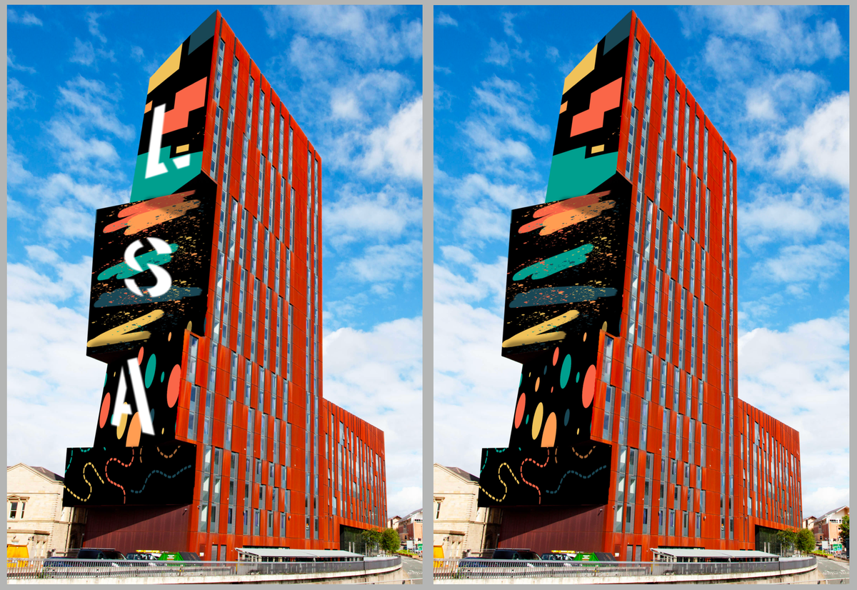
The brief I decided to reflect on was my very first brief of first year, which was the wayfinding for the university. I enjoyed doing this brief, but I could definitely have utilised and used a variety of technologies and experimented with a lot more ideas, instead of just a simple mural-style design on the side of the building. I liked how it turned out in the end, but if I could do it again I would absolutely look at more unique ways that I could present the design, while still representing the university and communicating the area effectively.
I think it would have been really cool and interesting to experiment with AR or another form of interactive signage. For example an attached app that allows you to point a phone or ipad at the building, in order to see or edit the mural. For example, I could create a moving/animated background or have the lettering animated, moving across the building to show the shapes and forms in motion. I could even add a more interactive feature such as: instead of the shapes and the design moving around on its own, the user could tap on the screen, drag things around, change the sizes and rotation of things, and even add shapes themselves, to make it a more fun interactive experience.
It wouldn’t even have to just be limited to the building itself, I could make it so that the users could add things around the university in general, if they wanted to create more signage based off my design, they could add in shapes on the windows to direct people where to go, or add in a statue of shapes in the courtyard area, they’d have the freedom to do that. I’d make sure it all reflected the sort of branding I created for the brief, using the same sort of shapes and the same colours.
Looking back on this past brief definitely was interesting, and really helped inspire me to think more like this, and be more experimental in my future projects and designs.
