Raising Neurodiversity Awareness in Public Spaces

Campaign: Reading is hard
The objective of this task was to create a group campaign to raise awareness about neurodiversity issues in public spaces. Focusing on the challenges neurodivergent individuals may face in navigating, accessing, or engaging with public environments.
As someone with dyslexia, which is something people may not realise affects more than just sitting and reading a book, I wanted to create a campaign that reflected my personal experiences. So as a group we brain stormed ideas of bringing awareness to how dyslexic individuals may experience public spaces.
The main problem we identified was with use of text in public spaces such as billboards, posters, adverts, and most importantly street signs and wayfinding e.g. signs in museums that guide and help navigate. And how people with disslexia may struggle and straight up miss read the text. So the goal of the campaign was to highlight the struggle and offer some ways to make this better however there isnt always a sollution, as the most readable font and best size doesnt cure dyslexia so making other understand more and feel how its like to experience the struggle.
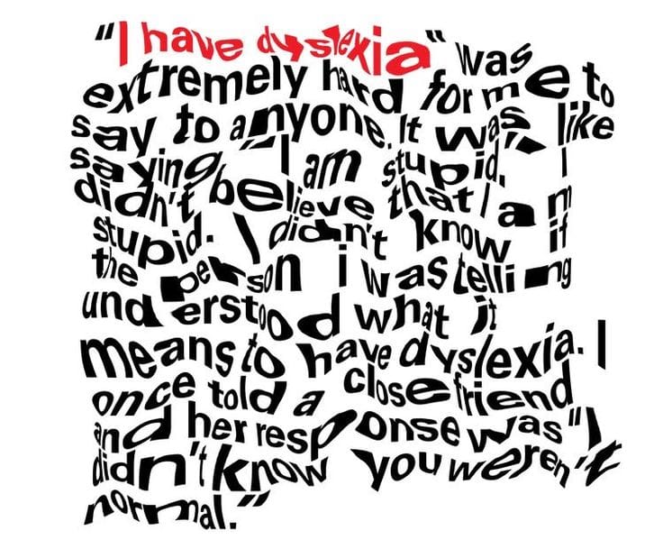
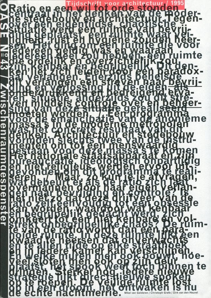
We did some research and found images that emulated what its like to have dyslexia aswell as some that may not have been intended for that but i felt in some way represented reading with dyslexia. The focus wasnt on finding images that accurately showed exactly what its like but more captured the feeling and how frustraiting it can be as with the campaign we wanted people to understand the feeling more than the logistics and technicalitys.


Images that we thought either replicates what its like having dyslexia some which are highly styalized and exaggerated
We decided the approach to realise our ideas would be to use projection in public spaces. So we would create videos and moving image of text that is already in a public space, so this could be a billboard or a information board in a library and then onto project the videos which would be glitching,distorting, changing words, and altering the text, in similar ways to the images we found. This would show in real time, in real spaces how dyslexic people may feel when navigating public spaces.
I did some research into projection which can be found here :


