5.2 Process Document
I see technology as an easy way to create things. When I think of design, I consider Photoshop, Illustrator, and InDesign as convenient tools for making projects instead of designing in real life. Before this module, I had never considered working with technologies like augmented reality or designing with coding. After exploring new technologies over the past couple of weeks, my initial thought process has expanded. I now consider new ways to make things instead of relying on the knowledge I already have. Over the past five weeks of learning, I have discovered various new technologies that I can see myself using, as well as some that I probably won't use. In this document, I will elaborate week by week on what I learned and how I may use these new skills in the future. Each week, we were assigned different short briefs to help us learn about new technologies. Alongside these briefs, we were given small reflection tasks that helped us reflect on our experiences and learn from them.
Week 1 - A Visual Framework and Neurodiversity
The first week of this module was mainly an introduction to the next couple of weeks, what we would be learning and how we would be learning it. The first mini-brief we were given was to create something to bring awareness to neurodivergence in a space in Leeds, this task was done in a group with two of my peers. We decided to use the Rose Bowl cafeteria as the main location for our idea because it is a popular spot for students. While brainstorming, we discovered a YouTube channel called "OK Go", known for its creative music videos. One video that particularly caught our attention was "The Writings on the Wall," which uses perspective to create fun and engaging illusions. This music video inspired our idea to use perspective in the canteen to raise awareness about neurodivergence. The image below illustrates the beginning of a mind map, allowing us to identify our audience, the location, and how it relates to the task.
The second mini-brief in Week 1 was to create a visual framework based on 2 of John Madea’s 10 Laws of Simplicity. The first concept I chose was "Reduce." I like the aspect of minimalism, as it creates a clean design that effectively conveys its message without unnecessary distractions. As this module focuses on technology, I imagine a futuristic design style, similar to how many tech companies, like Apple, make their products and accessories more minimalistic. The second concept I selected was "Differences." I believe that simplicity and complexity often complement each other. Introducing colour to an already minimal design can add depth to the pieces. Design created with technology has always used colour because we have the freedom to use every colour that exists. I made the framework on Figma because I have used Figma a couple of times before, and I like how easy to use it is. I usually don’t enjoy using software like InDesign to create documents such as this Visual Framework, as I find there are too many unnecessary steps for inserting and cropping photos.
Week 2 - An Augmented Reality Intervention
In the second week, we focused on Augmented Reality (AR). In the lesson, we learned how to use Adobe Aero, a relatively new software designed for AR experiences. I find it simple to navigate; however, the movement controls took some time to get used to. Creating basic items in Aero was easy, but adding more advanced features like animation and movement made it more challenging. If I had spent more time learning the software, I would feel more confident using it now. In the lesson, we were given a small task, which was to make an AR object to raise awareness of dyslexia. I partnered up with another one of my classmates to make it. Our idea was to use the word ‘reading’ as the main subject and then to make the letters move individually and differently. This task was a good opportunity to learn how to use the software. It was more of a playful, self-discovery approach, which I believe is effective for learning. There are so many different ways to utilise the software, and I find I’m more likely to remember something if I discover it on my own rather than asking someone and potentially forgetting the information.
The outcome for the task
The main mini brief we got for this week was to add an interactive layer of information or storytelling to a public space, such as a sculpture or graffiti that only exists in AR. My idea for this task was to create something informational that would help people. When using Snap Maps on Snapchat, small 3D icons appear when you zoom into a specific place or location.
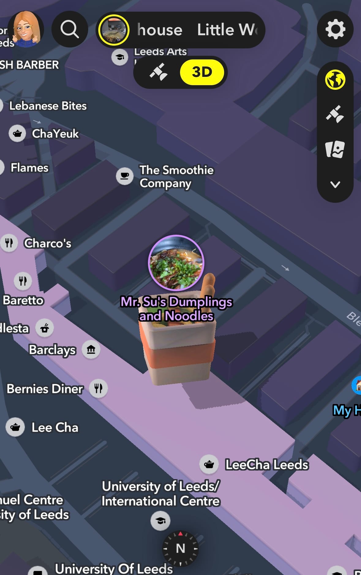
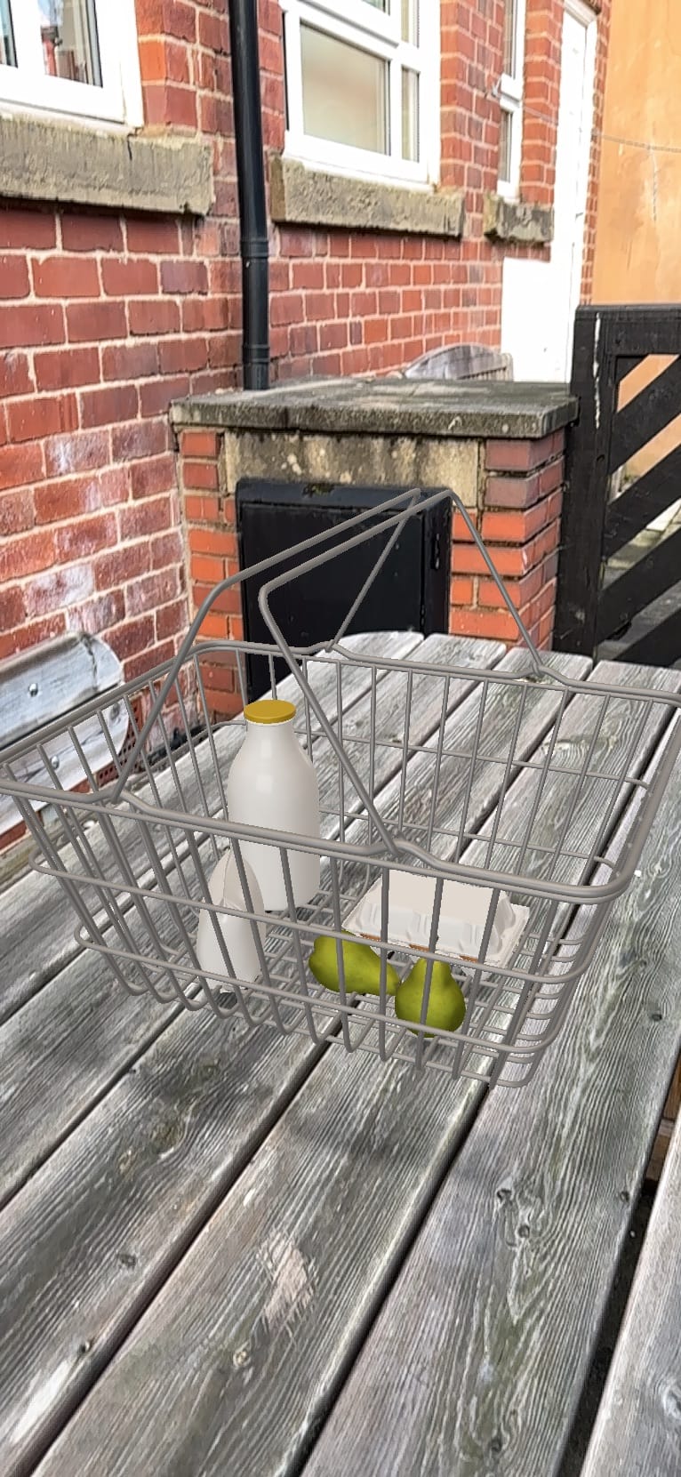
This concept inspired me to create a 3D icon that would appear when someone walks past a building. I designed a shopping basket icon to help people easily identify stores. In Leeds, many shops often resemble restaurants or social spaces due to the diverse cultures present in the area. My idea aims to simplify the identification of shops, making it easier for people to distinguish between retail spaces and other types of establishments. I created it in Adobe Aero using downloadable item presets. I designed a shopping basket filled with typical grocery items to make it clear it's a shop. So the basket doesn’t look stationary, I added an animation to make it bounce and spin around, just like the 3D icons on Snapchat do. I think working with Adobe Aero is fun as the concept of AR design is really interesting to me, before learning about AR design I never would have thought to create things with it. I can see myself using AR to design in the future. I believe it offers a lot of possibilities for transforming our view of reality. With AR, we can create new spaces and objects that are not typically found in real life. This technology has the potential to significantly enhance design, especially since much of design today is limited to 2D.
Each week we were given a small reflection task to do, and this week was to reflect on a project you’ve previously completed and explore how one or more of the technologies introduced in the “Innovations” seminar could have been applied. I wrote:
For the 1st first-year project, I made a mini sculpture of the broadcasting tower with moss on the side, as the task was to create a welcoming area for students to navigate around. I think from the seminars recently, I have learnt a lot about technology and how many things can be made with it. One of the most recent software I've learnt to use is Cinema 4D with Jon. If I had known about this software sooner, I could have used it to make the sculpture I made online. I think if I had used technology instead, I could have added more detail to the building replica, and I could have added a surrounding area, which would have made the outcome feel more authentic. I think it will be beneficial to use technology for future projects as it's more efficient and doesn't take different resources to use.
I believe that writing reflections like this is beneficial for my learning. It allows me to think back to how I could have improved my previous work with the knowledge I have now, helping me recognise how far I’ve come.
Week 3 - Experimental Cover Designs
For week three we were assigned to write a blog post about our workflow and what works best for us, I wrote:
My design process is simple but often not very effective. The steps I usually take are Thinking, Planning, Experimenting, and then doing. Thinking and planning are usually the easiest steps for me as I don't have to start designing my work, giving me more time to think of ideas. The bit that I get stuck on most is the planning part. Although planning my ideas isn't fully designed, I find it the most difficult because I struggle to get going when I'm given a brief. More often than not, I spend most of my time trying to think of ideas and how to progress them rather than experimenting and trying them, which then wastes time in the long run. I feel that if I use easy-to-use software to plan out my ideas, such as Figma visually, I can visualise my ideas better and expand on them a lot faster. Figma is really easy to use as I can create online mindmaps quickly whilst also being in good detail. Although I haven't used Figma too much recently, I will begin to use it more often as it is a really strong tool which can be used both creatively and academically.
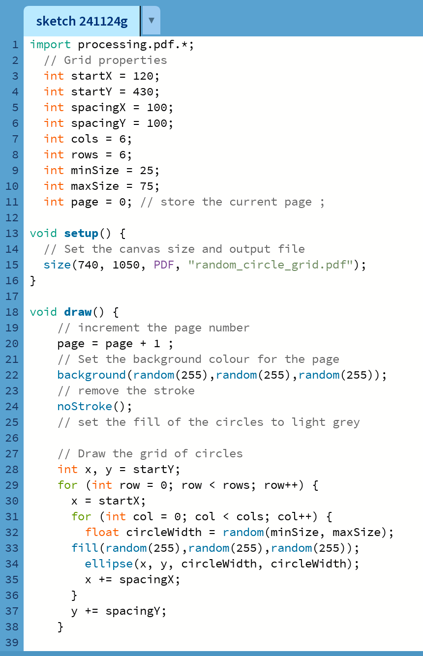
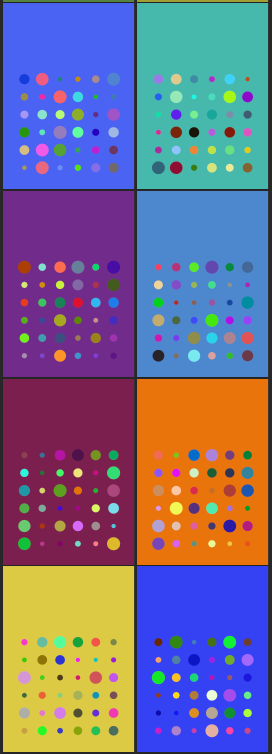
The second task involved creating a piece of code that randomly generated one hundred covers, each consisting of random colours and circles. I found this task quite challenging because coding requires precision, and I don't have much experience with it. It's easy to make mistakes, which can be frustrating, especially when I keep encountering errors. I have to admit that this was my least favourite task so far, as I don't find coding enjoyable. I don't see myself using this type of design in the future. Here is an example of the code I used, but I didn’t change much from what was provided because I couldn’t quite figure out the formula.
Here are a couple of examples of the randomly generated covers:
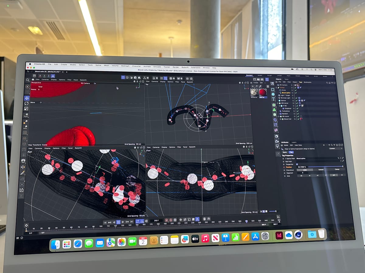
Alongside the normal workshop lessons, we also had technical workshop lessons with Jon. These lessons focused on 3D motion design using Cinema 4D. Each week, we return to the same project, expanding it and making it more complete each time. The ongoing project involves making red and white blood cells float through veins. We began by creating the basic shape of a blood cell, duplicating it, and randomising the arrangement to represent how blood cells appear accurately. When using Cinema 4D for the first time, I was overwhelmed with the amount of tools in the software but going back to it every week helped with remembering how to use it. From my first experience using Cinema 4D, I enjoyed the concept of creating 3D motion graphics. It made me eager to revisit it, and I see myself using it in the future.

Week 4 - 6 x 6 Briefs
This week, we received six briefs with six different potential outcomes. I chose to explore a narrative through interaction (option 2) and generative design (option 5). My outcome is a short interactive story that has various endings based on the choices you make. The story begins with you waking up in a haunted house, and your goal is to escape, though there’s a chance you might fail. I created an interactive story using the Figma design board, taking advantage of the prototype settings to switch between pages. For the images, I used an AI generator to capture the mood of the story. Since this module focuses on technology, I believe that using AI enhances the narrative. The AI-generated images added a level of creepiness that I wouldn’t have been able to create otherwise. Personally, this was my favourite task because I enjoy working in Figma as it's user-friendly and sleek.
This is the first potential outcome
This is another potential outcome
Week 5 - Custom CSS Theming
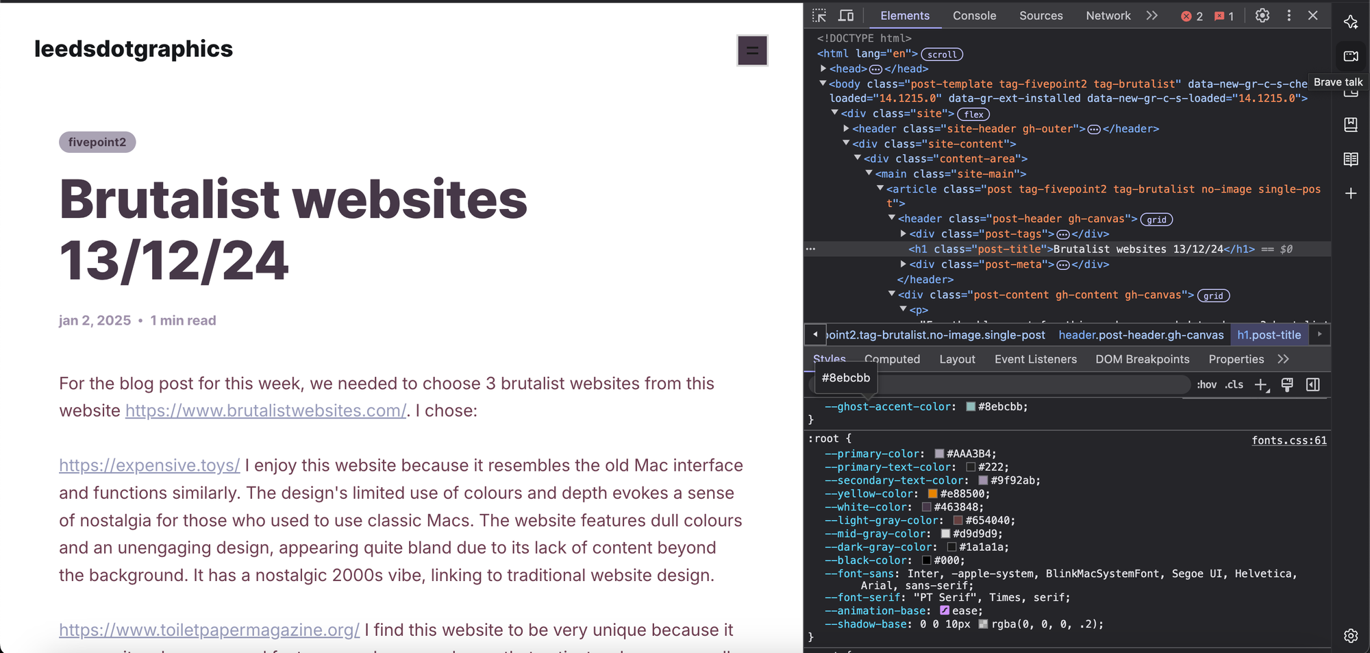
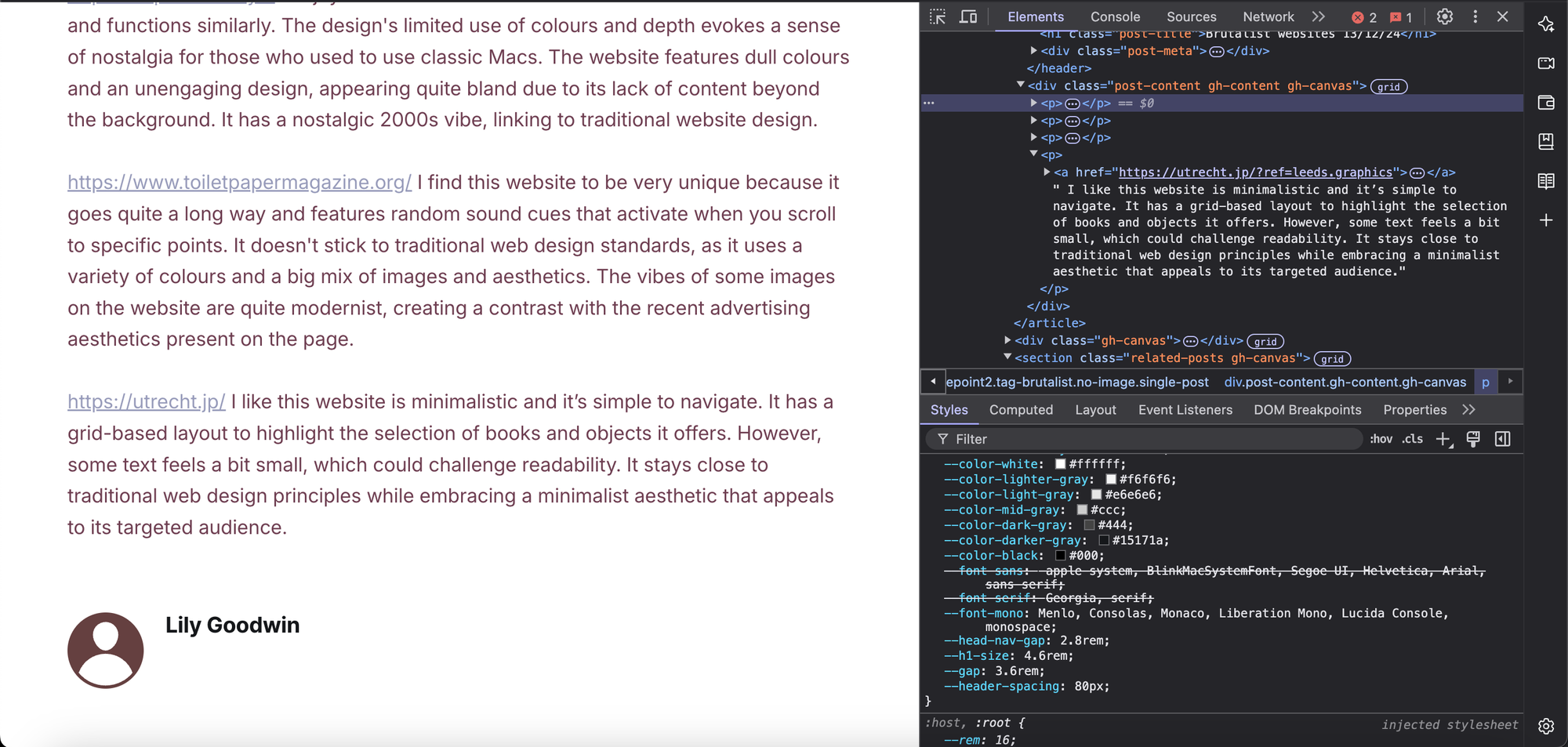
The task for this week was to choose one of our blog posts on leedsdotgraphics and then customise the page by using the HTML file and CSS to change it. I found this task to be similar to the coding task, but I found it much easier. The code was already provided; I just needed to make some modifications. Whereas, the processing coding task was more challenging because I had to create it from scratch. I increased the size of the title and made it bolder to make it more eye-catching. I changed the colours, going for a brutalist colour palette that includes muted oranges and dark purples, reflecting the blog's focus on brutalist websites. However, I was unable to change the background colour from white, as I couldn't locate that option in the HTML section. I enjoyed this task because previously if I accidentally opened the HTML section, I wouldn't have understood what everything meant. Now, I have a general idea of what the different coding elements do.
For the blog post for this week, we needed to choose 3 brutalist websites from this website https://www.brutalistwebsites.com/. I chose:
https://expensive.toys/ I enjoy this website because it resembles the old Mac interface and functions similarly. The design's limited use of colours and depth evokes a sense of nostalgia for those who used to use classic Macs. The website features dull colours and an unengaging design, appearing quite bland due to its lack of content beyond the background. It has a nostalgic 2000s vibe, linking to traditional website design.
https://www.toiletpapermagazine.org/ I find this website to be very unique because it goes quite a long way and features random sound cues that activate when you scroll to specific points. It doesn't stick to traditional web design standards, as it uses a variety of colours and a big mix of images and aesthetics. The vibes of some images on the website are quite modernist, creating a contrast with the recent advertising aesthetics present on the page.
https://utrecht.jp/ I like this website is minimalistic and it’s simple to navigate. It has a grid-based layout to highlight the selection of books and objects it offers. However, some text feels a bit small, which could challenge readability. It stays close to traditional web design principles while embracing a minimalist aesthetic that appeals to its targeted audience.
In one of the last Jon workshops, we learnt how to animate in Photoshop using Wacom drawing tablets. I have some experience using Photoshop for animation and a drawing pad. This was one of my favourite tasks because I enjoy drawing and find Photoshop easy to use. I like how the draw-pad makes the sketch look; it seems like I've drawn it on paper with a pencil, even though it’s digital. I struggled most with deciding how far to move the stickman in each frame without it being too choppy. Here is the animation:
Through this module, I have expanded my perception of design and technology, moving beyond the tools I was comfortable with, such as Photoshop, Illustrator, and InDesign. I’ve discovered how emerging technologies like augmented reality, coding, and 3D motion graphics can transform the way I approach my creative projects. Each week introduced me to a new skill set that pushed me to think differently, from using Adobe Aero to create interactive AR experiences to experimenting with coding for generative design and even animating with Photoshop.
The short briefs and reflection tasks encouraged me to experiment, learn from mistakes, and see how technology can enhance my ideas. While I found some tasks, like coding, less enjoyable, they still contributed to my knowledge of diverse design processes.
I plan to use AR and 3D motion graphics more in my future design work, as these tools allow me to create cool and immersive experiences. I also see the importance of tools like Figma for improving my workflow and planning ideas more effectively. Overall, this module has taught me to step outside my comfort zone and discover technologies that I previously hadn’t considered.
