Process Doc 5.2
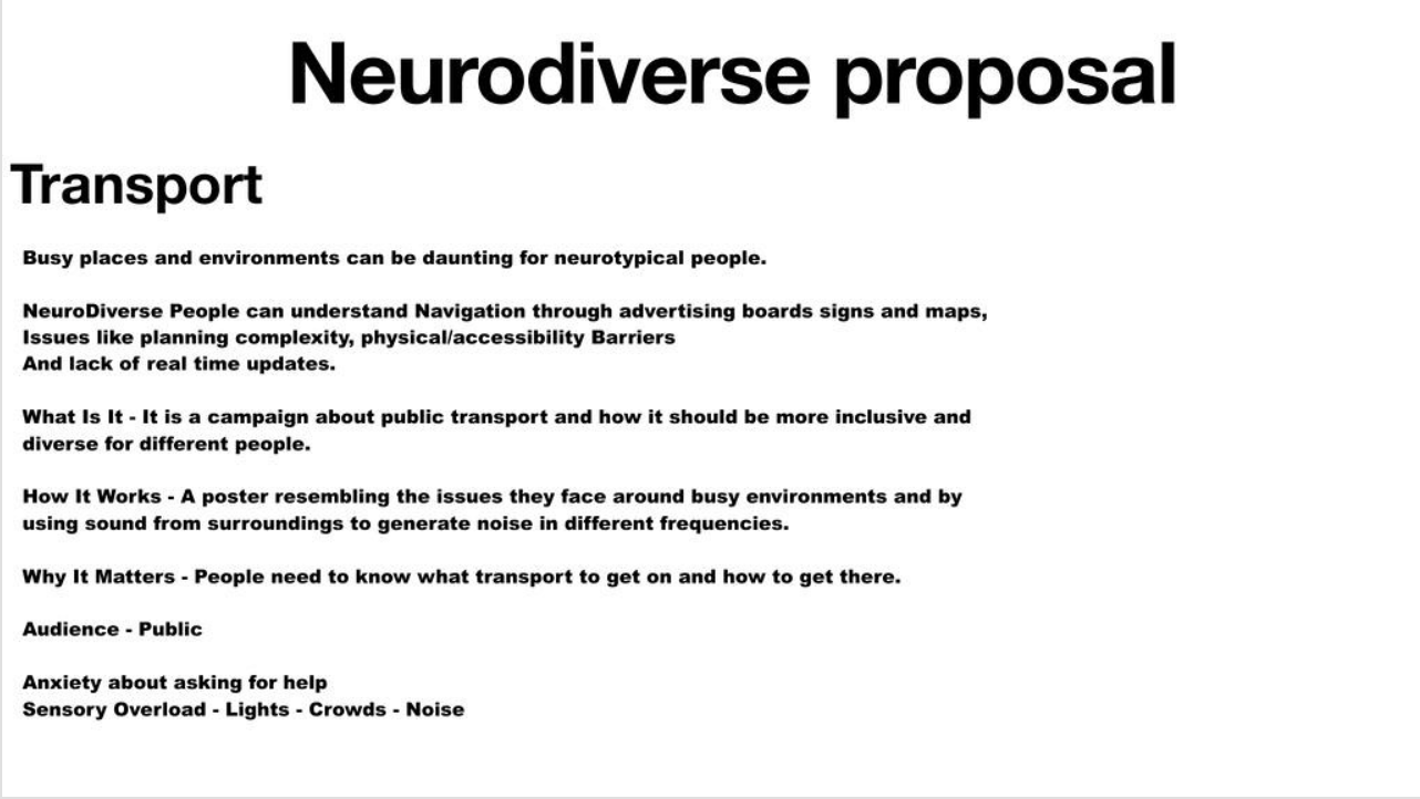
Neurodiverse Proposal
The approach we took was to research into what neurodivesity is and from there had a conversation on what area we would focus on the problems that could be present in that area. Technologies that we used were our phones and laptops for research and used keynote on the laptop for the one slide presentation.
Check my Journal on Cagd for the youtube links for the projects that i researched in case they dont link correctly.
Week 2
The first little project that I came across this week that caught my attention was an edit on TikTok of a skiing compilation.The video was made by an account called ski heaven and the page is dedicated to skiing and have multiple compilations of freestyle skiing. It caught my attention because I am very intrest and passionate about winter sports and thought the editing between clips was very good alongside the song choice.
Project 2
The second project that I recently rediscovered was the old ITV England intro which was used for when England National football team would play. Which for me was very nostalgic as I remember this intro from when I was a kid was watching England play. The project ran from the late 90s to the early 2000s which would often have been aired on Itv sport before any England international match. The intro sequence would start off with an image of poppy fields and through a clever decision of using the colours from Saint Georges Cross it would exaggerate the colours of the poppies as everything thing else in the background was white and they would keep this same idea throughout the whole sequence. The sequence would show and move through multiple different famous landmarks of England such the angle of the North, Clifton Suspension bridge a Wembley stadium which it would end on. The sequences also included symbolism of England for example showing Lion statues and roses which are both heavily link to England as they are our national animal and flower but are also used for our national team’s badge. Throughout the whole sequence they decided to use the soundtrack from the verves Bittersweet Symphony as it was a very popular song at the time, and I believe that it was the perfect fit for the soundtrack and it created a memorable feeling and now a very nostalgic one for England fans. This project was created by Itvs team for branding and marketing etc but can’t find out the actual names or studios but there was one call Vincent studio but after looking on their website it had no mention of the project.
Project 3
Another project that I rediscovered was the old premier league intro from the 2011/12 season (20 years special) would typically be play before every match week and match on sky sports. Technologies used would have been premiere pro and aftereffects that would have been used for the editing of the multiple clips of football footage and for the audio, then aftereffects for the golden spotlight light effect on the players and movement. The soundtrack they decided to use was “written in the starts” which again was a very good design decision as it fits well with the footage but also enforces how exciting football can be, along with the footage itself. After looking at the current premier league intro, I believe that the current lacks that. It of excitement that a good song choice will bring partnered alongside clips of the last season and to me the new intro is a bad example on how trying to modernise everything doesn’t work. To start a career in this area I would have to develop my skills within premiere pro and aftereffects and have some good examples of work from using these programs.
Project 4
The other project that I came across was the advertising\ trailer for Avatar Fire and Ash as I am a fan of the movies and excited for the new one to release, one main reason as to why I like the moves is because of the world creation and the visuals in these films are breath taking. I recently watched an interview where talked to two of the main production designers from the new avatar film about the creation of the world and they mentioned that they use stuff from the nature we have as a baseline for the creation of the world Dylan stated “silly and very arrogant to believe that you can do something in an afternoon that is better than millions of years of evolution from nature” also stated that “Design is like Joke if you have to explain it its not very good”. I really liked these quotes as it makes so much sense in the way that sometimes-keeping designs simple is usually better for the audience than some over complicated design. Entry level skills for a production designer would be to learn and develop skills within 3d art and technical drawing skills.
Interview with production designers for Avatar Ben Procter, Dylan Cole.
Fivepoint2 Innovation
The project that I have chosen was the app from 4.4 where I would integrate data driven design, the decision of using data driven design within this project work change and elevate the design but also the experience of the audience as this would make the app work a lot smoother and would give valuable feedback on areas which need changing or rethinking. With having this data driven aspect very much included within the design process I believe that the app would have been more polished and just an all-round better design that would give a developer a better understanding on what it was I am trying to achieve with the app. This module has given me a range of new techniques and technologies to consider when it to comes to creating a new project and that there are a lot more different and exciting new ways to create pieces of work. To achieve this I would need to develop my skills and understanding of Figma but also learn the basic skills of coding and ux design.
Week3: Workflow
Part1
The parts where I find the most excitement during a project is when I’m given a brief and have a few ideas following in my head in the direction I am wanting to take on a project and when I’m creating something within Illustrator Photoshop, but I would say that I do like to sketch out a few ideas or just try to incorporate drawing within a project as it’s the best way to get ideas out of my head but can also create some good final pieces too. The points where I feel like im designing is typically right after the research phase because I am fully focused on my work not what is already out there which allows me to start making small decisions on my design. The parts of my design process that I feel is more of a task and or repetitive is research as I find it mostly boring and just slows down my momentum in the projects where it is about something I’m interested in I find that research comes more easily and when it is about some real world issues is when I get caught up in the research in wanting to find out more.
Part2
After doing a little research and experimenting with some programs I found motion to be beneficial to me as it creates a list on the task that I need to do and when by making the research phase flow more smoothly. It also helps manage time management by having the list of task and when to do them by which helps with staying on task and what to do by when to help stay on task/time, which is a crucial area but one I need improvement on while working a lot of hours. This will help reduce the pressure of failing behind and playing catch up, by improving my time management which will then help the rest of the project flow by staying on top of the task and all the deadlines’ motions gives me.
Part3
The obvious answer to ai is that it can help us complete and finish the tedious task that we don’t find to be desirable but see as more of a chore, but Ai is more than that as many studios and companies are using it for a way to save money and or replacing the artist behind the work for example coca cola have used ai to produce their Christmas advert for 2024 and 25. When looking at the out come of these ads/project that use solely just ai we can see that something is missing, that creative edge and flair that a industry professional will bring. Another recent example that used ai to replace a artist is EA how used ai to create the player dynamic Images for silver icon cards within their recent release of EA FC 26. After seeing the outcome of these projects of what ai can produce is a pretty good product but for me when ai is used solely in a project it just seems a little soleless and lacks that creative edge.
However, I do believe that there is a place for Ai in the design process/industry as long as it is used alongside industry professionals used in more of an ideation way that can generate quick concepts of the ideas from the artist. I do also believe that ai should not be used by a company or collective to create finished designs and products as AI as of now does lack that bit of finishing edge to a project that a design does have and companies should use both in equilibrium in the areas which they thrive in. I can see the role of a traditional designer strengthening because for me the end product you get from a designer is more refined compared to AI end product. So I think that if companies care about their end product then I don’t see much changing in terms of the role of a designer but if companies care more about cost cutting rather than a finished polished work then yes, I do see the roles changing. I do believe that we a still a few years off the industry completely changes as AI as of now isn’t as or that advanced yet that it will/might replace designers but on one can say for sure what will happen.
Automation
The piece of software that I experimented with was Munken creator where I would use the random generator to create different short animations of words and letters changing how they move and react, by editing the speed, size and how many rows there are. Which would create some interesting patterns and videos for example I generated one where it appeared to move in way like a wave which I found very interesting to see what you can create by doing something as simple as editing a few settings. The outcomes of this are on my jounal in Cagd as I cant upload the short animations on here. https://colab.munken.com/
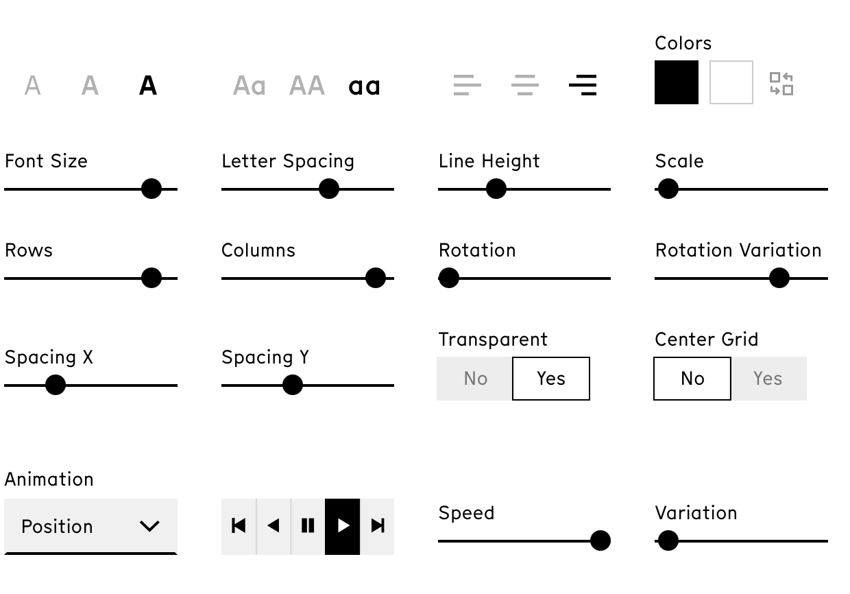
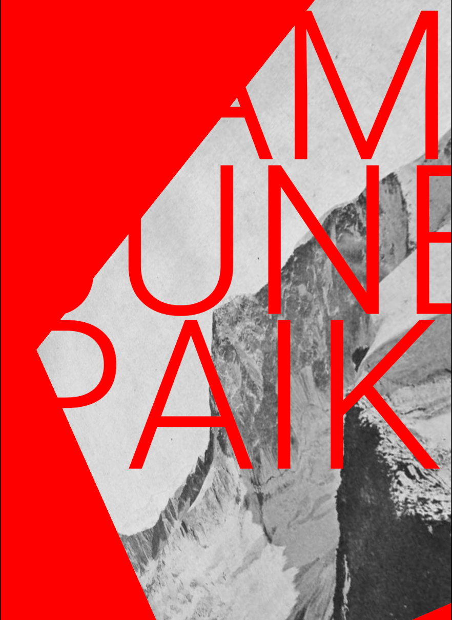
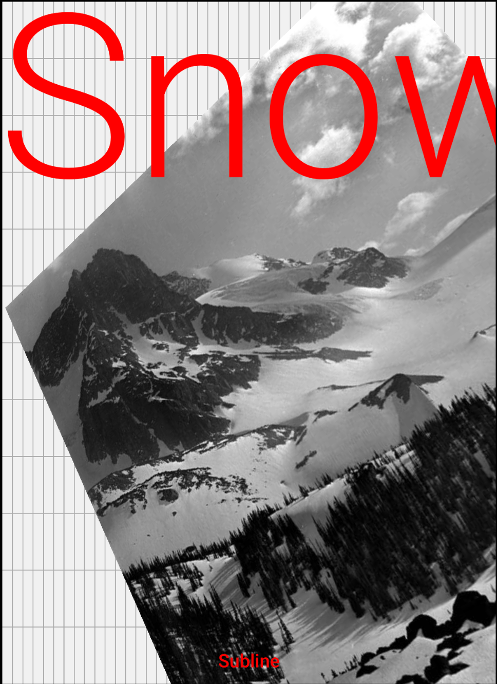
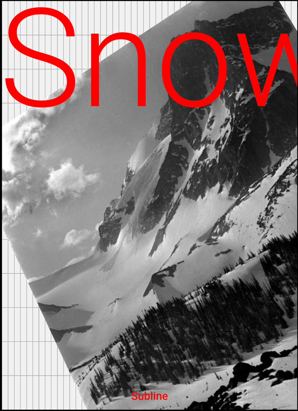
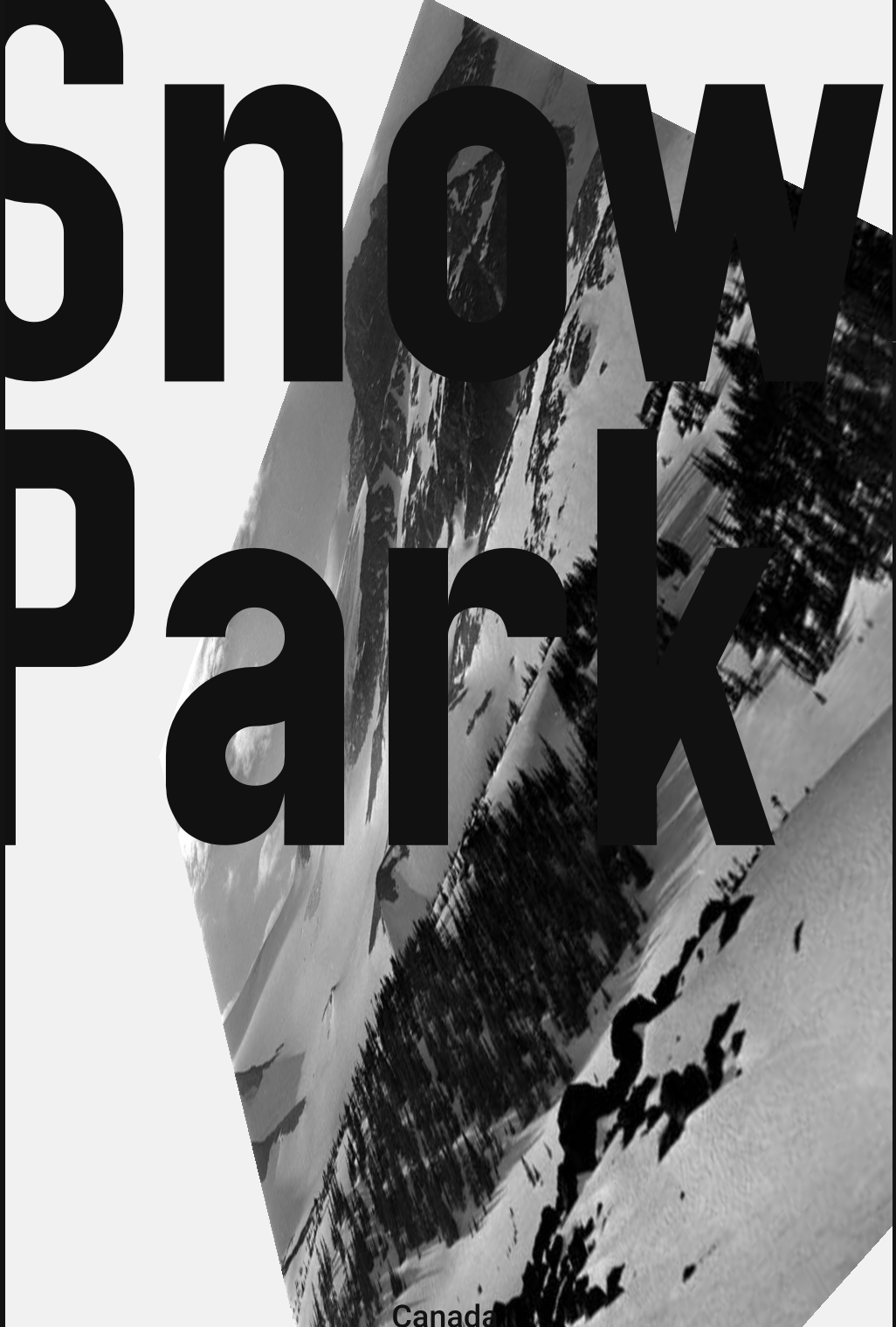
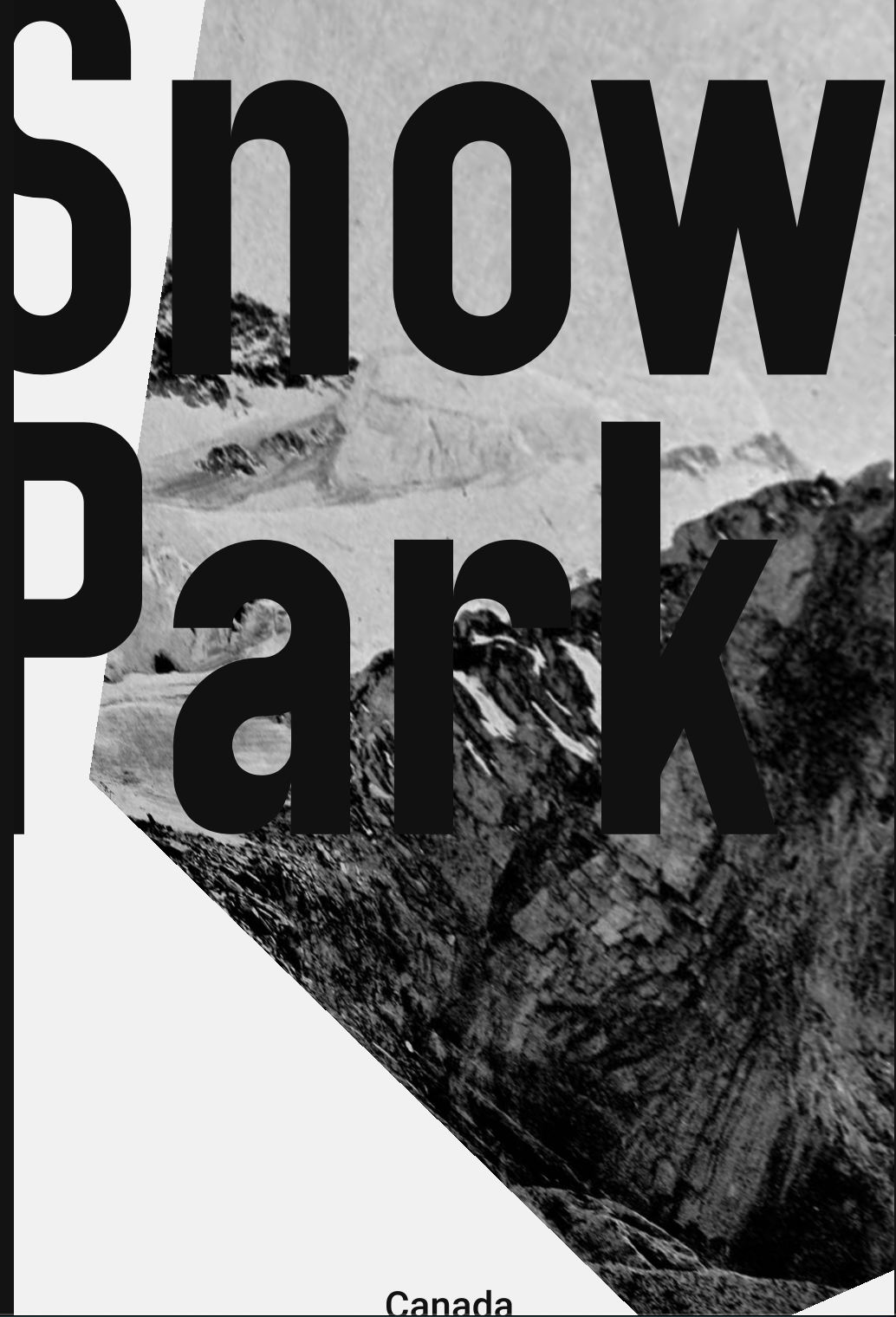
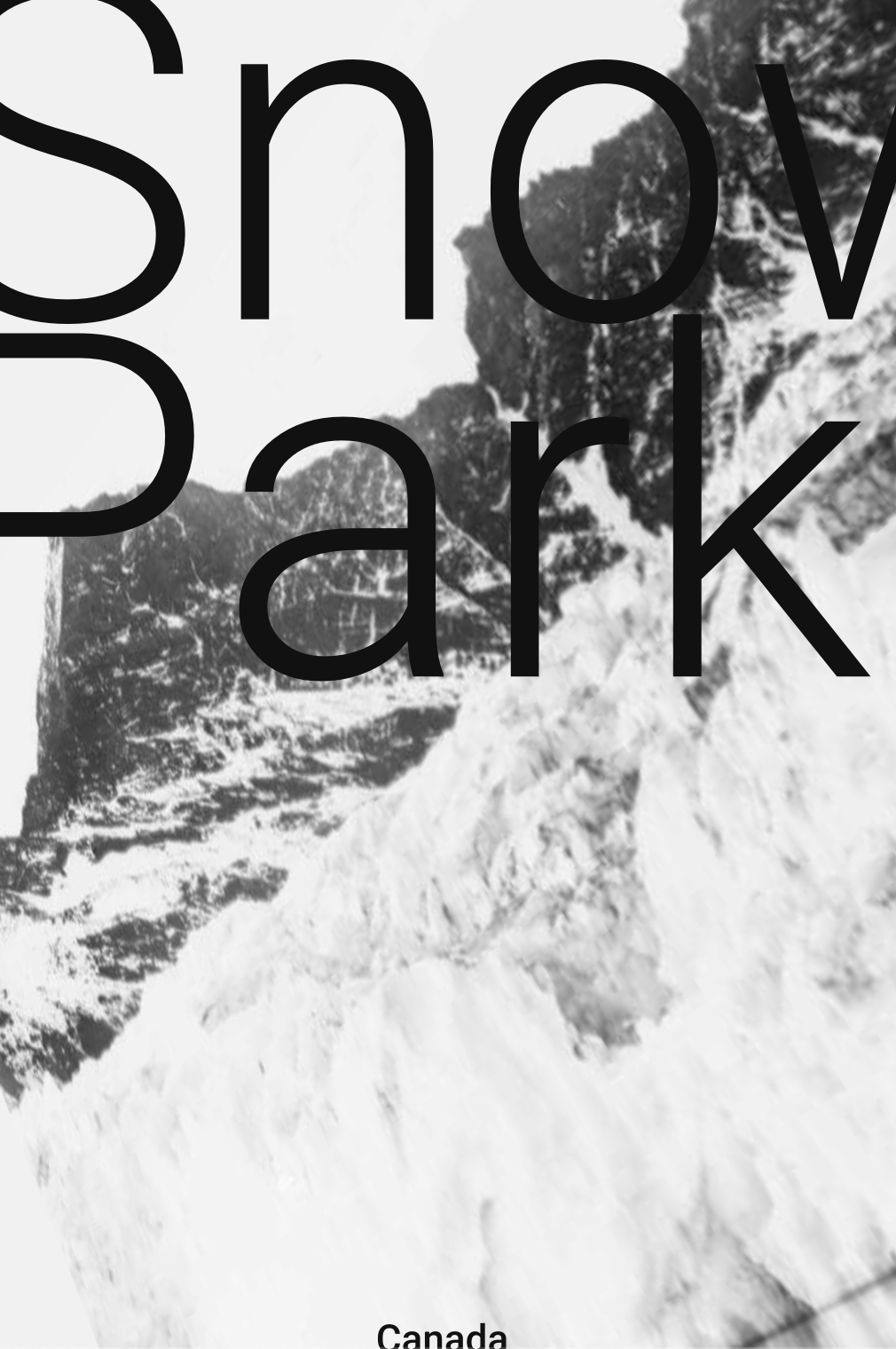
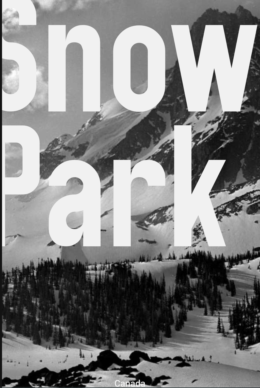
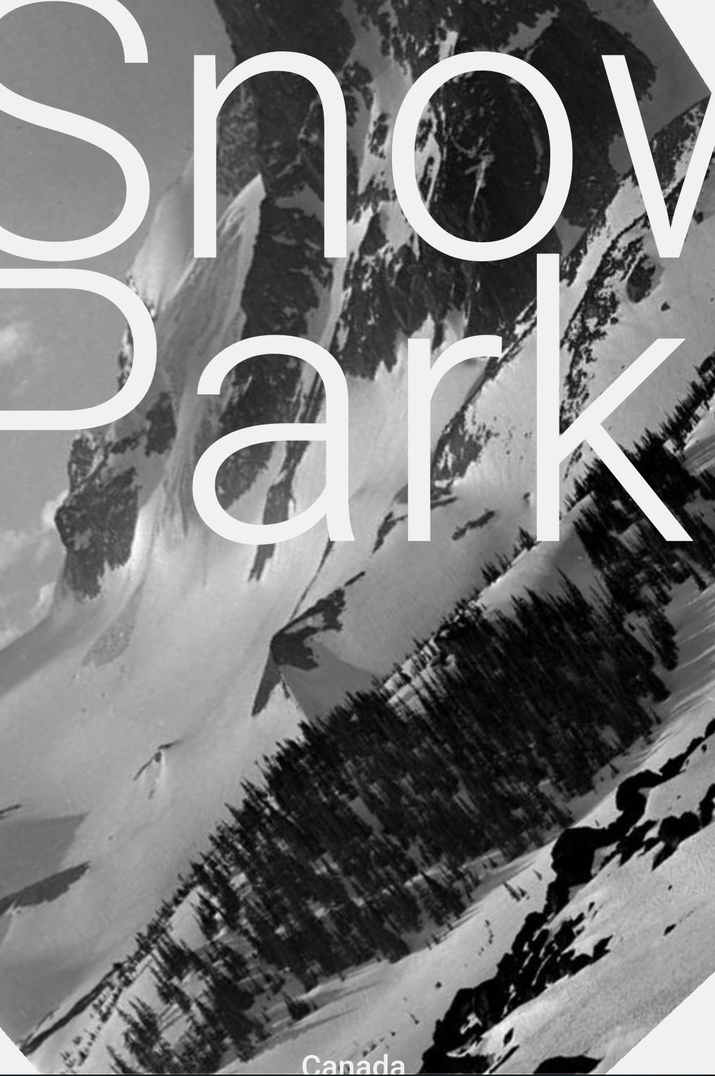
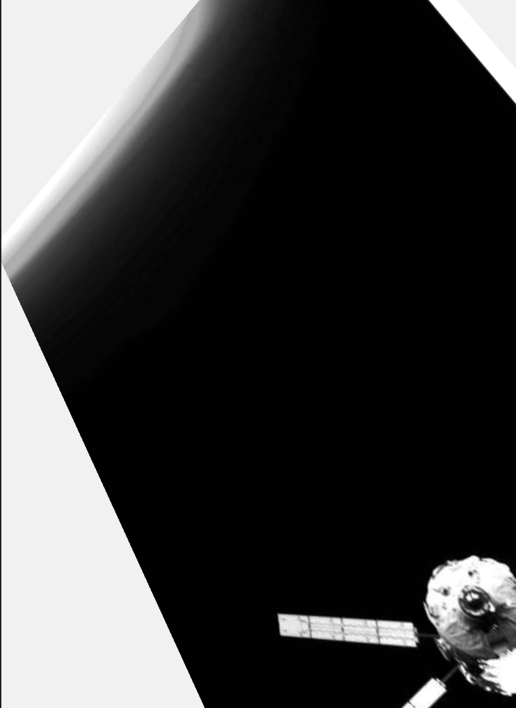
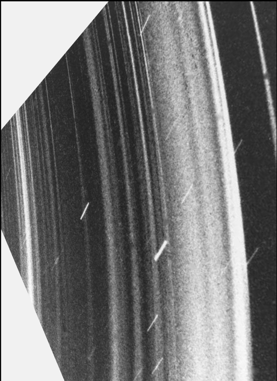
Another piece of software that I exprimented with was p5studio, this program allows tou to quickly put together posters but my favourite edditing tool was one that allows you to cahnge the x y and z axis of the image to create very unique poster. This will be a piece of software that I will use in future projects to just quickly create a few concepts of posters. My favourite posters that I came up with is one of the space ones where I used the negative space around the image to incorporate the glare from the photo. https://p5studio.vercel.app

Glitch Effect
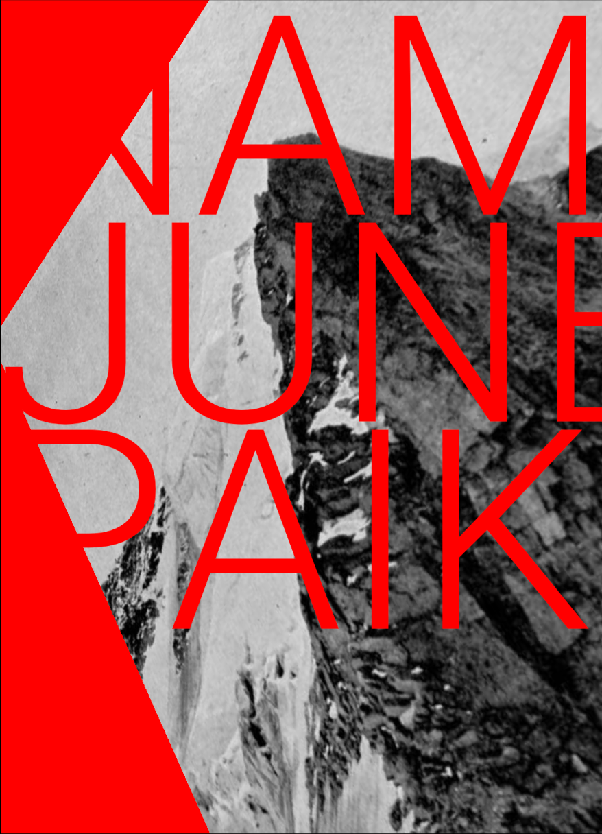
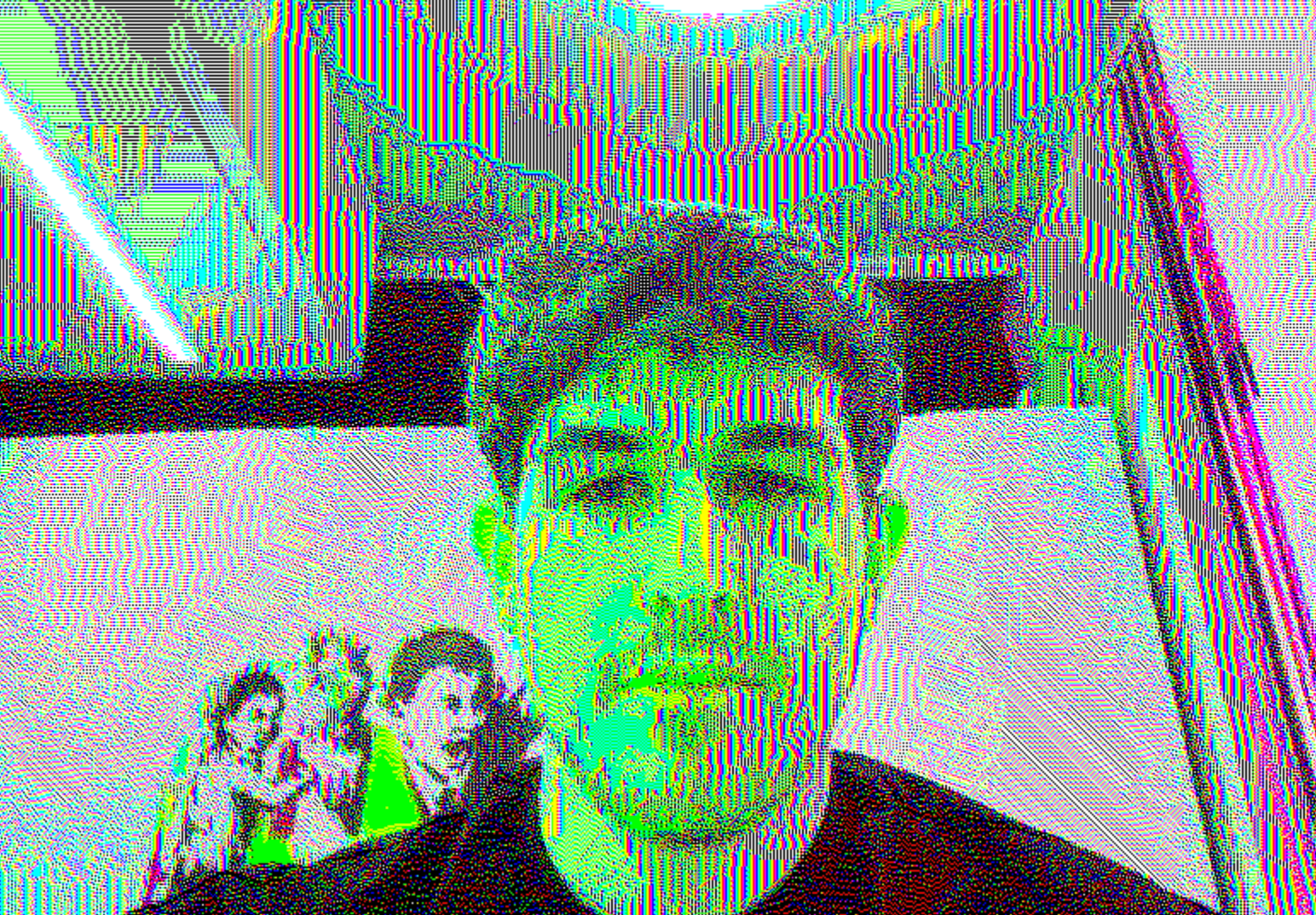
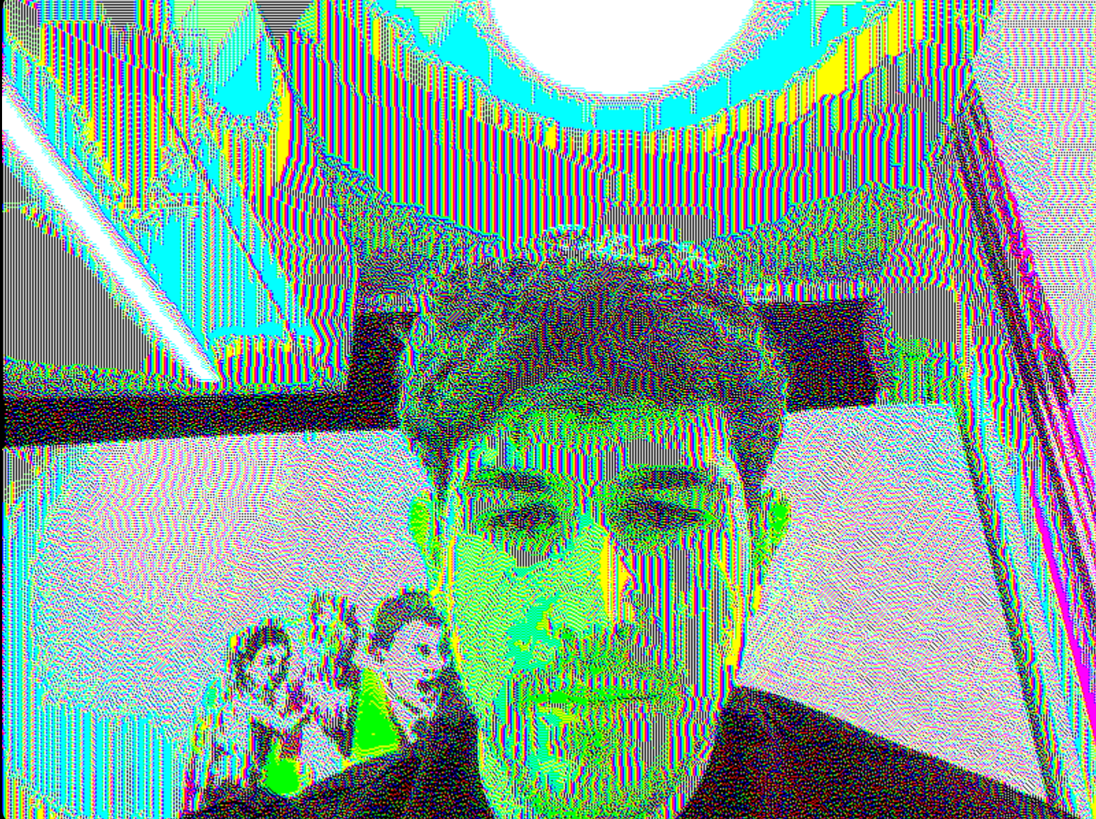
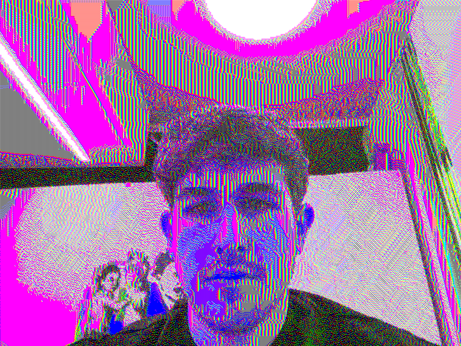
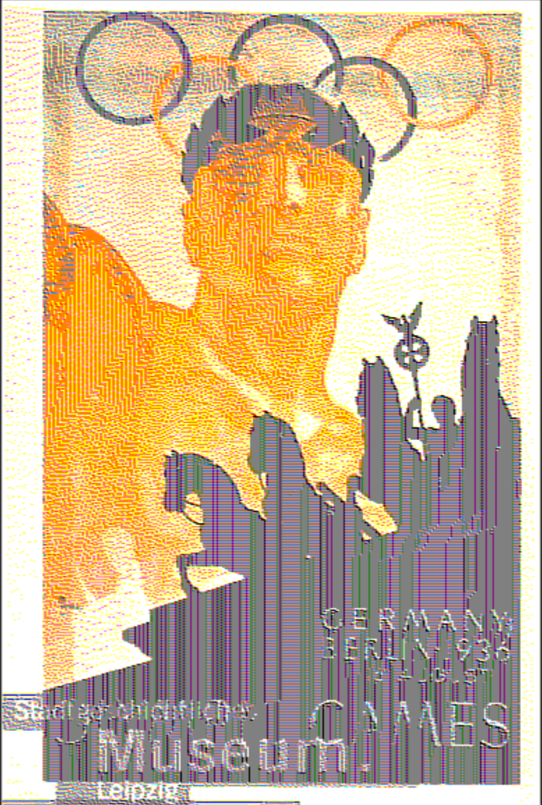
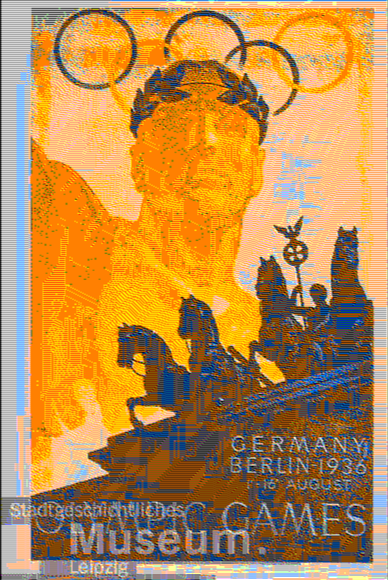
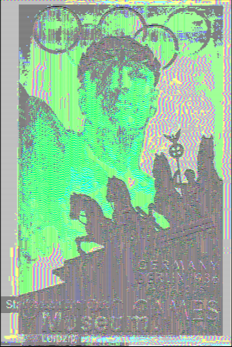
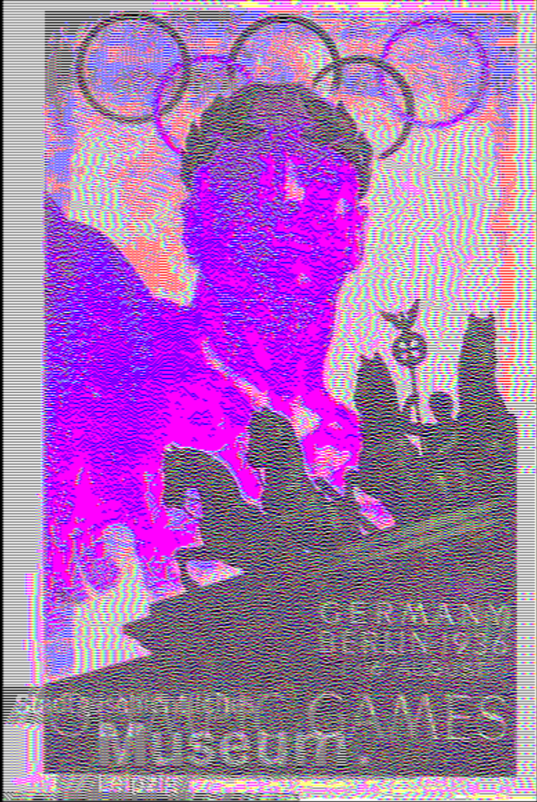
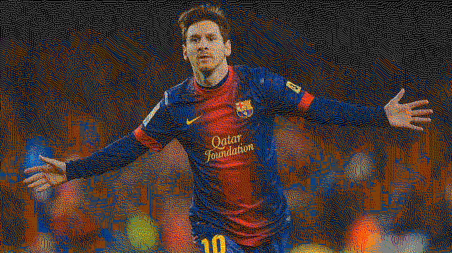
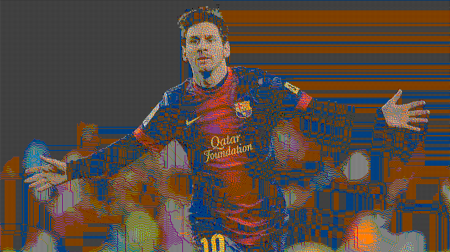
Another piece of software that I experimented with was a program that allows you to create a glitch effect on to photos which I found to really like because it gives the images a more of a digital feel. I also like the outcomes of the images that I used the effect on especially the Olympic games poster as I think it adds more to the design and in a way, it brings it into the digital era as the poster is from 1936, so it is a very fitting effect to apply to the poster. https://synthymental.com/signal
Gradientor
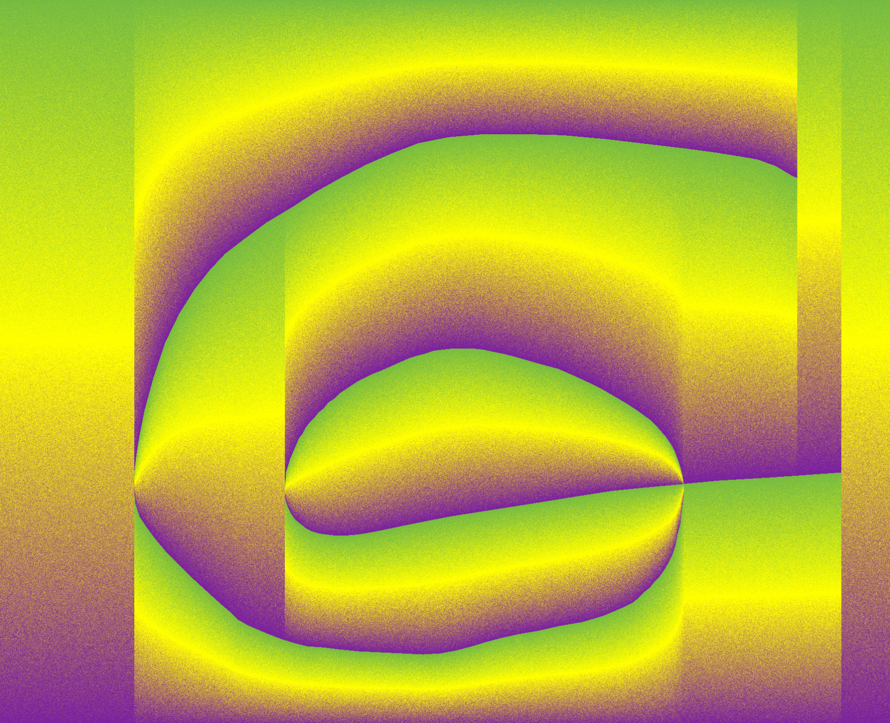
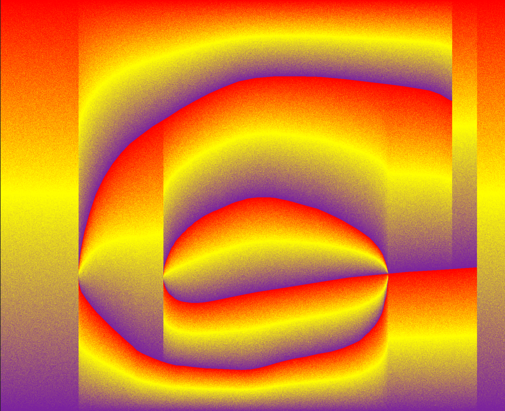
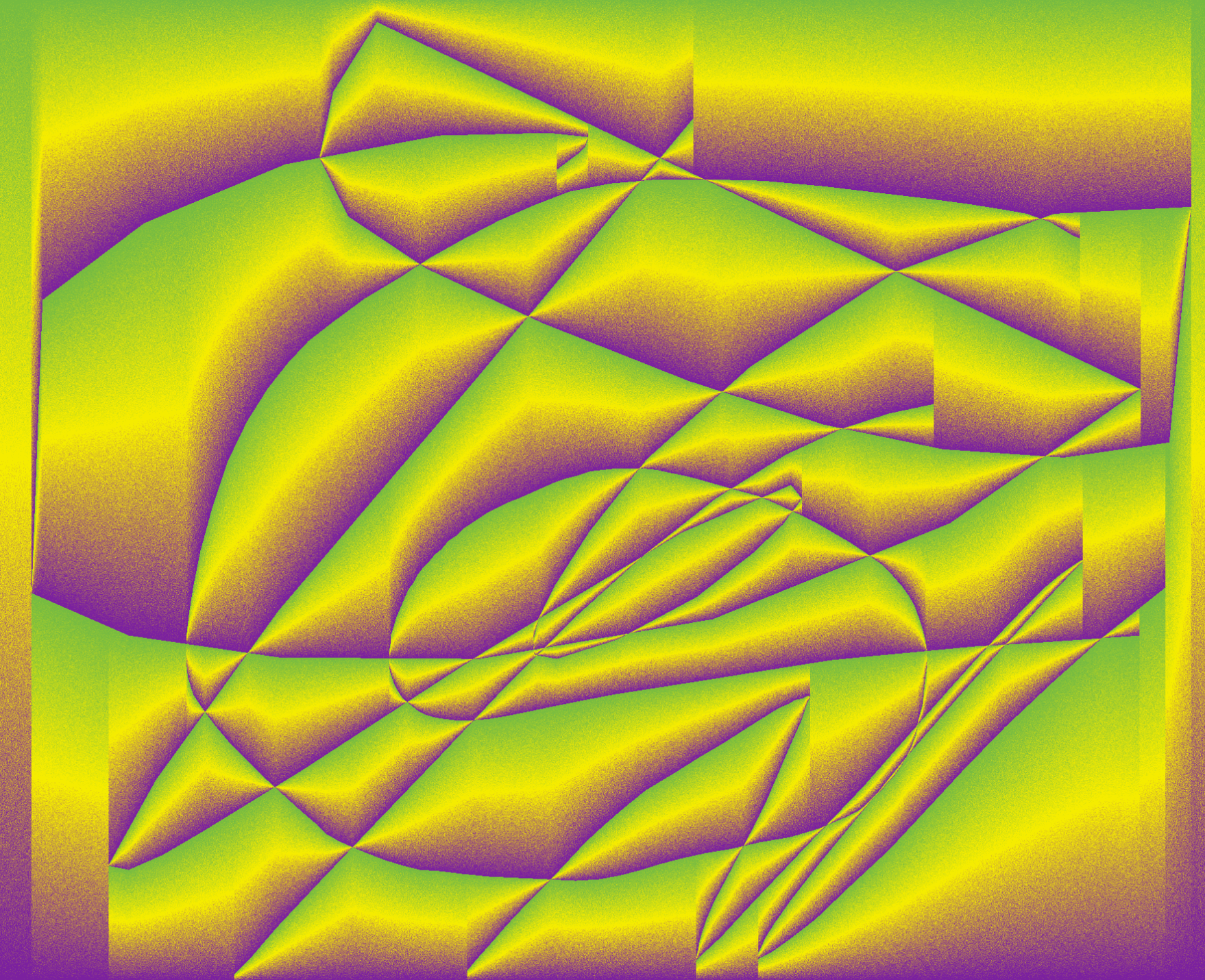
The last piece of software that I experimented with was a program that allowed you to create a gradient and then draw and create patterns within the gradient. I didn’t really spend much time on this program as there wsant much more to do and don’t value it as much as the others that I used. I did like the unique patterns that I could create but I don’t really see myself using this program in the future as I don’t think it is as useful as the others that I have used. https://gradientor.afterimage.cc
Processing
The processing task was one that I found quite challenging to try and understand the coding as I have no idea about creating it myself, but this was one of the reasons as to why I enjoyed it because I think that coding in this day and age is very important, so I think it is just as important for me to learn and try to understand the basics behind it. I found the task of creating a series of randomly generated circles to be quite challenging because I found the process of creating code to very tedious and frustrating at times because I would forget to add something like brackets etc and spelling of words as this would cause and error which meant I had to tweak the code to work. This whole process became very rewarding to see the finish product of my code after the struggle of getting it to work.
Evaluation
I enjoyed this project as it has open my eyes so to speak of the potential roles that new technologies could hold and change the way we think about design but also help create new ideas and techniques we can incorporate into future designs. My favourite new techniques/programs that I have used was Munken creator as I like how easily you can generate different short animations and how good some of them can be but I also like the fact how you can create completely random animations and see something that you maybe might not have thought about before to open the doors for more experimentation. Another favourite of mine was the glitch effect and p5studio because I like how I can create quick simple posters for a mock up and concept, I like the glitch effect purely because I like the effect. One that I don’t see myself using much is the gradientor program as there isn’t much you can do with it and I don’t really see a project in which I might use it. I have learnt some new valuable techniques within this module that I can see myself using within future projects and has also showed me there is more to graphic design outside of the adobe suite.
