My own research
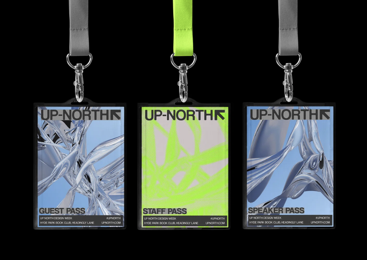
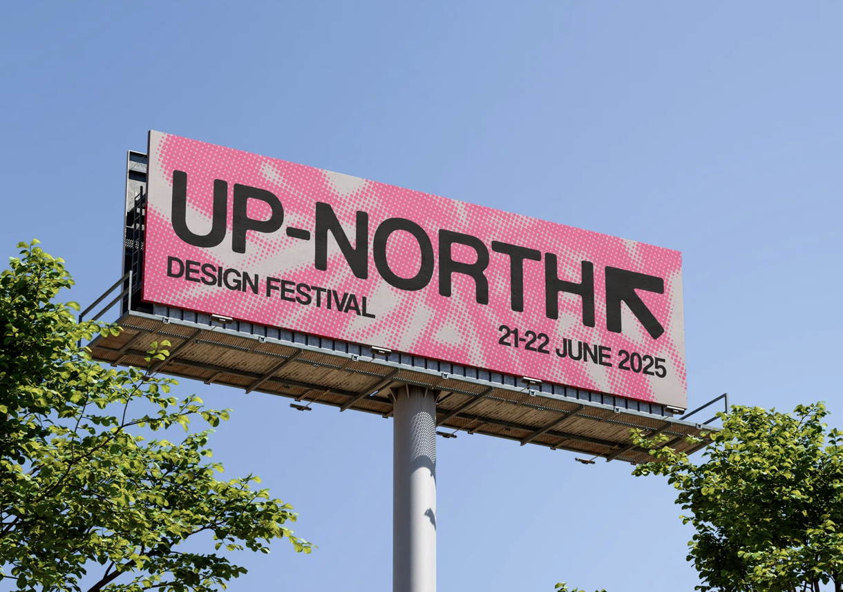
Ruby Brown
She is a Graphic Designer and first-class honours graduate from Leeds Arts University. She specialises in visual identity and 3D designing she was recently selected as one of It’s Nice That’s One’s To Watch 2025.
I have previously looked into her work in the media diet tasks and thought I would dod more research on her as I loved the work I saw on its nice that.

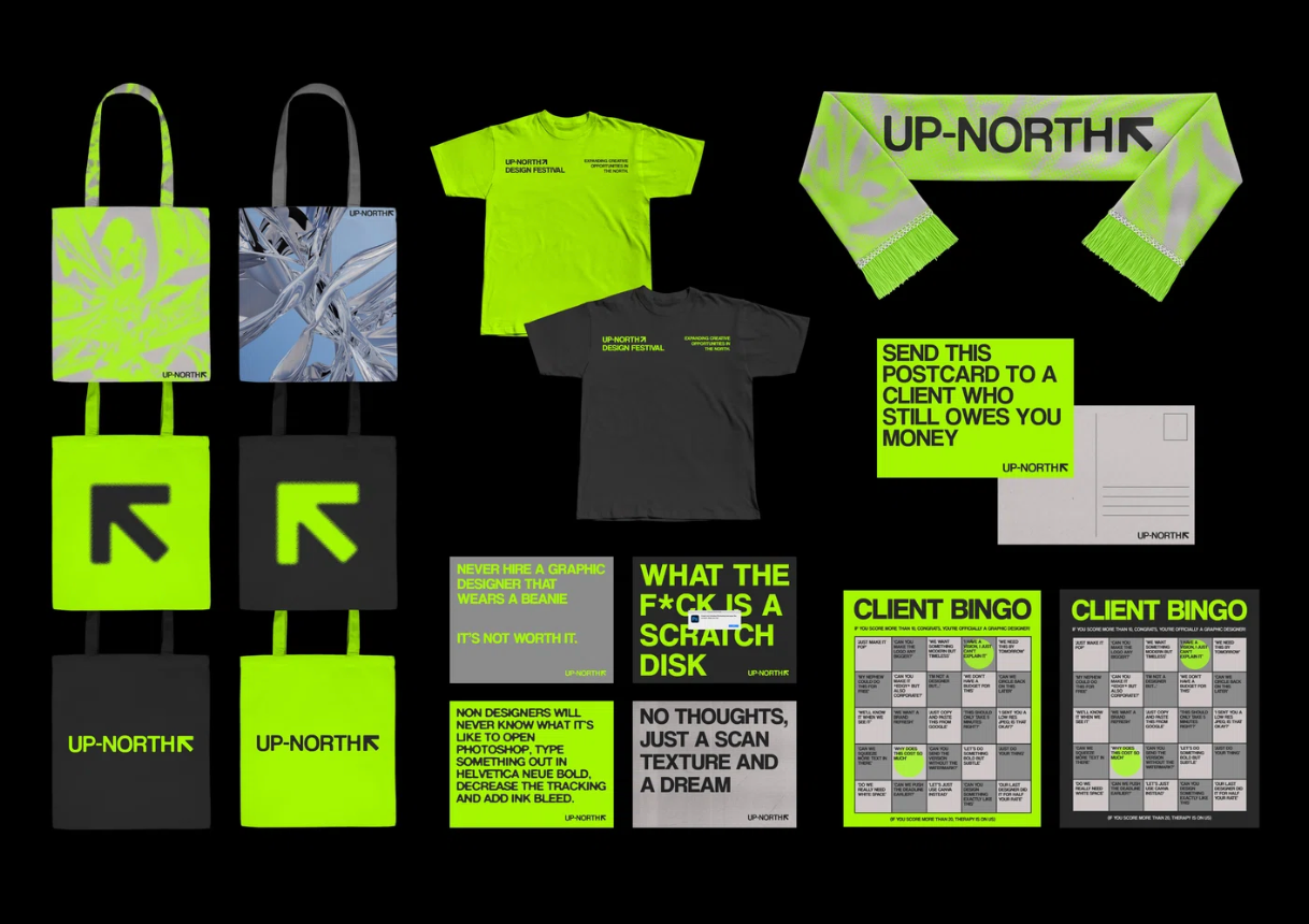
This is the war I found on its nice that and it is the kind of work I would like to produce one day however I am more interested in music festivals and designing the merch and advertisements for them.
Vinyl Designs
In her free time she creates vinyl designs as they offer a unique opportunity for creative freedom. She says 'The process of designing for vinyl allows her to experiment with bold visuals and artistic concepts, while also considering the tactile and visual experience that comes with physical music formats.'
'I’m passionate about design within the music industry, and creating album artwork gives me the chance to explore this area further. It's an aspect of graphic design that excites me, and I would love to continue pursuing opportunities to work within the music industry.'
Below are some of her vinyl designs
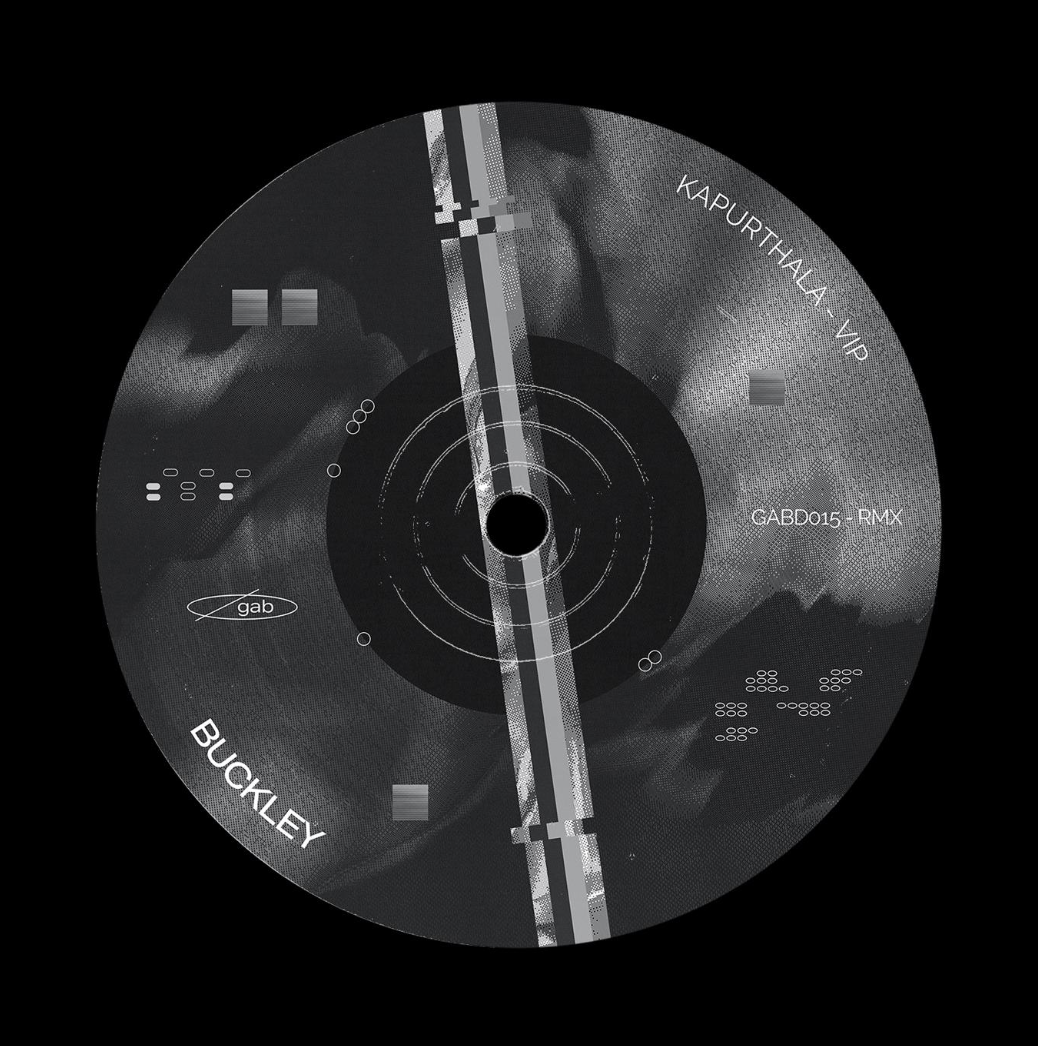
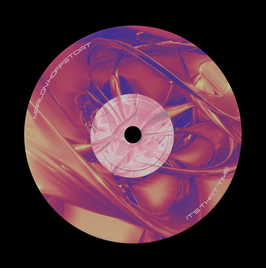
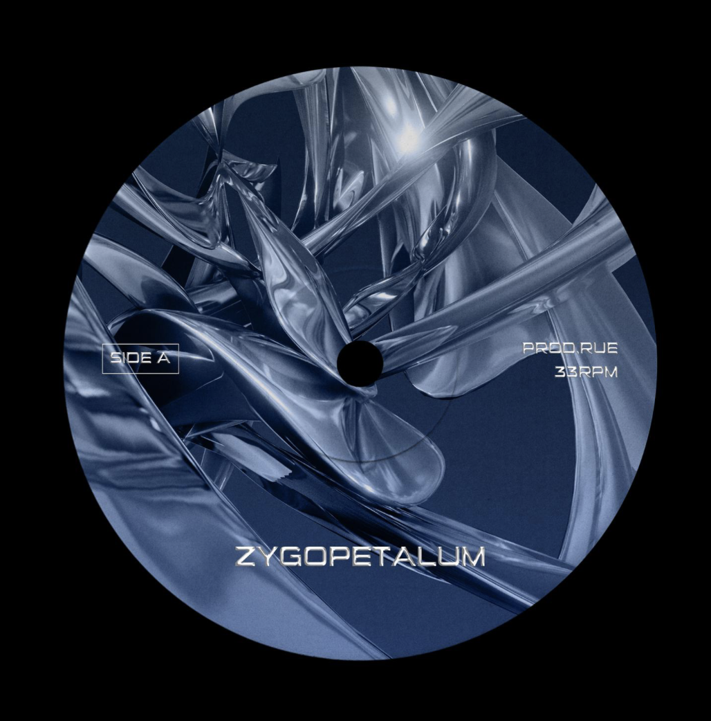
I really like the work she makes. I think it's the bright colours she uses on the up-north brief (first set of images) as it's eye catching. I also feel like although it's for s design festival and I would like to look more into music festivals and raves however I feel her designs would work for a music festival. I would also need to look into After Affects more because as much as I don't like it I feel I it would be a good tool to use for this kin of work.
The Warehouse Project
Paul Hemmingfield
1999—2009, Senior designer at Eg.G
2010—2019, Creative Director / Founder of Pin
Clients Past & Present Include:
Phantasy. Now Wave. YES. Homobloc. Trof. Gorilla. Bluedot. Grand Central Records. Albert’s Schloss. PIAS. The Warehouse Project. The Royal Exchange. Mute Records. Deathretro. From the Fields. Band on the Wall. Whitney (Band). R-Store. Arts Council UK. Erol Alkan. Escape to Freight Island. Sankeys Soap. Electriks. Albert Hall. Edward II. BAB. We are Indigo. Beacons. Manchester Digital Music Archive. Rudy’s Pizza. Common & Co. Parklife Festival. Ape. The Deaf Institute. Electric Elephant Festival. Holy Crab. Piccadilly Records. Rasa Theatre Productions. Nell’s Pizza.
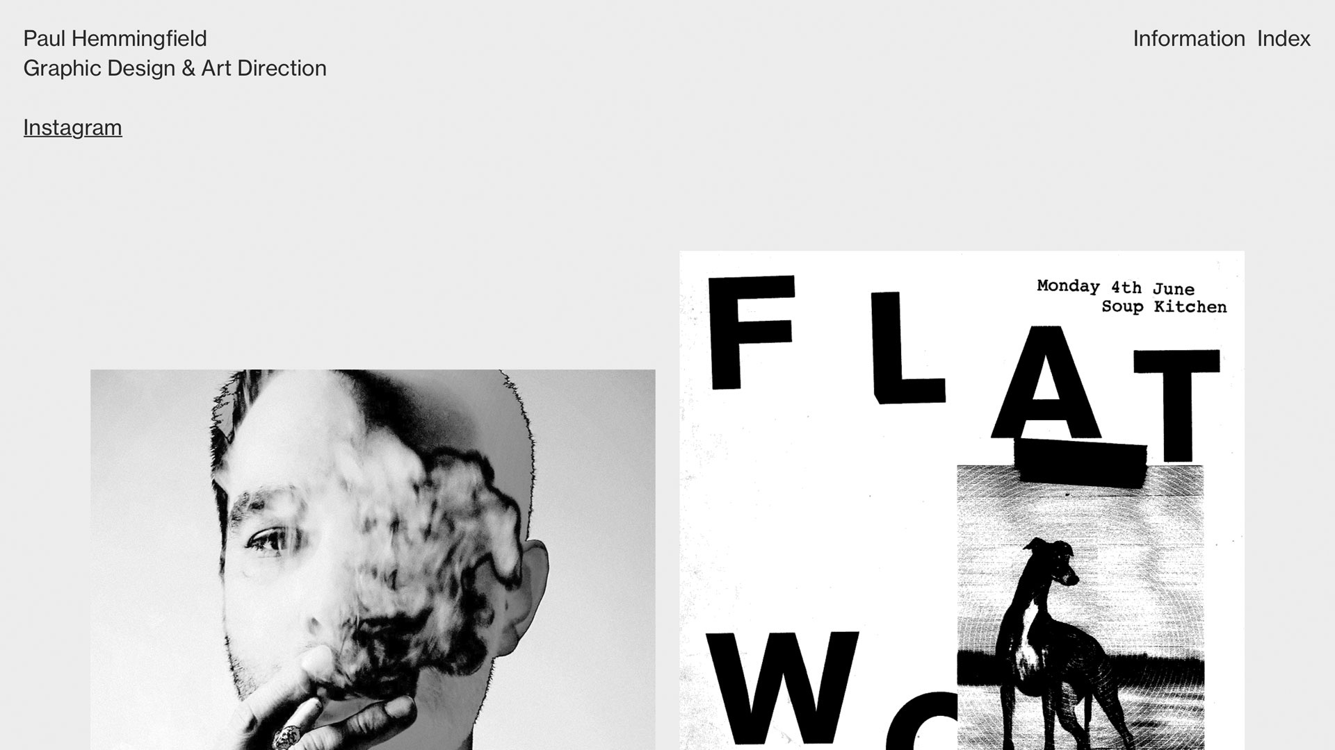
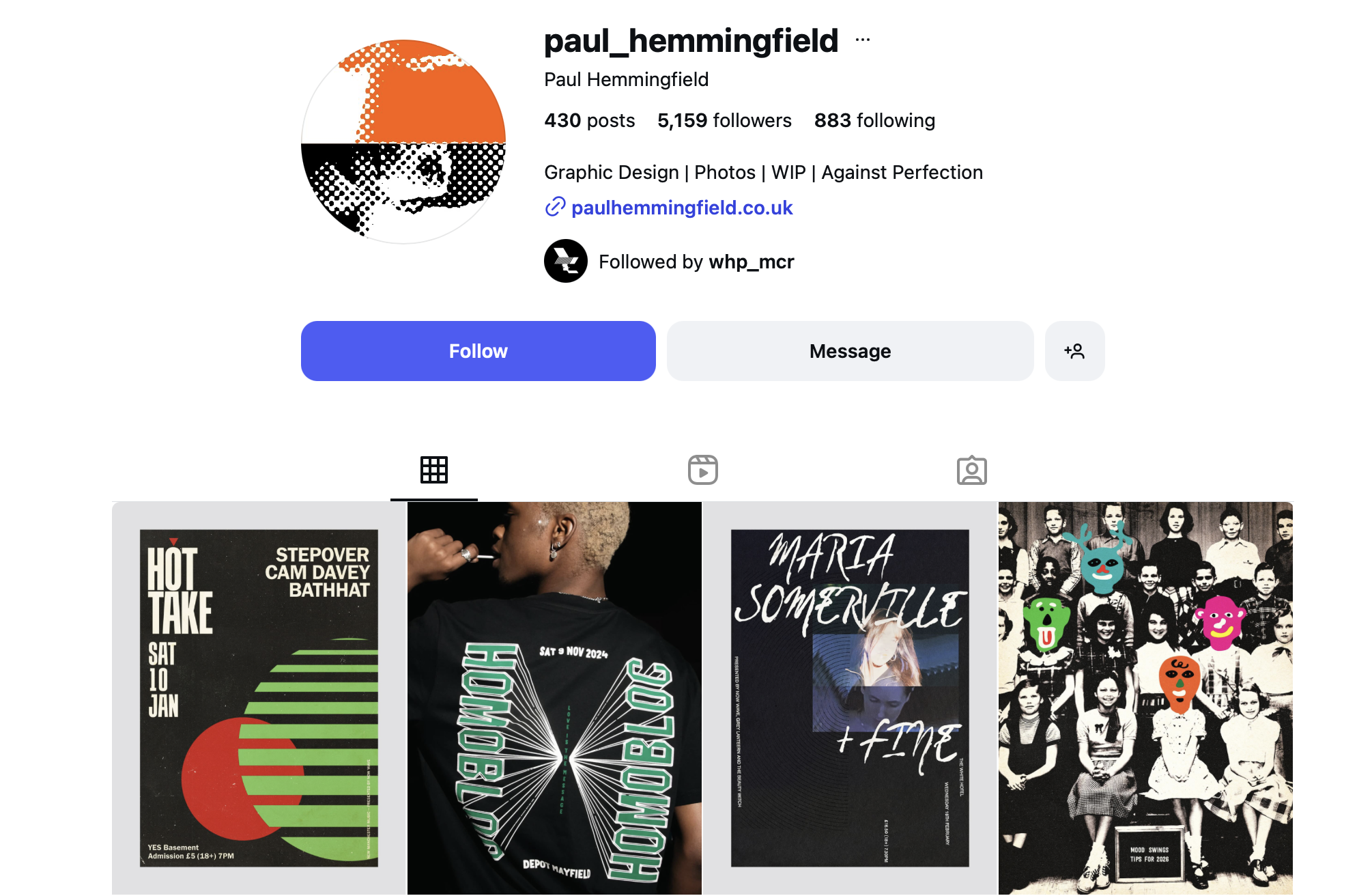
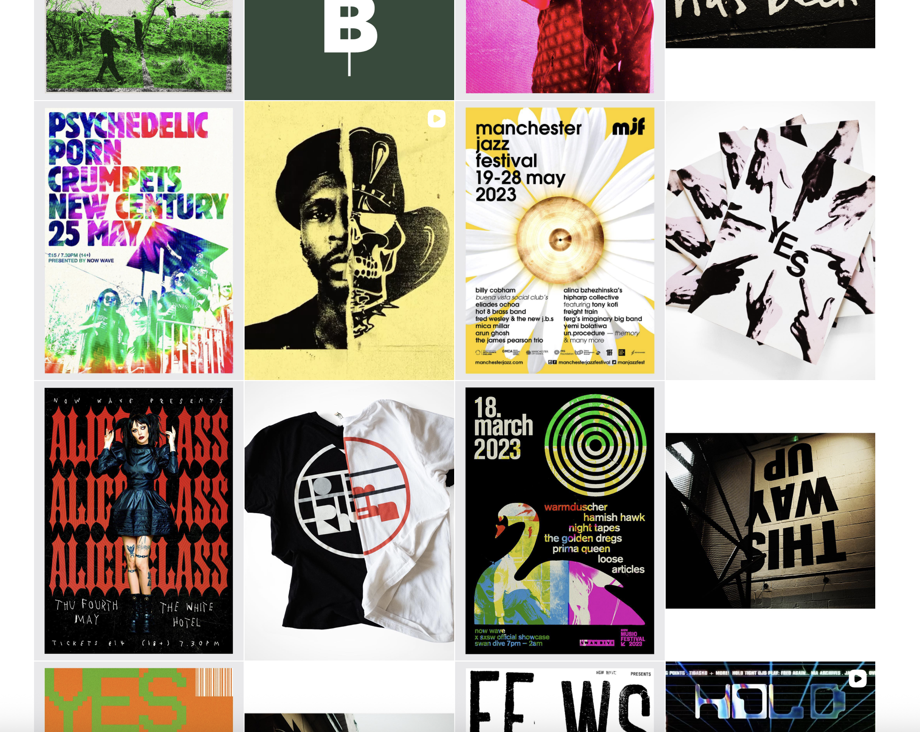
He is a graphic designer & art director from Manchester he works predominantly within the arts and music sectors for print & motion video.
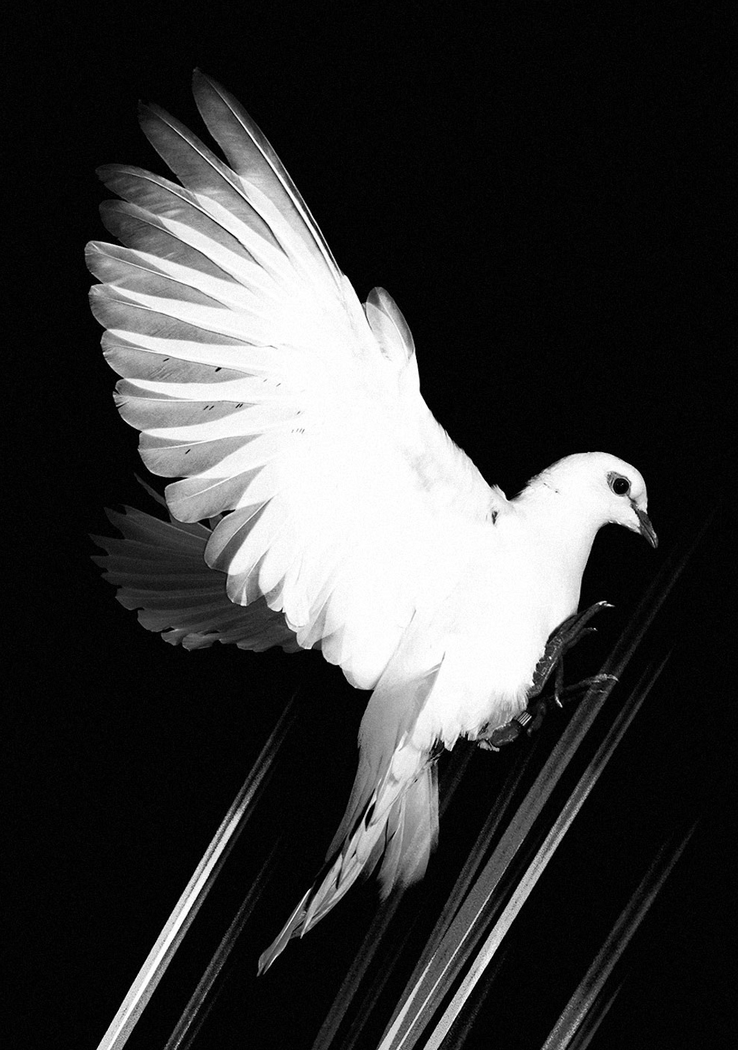
He has worked with a lot of different brands but the one I am most interested in is The Warehouse Project, I know that there are a lot of different designers that work with this brand but Paul Hemmingfield made this print above of a dove which they then used.
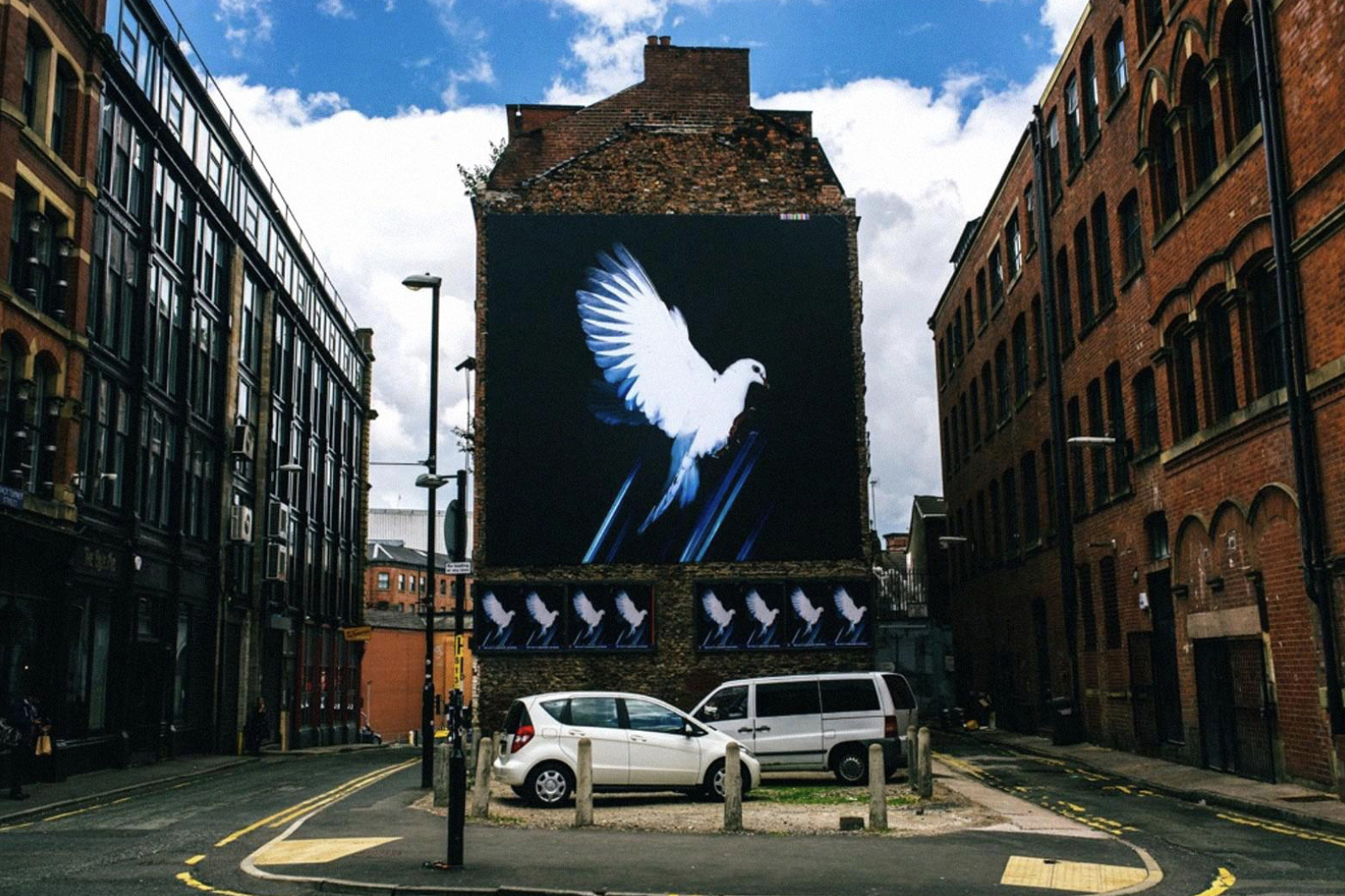
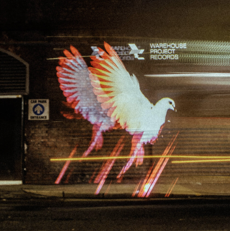
'Design for the season artwork which includes posters, flyers, merchandise, animation, website and moving image. In 2018 to celebrate the history of WHP I took part in a three-month design & photography exhibition as part of Design Manchester.'
Studio Moross
This is a studio that also worked with The Warehouse Project and they collaborated with different artists for each show to keep the creative flow and to showcase a variety of artists.

'We wanted to capture the vast scale of the new venue by commissioning a creative film. This was the headline in the brief from the team at WHP – the venue as the hero. With this in mind we chose to collaborate with Nic Hamilton whose work is a blend of architectural and atmospheric beauty. Nic has an ability of capturing the emotion of club spaces beautifully and his videos lead the viewer from the buildings details to the destruction of reality as you lose yourself in a rave. Nic created several video pieces and stills that are used across the campaign collateral.'
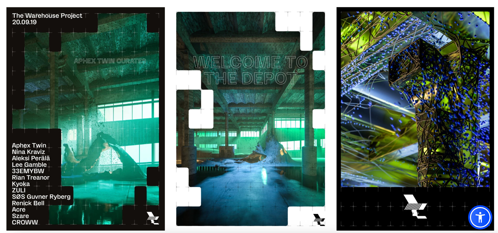
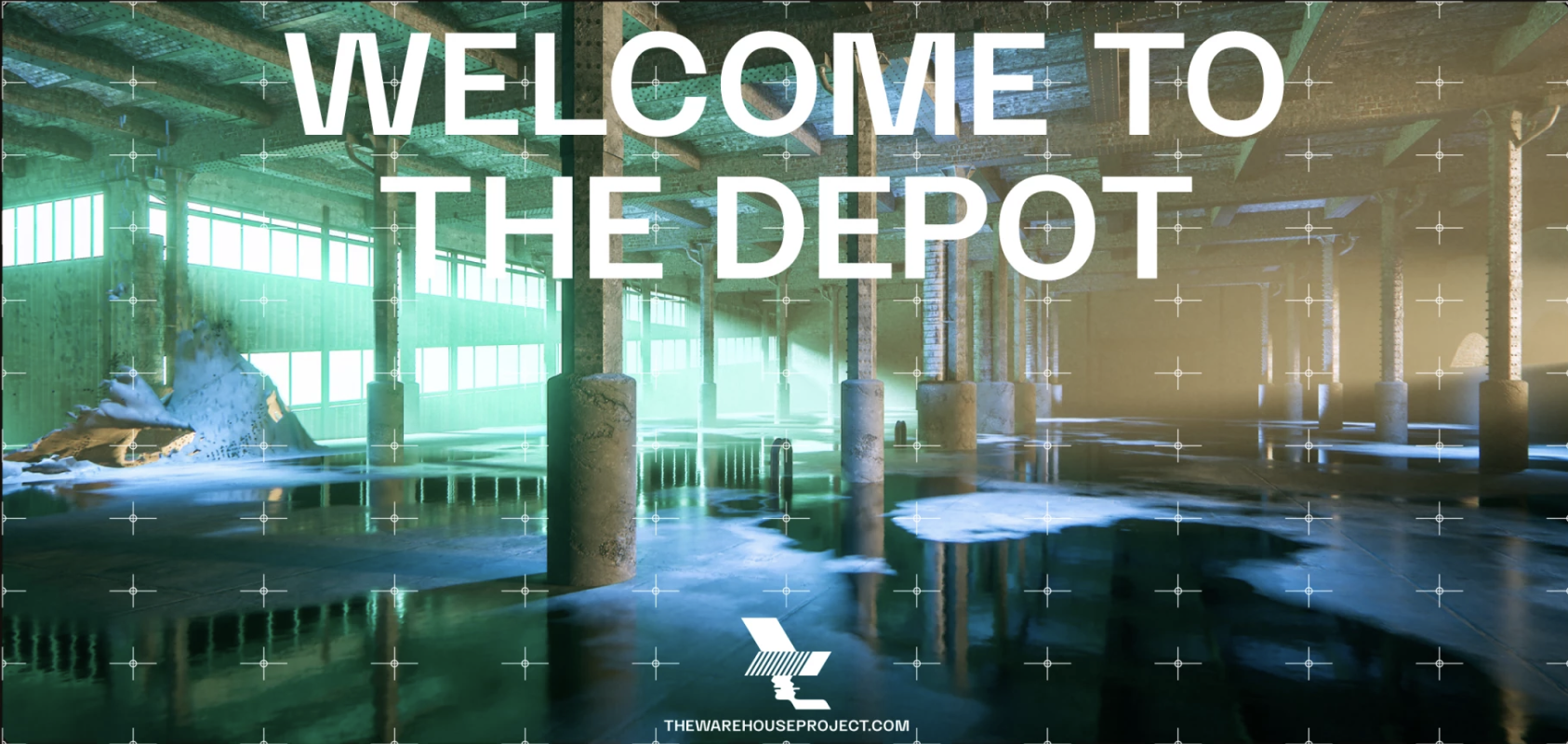
'We used The Depot’s architectural blueprints to devise a grid that acts as a graphic device to house content. Kia Tasbihgou was brought in to develop a new custom typeface, WHP Display, to give the brand a unique voice.The result was a geometric display face that sits nicely within the grid system.'
'The typeface bridges the gap between the rugged workhorse aesthetic of traditional gothics and the cold utilitarianism of a neo-grotesque, with a splash of subtle exaggerations across some of the characters.'Kia Tasbihgou
This studio has worked more with WHP over the years as well as other big festival and rave brands such as Glitter Box in Ibiza and Parklife.
Again I love the work this studio has produced and this is really something I would love to do in the future, working in a studio just like this one. I think I am passionate about this work not only because I like how it looks but because I also love what it's made for. I know that I work better when it's something I really enjoy therefore I think this would be a good route to go down.
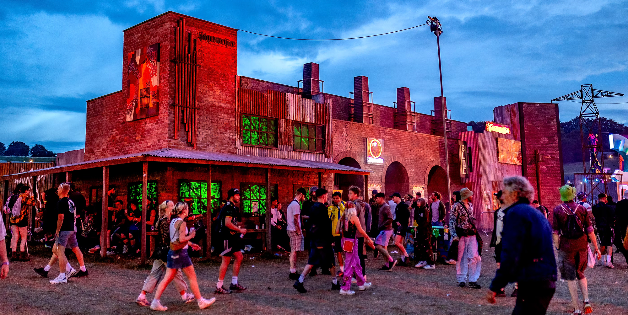
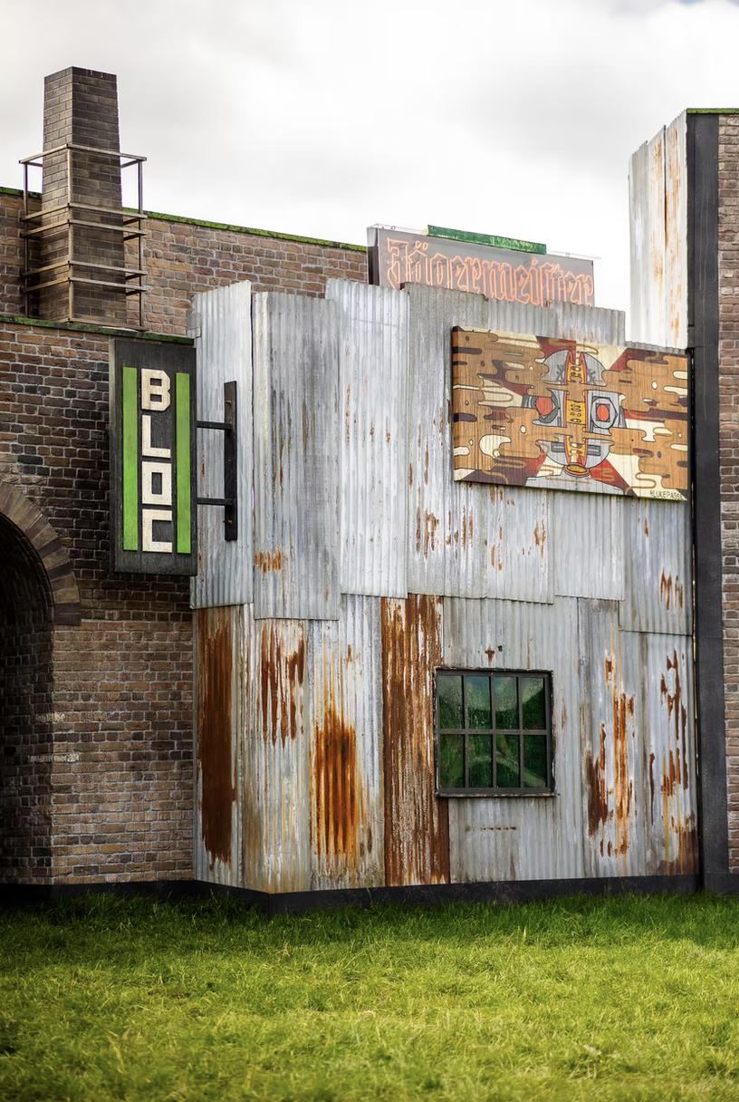
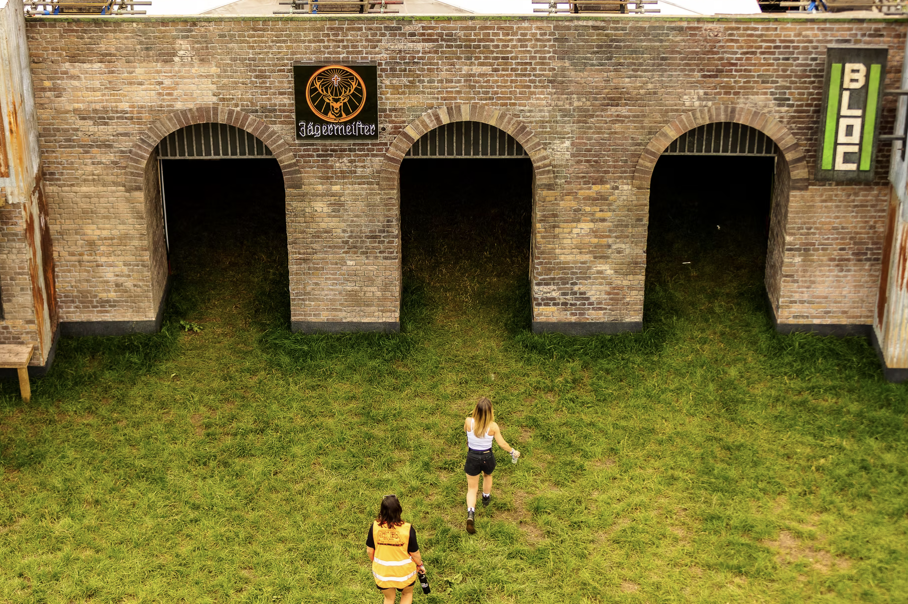
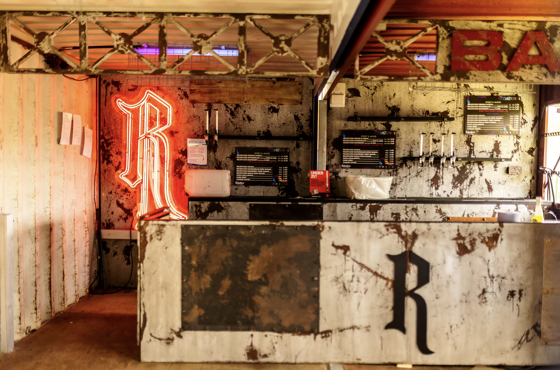
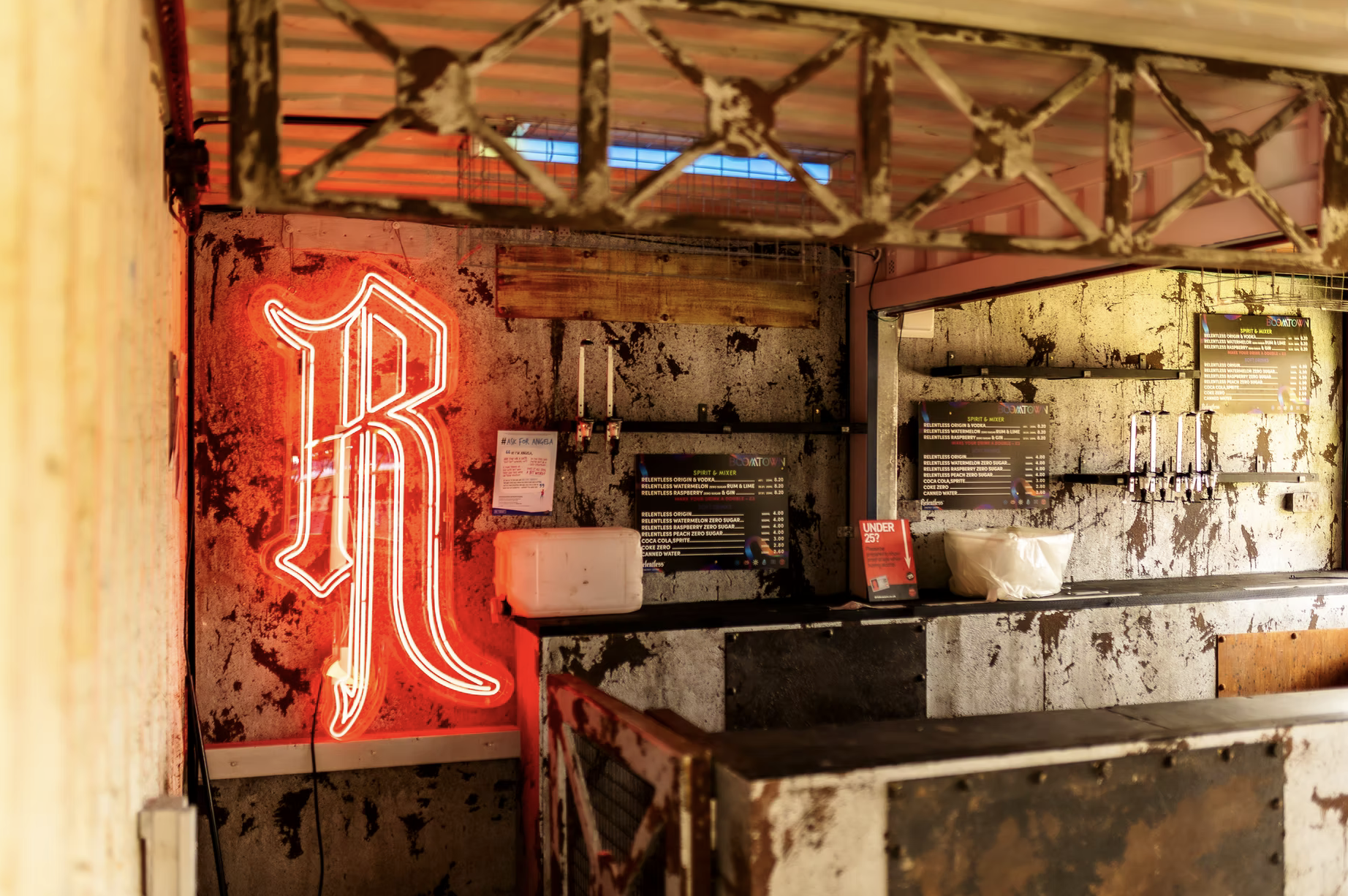
BoomTown
Fables Creative
'This was our largest immersive set production to date. Boomtown entrusted us to deliver their vision of a vast dilapidated power station in collaboration with Jagermeister. Vast amounts of Scenic Painting techniques were employed to create a vividly realistic stage design. Also new to site was our new bar for Relentless, a weathered metallic converted shipping crate lounge.'


Visual Architects
https://visual-architects.com/project/boomtown-fair/
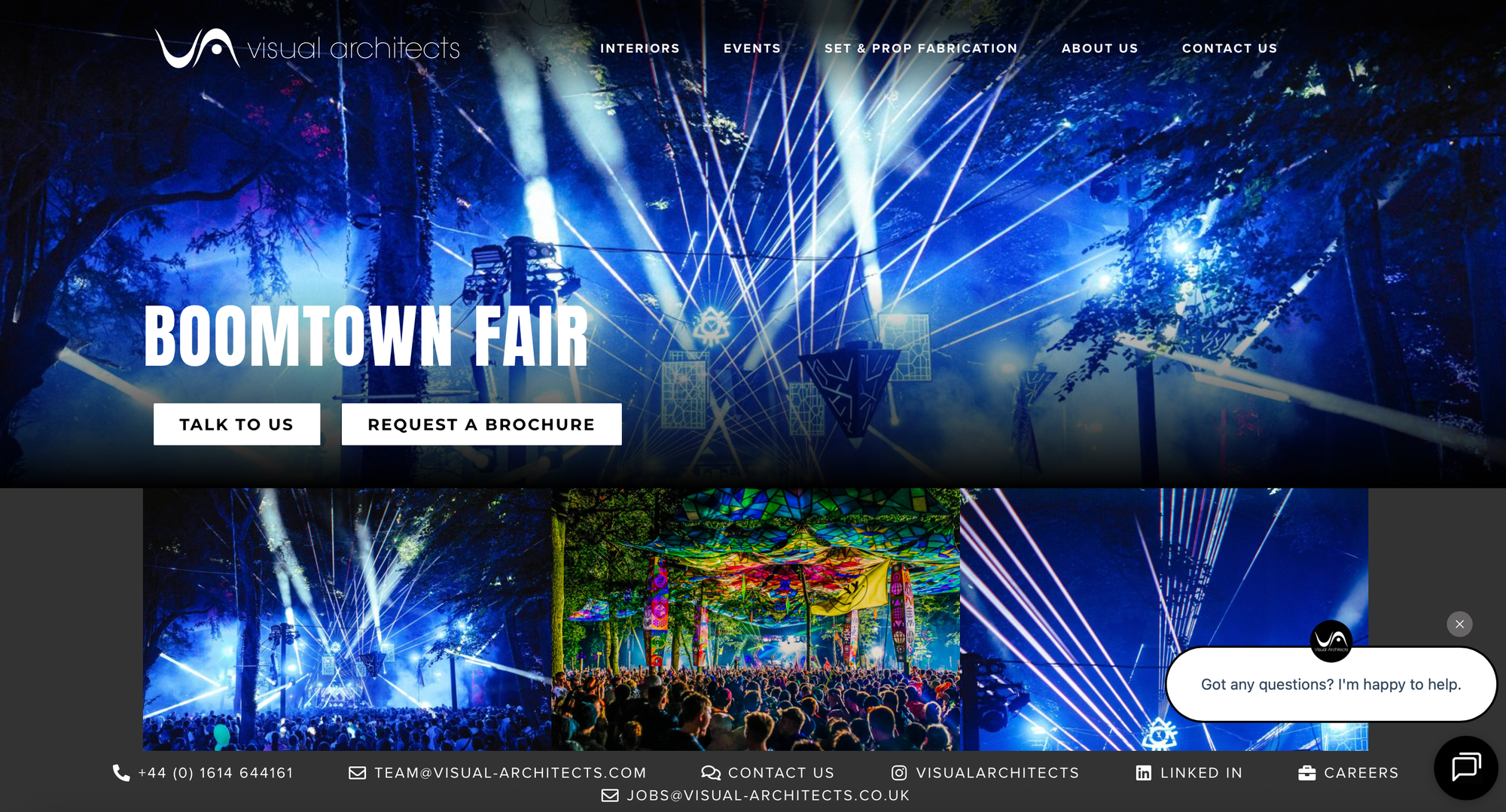
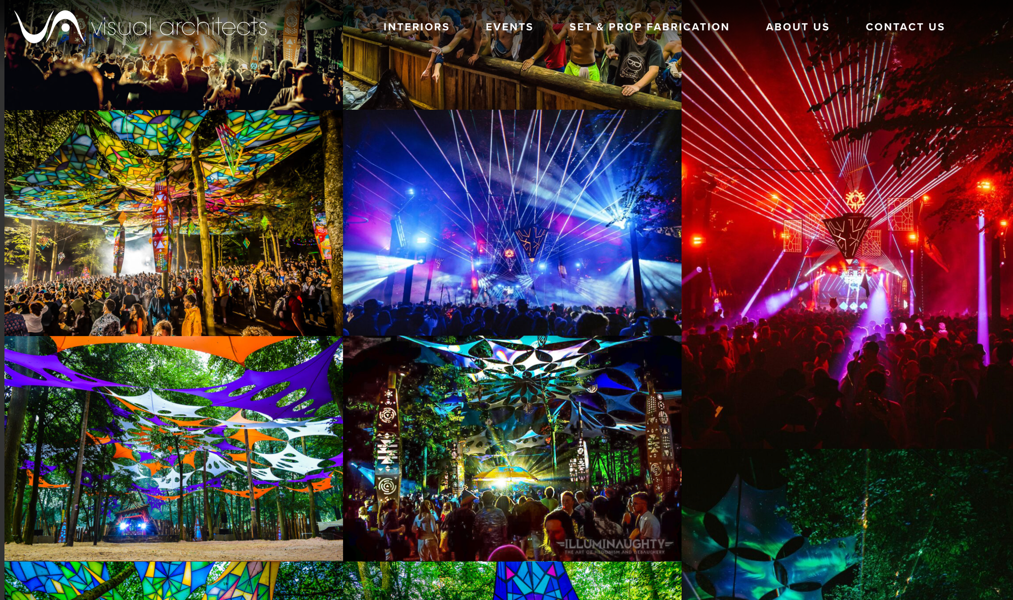
'The major UK festival ‘Boomtown Fair’ has required unique transformations from our team across multiple years since 2015, inclusive of scenic woodland areas, a tribal dance arena, futuristic displays and art around the iconic Boomtown Fair logo. Each year, a new incarnation of the Boomtown style and character is needed for the ultimate escape under an electric canopy.'
- 3D Renders & Visualisation
- Bespoke CNC Creations
- Full event production
- Venue Managment
- Installation
Both of these studios are more visual designs which is something new that I've not really thought about, at first I was mostly looking into logo, branding, set lists etc. But now I've looked more into what goes into a festival I've come across these which is something I would like to consider however I feel I would need to think about learning more moving image or at least the language so that I can talk about what I would like to be made, say I design it and someone else makes it.
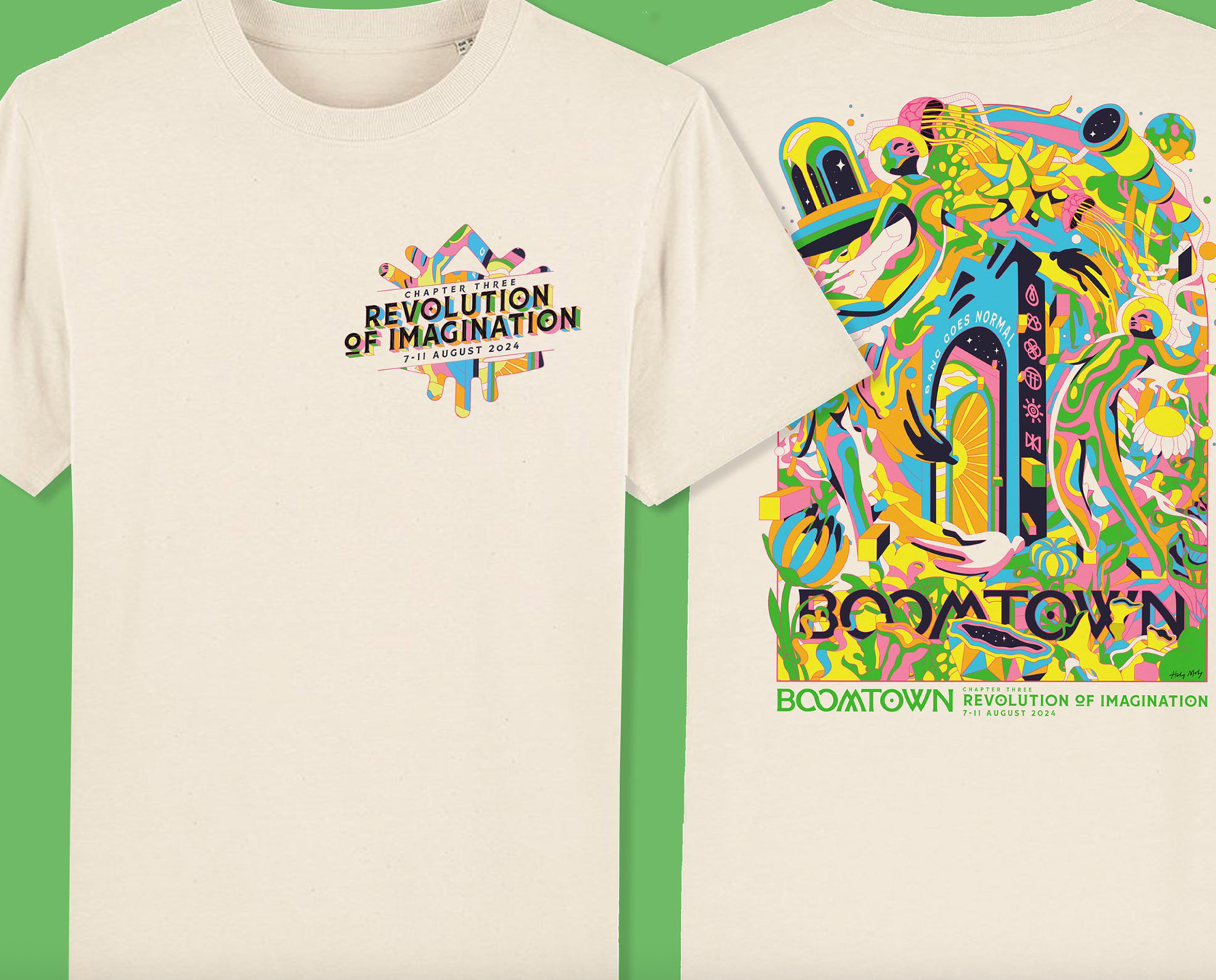
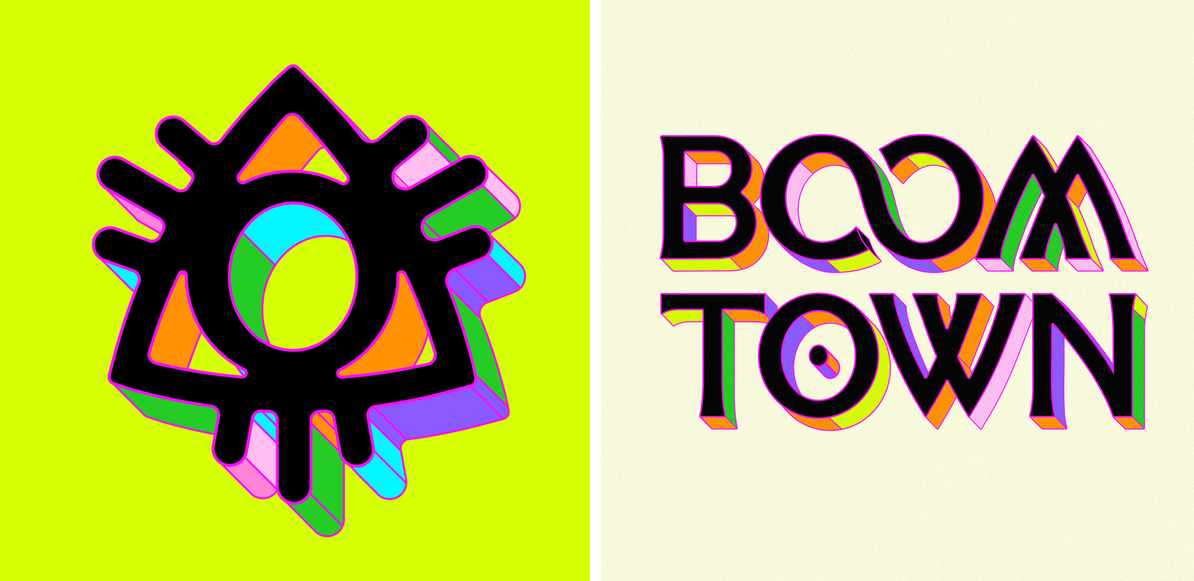
Holy Moly
https://holymolyuk.co.uk/boomtown-festival-identity-2024
Holy Moly is another studio that worked with boomtown in 2024 for that year's festival however they did the branding for them creating things such as the logo, app design and merch.
'The branding created by Holy Moly working closely with Boomtown Festival depicts surreal explorers floating amongst other-worldly foliage and strange objects as they drift towards a vortex of figures heading toward a gateway citing the festivals tagline.'
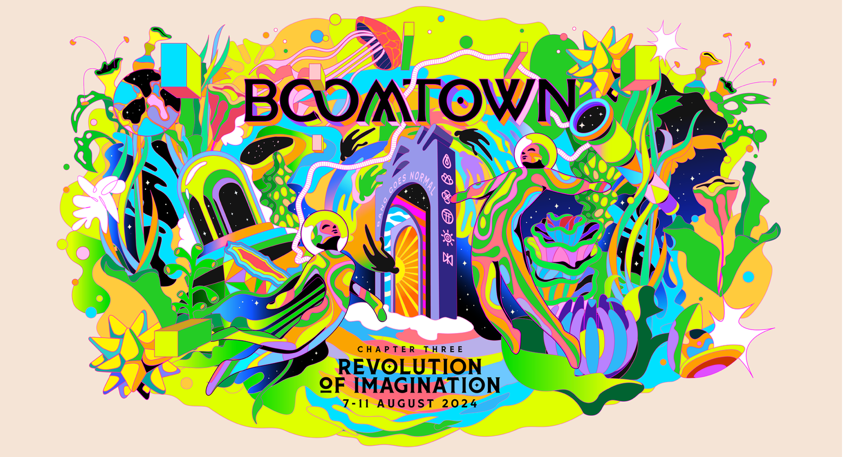
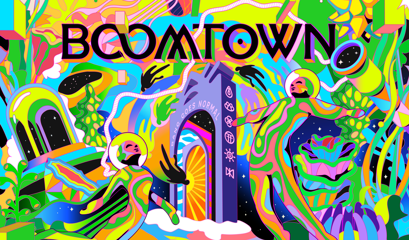
I think this is something I would really like to get into after uni, this kind of design for music. I love the fun bright colours and how its all abstract and unique.