5.2 Media diet
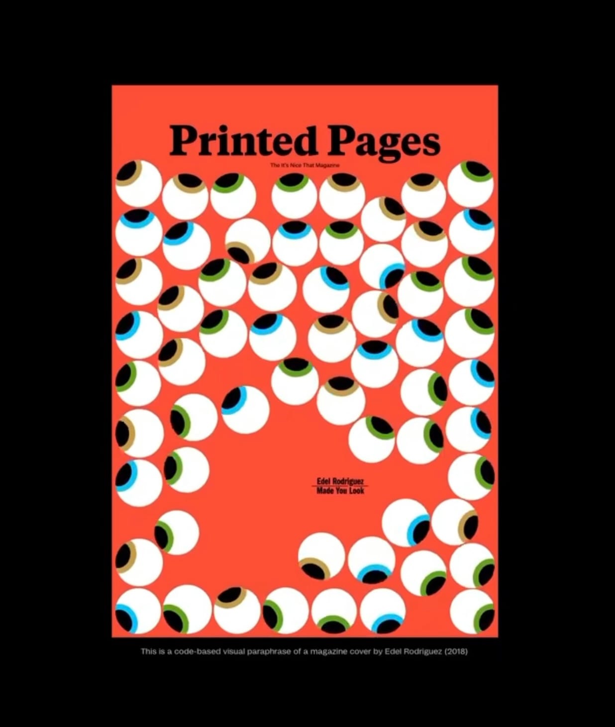
This piece of work was created Hansen for printed pages, animated magazine cover that tracks the movement of the reader whilst they scroll on the page or move that finger across the screen, the eyes copy the movement of the finger or when agitated by movement they multiply to create different randomise shapes of eyes and colours. Hw has a lot of magazine covers that use the same type of was a recreation of an original printed pages magazine cover from 2018 it was originally created by Adele Rodriguez. He also includes a tiny line of text that says made you look. exploration of visual attention control. Using Ricard Marxers Fisica library processing he gave each eyeball a physical body free to bounce around the canvas. Their gaze locks onto the text using atan2() function well custom gravitational pull draws them closer is strength influenced by each eye distance size driven density. To make them look away I just made the and rotated decade by PI, instantly causing the flock to flip and flee. The result is eyes responding to their environment swimming towards from it.
https://www.instagram.com/p/DJe5GP2Ic7Y/?igsh=MTdiaDBwM3RwYW5lNQ==
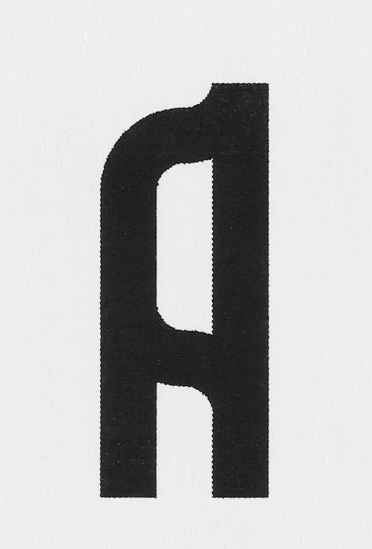
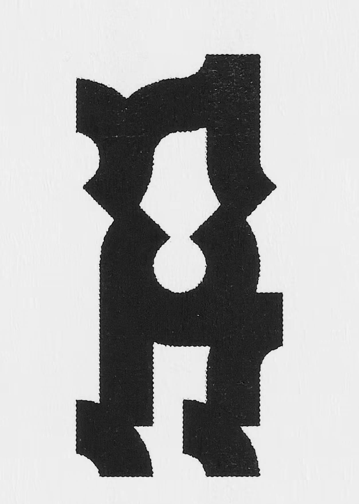
Multiverse type, this is a project about creating letters that have many structures. It is like when you wear different clothes and walk like an Egyptian, but you stay the same person. For this project he created quite simple letters based on a basic 3 x 7-pixel grid and then module corners/T junctions/ and of line lines. The example letter a consist of two corners two inner lines and two of lines and so is the perfect example these eight modules can have 5 to appearances depending on the module.
He said he created it having each frame printed on paper two times and scanned back into a computer. The images different content images to different twitches throughout the distortion of the took the that he all the different variance of it and can appear in so many ways. He is also turned into that in a loop of each letter and all the variance that it could be.
https://www.instagram.com/reel/DQDW_kiinEx/?igsh=MXN1MXNidmpseWF3OQ==
https://www.instagram.com/p/DQrDnAADQ1c/?igsh=aW5xdHcyNHM4bWts
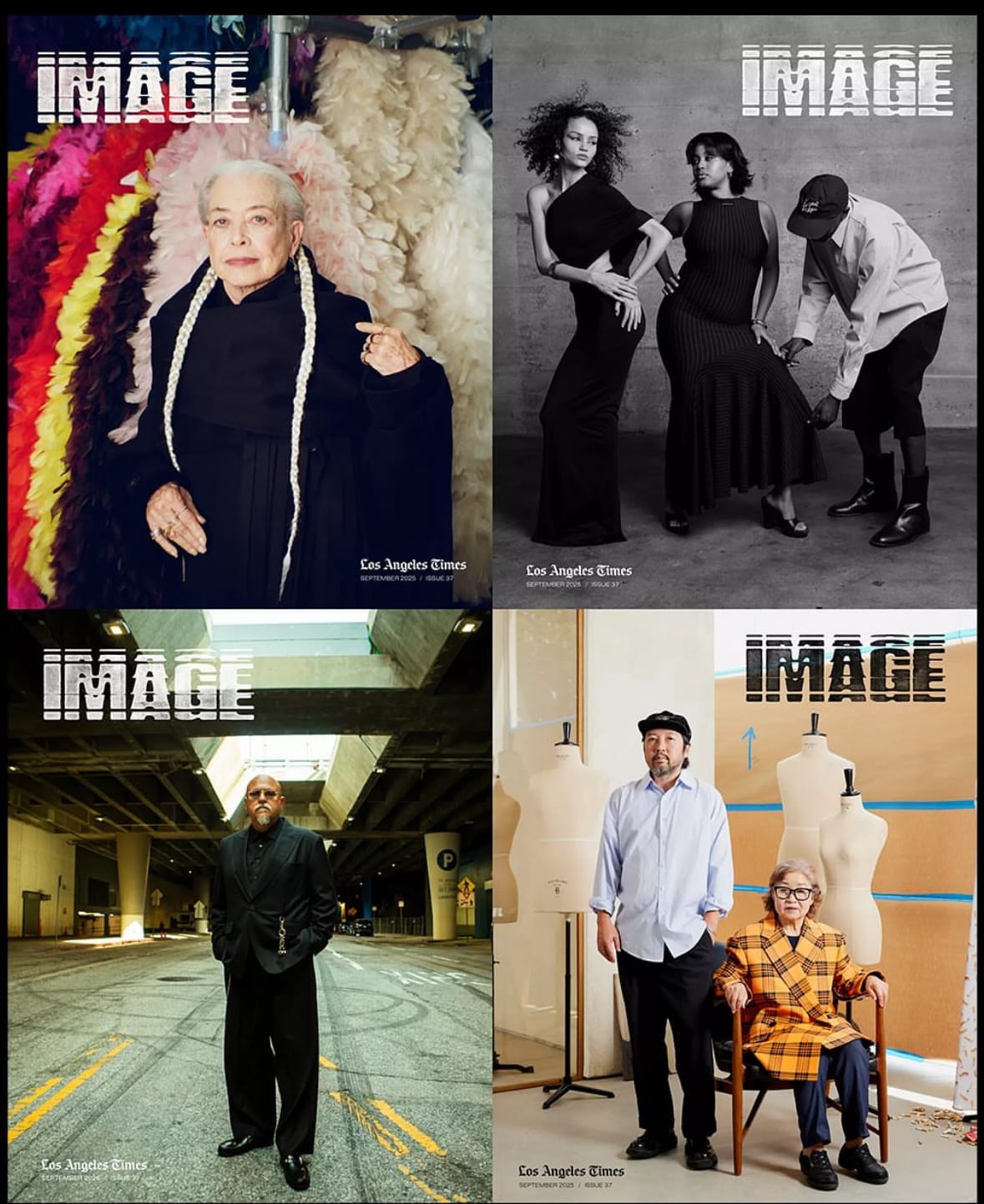
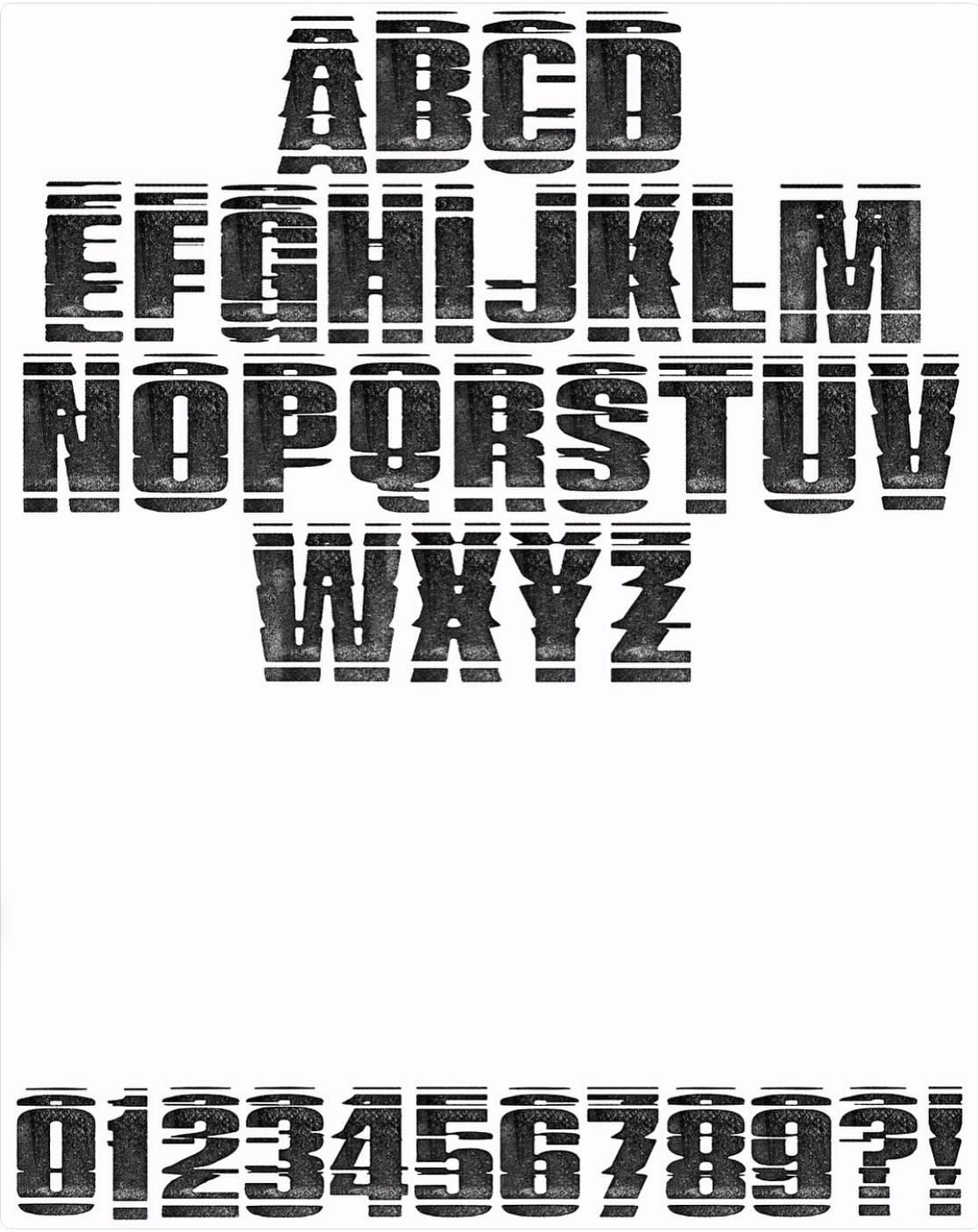
It’s a typeface made for Los Angeles Times Image by Ivan Alvarado, “The goal was to find our letterforms in a state of transition. An effort to reach back into the past. We ultimately landed on this refracted, mirrored approach. As if someone hit rewind on old on VHS tape. Not entirely novel, but certainly exciting-
Not only was this was used for the flag on the cover, it can be viewed throughout the magazine highlighting individual creatives and the overarching theme "Image Makers". Peppered throughout are additional glyphs of our vowels.
This type was also used for individual dinner name cards and tags at the Archival Revival, a celebration of the magazine's release and all creative involved.”