Interactive Websites
After looking at both motion design and everywhere tools, I decided to research interactive websites, and look into how web design and animation are used to draw in an audience.
This website is where I got the list of interactive website examples and info about them, I looked at the ones that stuck out to me the most:
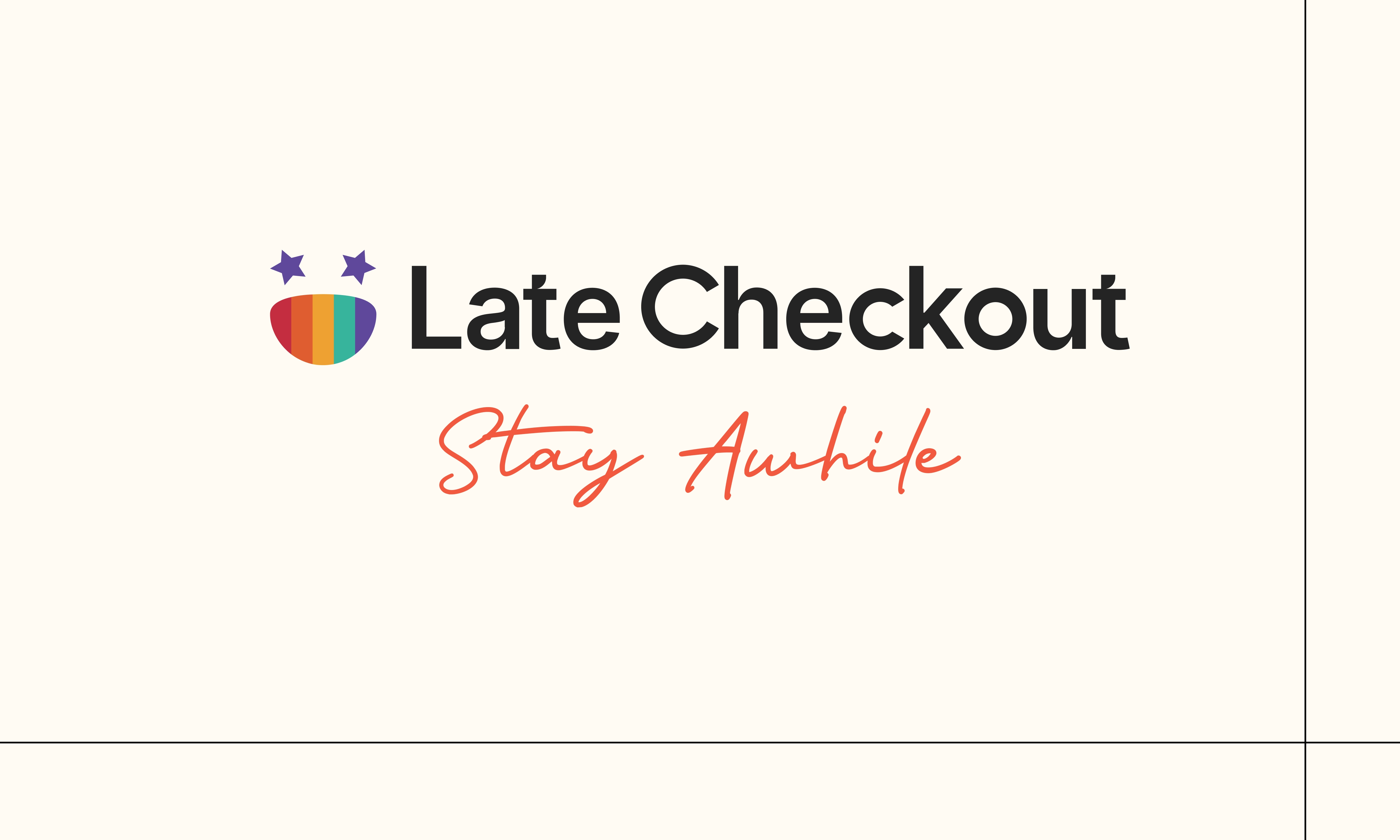
- Late Checkout
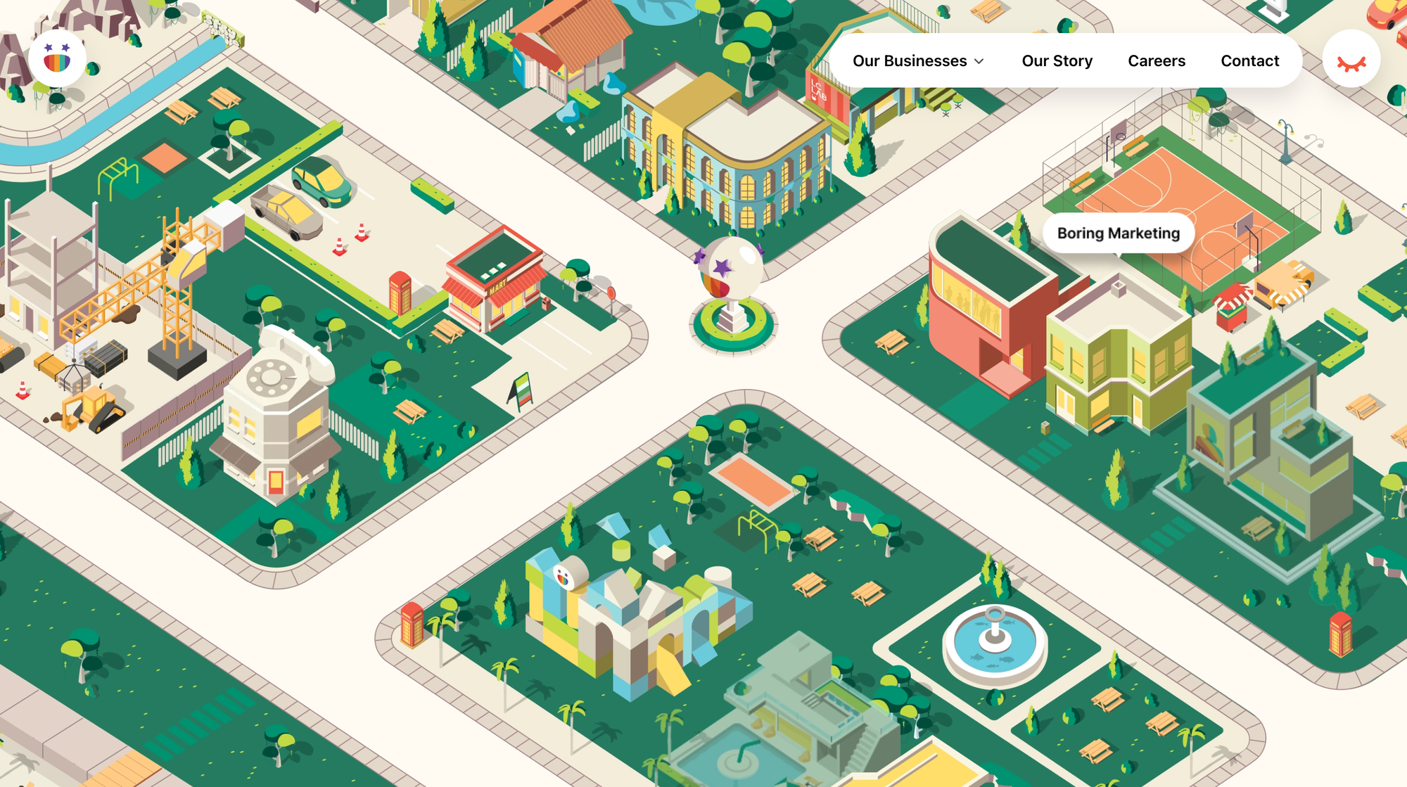
The interactive features on this site include the hover effect that displays pop-up texts about a service the brand offers when you hover over a building. And that makes navigating the site easier.
There’s a small menu bar at the top-right corner of the site that also simplifies navigation.
In addition, you can double-click to move the ‘neighborhood’ around and just explore the site at a convenient pace.
In a nutshell, LCS combined several interactive elements to make the site solid, including
- Animations and 3-D elements to make it attractive.
- Micro-interactions for easy navigation and access to the site’s services.
Key takeaways:
- Ensure any interactive elements you use reflect your services.
- Keep your elements genuinely interactive.
- Sometimes, less content is more when building an interactive site.
- Webflow


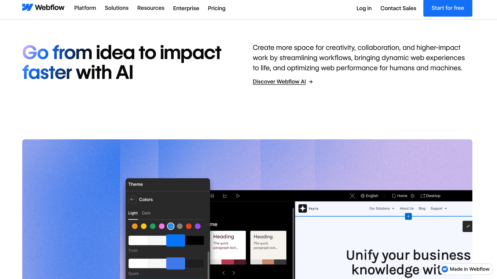
As you go further down the website, you’re met with several clickable elements that make the experience more engaging.
You click on them and the image beneath them changes. This way, you’re not just viewing passively but actively exploring the site.
Some of these clickable hotspots even allow you to preview what a localized version of a Webflow site looks like, making you experience their features in real time. Without actually using them.
Another thing you’ll notice with Webflow’s site is that it’s black-themed, with classy color palettes like white, blue, and purple to make the design pop. This helps improve navigation and readability and strengthens the brand identity.
Cool combos for an interactive web design.
Key takeaways:
- Pair black themes with bright colors so you have a solid design and make it more accessible.
- Visitors should know what your site is about from the get-go.
- Keep a balance between interactive elements and important content.
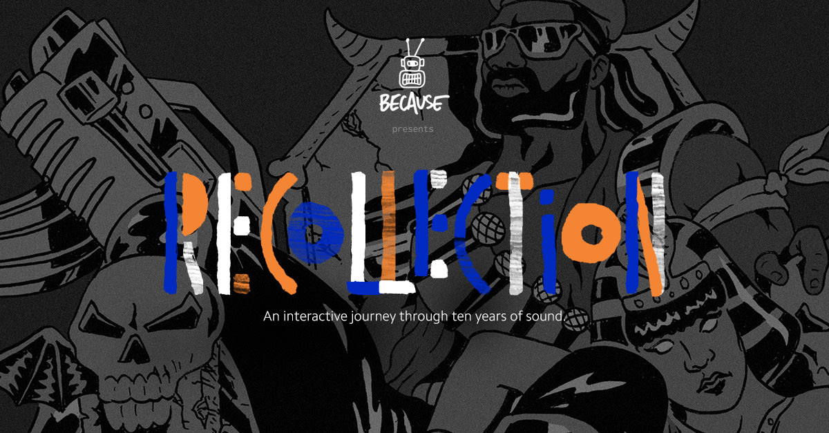
- Because Recollection
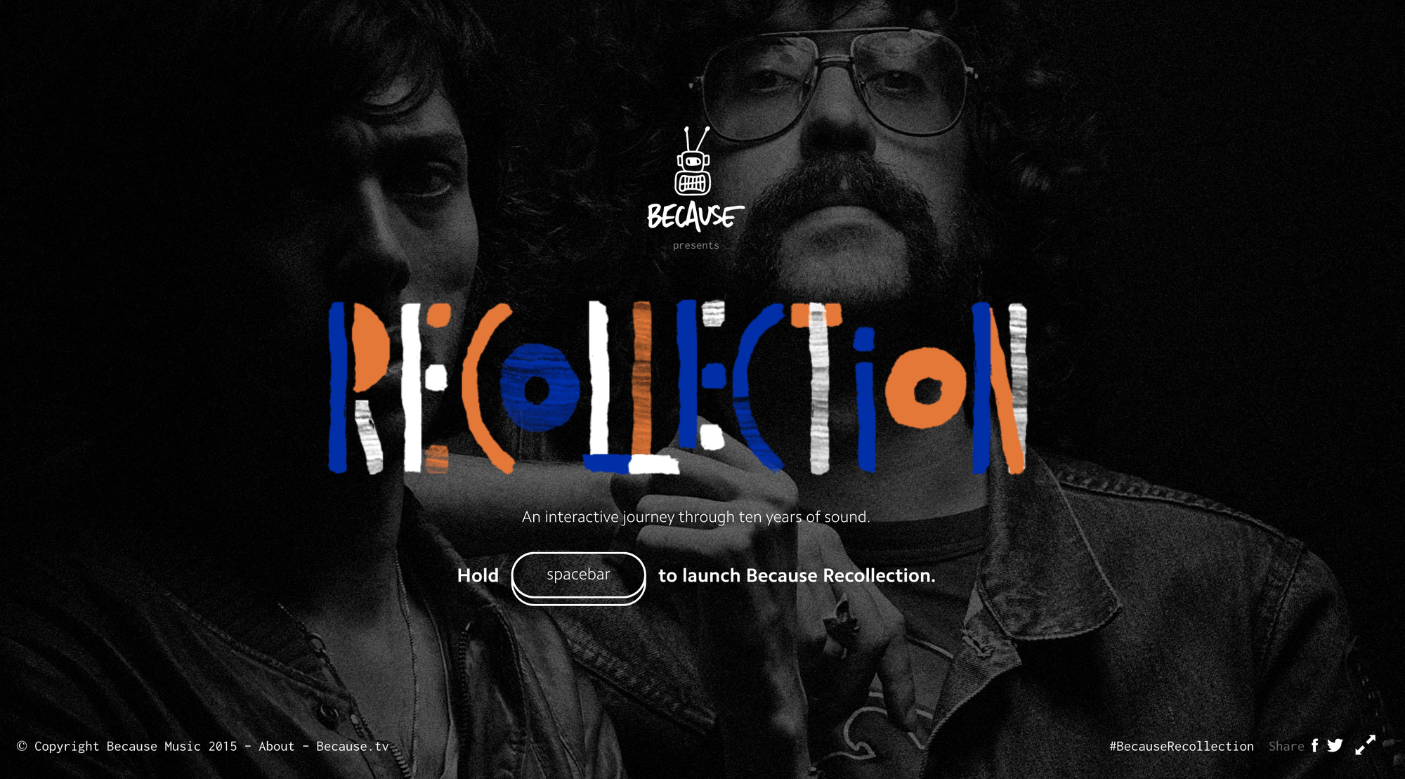
If they press the spacebar button once, they’re taken to the homepage. With music playing in the background.
And if they hold the button down, a new artist comes up alongside their sound.
Now, here’s the fun part:
The music doesn’t play unless the user follows the on-screen instructions. It could be to press H on your keyboard till the bomb explodes. Or roll the pillar for the rhythm to play.
Overall, Because Recollection’s design is pretty astounding with colorful texts, icons, and innovative interaction that’ll keep visitors engaged for hours.
Another important element of their experience is its intuitive approach…users know what to do without requiring additional assistance.
Key takeaways:
- Let interactions reflect the industry you’re in and your audience’s preference.
- Ensure your interactions are intuitive. Users shouldn’t have to think hard to know the next step to take.
- Include keyboard shortcuts in your interactions.
- NASA Solar System
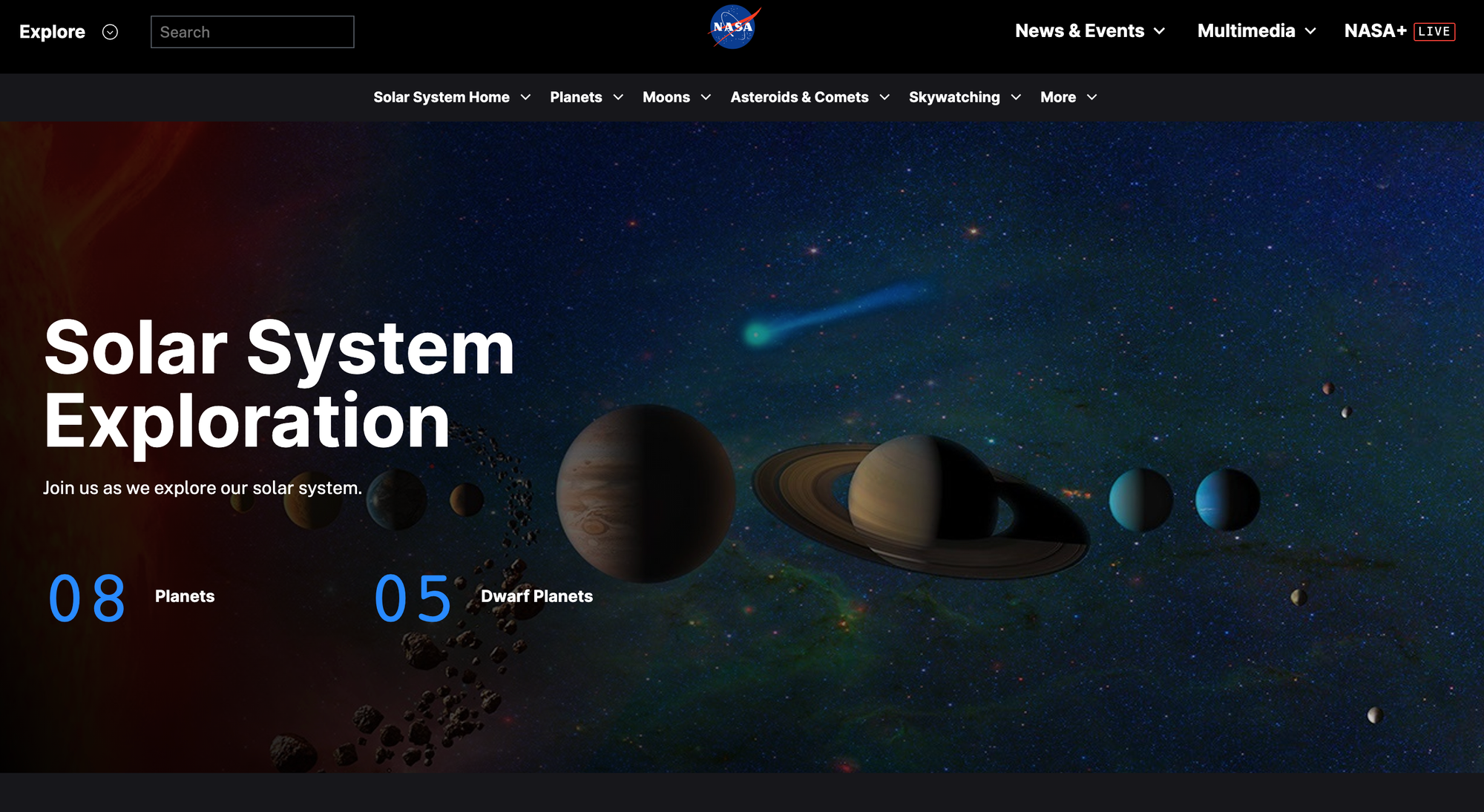
With this 3D map, users get to interact with the solar system using only their mouse. They can click on any of the planets to get a large view and scroll in or out to zoom in and out.
The approach NASA used here allowed visitors to visualize and engage the solar system better than they’ve ever done. This way, they understand the whole concept better and make it easy to remember.
Key takeaways:
- An interactive site can have interactive elements in just one section.
- Great copy and content can keep users engaged too.
- If you aren’t using lots of interactive elements, throw in more media content.
I really enjoyed researching these and scrolling through them and seeing how the interfaces work. I've created similar work to this in the past by using figma to create an app prototype, that did contain animation, however it was relatively basic and I would like to explore this further, now that I have more knowledge of figma and animation.