Extra Experiments
Below is work I have done outside of lessons, I am starting to think about what work I enjoy doing and where I would want to take it in the future.
1st - edited photograph
Below I have looked at distorting an image I took out of my window for my Accomadation last year. I have brought it into photoshop and started messing around with changing the colours and inverting them as well as adding a slight blur over the top.
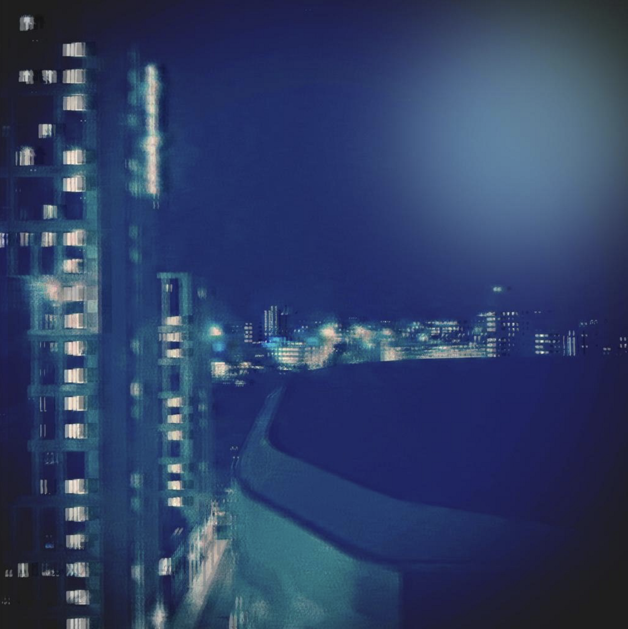
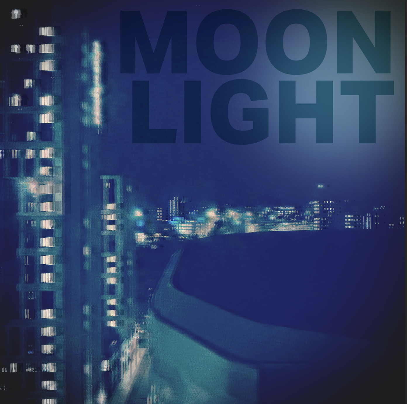
I could look at trying this into an album cover, adding type onto it.
2nd - Oil pastel/collaging/photoshop
Again below is another thing I've experimenting with on photoshop, taking images of fruit that I have drawn either with coloured oil pastels or on transparent paper and a black fine line pen. I have then brought these into photo shop inverted some off them and then created a composition using both normal and inverted images in stripes to create this affect.
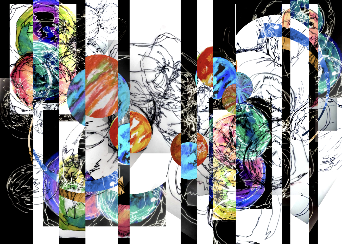
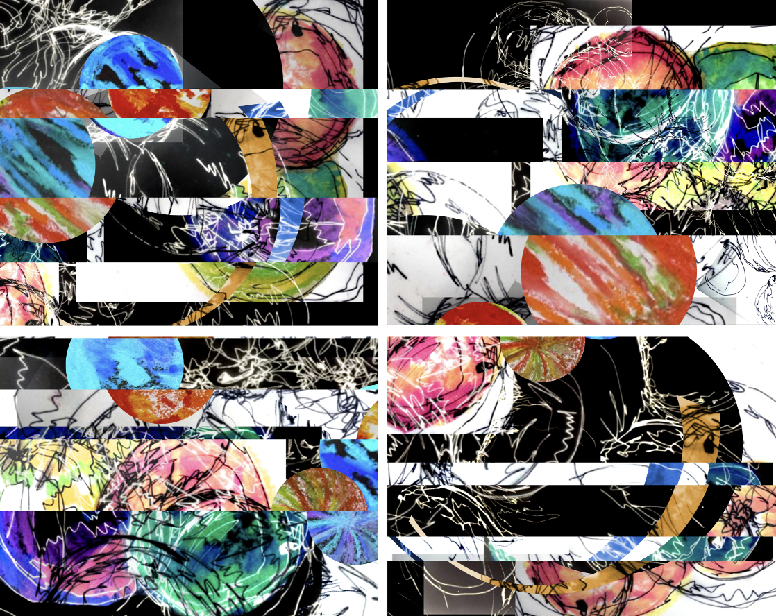
Again I'm not top sure what this could be used for but I do really like this design and messaging not just on screens but on paper as well and with different medias.
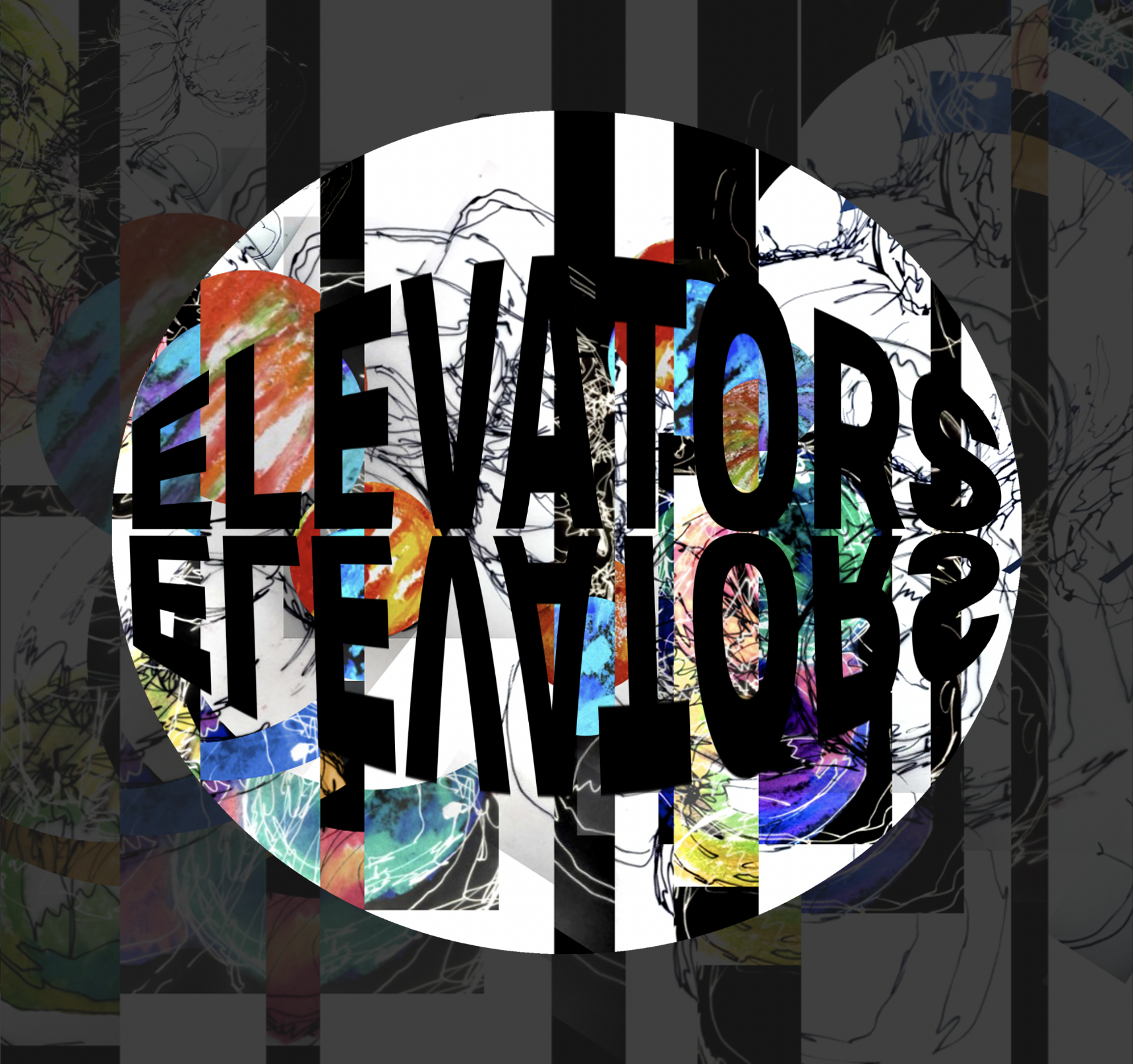
I have experimented further and made this design I and think you could use it for a festival or maybe even a rave, you could take this design and use it for the logo, then look at ways of designing it to add on the set list and could even turn it into merch. (have this printed on the back of tops and hoodies)
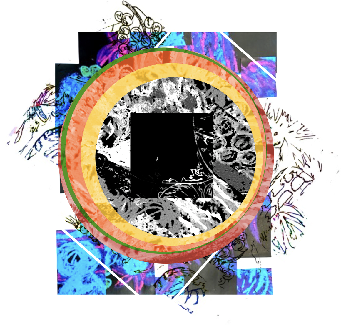
Im not really too sure what I was trying to make here I was just messing around with the composition and in the end I made this which I think looks cool and I think maybe I could add type again and turn it into branding for something.
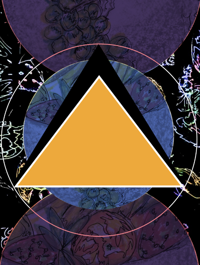
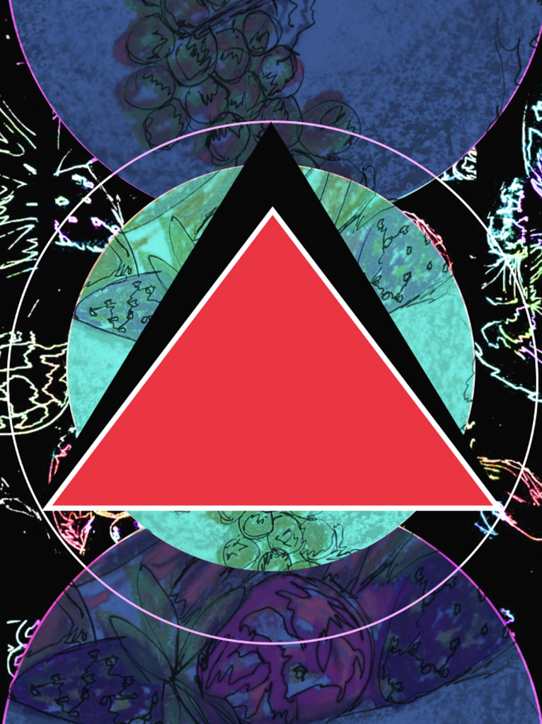
Same with these messing around with images and composition to make something I find interesting.
3rd - Dance poster
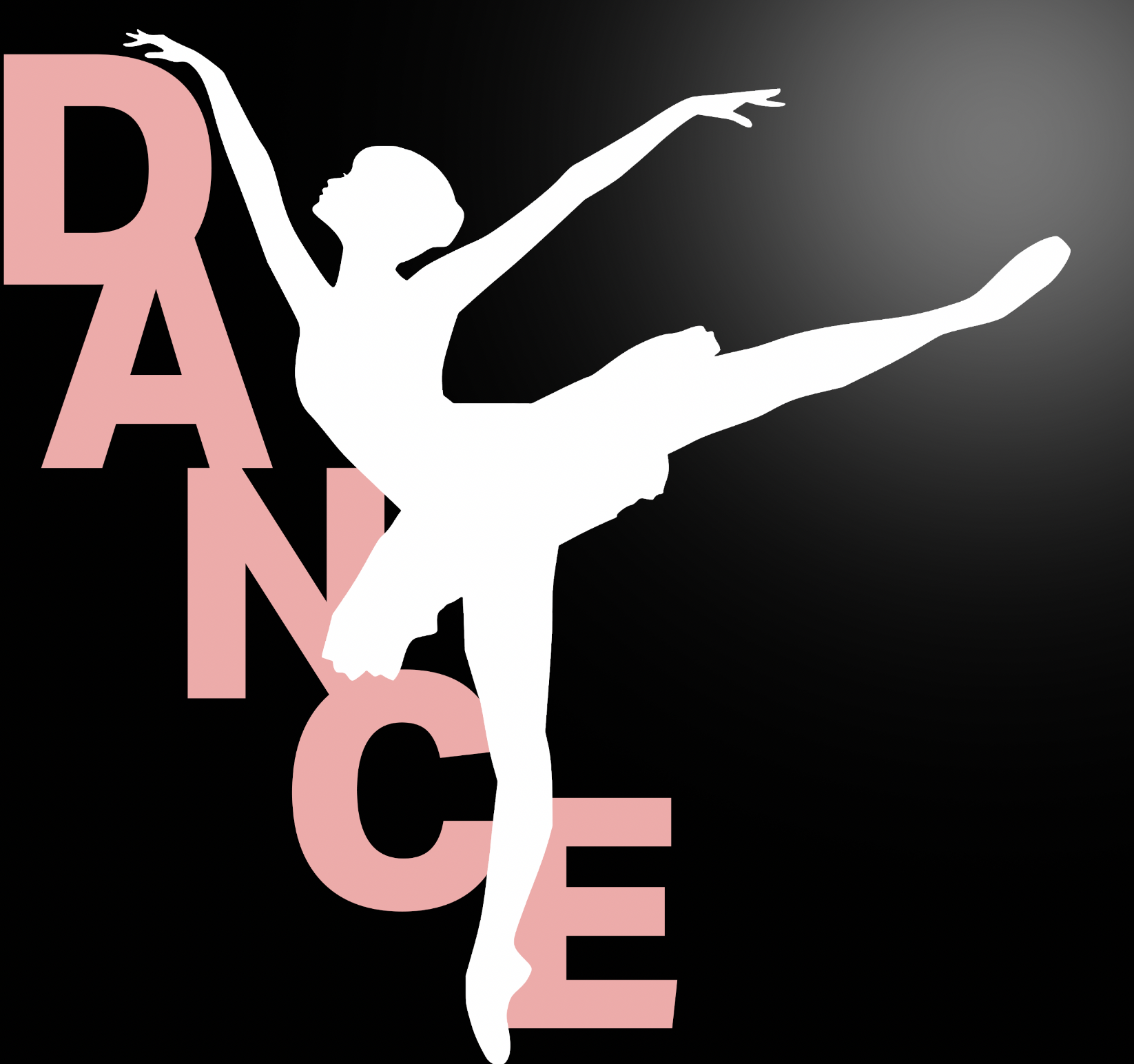
I have grown up dancing so that as always been a passion of mine so I thought it would be a good idea to look at making a poster for dance. this is a simple design but I feel like it cold be used in a dance studio, making tweaking it a little bit to add a studio name on to it. It could also be used on the cover of a program or something like that.
This one isn't my favourite and I feel like I could develop this further as it just looks too simple and I know I can produce better work than this. I think I just need to maybe go back and look at it more, google things that link to see where I can improve and develop this.
4th - Animals
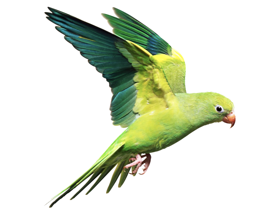
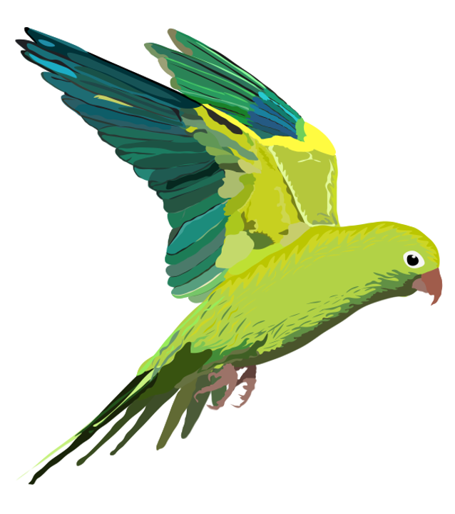
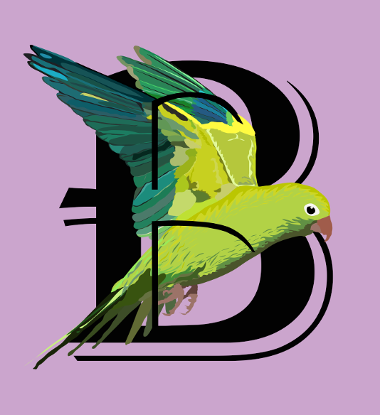
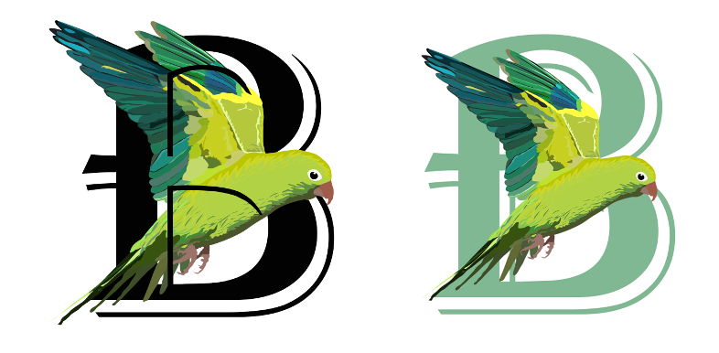
First I started, by looking at birds on google, found one I liked then using the pen tool on photoshop I drew out the bird looking at the colours and patterns I needed to make it look realistic. I then aded the letter B in the background to add something more to it.
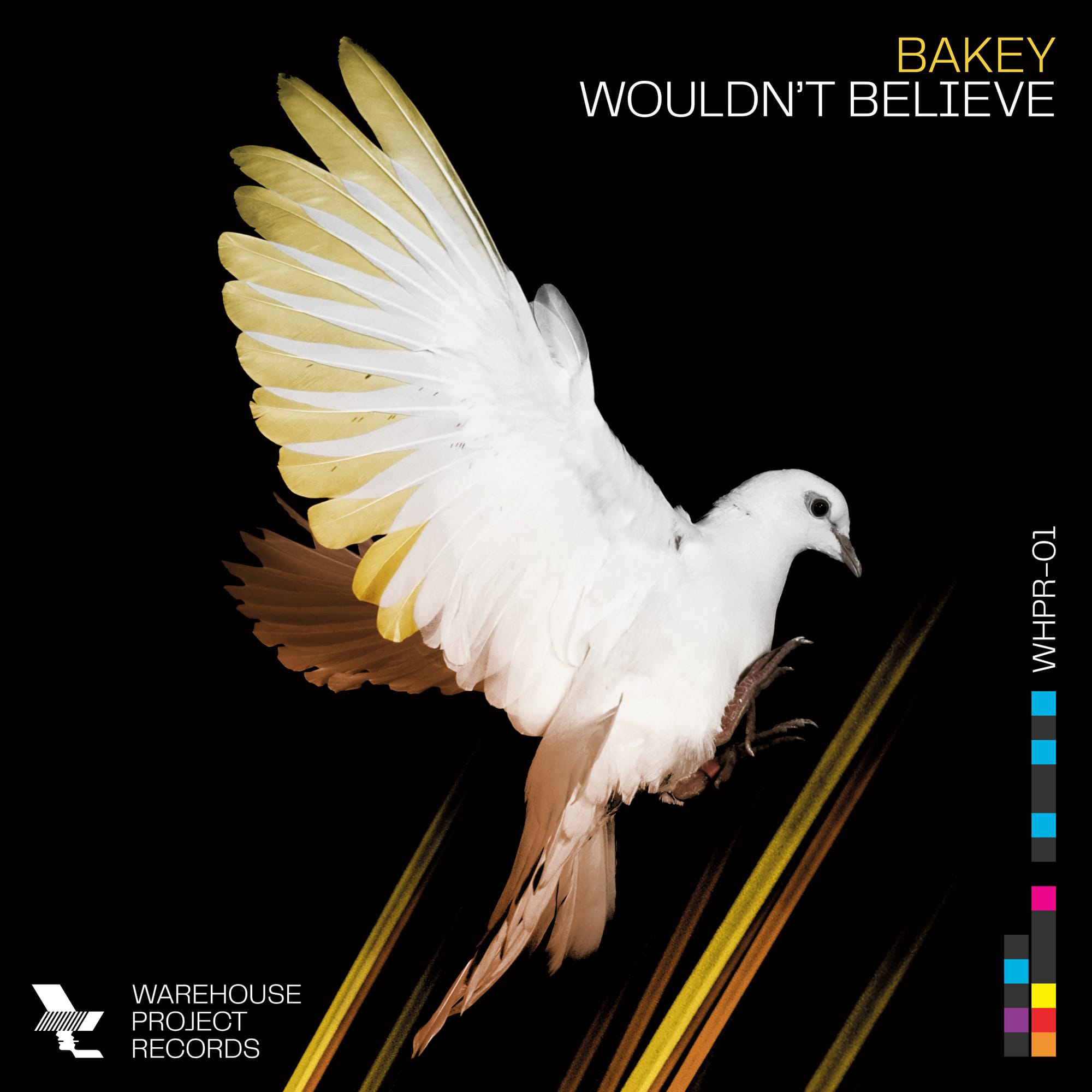
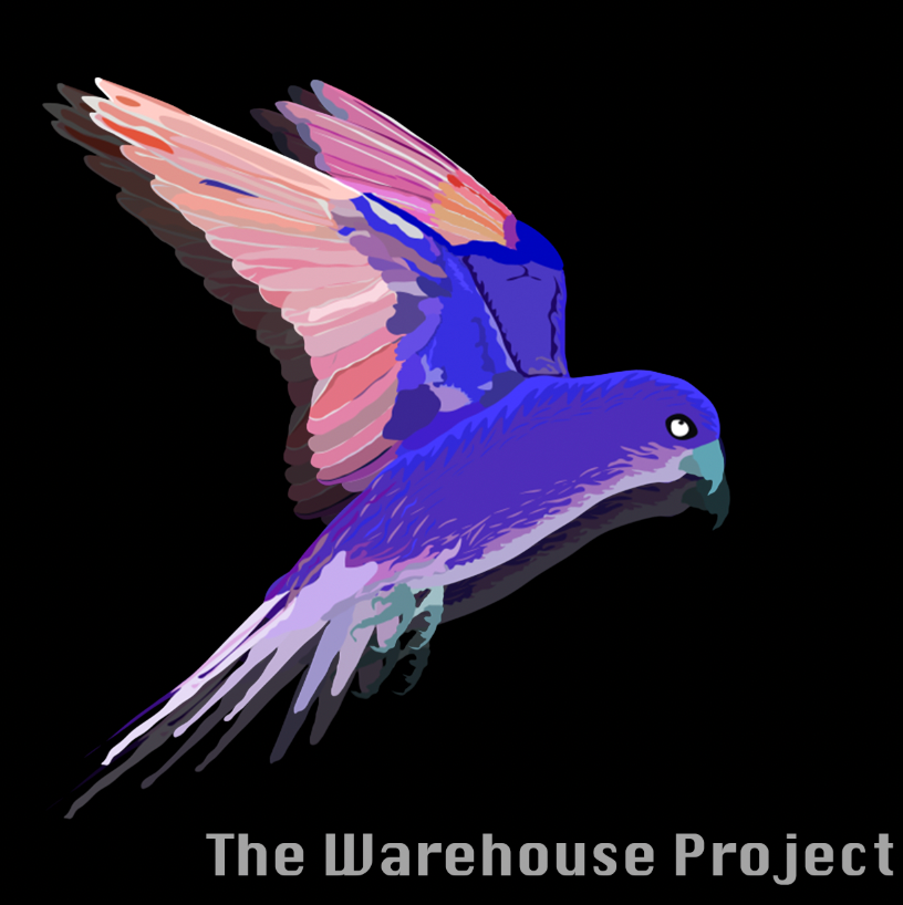
On the left is an image I found on google that who used in 2014 for the DJ Bakey, and on the right I have began to make my own version using the bird I made above however at the minute it feels too plain to me therefore I would like to go back and add more to it.
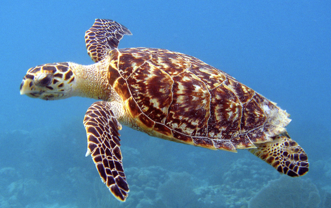
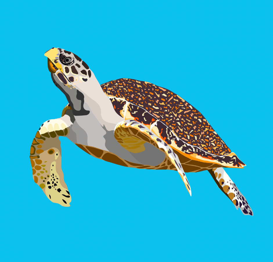
Here I did the same again but with a turtle however I was unsure where to take this next.
5th - Website Experiments
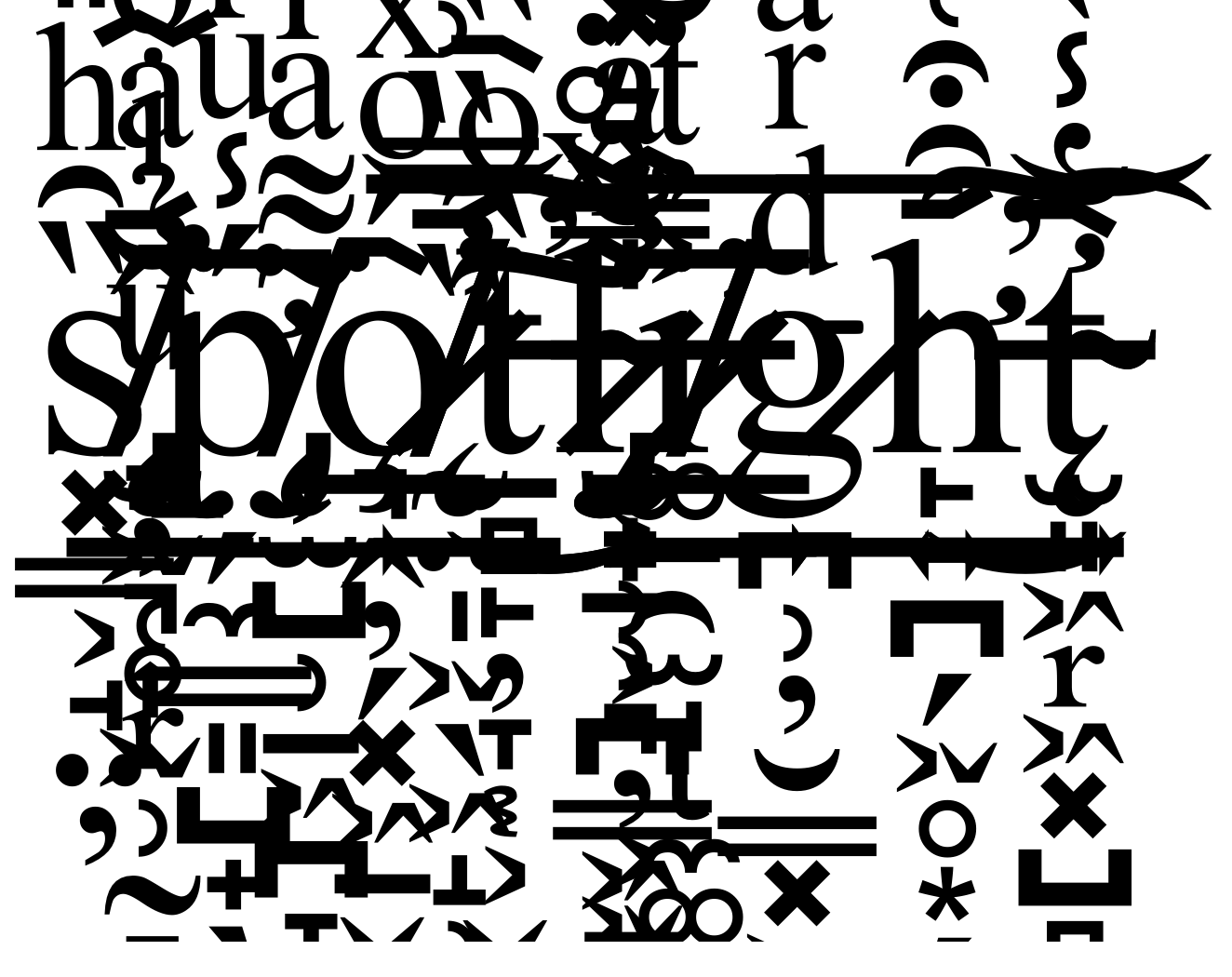
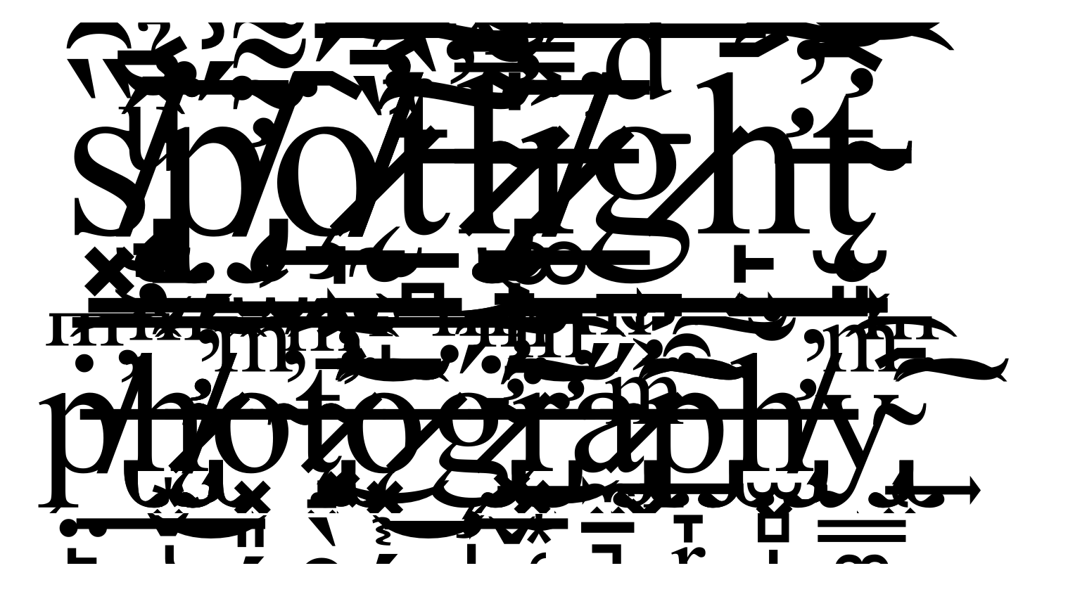
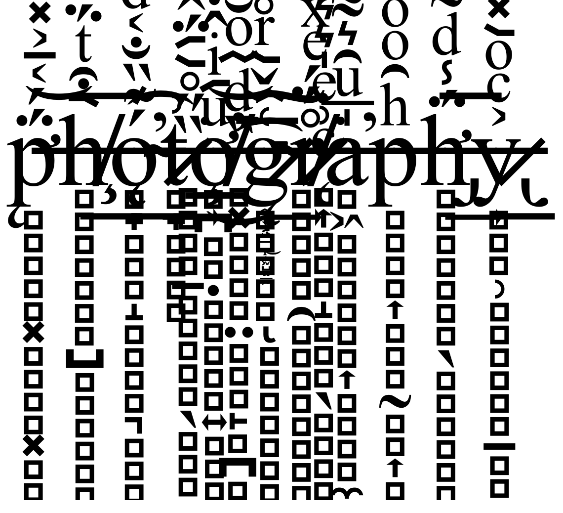
For this experiment I decided to go back and look at the websites we used during I week 4 of this module. I looked at Munken and animals with animals generator to create the images above, they are quick and easy edits which I can then combine.
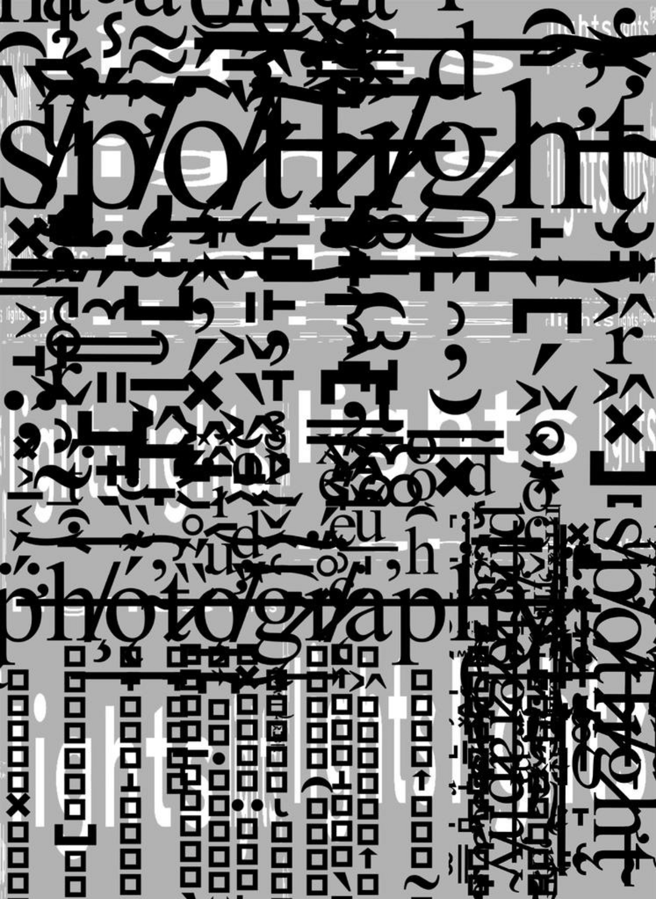
This is my final design using the websites I used the Munken design (black background with the word light on it) as the base then turned the opacity down on it, I then overlapped the other images from the animals with animals website and added a multiply onto it to create the affect.
