Brutalistwebsites.com
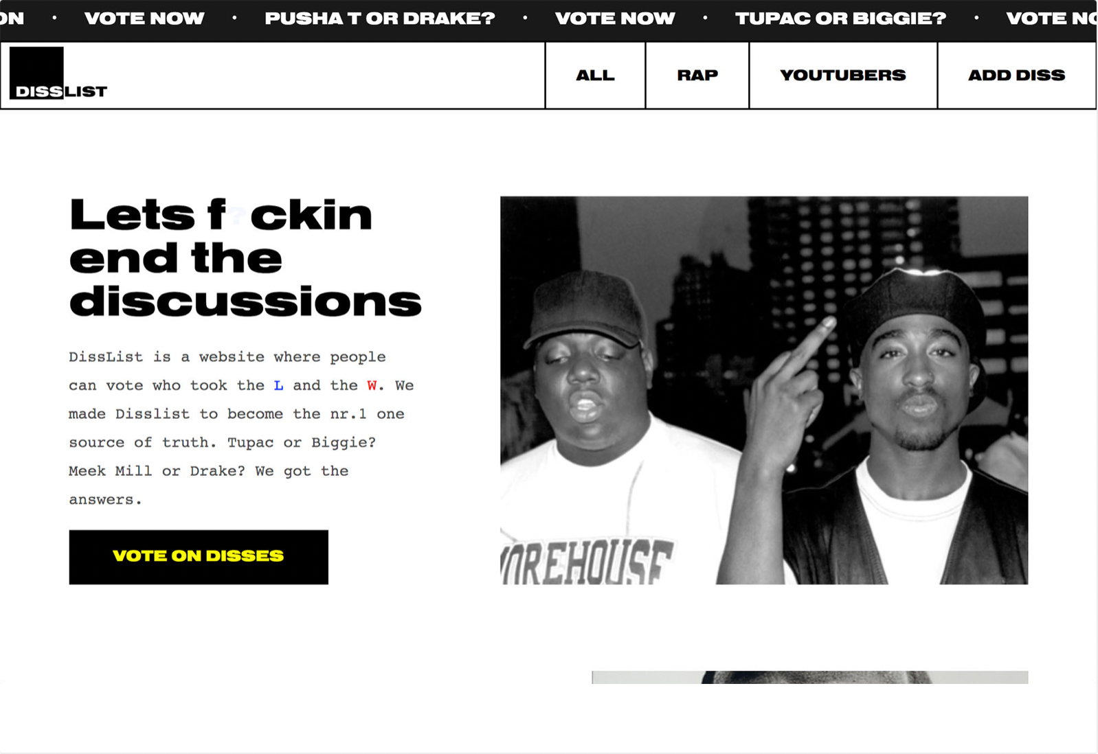
To start off with I picked a website I wasn't a fan of, despite not being able to access it as it said it may contain a virus. The type seems unprofessional and badly spaced with a poor display of hierarchy. The layout also seems basic and the main display font itself is not well kerned as it merges into a blob.

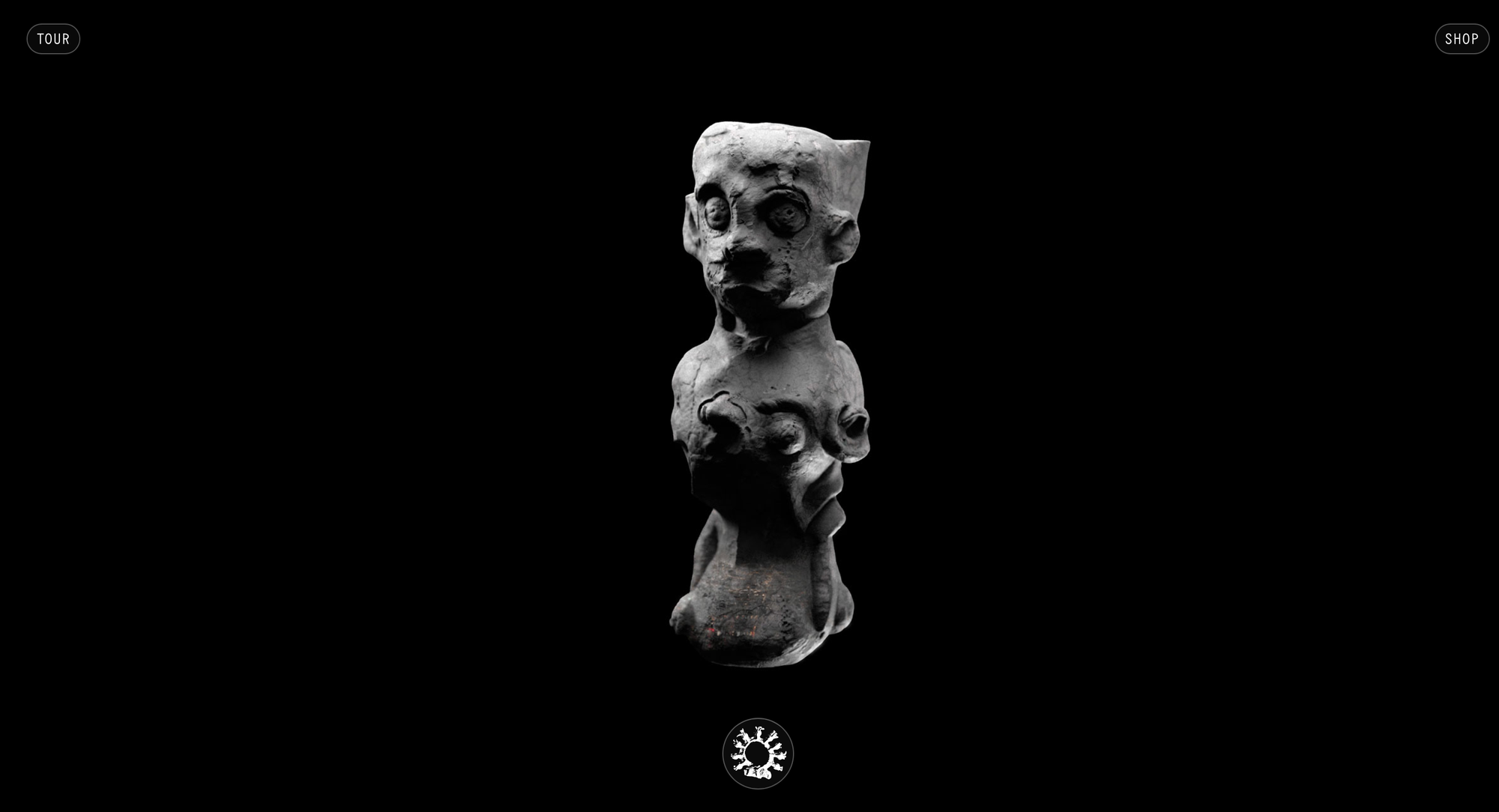
For the next website I decided to look at https://www.travisscott.com. Upon entering the website you are met with a 3D model that can be twisted, providing an interesting dynamic unlike others websites. The rest of the site is very motion and video based with minimal text and instead maintaining Travis Scott's fictional 'Utopia' image.

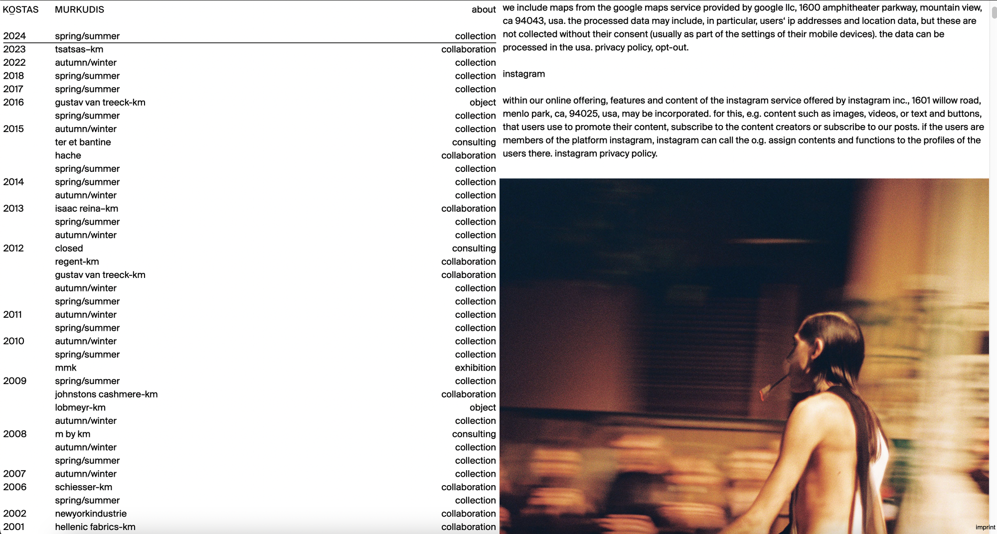
Finally I decided to look at https://kostasmurkudis.org/johnstons-cashmere. The website is like none I have ever seen before and easily my favourite of what I found during this task. The page is split into half with one side being headings whilst the other the content, both being able to scroll without effecting the other. Whether intended or not it creates beautiful patterns of type and type and image combo whilst also maintaining the base of the website of informing and showcasing what they to offer.

