Brutalistwebsites

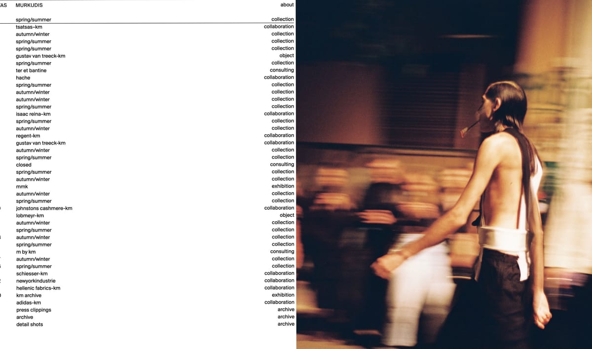
I like the design for Kostas Murkudis, I like the combination of photos and how his works clearly show the fact that it's easy to navigate. Again there is a strong use of a grid, and there is a strong sense of hierarchy. However, I do think the text could be a little bigger just to make it easier to read, but I think this website does a good job of following web design principles without making them boring and like every other website. The type design fits very well with the images so gives it a sense of branding.
Band tour dates is an interesting website, as it takes you to more websites that tell you more information about the event. The websites included in that have some very interesting visuals, that I much prefer to the original website. I found this one a little implicit with where to click, but I like the typeface and composition. It’s just a little boring in my opinion and could do with including more information and interesting visuals. In terms of branding there is no feeling of a brand as it's just boring text on a page.
My initial thoughts of Studio Ottos' website was its interesting graphically speaking. There is a clear sense of a grid and I like how minimalist the design is, however I would say that the interesting design takes away from the legibility of the content. I don't think the navigation is seamless, as you have to mess around a bit to figure out what aspects do, so I think it doesn't follow some of the key principles for a good website, but it does make for an interesting aesthetic and example of moving elements within web design.


