Brutalist Websites Task
Crew
Opening the Crew site is immediately met with a full screen animated logo. Scrolling down is met with with a walkthrough of their projects that they've done, eventually leading down to basic information about them. The projects being displayed as slides is an interesting idea as it reduces bulk, aswell as the cursor turning into a directional arrow, making sure the user knows that clicking will flick the page over. Having all their information on one page makes it easy to scroll through and find it, reducing the hassle of navigation while promoting their projects to users going through.

Studium Generale Rietveld Academie
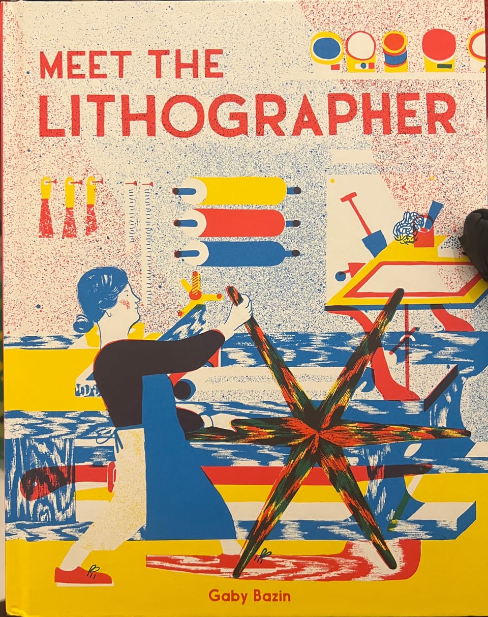
To put my initial thought of this website out, looking at it gives me a headache. Everything about it is uneven and a chore to look through. Which doesn't have to be a bad thing, as interesting and unique navigation can encourage a user to explore while helping it stand out, the paired backgrounds and cut outs that move creates a disorientating experience that distracts you from the text. Certain menus scroll with the mouse movement which is an interesting and effective way to manage it, but the sensitivity leads to dozens of boxes flying past at the slightest movement.
NES.css
NES.css is a CSS framework designed to look like an old 8 bit interface. Since the whole idea of the project is based on looks, the website gives basic download and install instructions, then spends the rest of the page showing off what certain functions look like, such as buttons, checkboxes, text, containers, dialogue, etc. It doesn't even just show them as each element is interactable for the user. This design is a great idea as it gives full demonstration of the framework in action, letting the user play around with it and know what they're getting out of it.


