Brutalist Websites Research Task
Web 1: https://bf.sistema.ru/futuretense/
I really like the retro brutalist style of web design that has gone on here. I think the imagery works nicely with the tanned colour pallet and condensed sans-serif font style. The stylistic type used in the title work is what initially drew me in, and the rest of the design did not disappoint. I think this website aligns with traditional design techniques such as consistency, simplicity, and clarity. However, the nature of this retro style puts its own twist on the navigation of this website.
Web 2:

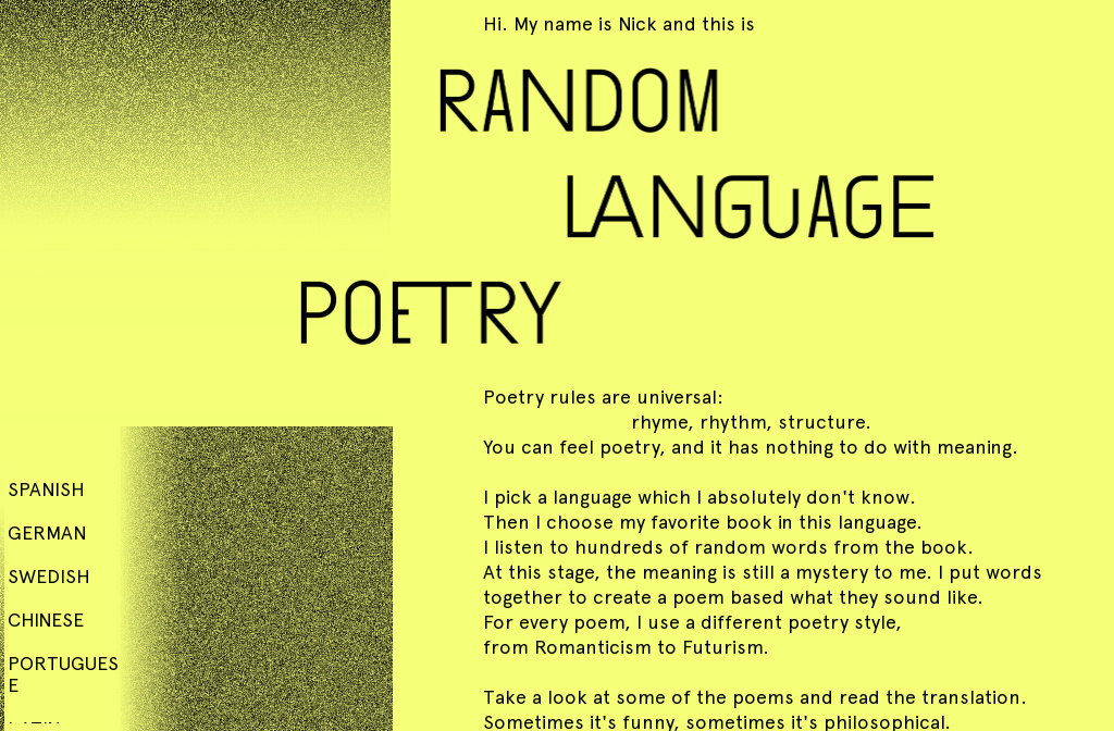
I have noticed the use of yellow in design a lot recently. Through social media I see it used by professional established brands, and friends who use type in video collages. I feel quite a sense of nostalgia when I see the colour yellow used in design, might not be something that can be explained but where it is placed it always makes me think of particular memories that may be linked to these designs. I really like the choices behind this website, the warm yellow encourages thoughts of printed paper for easier legibility which works well with the content about poetry. The subtle typographic choices connecting letters, and how the website scrolls are unique too which is interesting to explore.
Web 3: https://littlefragments.com/projects/atlas-collective/
This design I feel has so much more potential than what it is. I really like the simplistic aesthetic behind simple lines letters and a small amount of animation when clicking on the sides. But ultimately the design ends there. There isn’t a great deal of explanation behind what he is doing with this website, and although there are a few things that encourage user accessibility, you click on someone else’s website and now you are done with it. It challenges traditional web design encouraging people to explore what different buttons do but there isn’t a massive amount to click. Overall, I do like it though, it is something different which does interest me, even though it doesn’t feel fully completed.

