BRUTALIST WEBSITES DOT COM
Brutalist Websites

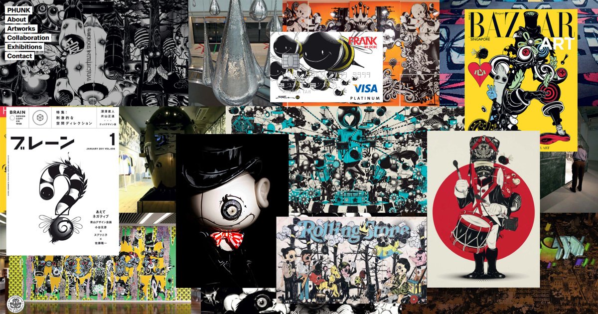
- PHUNK
Phunk’s website is a bold, immersive showcase of its creative philosophy. The striking use of oversized typography, abstract visuals, and minimal navigation captures attention but risks overwhelming first-time visitors. The monochromatic palette feels cohesive but may lack contrast for accessibility. While it challenges traditional layouts by prioritizing artistic expression, the unconventional design may alienate users seeking clear navigation. Phunk succeeds as a portfolio for an avant-garde collective but could benefit from subtle usability improvements.
Phunk | Art & Design Collective
PHUNK is a contemporary art & design collective based in Singapore.
- MARIANO PASCUAL
Mariano Pascual’s website is a visual playground, with vivid gradients, playful animations, and a layout that embraces controlled chaos. It perfectly reflects the artist’s style but may confuse users unfamiliar with interactive design. The color contrasts and responsiveness are strong, but the unconventional navigation challenges user expectations, making it more an art piece than a functional website. While it aligns with brutalist principles by rejecting polished conventions, it pushes boundaries in a way that sparks curiosity.
Mariano Pascual
Illustrator, visual artist and designer from Argentina, based in Barcelona.

- VAN HOLTZ CO
Van Holtz Co’s website is a modern take on brutalism, blending clean, geometric layouts with surprising interactions. The bold typography and asymmetry make it visually memorable, while smart animations add depth without overwhelming functionality. It balances aesthetics with usability, proving brutalism can be user-friendly. Though it challenges traditional designs with its grid-breaking layouts, it retains enough structure for intuitive navigation. This website is a compelling mix of creativity and accessibility, demonstrating how brutalist design can evolve.
Van Holtz Co
Studio of Eric Van Holtz. Specializing in refined digital web experiences with a focus on animated, responsive, and interactive content.
