Brutalist Websites.
Going through the Brutalist Websites there were 3 that stood out to me, one of them;
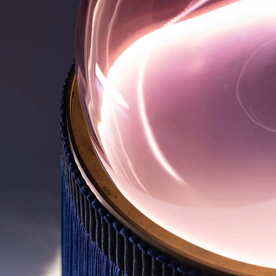
PURHO is one that stood out to me; it has a sleek, clean and minimalist design that focuses on high-quality motion imagery on the home screen and also has high-quality images on the products. It has a clear menu structure that is easy to follow but one thing I would say, it is missing a search bar so it then becomes harder for users to quickly find specific products or information. One thing I did notice was that when loading different pages there was this screen that came up with the name of the page which although looks good did make it seem like the loading speed wasn't the best.

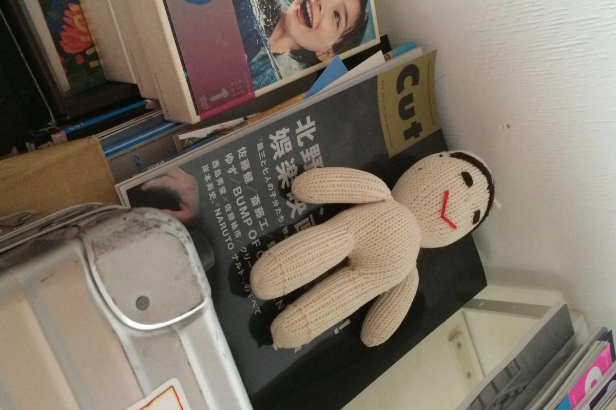
Going back to the first week, I thought about the 2 laws I picked that I felt were important to me when it comes to design, I feel that the Middle Plane amends these laws. With the minimalist, vanguard aesthetic it almost contradicts itself with having almost a retro raw feeling. One thing I liked about this website is that they have a 3D rotating interactive magazine that shows us how it would look in real life. The editorial feel of the website feels like an extension of the magazine.

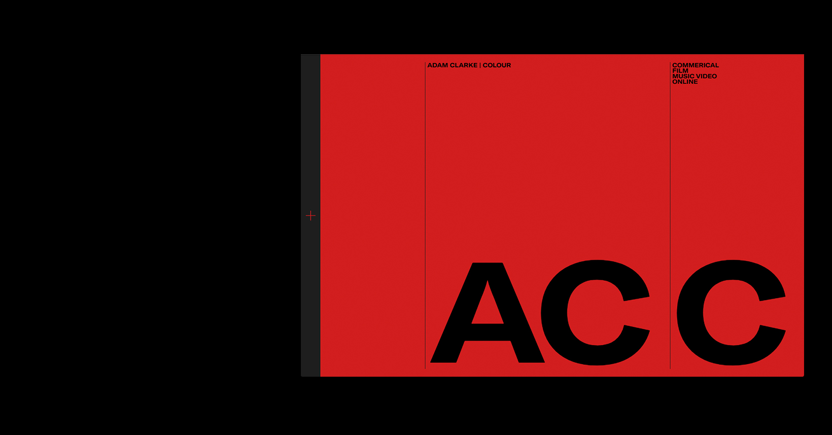
One thing that I enjoy about the Adam Clarke website is the flow with the moving text when highlighted and when hovering over the video it creates movement for the page. The bright red background adds a vibrant feel to the website and shows his colourist in the film and music video industry.
