Brutalist websites

What is a brutalist website????
When the task was first explained immediately my question was what the hell is a brutalist website? I created a picture in my head of a bunch of websites that were carved into concrete.... in real life. Obviously, I knew that wasn't it but I was actually thinking they would all be very blocky, minimal, rough textures, and drab colour schemes. So I went to look at https://brutalistwebsites.com/ to explore...
In its ruggedness and lack of concern to look comfortable or easy, Brutalism can be seen as a reaction by a younger generation to the lightness, optimism, and frivolity of today's web design.
This quote was the explanation I received, and after thinking about it, it makes a lot more sense and I really like the idea. Brutalist, not necessarily in the aesthetic way (they sometimes are though) but in the meaning of the term/ movement and as someone who isn't very tech-savvy or enjoys it massively this is right up my alley!
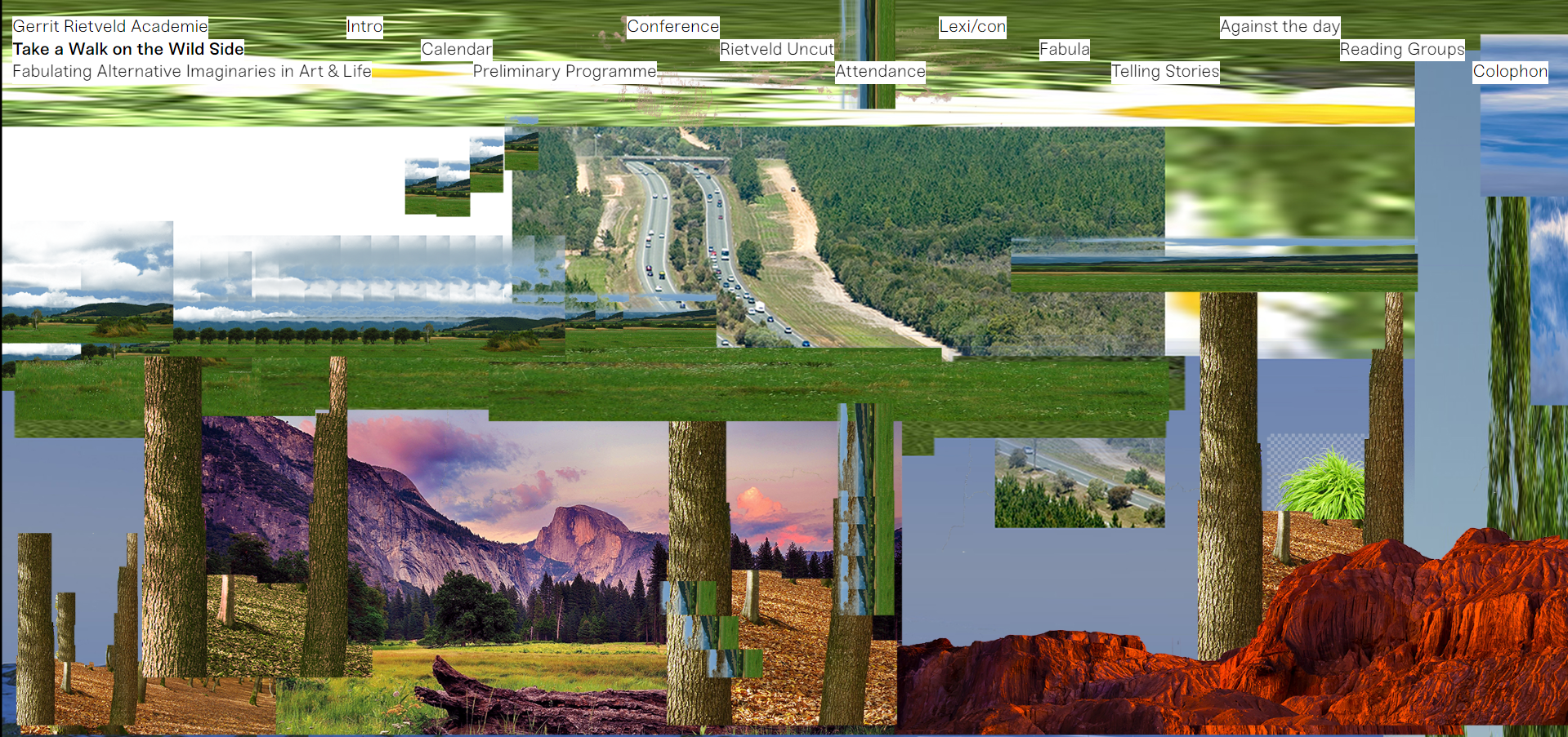
When scrolling through to find a brutalist website that intrigued me, take a walk on the wild side immediately jumped out and grabbed me. You click the link and pictures of nature and the world are collaged and thrown at you, then when you move your mouse everything moves in an odd way.
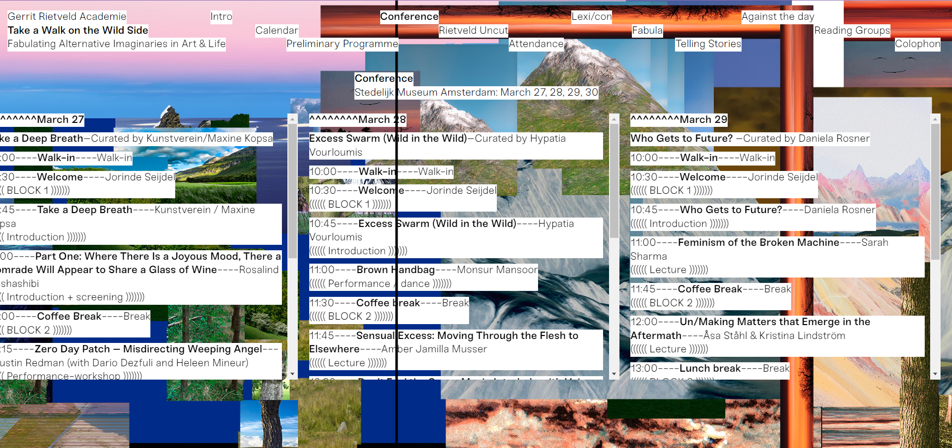
When you click the tabs to show you the text to try and understand what is going on it gets more confusing; the text box moves away from your mouse, you can't scroll. It's confusing and borderline unusable but it's so fun and weird, and you want to try to get the hang of it and learn more. it's such a unique website Im sure would straight-up anger old and closed-minded people (which makes me a lil happy)
unlike the previous website, this one was found after clicking and looking through many. It at first looked quite simple and boring making me question if I agreed with the label of brutalist website being put on it. However, what I thought was a logo or just three colourful dots ended up being an intriguing feature.
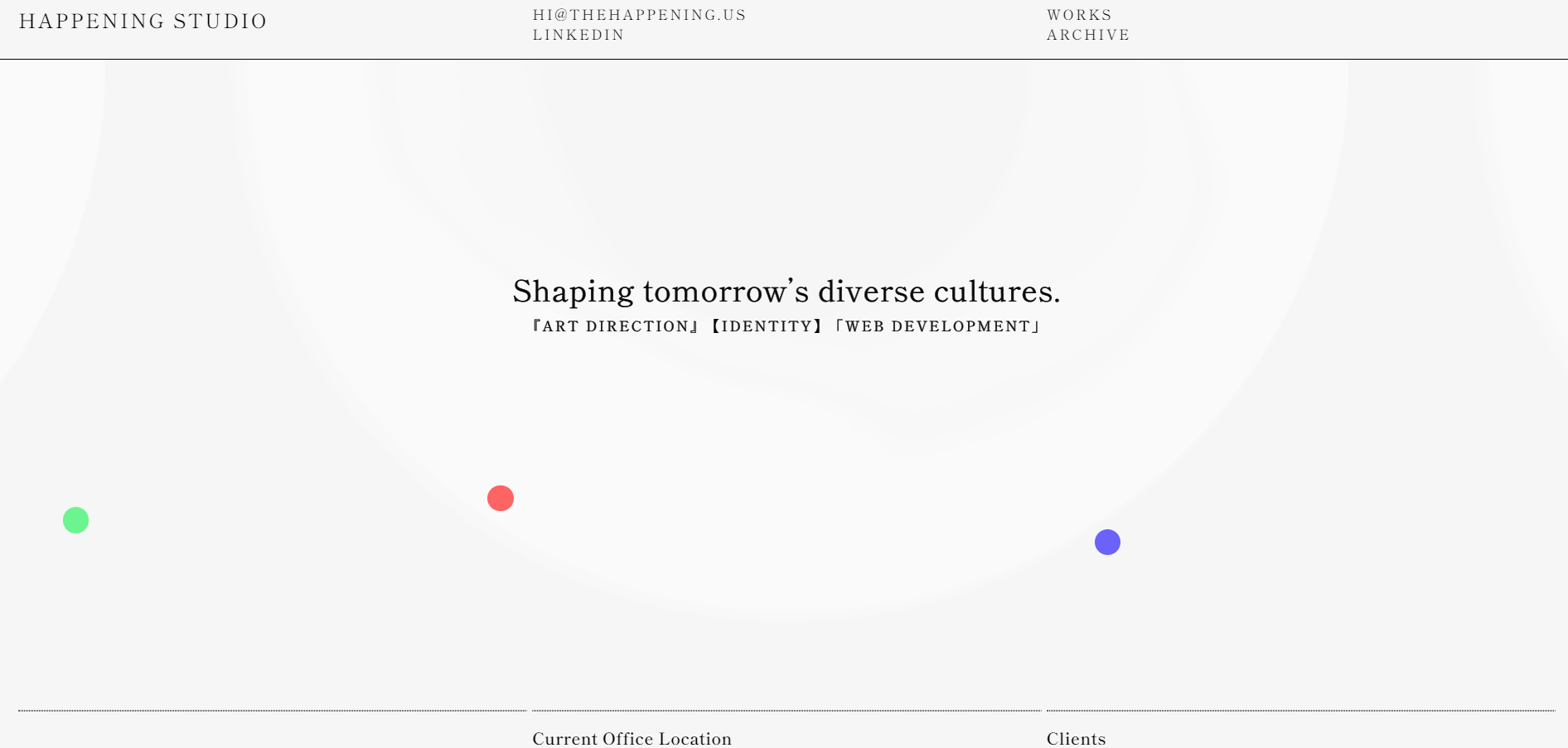
Three dots, red, blue, and green are permanently on the screen and when you drag the dots the entire page changes colour, arranging them differently makes different colours. However, I don't quite understand exactly why the colours are what they are but maybe they want you to keep questioning.
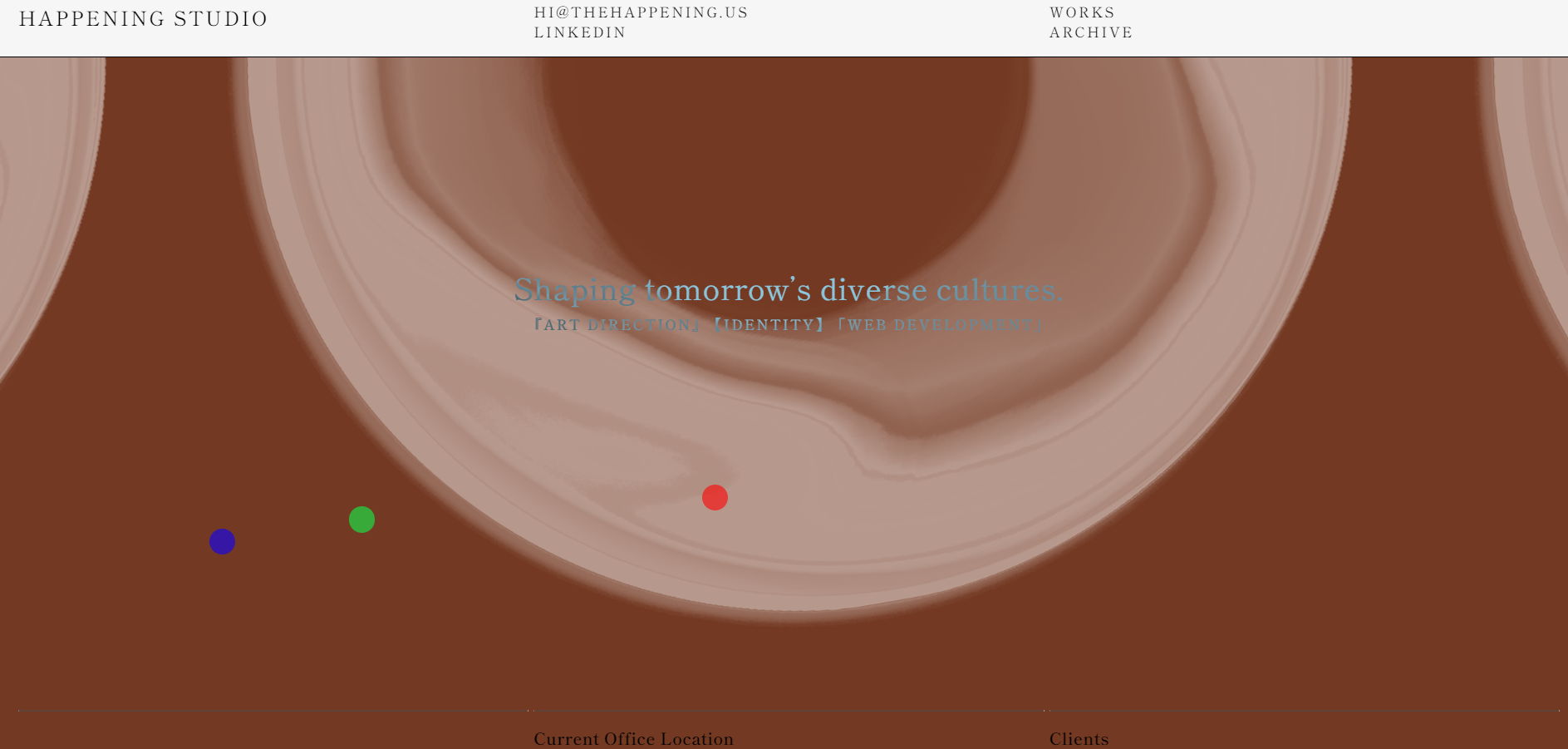
I now think it definitely fits as a brutalist website, it subjects what you expect for a portfolio of work at first being something you might expect to subvert that playfully but still being simple. I think this fits well with one of the 10 laws that I chose: difference.
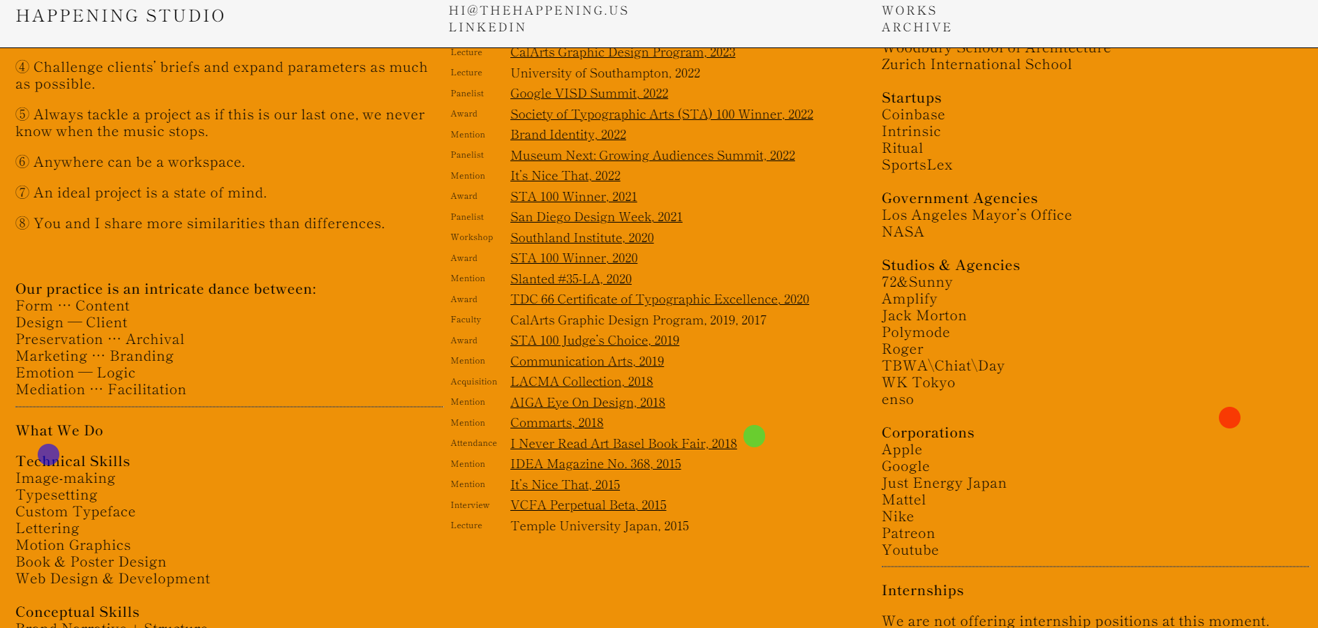
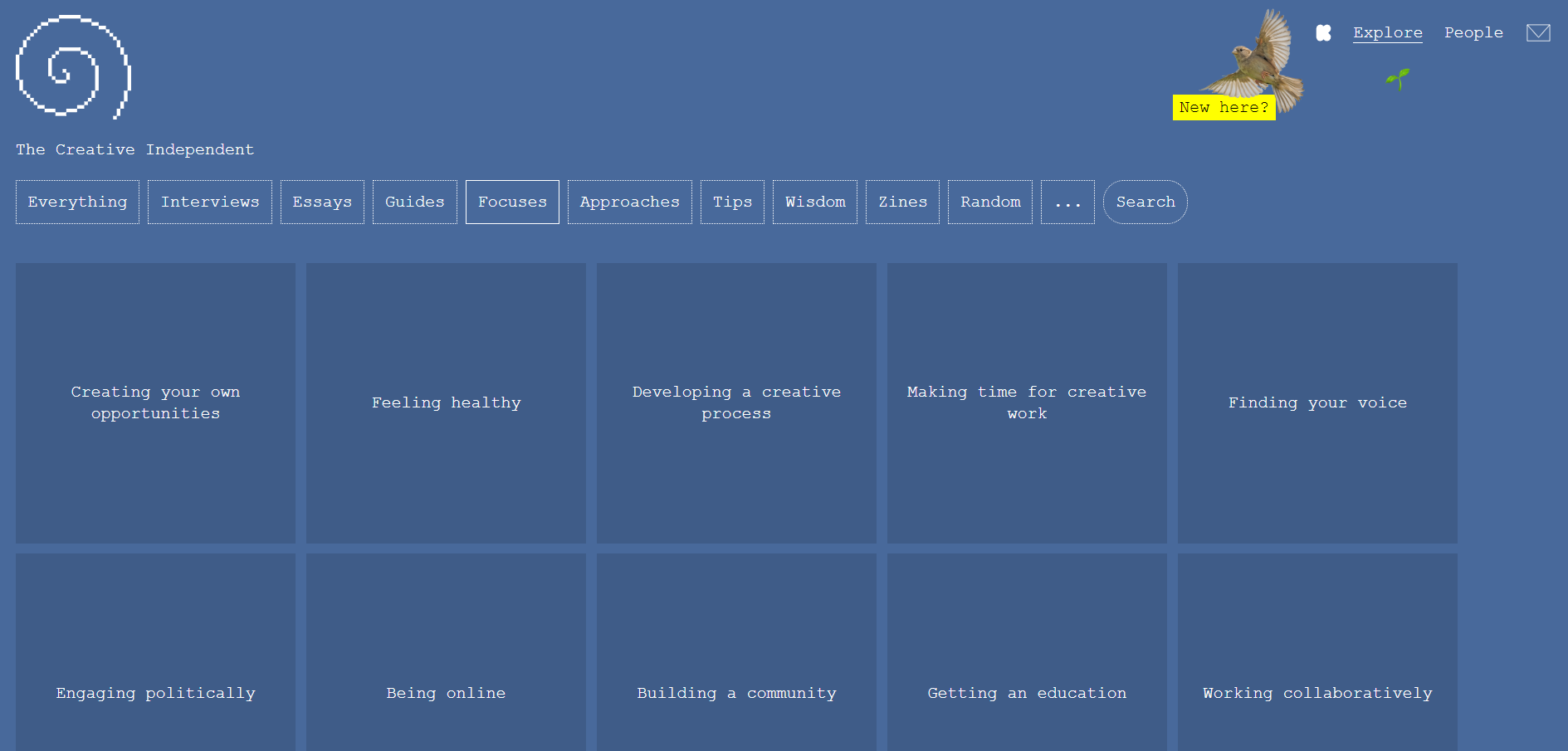
For my third selection, I kind of cheated. Instead of picking a website from the collection of brutalist websites I chose when which I think could be categorised as such. I have no idea where or how I found this website but it's been on my computer for ages, every time I go to close my tabs I look at it think it's cool and leave it. It's a collection of people, essays, and zines basically just a bunch of stuff meant for artists.
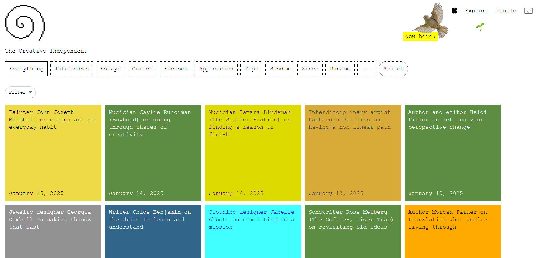
Its design is a bit funky playing around with colours, but makes a lot of sense (at least to me). I think it challenges what websites with resources usually look like which i would say makes it brutalist.
