Brutalist Websites


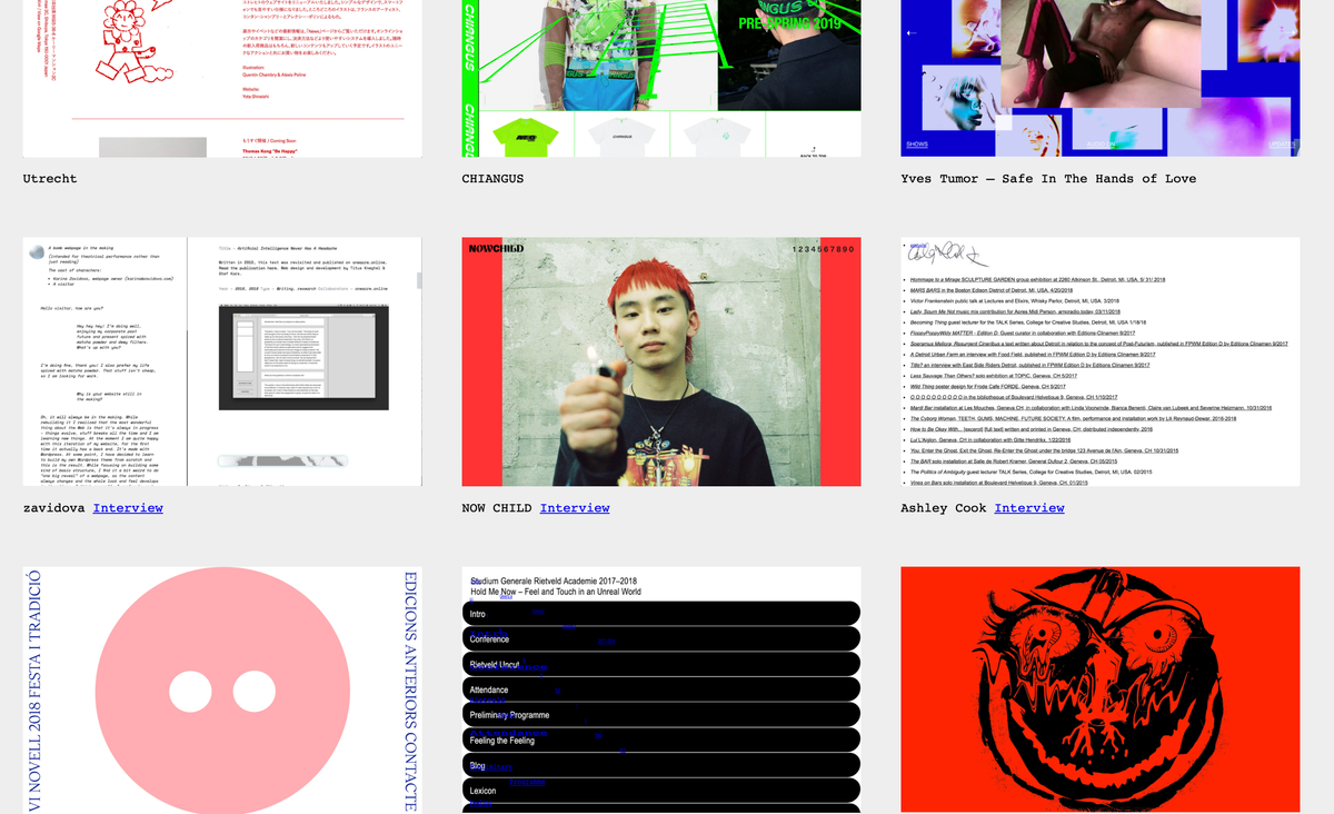
Starting off with this website, visually it stunned me with the colours and the type before I looked about on the website. Obviously, the language is different so I won't be able to fully understand what it is about but from having a look about, it seems like it's a website for a wine brand. As you scroll through the website, the hand at the front moves as you make your way around which I thought was an interesting aspect and made the website more fun. As well as this interactive aspect, the model of the wine can be moved about with the curser which just adds to the overall look to the website.

Next was this clothing website which was extremely fun to play about with. As soon as you enter the website it becomes interactive with every movement you make. Moving forward onto the actual clothing bit, instead of it being a standard grid layout like most clothing websites, it puts you in a 3D model with a shopping trolly that you push about as if you were there in person. Although I did have a lot of fun playing about and looking, the downside to this is that they had quite a few clothing choices so it takes a bit of time to get to the end and see it all as an overall picture and to compare the products they sell.

Finally, this website was interesting and felt a little surreal. Again, this one is a clothing shop and at first, I thought it was a website for outfit inspiration. Having a closer look at it, what caught my eye was how the webpage moves and is not the average website that you scroll down on and that the pictures were panels that flip when the cursor is over it. This was fun to look at and mess about with but when it came to how to navigate around on it, I did struggle. It wasn't simple enough to have a browse through products and felt like a glamorous Pinterest page.


