BrutalistWebsites.com
Whilst looking through Brutalist websites, there were a few which especially caught my eye. The first one which captured my interest was 2018: The Year in Dissonance - The New York Times.
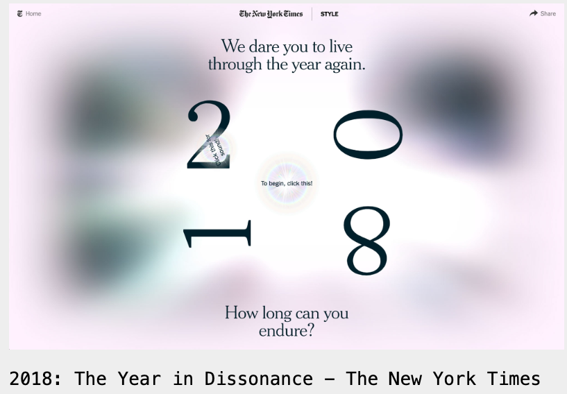
This one immediately caught my eye because of the design including the colours and typography. The website is set up as an interactive game that shows you different headlines and photos from 2018, with occasional quiz pop-ups where you can earn points. The website has a cohesive overall theme which complements the nostalgia of looking back on 2018. The site also pops up with advertisements however, due to lagging problems, it often doesn't load making it feel less professional. I also think the website gets a bit repetitive after a while.
The next website that drew me was Bergan Assembly.
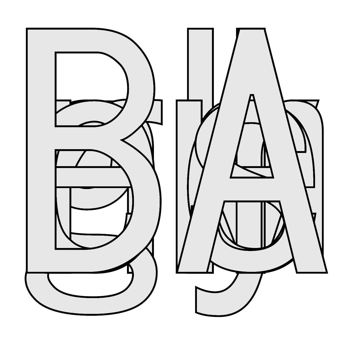
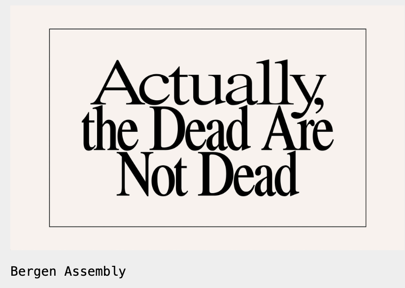
It immediately liked the typography style and was interested in the bold statement on the cover. You are greeted on the home page with a series of fast moving images paired with columns of text underneath. I do like the layout, however I think the images move too quickly making it hard to focus on reading the text. I really like the choice of font and grid used across the whole site as it looks professional and easy to find exactly what you're looking for in each section.
Lastly I looked at the website Take a walk on the wild side.
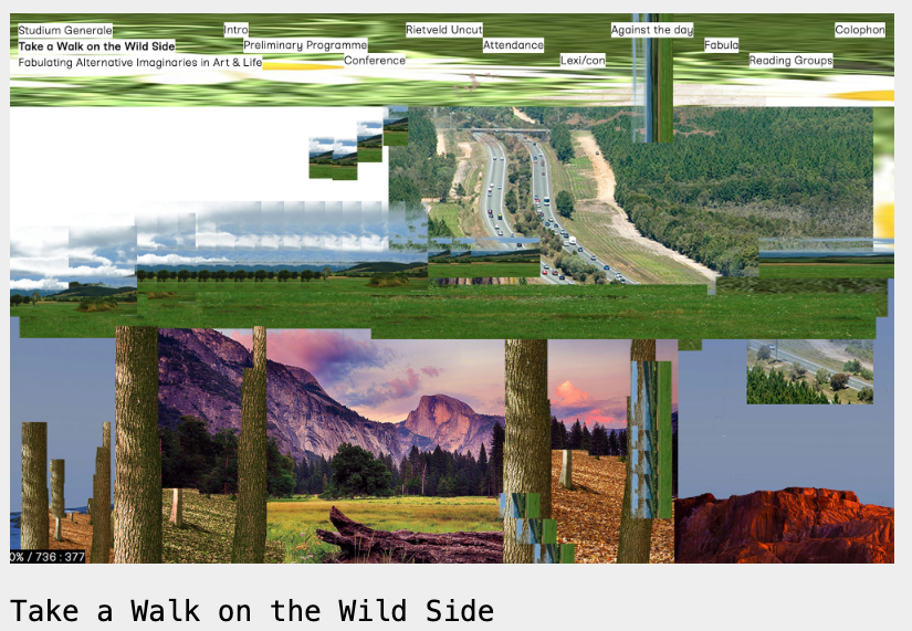
From the moment you enter the website you're met with different moving images layered on top of each other, following the direction of the mouse. The 'menu bar' is located at the top in white boxes, adding to the geometric design. The whole website is hard to navigate and overwhelming, making it difficult to read any of the information. All the text is the same font in the same size, again making it challenging to read. Although the site is doing something different and challenging mainstream design, I believe its failing in communicating the information and needs to simplify the design.

