5.2 Process Document
Week 1 Public space, public voice To raise awareness of neurodiversity we need to promote welcoming public environments in community spaces. We are all different and our brains function in different ways, we don’t want people feeling like they don’t belong and have no place. Not all disabilities are visible and it’s important to remember that autism and sensory overload can happen anywhere “overstimulated” now a small change can create a big inclusion like patience and choices, public spaces belong to everyone. We can do this through posters and signs in shops, very calm and minimalistic like “some people experience social crowds differently” or “light, sound and spaces, we don’t experience it the same” mixed with a few symbols would help as well like headphones or volume icons just to be clear and consistent with the visuals to reduce some confusion. Inside the shops it can have sensory friendly zones within certain times of the day like lower lighting or reduced music with calm checkout lanes. And for more outdoor spaces like parks, we can have a “busy zone” or “busy areas” with low sensory ours like the mornings. More general awareness online with short content with tips videos and some before and afters of sensory friendly changes in public places and a brief for staff and park visitors when walking in.
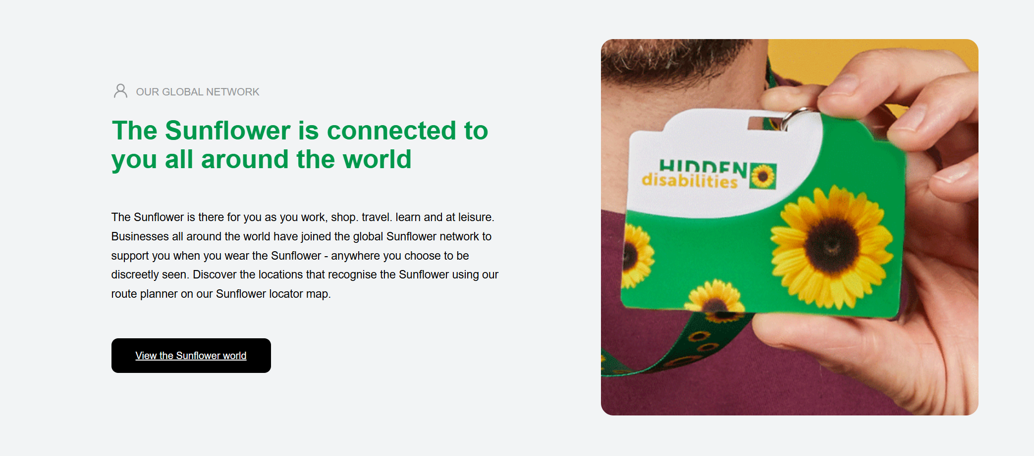
This was a nice start to the module, getting to understand that people don’t often get to express themselves the way they want to and it can be a real struggle for some people i do like the sunflower lanyard scheme it’s a great way to show other people Sutley that they might need additional support or patience organisations including the NHS trusts, airports, transport companies, councils and courts recognise the scheme and train staff to respond appropriately. this type of change is a smart step forward to a better work environment for everyone.
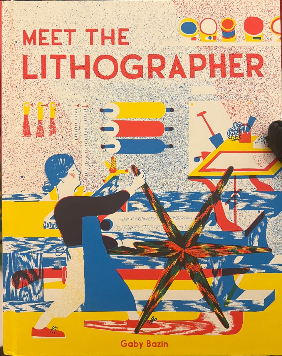
5.2.2 task Recently I started to rewatch the hobbit trilogy and as I was watching it, I wanted to know how they could possibly make someone else look smaller/ taller in a film when stood right next to each other, a couple of days later i was scrolling through Instagram and came across a clip on the film set of the hobbit and all the blue screens and camera illusions that you can make with angles similar to how they made Hagrid from Harry Potter taller. it’s called a focus perspective shot when something is filmed further away but shot so it’s right next to some - one or something it can make something look smaller or taller, i thought this is clever, and it amazed me how this could be filmed, edited and released. And then there’s moving perspective so when the camera moves on a dolly and as the camera moves the acter also moves with it so the perspective never changes i would like to do more photography and this is a cool little technique I would love to tryout in the future I like implementing photos to graphics. I remember a task from first year compiling pictures and videos for a short clip and going on premier pro to edit, i would like to expand on this in the future and do more photography io really enjoyed that task and the publication on a chosen place on the map that was probably my favourite module from the whole year.
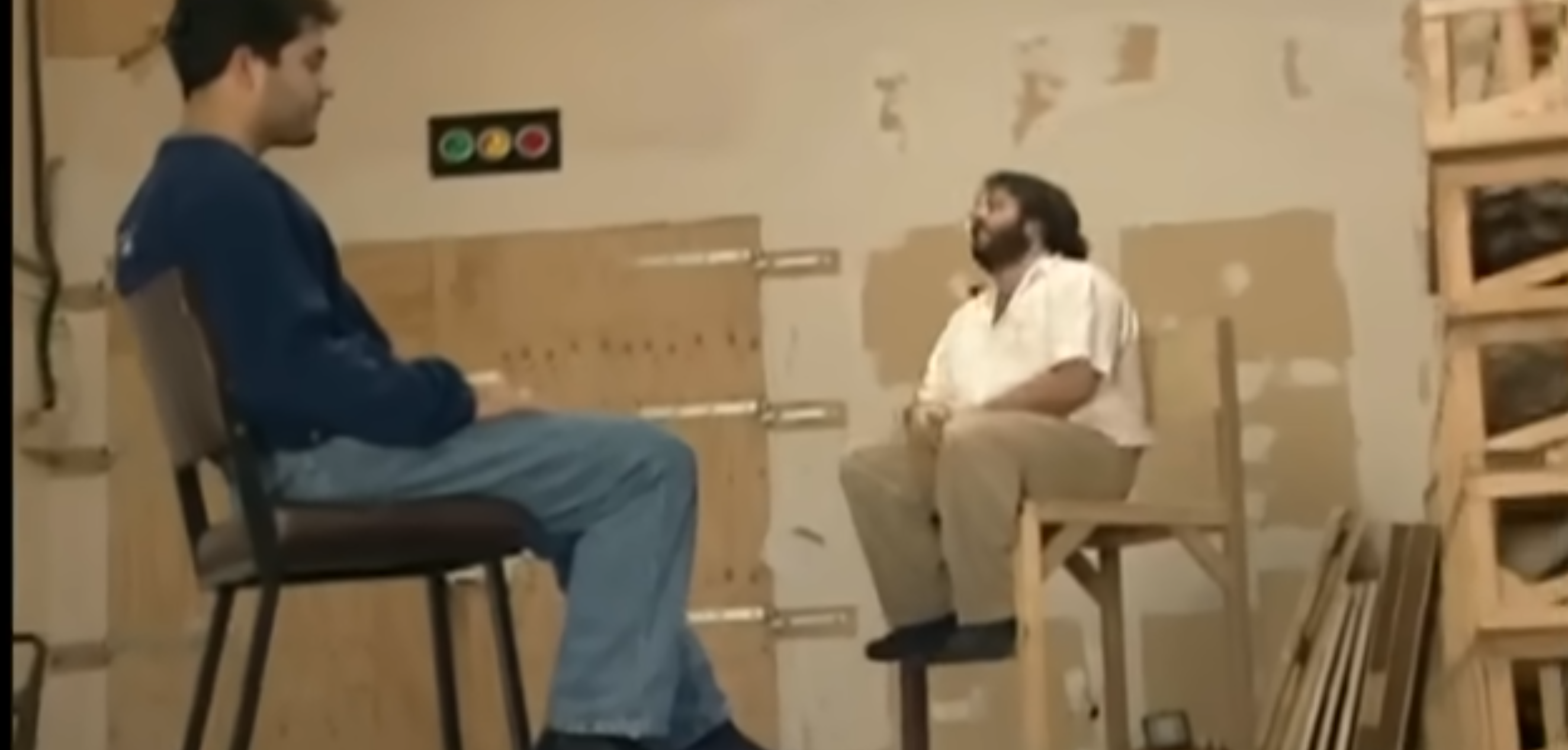
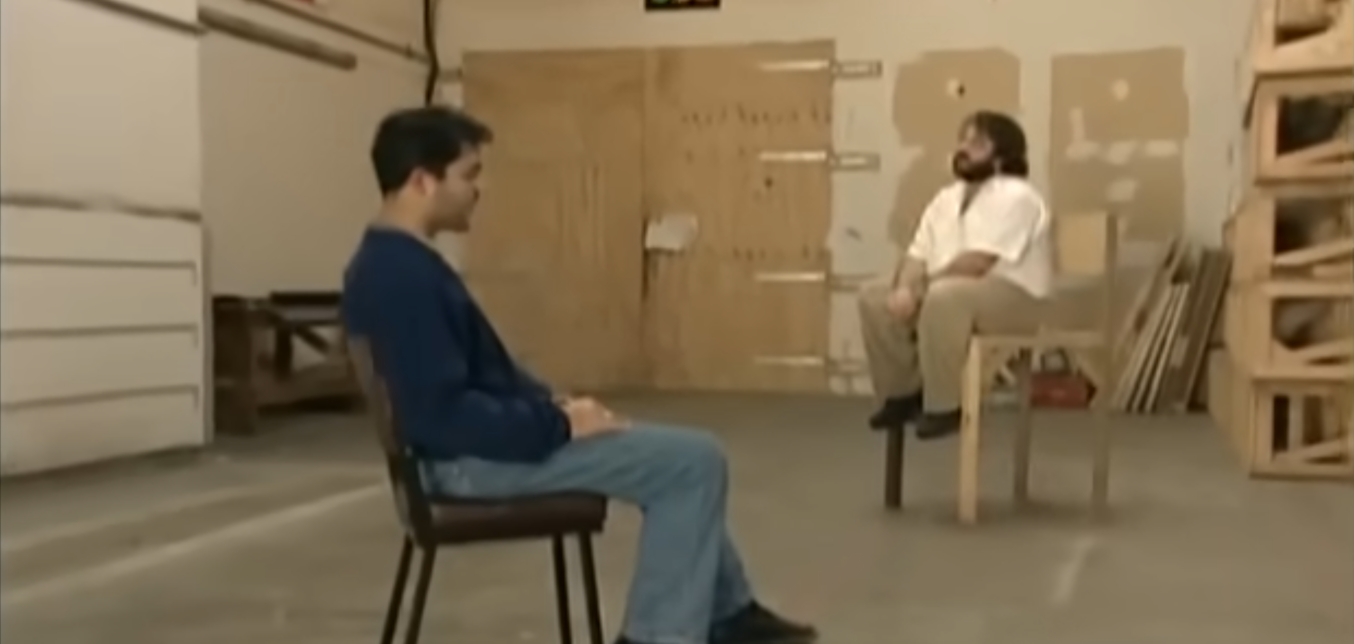
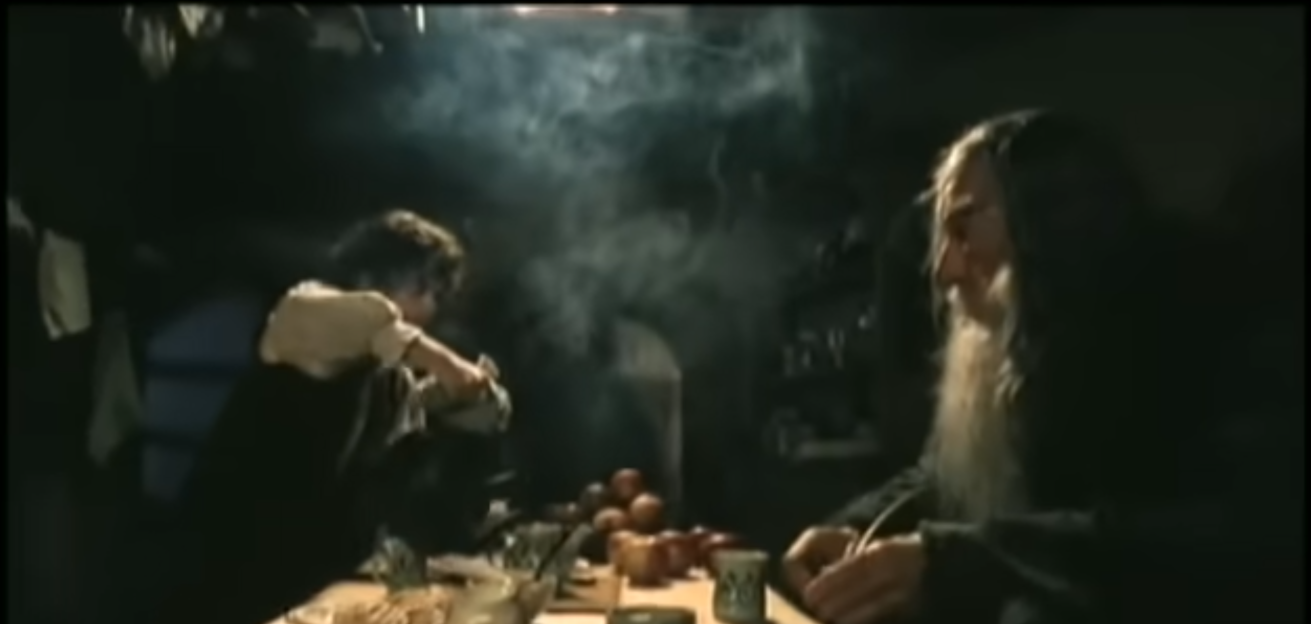
These clips were taken from a you - tube video from @TXFilmProfesser and feature produced trying to figure out the right angles to make it look some ones smaller/taller and wen done how can they pan a cam - rea from one side to the other whist still creating that same illusion and do so, then when the furniture and surroundings are adapted they can shoot the scene. it just made me think about visual effects when CGI was still progressing in the early 2000s
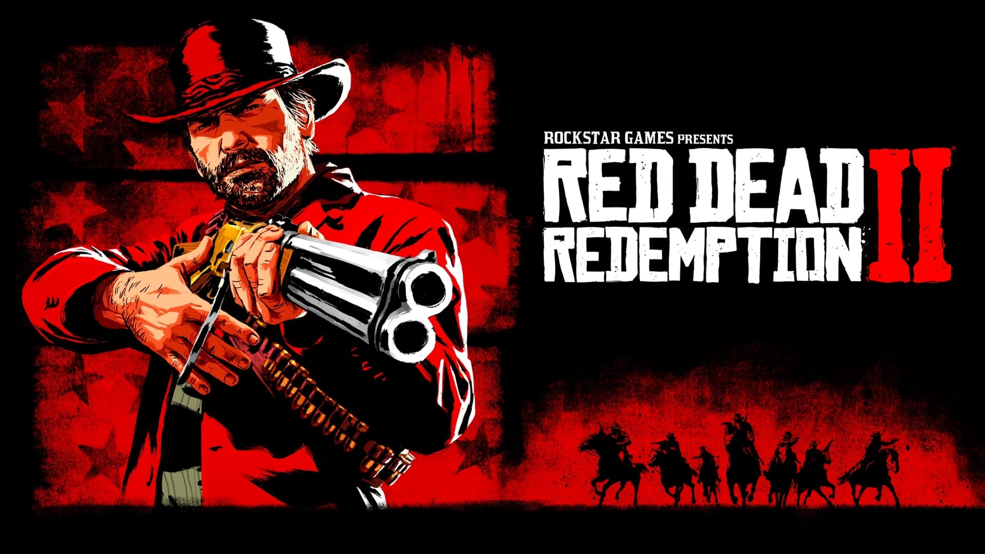
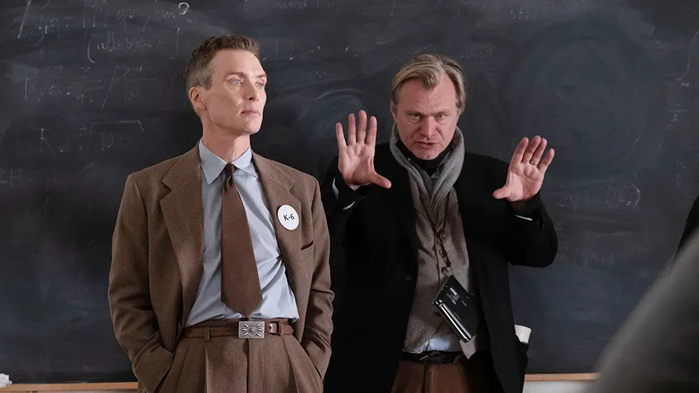
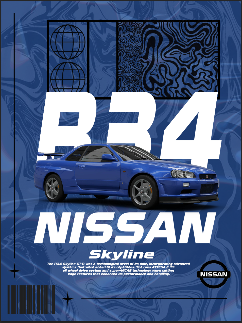
5.2.3 task Week 3 Work flow I feel my momentum when I’m designing when i have all the information i need and “blueprints” I can just get on with my work. My engagement really takes off when it’s about something i really like, if I’m designing something based on a film or comic book or show I can really sink into it, i do this mostly on paper through drawing but i like deigning on Photoshop and InDesign, I remember when I designed a car poster last year, it’s that exact type of media I’ll never get board of doing and can recreate endless amount of examples if asked that’s when i feel like I’m actually designing wen all y ideas come into one or i make a few changes then decide if i like to keep it or not. When I’m writing i do it writers block a lot, i can’t really focus when typing and i get distracted easily. I don’t hate writing it’s just about what I’m writing. If it doesn’t interest me or I’m not enjoying it i will take a lot longer than if I’m typing about something I’m really interested in with background knowledge like with 5.3 i wanted to talk about Nirvana but there wasn’t enough talking points so i had to change it and force myself to redo everything. Talking about the article AI has its uses but can change the way we think and research, it can also affect our creative flow, Christopher Nolan doesn’t carry around a smart phone because he wants to stay away from social media as much as possible, a lack of resources can be a breeding ground for creativity, meaning that sometimes less is more, i see this with video games, i often ask myself why i don’t like videogames that come out now adays and i think it has something to do with game devs focusing too much on graphics and not enough on storytelling, you get the odd great game like Red Dead Redemption 2, cyberpunk 2077 or Jedi survivor but mostly its half-baked rubbish that doesn’t last long, so AI can effect that massively, look at Disney, its theorized that the 2023 film Wish was Ai and other companies don’t hesitate to use AI so to challenge that with better work flow is to disconnect yourself with social media and go from ideas that can sprot into other ideas and develop we don’t have to rely on other resources to help.
5.2.5 task Week 5 Type Activation take your type specimen or poster from the last module. move it to screen and investigate how the types character changes or expands in a digital environment. what does screen technology (motion, variable axes, interaction, responsiveness) reveal about the typeface tat paper couldn’t?
Installation work designed for a specific physical or digital space. This could be projection mapping, environmental graphics, kinetic objects, or site-specific digital experiences. the work resounds to its location and context - - the space shapes the work, and the work transforms the space.
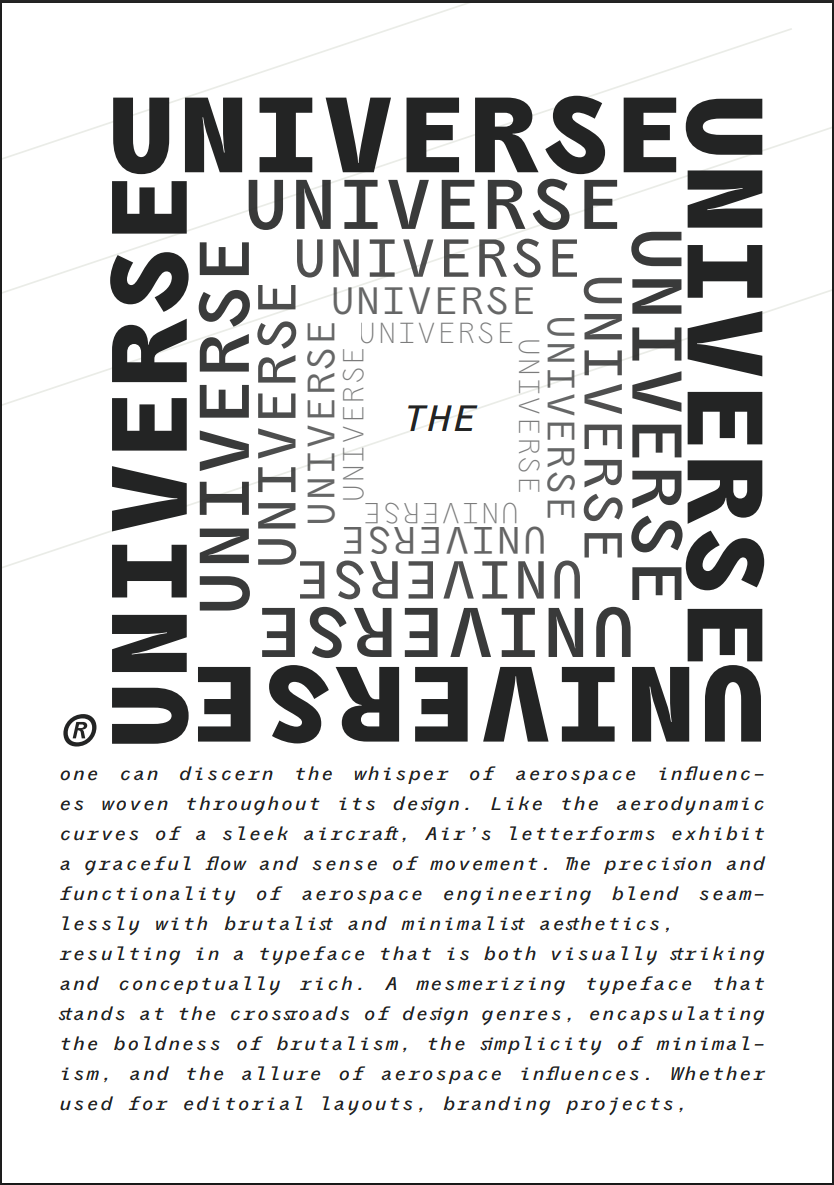
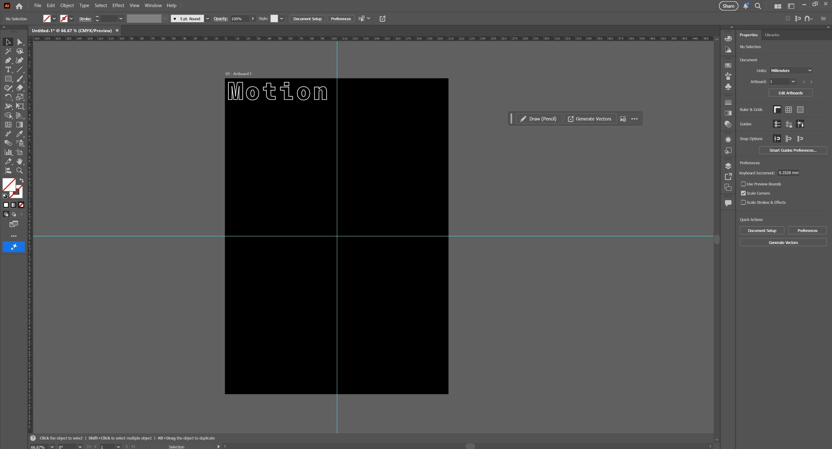
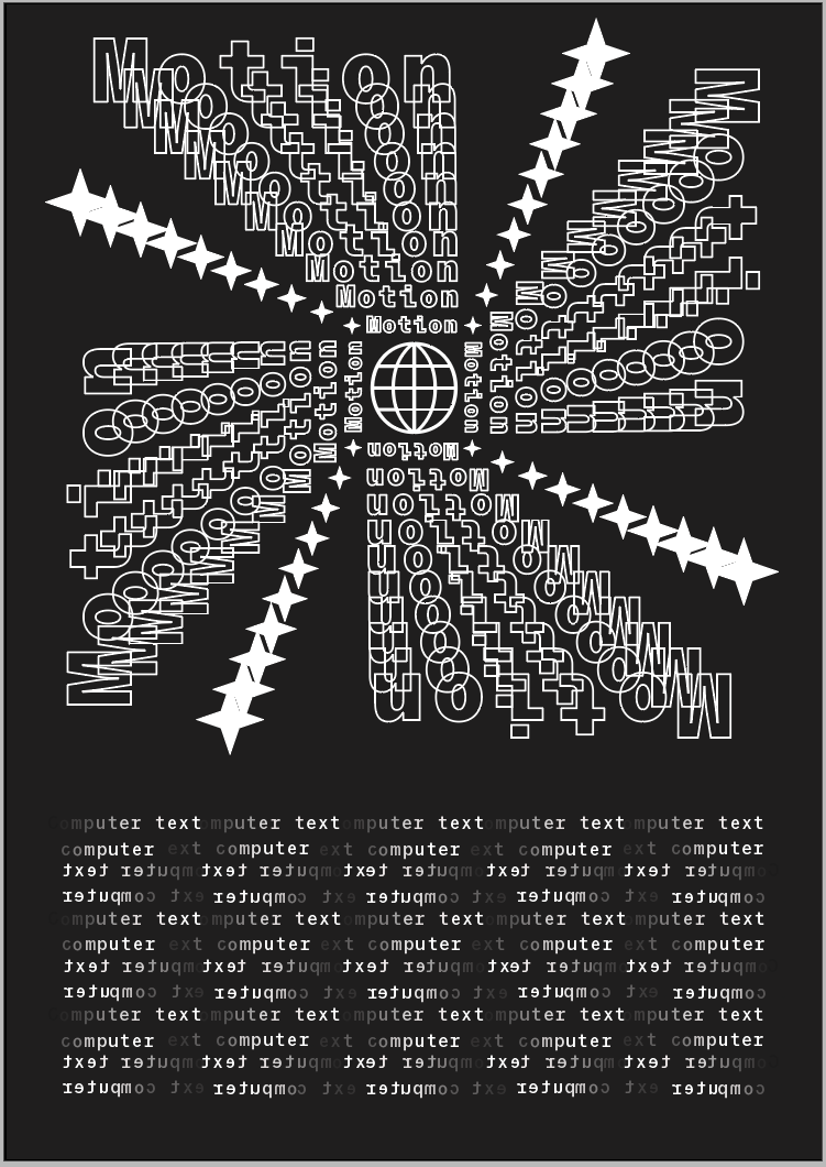
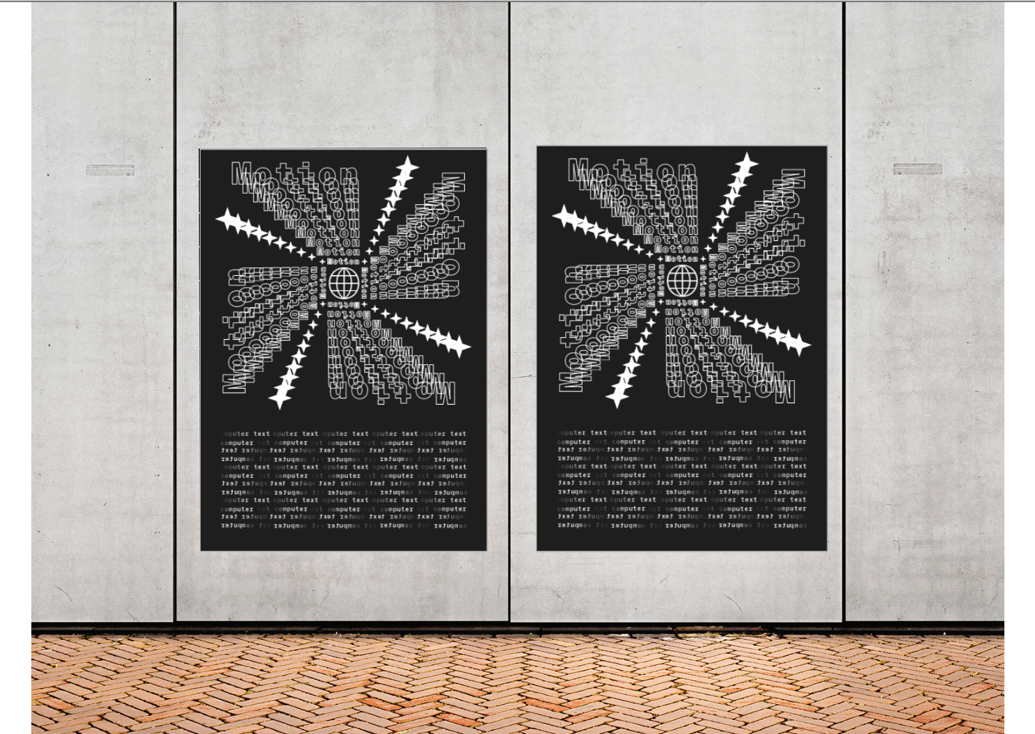
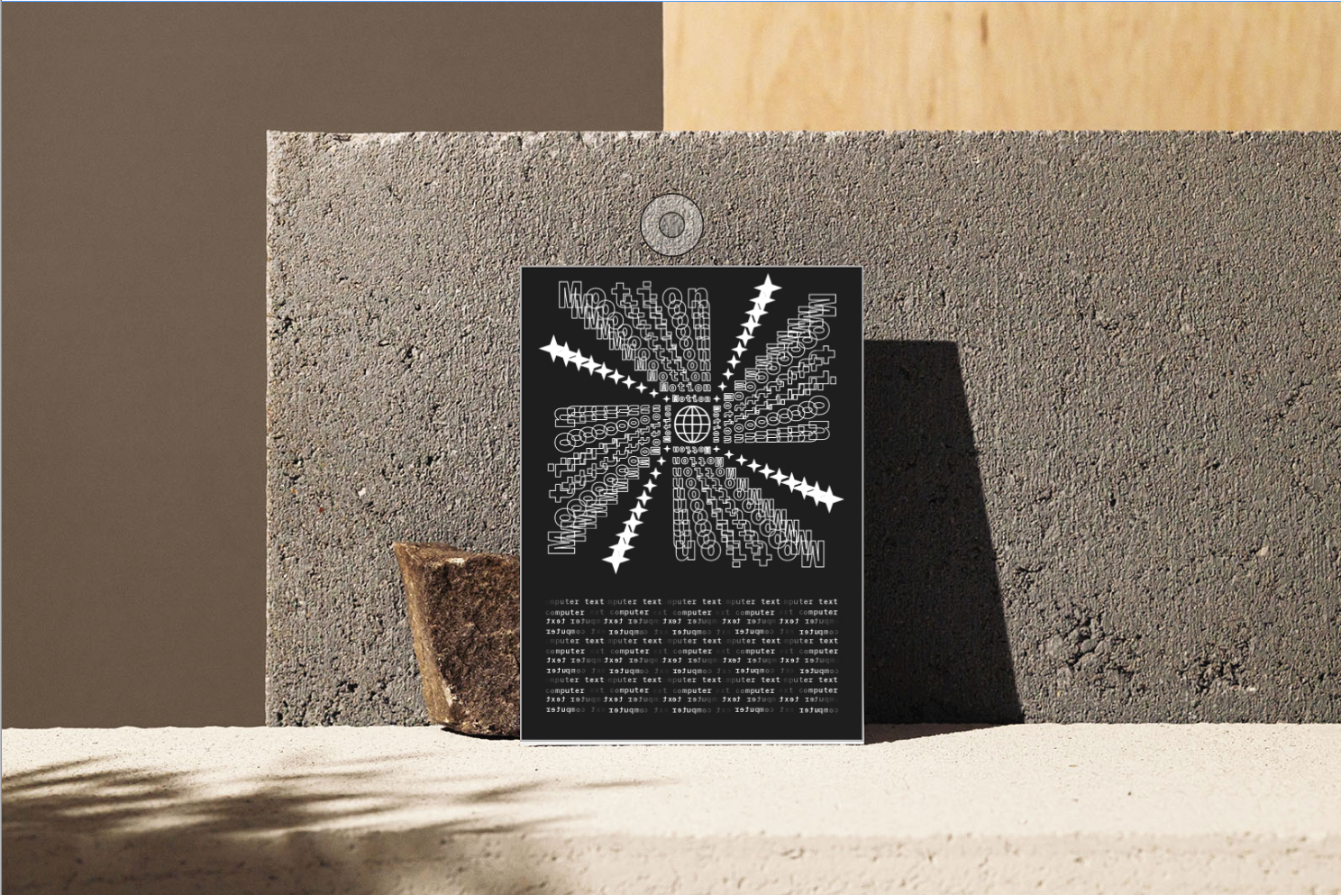
I am processing an expansion on my specimen document from the last module, i want to expand on my work. Take it to the next level of detail, i want to expand on the type itself see what fits, try and manipulate it, mold it into an illusion, similar to one of y pages with the words “Universe” it’s a spiral going down giving this looming feeling and perspective. I will do this as a poster that would be in a publication or magazine so i want to feature some mock ups after its finished. For this i am going to use illustrator and InDesign, so software will need to be up to date and some background simple knowledge.

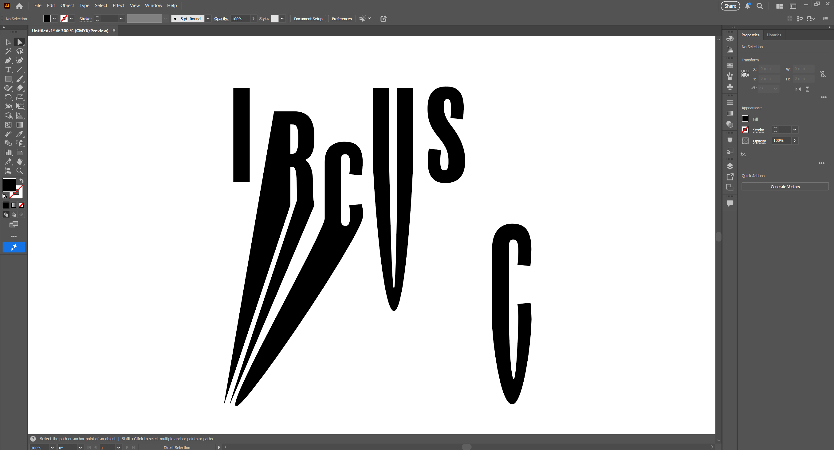
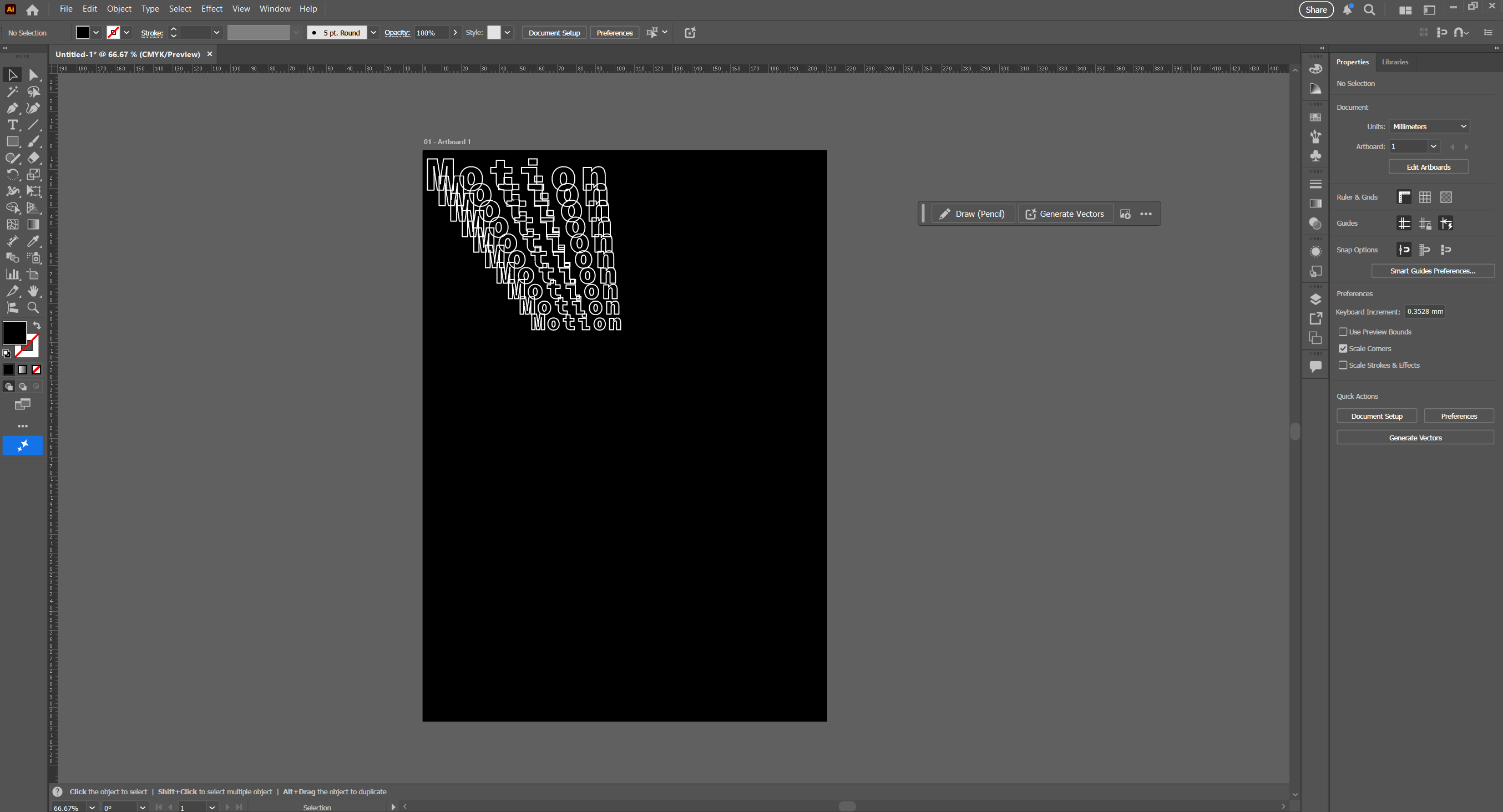
i started just testing out and playing around with the type trying to find out wat i can do with it, i tried transforming the text by warping and stretching it then i ad tis idea of pulling down the bottom half of the text but not distorting the image, i was able to do this but it only worked for a few letters and i couldn't really get round to doing a capital G for example so i left that idea and tried something else
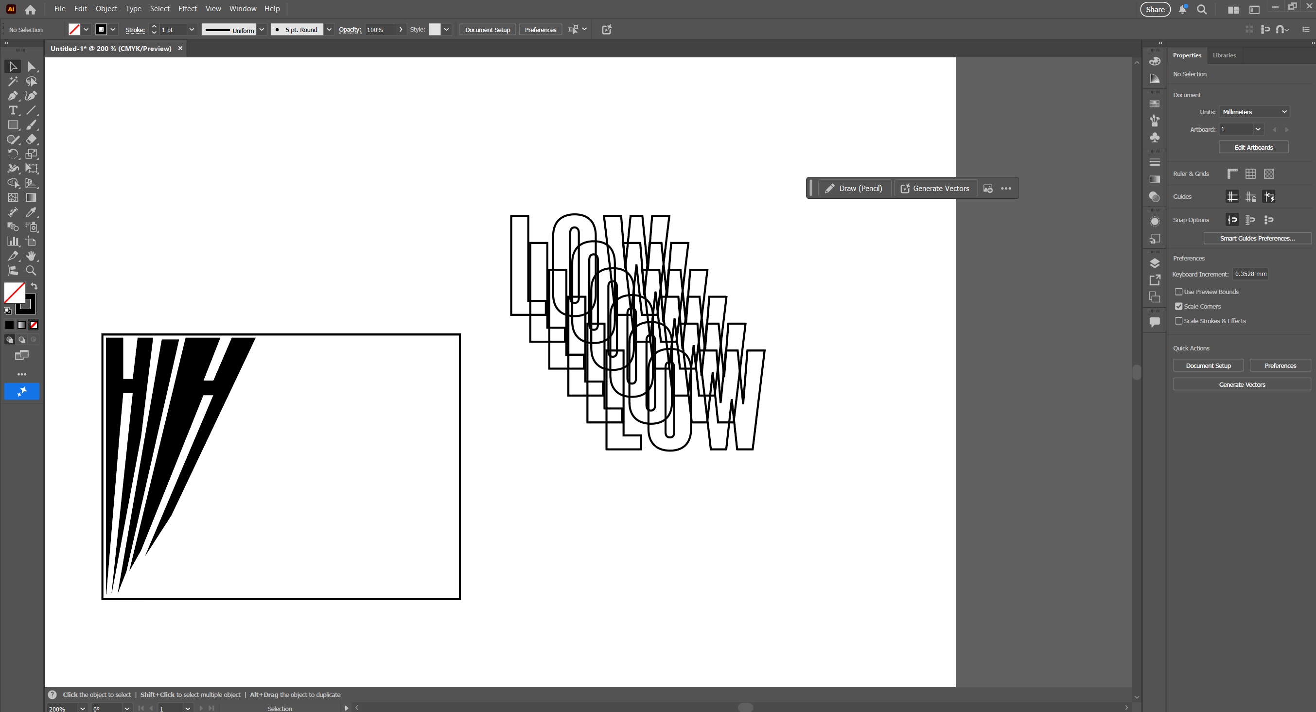
Next was boxing up the text then giving it a horizon line getting thinner and thinner but the H was to thick and the white bar was out of place so i had a new idea of creating a mirror transparent effect by layering the same word over and over again, this linked to my specimen document universe page and can work for the illusion so i stuck with that.
Next was trying to place the word i wanted tis spiral effect so i and to be carful were i place this letter, i got a smaller word to go underneath then highlighting both words i would click object at the top ten press blend, i would choose how many words there can be in the middle then see what it would look like.
i thought tis looked really good i can see the word clearly its not to close together and its not far apart for the illusion i can make out wat the word is as well which is a flow i don't want to have because it won't communicate well enough if its too hard to read.
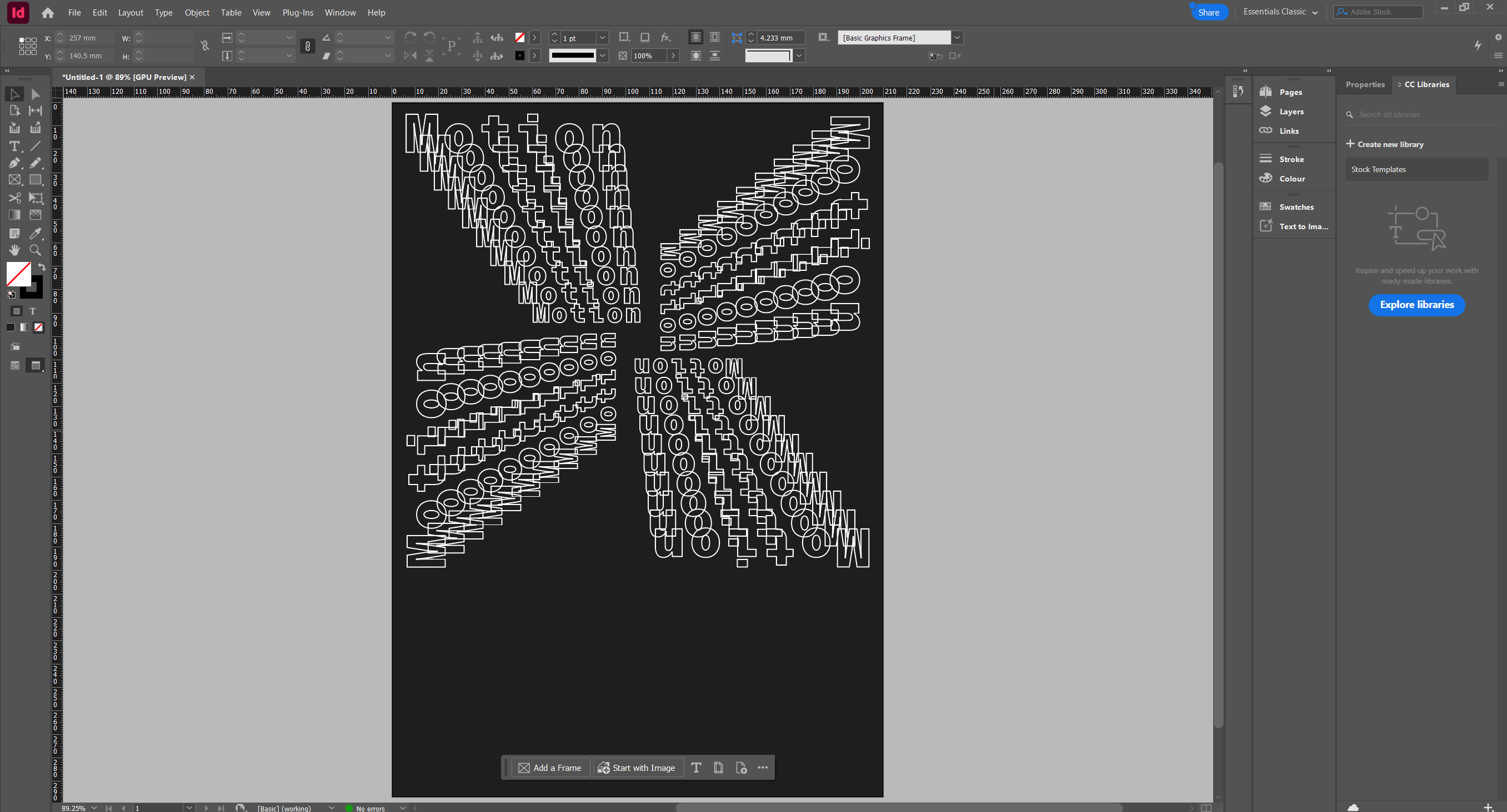
this is the first time seeing the four corners of the spiral down sequence, i turned it 90 degrees three times but it didn't look right, i wanted a perfect square in the middle without theses line gaps going between them so i started again.
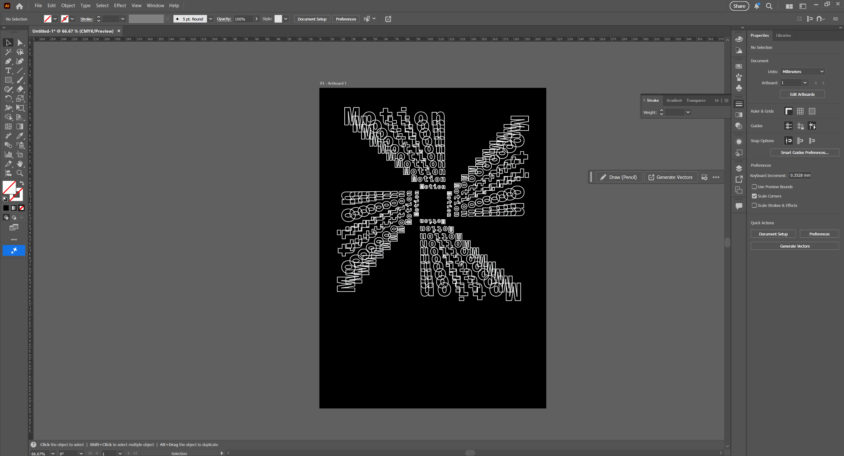
so i realigned the 2 words so they line up straight on the right side then blended it again rotated it again so I'm left with this and i really like this now its starting to pick up i just need to add some more text and glyphs if i need to.
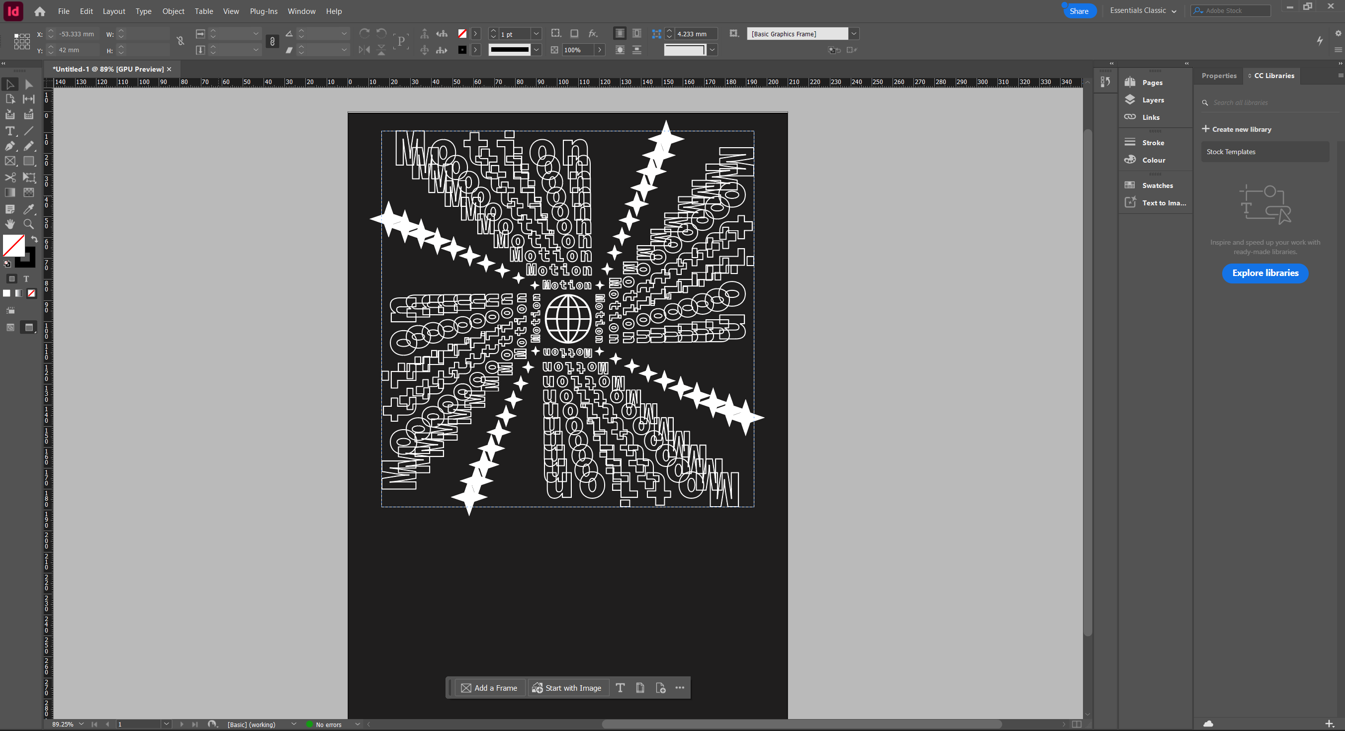
After that i added some more glyphs spiralling in the same direction creating this circle effect and i want to put some text down below so it looks like a magazine cover or page, i was thinking of a matrix style like the binary code trickle down like from the film. With this computer theme going on.
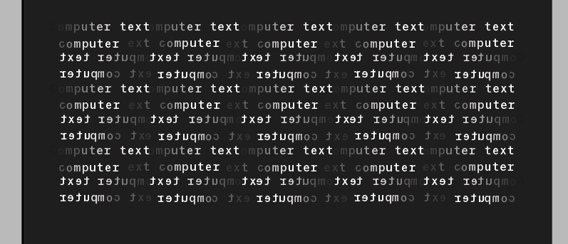
i didnt want to have the text going down didnt think it would look good so i did it horozontily, i had 2 words “computer text” and had to individually edit evey letter from darker to lighter then stack to the side, then i had an idea to reverse it so now it looks more wavey and i think it looks brillient. That combined with everything else creates a very nice peace of design that takes my previous work and make it grander.
Reflection:
technology plays a lot of parts in y work, mainly InDesign but illustrator is a close contender, i find it easier to do this sort of thing on computer but i do like a more hands on approach. the only limitations i have on my work is that i don't fully know everything yet, I'm still learning and i know i can do more. it took me a while to blend the 2 words to create a spiral and get a few ideas to stick with, i noticed you can do a lot more on illustrator when it comes to editing and manipulating text, i explored that because i couldn't do that on InDesign. i leant that half the fun is realising other ideas can be useful too, you don't have to stick to one specific route.