5.2 PROCESS DOCUMENT

This module has been really interesting and has made me think about how I work and how limited my use of technology has been in the past. It’s encouraged me to try out new tools and software to make my workflow more efficient. I’d gotten quite comfortable with the way I usually work, but this experience has started to change that. I don’t feel as nervous about using programs I’ve never tried before, even if I’m not great at them yet. It’s been fun discovering new ways of working, and I’ve also picked up skills in software that I’m looking forward to using in future projects.
WEEK 1 - Launch & Mini Brief
A Visual Framework
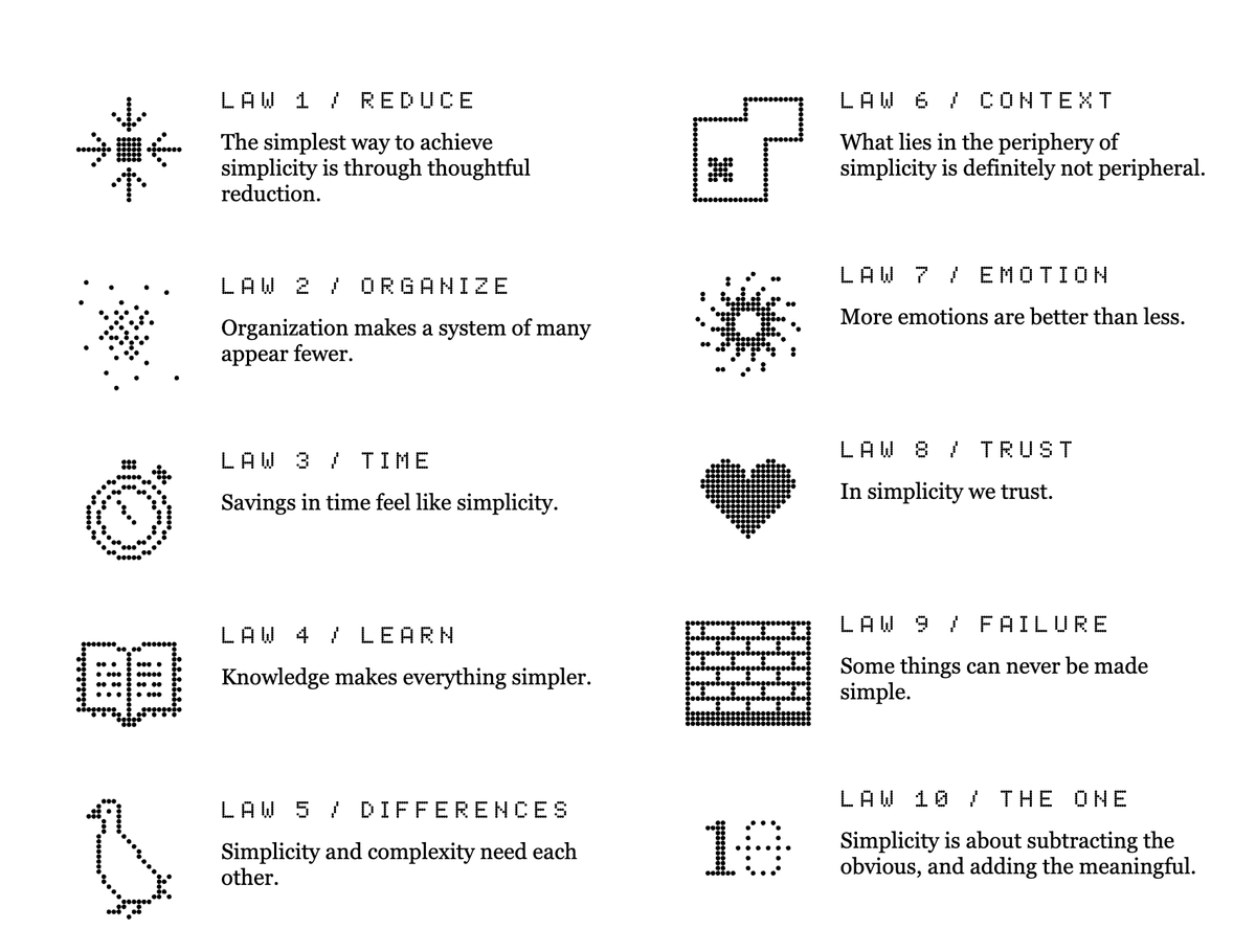
In the first week, we explored John Maeda's Laws of Simplicity and selected two to reflect our views on technology. I chose Difference and Emotion because they align with my approach to design. I appreciate tools that simplify tasks while maintaining a balance between simplicity and complexity, and I value emotional connections like personalisation, which make technology more engaging.
To explore these ideas, I created a mood board blending abstract visuals, vibrant colours, and expressive designs to represent these principles. Difference highlights contrasts and balance, while Emotion emphasises creating meaningful, personal connections. This exercise helped me see how design goes beyond function to inspire and engage on a deeper level.
Raising Neurodiversity Awareness in Public Spaces
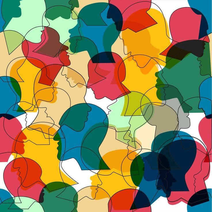
For this task, I focused on raising awareness of neurodiversity in public spaces, specifically the challenges neurodivergent individuals, like those with dyslexia, face in understanding way finding and advertisement signs. Inspired by campaigns such as the British Dyslexia Association's Awareness Campaign, Read the Signs by The Dyslexia Foundation, and Microsoft's Inclusive Design for Dyslexia, I explored how design can improve accessibility.
My blog uses chaotic typography to evoke the confusion and disorientation often experienced by neurodivergent individuals, highlighting the need for more inclusive design in everyday navigation.
WEEK 2 - Innovations
Reflective Exploration of Emerging Technologies

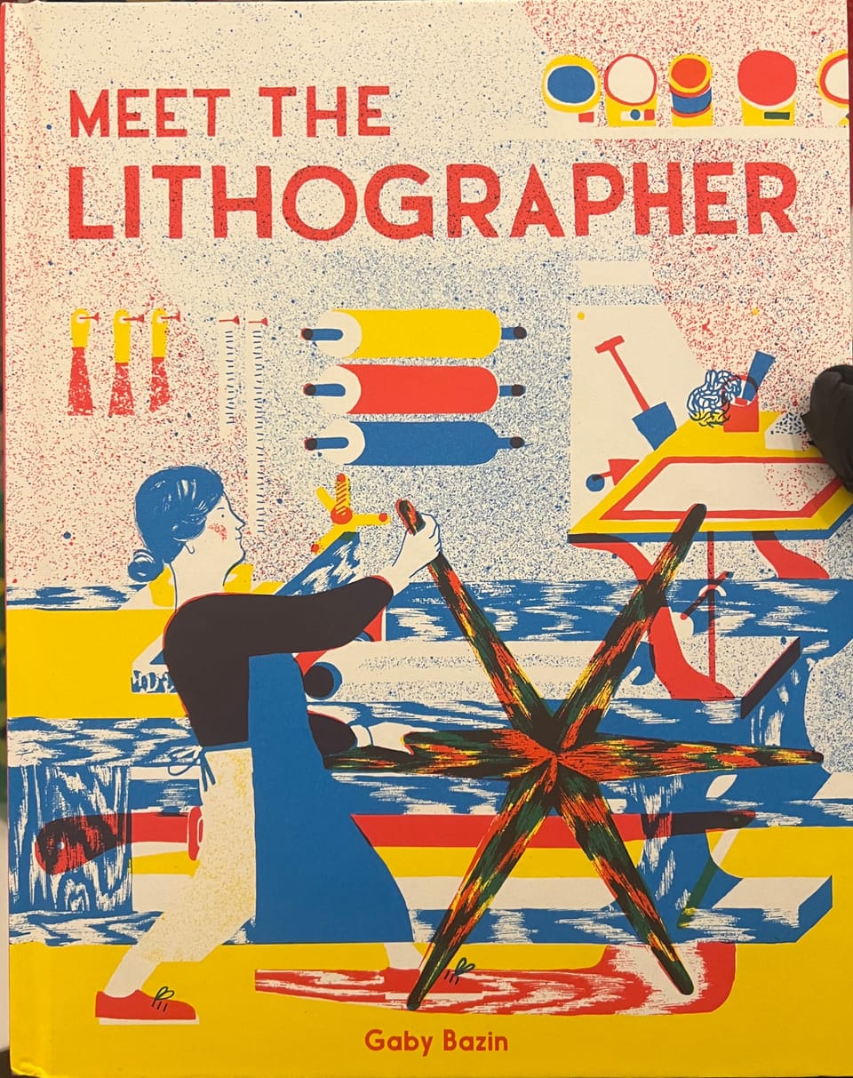
If I had known earlier, Photoshop’s AI tools could have helped me quickly explore unique design styles by generating visuals based on prompts related to the book’s themes. Similarly, Adobe Aero could have added an interactive layer, bringing the cover to life with animations or AR elements that reveal key aspects of the story, turning the design into an engaging and immersive experience for readers.
An Augmented Reality Intervention
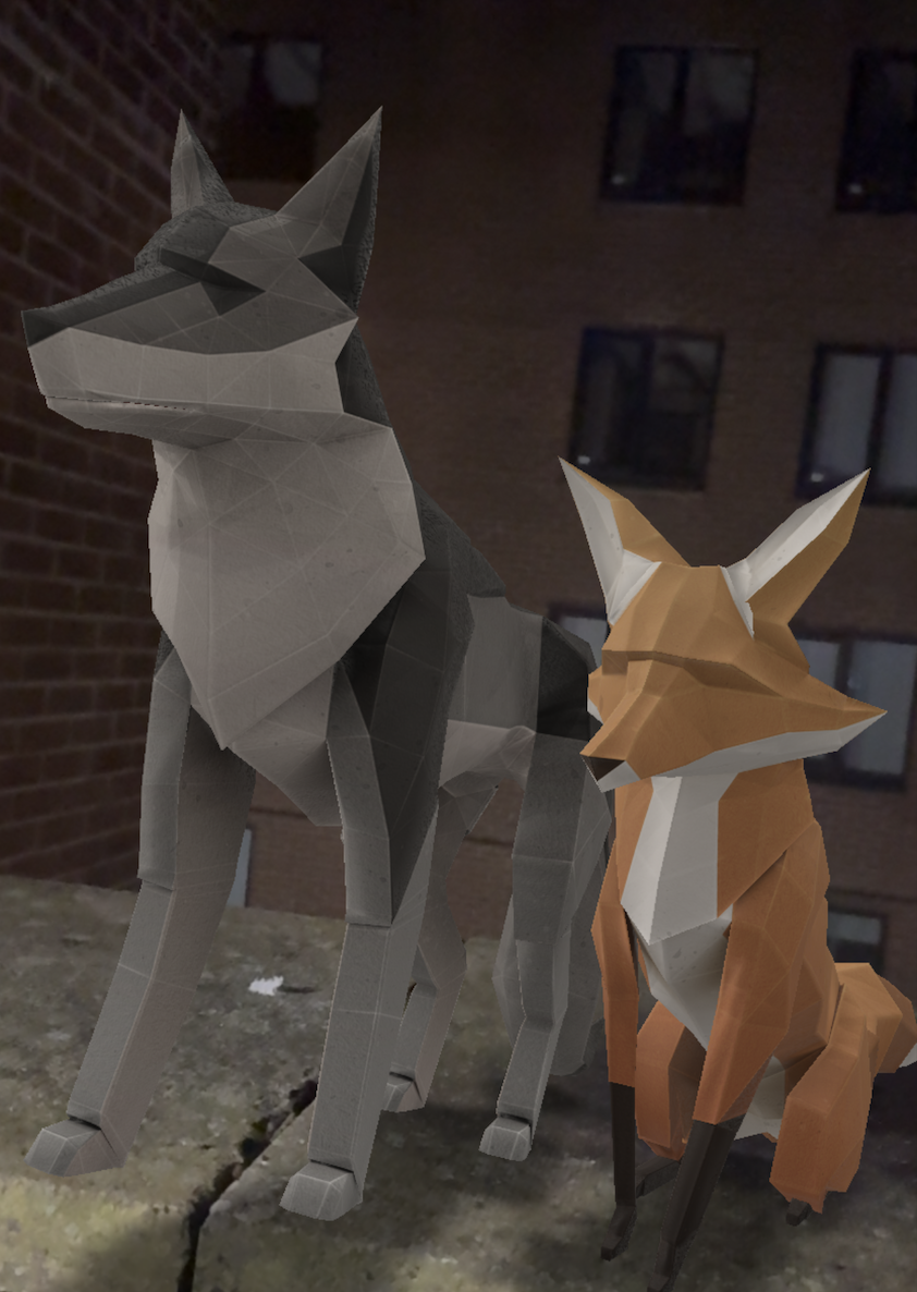
This really got me interested in what AR can do and how it can bring still images and artwork to life. Before this, I didn’t have much experience with it and mostly thought of it as something used for gaming, which I’ve now learned is actually Virtual or Mixed Reality (an extension of AR). After doing some research, I’ve discovered that AR has been used for so much more than just gaming, and people have created a variety of amazing projects with it.
I experimented with AR by creating a fox and wolf animation using Adobe Aero. Despite being in beta, the app is intuitive and makes animations feel incredibly real. It was an enjoyable experience that showed me how AR can transform static visuals into dynamic, interactive designs. I’m excited to explore its potential further.
WEEK 3 - Workflow
Experimental Cover Design
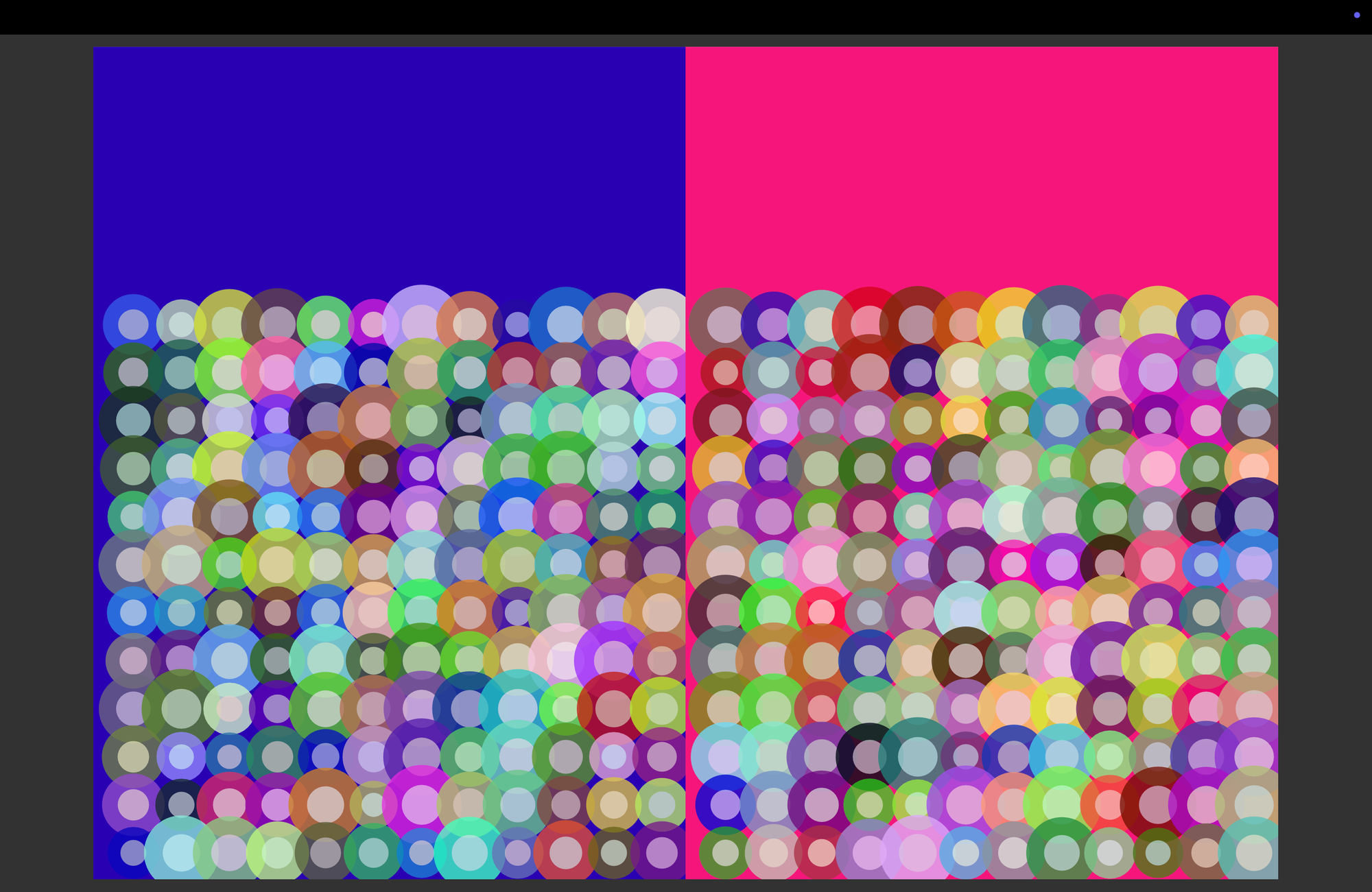
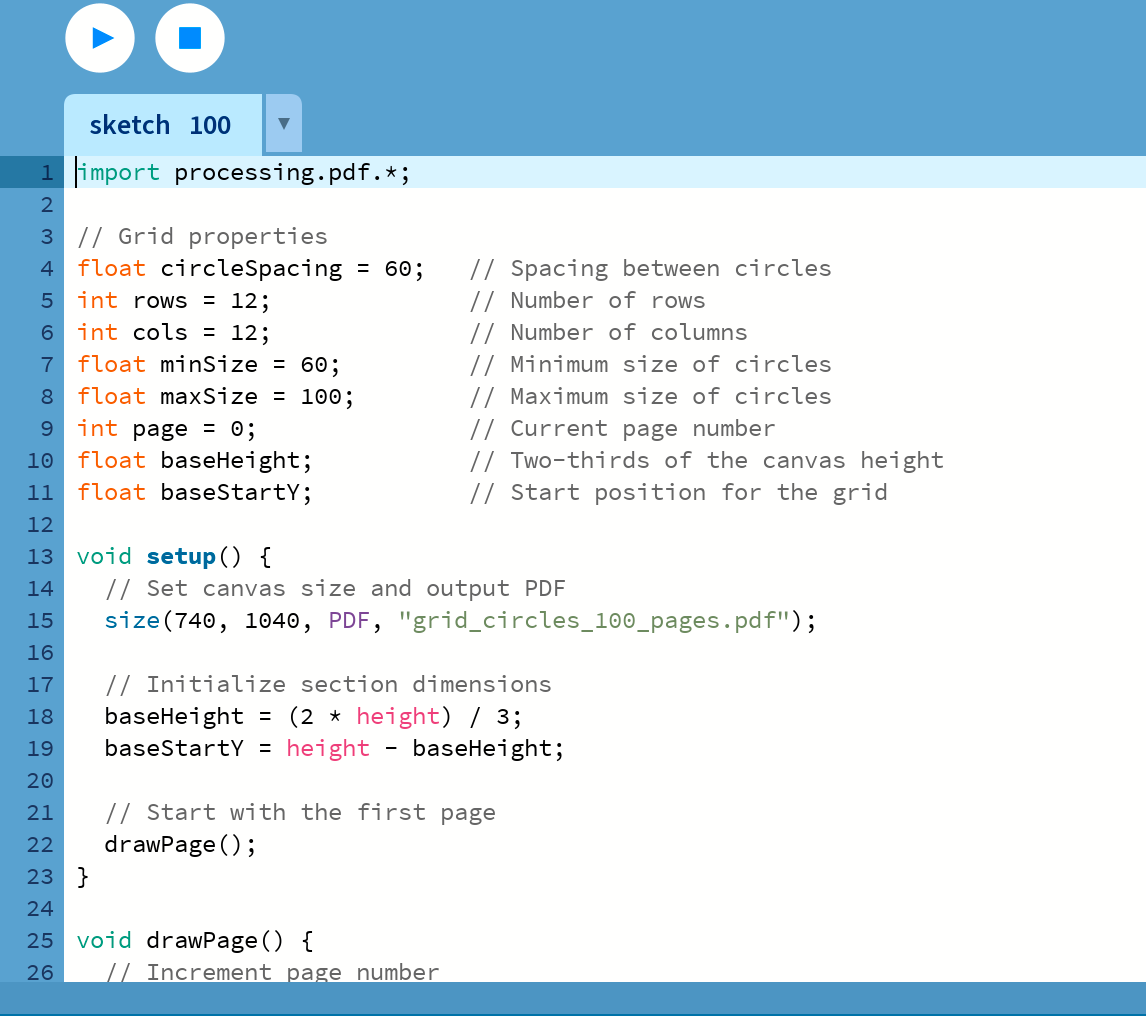
For this project, I used Processing.org to create a 100-page PDF filled with grid-based circle designs, with each page being unique. The goal was to explore generative design by combining a structured grid with random variations in size, colour, and layout. I was amazed by how efficiently Processing’s code can generate 100 random pages, as per the command, streamlining the process and allowing for quick iterations.
The grid was built using rows and columns, with circles spaced evenly. I introduced randomness in their sizes and colours to give each page a fresh, dynamic feel. Each circle consists of two layers: a larger outer circle and a smaller inner circle, both with randomly assigned colours. This layering effect added depth and complexity to the design, creating visually interesting results. The ease with which Processing executed these random variations truly showcased its power in handling large-scale generative design tasks.
Identifying Workflow Enhancements

By integrating Notion, Google Calendar, and Apple Notes into my workflow, I've enhanced my time management, task prioritisation, and design consistency. These tools have streamlined repetitive tasks, allowing me to focus on creativity while reducing the mental load of logistics. However, I recognise that balance is essential—tools should support, not replace, critical thinking and design development. Ultimately, these tools have empowered me to maintain an efficient workflow, balancing both my academic responsibilities and creative growth, which is crucial for my success as a graphic design student.
WEEK 4 - Production
6 × 6 Briefs
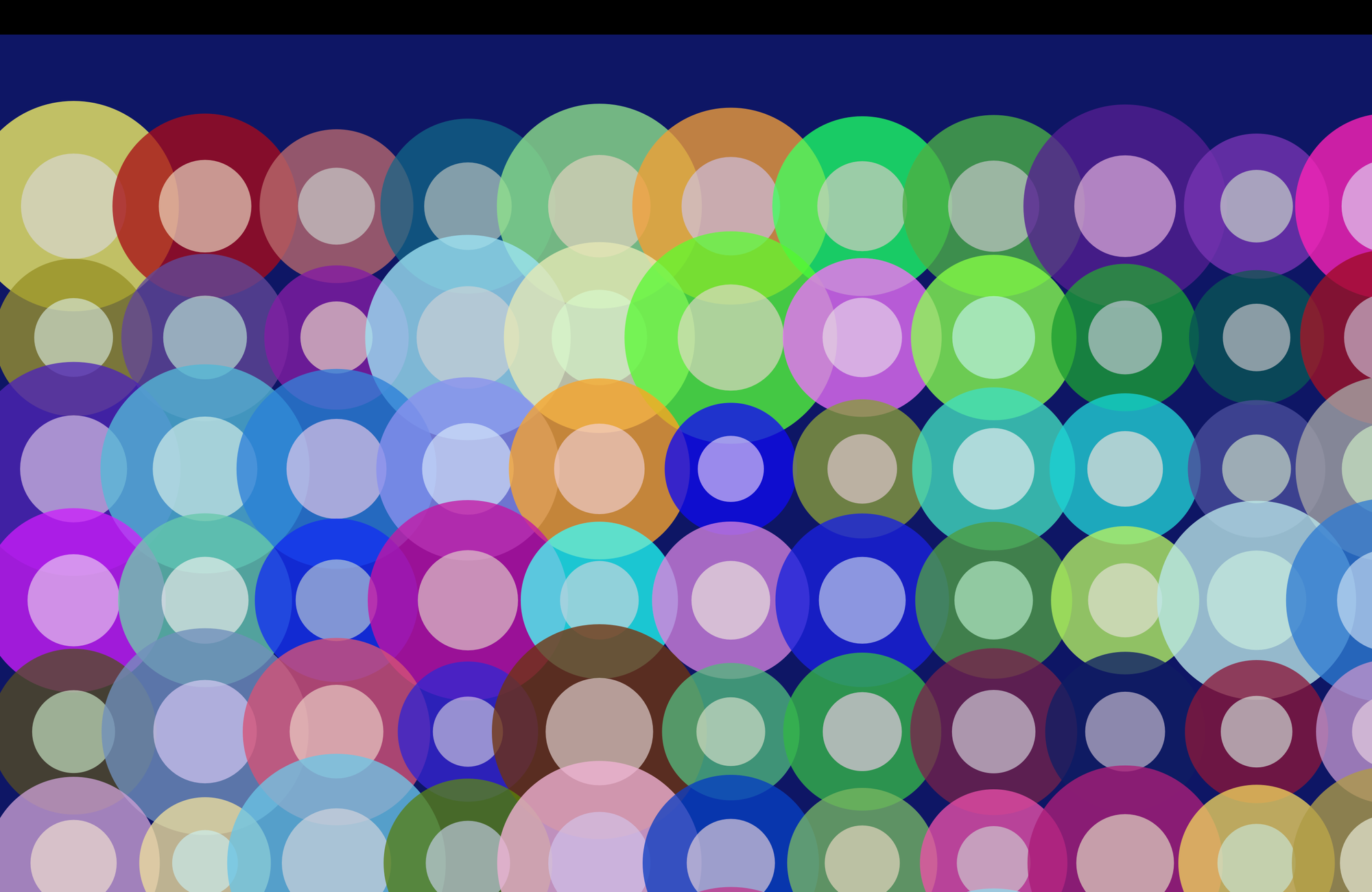
Generative art offers a unique way to explore overlooked details, encourage interaction, and create personalised experiences. For this project, I used Processing, an open-source creative coding platform, to design experimental covers with 100 unique generative grid patterns. As a first-time coder, I was amazed by how simple lines of code could produce endless dynamic visuals, blending creativity with logic and opening up exciting new design possibilities.
WEEK 5 - Distribution
Research Task: Brutalist Websites dot com
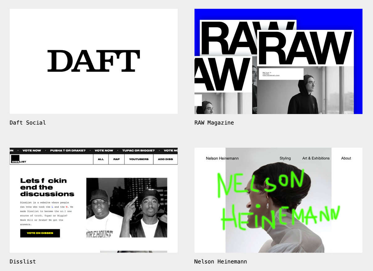
I admire the uniqueness of websites like PHUNK, Mariano Pascual, and Van Holtz Co. Each one presents a bold, experimental approach to design that pushes creative boundaries while showcasing individuality. PHUNK’s striking use of typography and abstract visuals, Mariano Pascual’s playful animations and vibrant gradients, and Van Holtz Co’s modern brutalism with geometric layouts all stand out for their ability to challenge traditional design norms. Despite their unconventional features, they maintain a distinct balance between creativity and functionality, which makes them captivating and engaging.
Custom CSS Theming
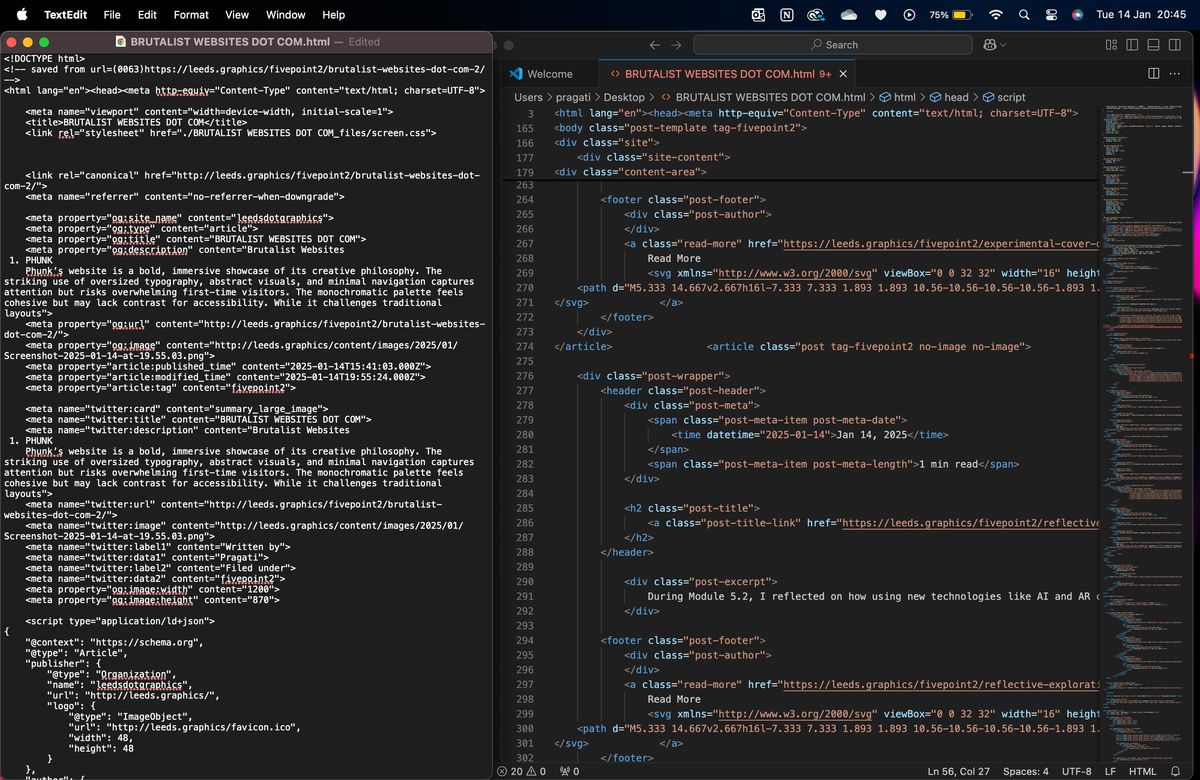
For this task, I uploaded screenshots of my Processing experiments to leeds.graphics site. It was my first time working with HTML and CSS, and while I couldn’t make major changes, I was excited to navigate the code in Chrome and see the results come together. Sharing my work felt like a meaningful achievement, and the experience gave me a greater appreciation for web design. I’m eager to keep learning and pushing my skills forward.
Reflection
I've really enjoyed how flexible this brief has been, as it allowed me to explore different ideas without feeling restricted. The blogs have been a fun way to share my work and express myself, without worrying too much about making everything "perfect."
Before this module, I had never tried coding, CSS, HTML, or even apps like Adobe Aero. Honestly, I was a bit intimidated by these tools, but I’m so happy I pushed myself to try them. Thanks to the guidance from my professor, I’ve been able to explore these technologies and gain confidence in using them. It’s made me realise just how much I’m capable of, and I’m incredibly proud of how far I’ve come.
This experience has also shown me a whole new side of graphic design. I now feel much more confident in my abilities and more excited to keep learning and growing as a designer. Exploring tools beyond Adobe programs has been eye-opening, and while some are still developing, it’s exciting to think about how they’ll evolve and how I can incorporate them into my future projects.
