5.2 - Mini brief 1 - Is it too loud?
To begin our module on technologies we were given a mini brief to create a campaign that raises awareness about neurodiversity in public spaces. We had to find a way to see how public spaces could be more inclusive and/ or safe.
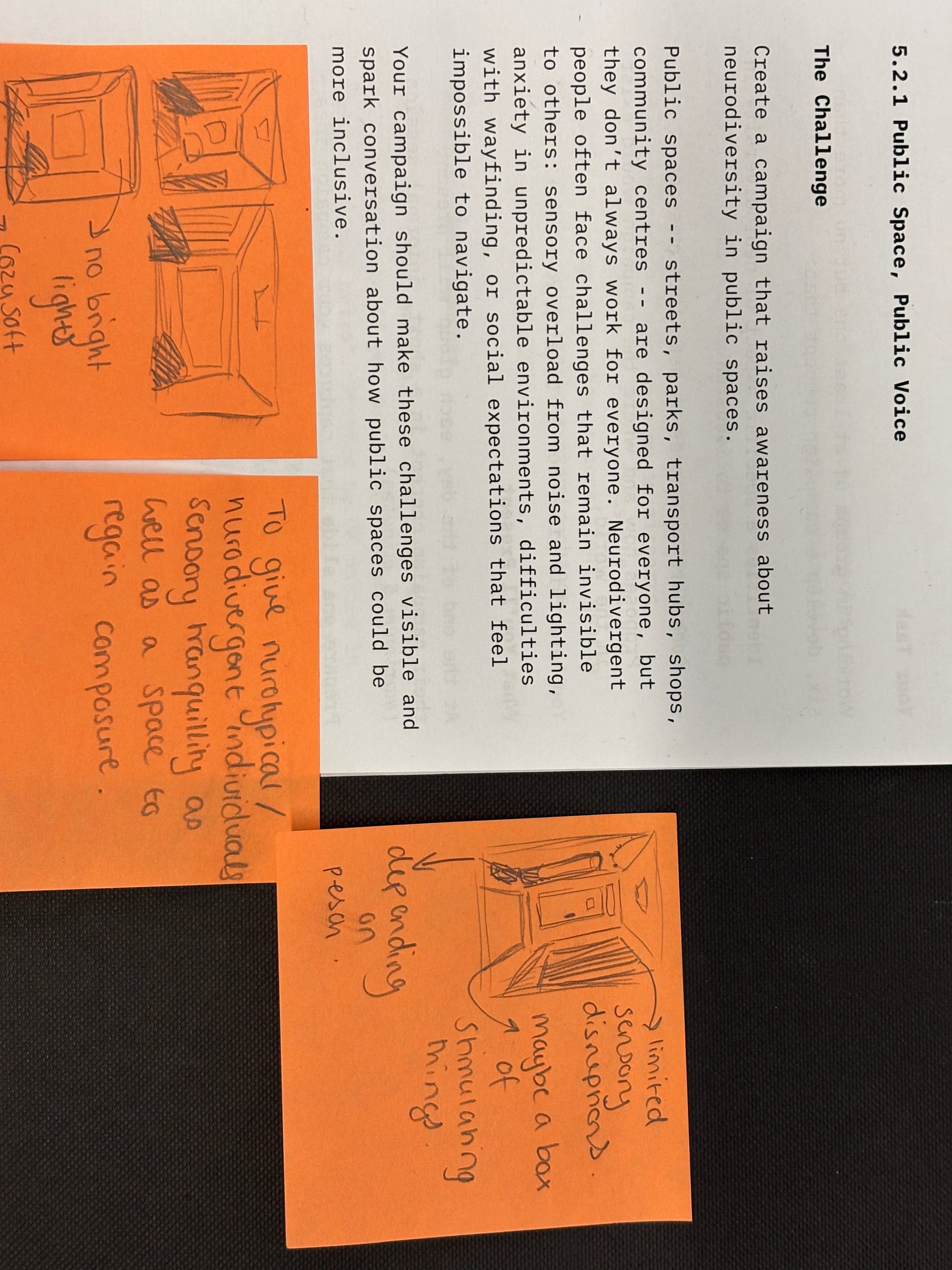
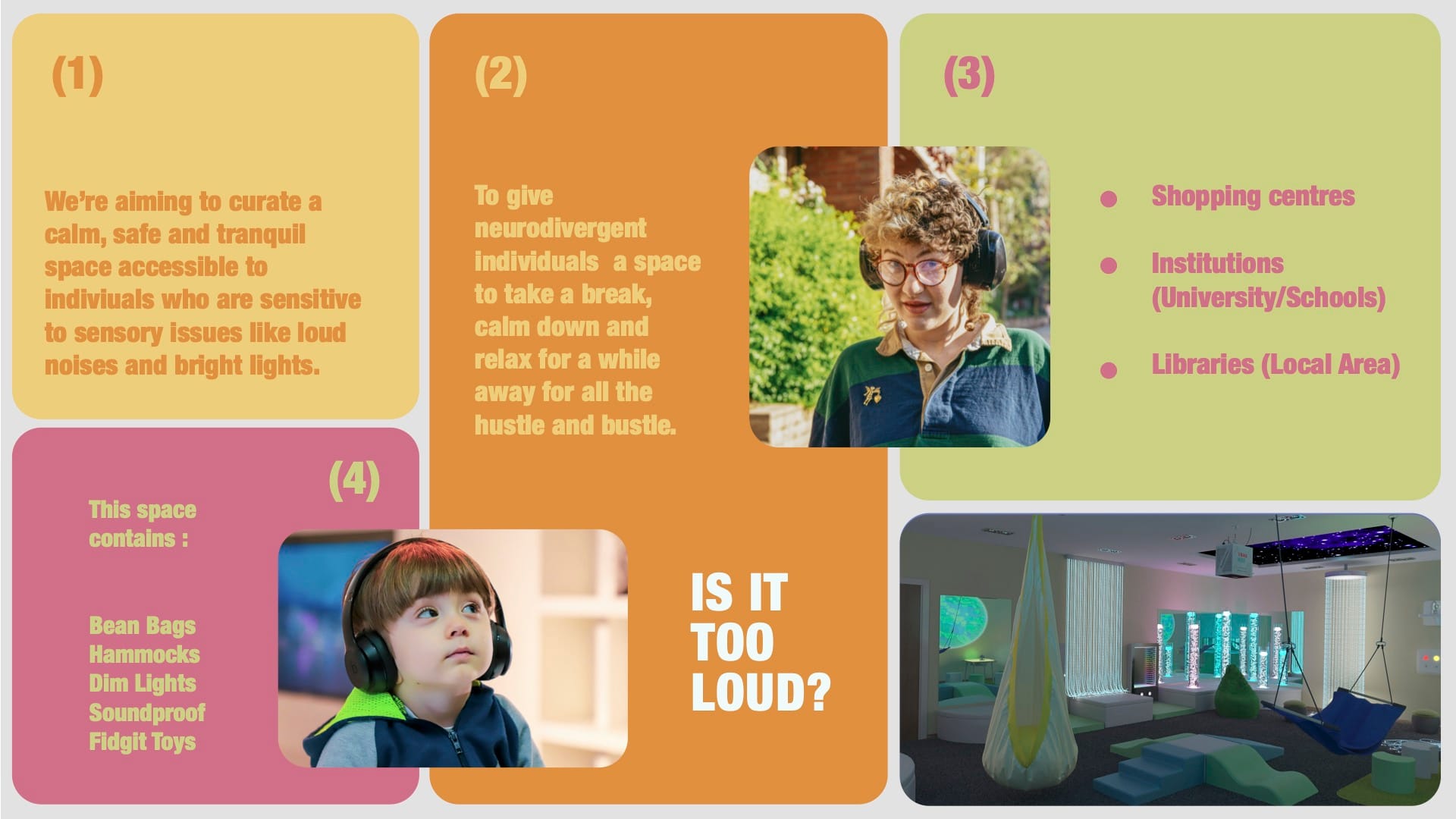
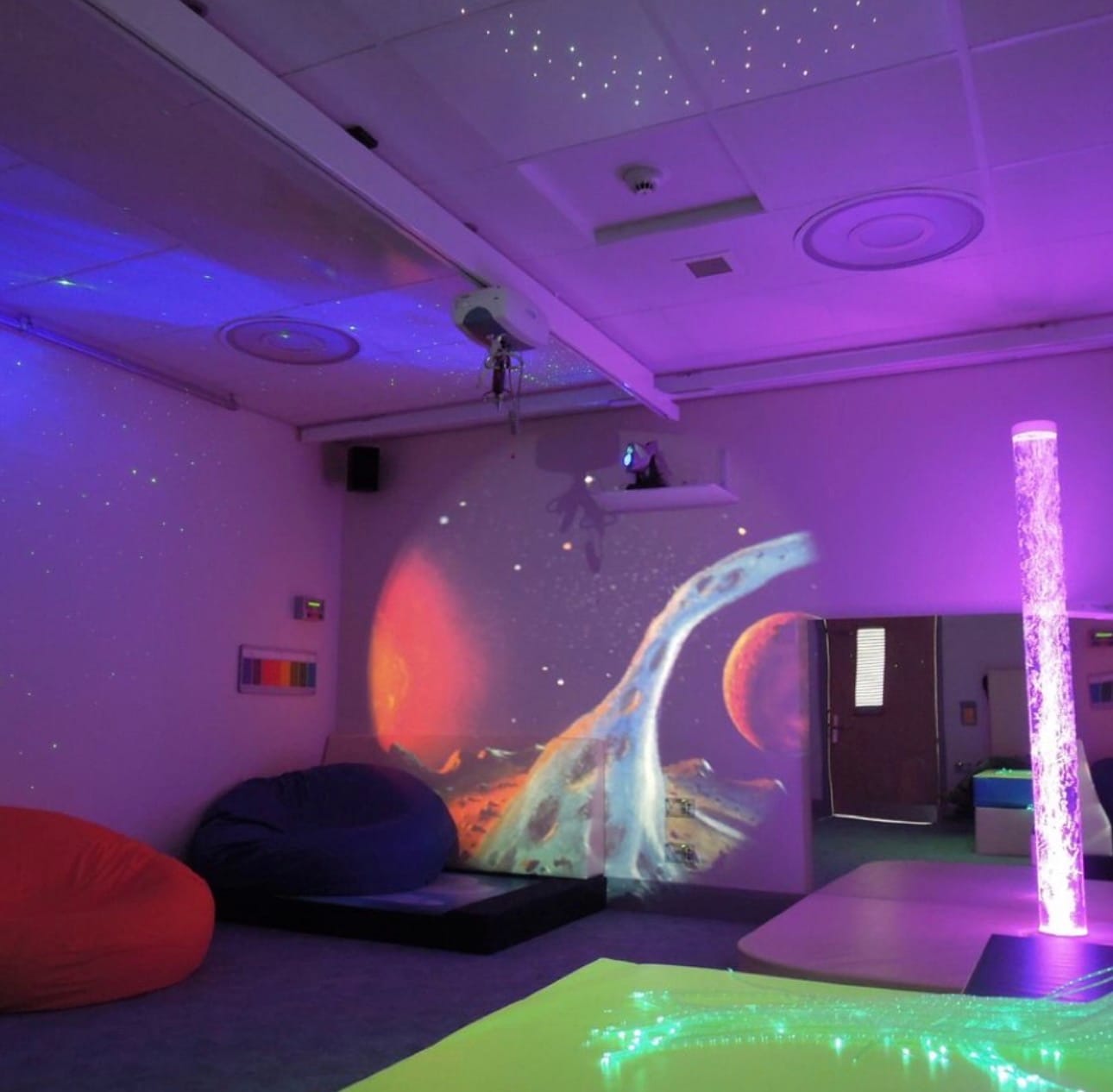
For my initial ideas I initially thought of a quiet room/ safe space for those who need it in a public area. Our group stuck to a younger age demographic as it seemed that the already idea of quiet rooms/ sensory rooms were severally lacking most likely due to funding. This was only a 'fake' brief and we had 'unlimited funds' in this instance so we didn't have to consider that. We considered things like locations that we could have these sensory rooms in like Shopping centres, Institutions (University/Schools) and Libraries in local areas. We also looked into what we could include in these spaces like bean bags, hammocks, dim lights, soundproofing in the walls and doors as well as fidget toys.
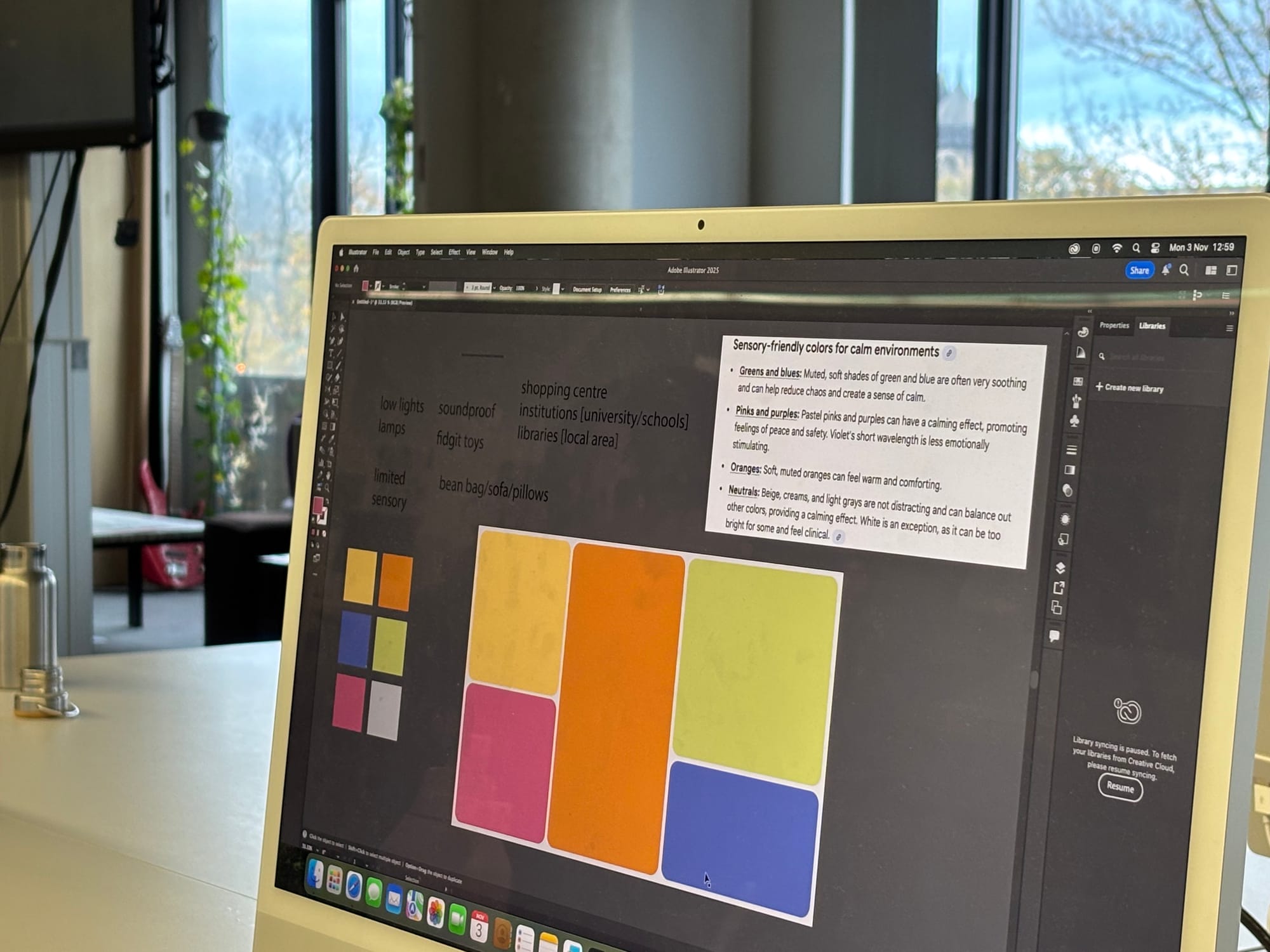
We took the symbol for the main neurodiversity logo and used those colours for the campaign and the one slide; that being the rainbow infinity symbol, which represents the diversity of human brains and the lifelong nature of neurodivergent conditions. The rainbow colors signify pride and the inclusion of all neurodivergent people, including those with autism, ADHD, and dyslexia. Instead of using the original colours we decided to lessen them to not only take away from the overstimulation as well as to have an appeal to our demographic. The color orange positively symbolizes enthusiasm, creativity, and warmth, often evoking feelings of joy, happiness, and optimism. It can also represent adventure, social interaction, and energy, and is sometimes associated with affordability, self-confidence, and good health. The colour yellow positively symbolises happiness, joy, warmth, and optimism. It is also associated with creativity, energy, intellect, and hope. The colour green has positive meanings including nature, growth, and renewal, due to its association with the natural world. It also symbolises health, harmony, and balance, and is psychologically calming, creating a sense of peace and safety. The colour pink is positively associated with love, romance, compassion, and nurturing, as well as feelings of calm, warmth, and hope. It is also linked to innocence, sweetness, and femininity. In a more physical sense, pink can signify good health and has been shown in some studies to have a calming effect on the nervous system.
For the making of the campaign itself we used a mixture of things when collaborating, those included things like pen and paper for the rough idea generation, phones for research as well as the Mac to actually create the slide to throw all of our ideas into. Looking at it on a deeper level we used things like indesign and google specifically to research and create. Now, we decided on those applications specifically as obviously google is a popular search engine – one that everyone uses and in-design is primarily used to design publications, typeset and things long those lines; so it was good in this situation.
We mainly just bounced off of each other with back and forth ideas. We all contributed to everything and I'd say we all understood it to some degree. We did a lot of discussing how, where and in what scenario these rooms would be in. I did a lot of sketches to visualise how it would look and as well as that we tried honed in on specifics. We wanted to try and promote this idea of a safe and calming environment within public spaces – out and about. I do think that I could've personally gone into more research aside from my personal experiences but it went relatively okay. It felt like It was missing things would be the main point. In the end I think I liked the general idea of our campaign.