5.2.5 Research Task: Brutalist Websites dot com
WEBSITE 1 - https://cristinamalcorra.com

I have chosen this website from the collection as I find it very visually appealing. Not only is the layout and presentation of her work spot on, it is also interactive. When you scroll down the page, your mouse changes with a different title of what this piece of work was from. A dotted trail also follows your mouse movement. This really enhances the website and is a fun way to show the artists talent and achievements. However, I do feel that the website should have more information about the artist included, as there is only one sentence given. Perhaps an "about" tab at the top would improve the websites use/ efficiency. After googling "Traditional web design principles", I do believe that this website aligns with a lot of the principles. The images chosen in the website are selective, making the website easy to follow and clean. The layout and order of the website is logical with a simple structure and a nice amount of white space included. The website definitely achieves its purpose of promoting the designers work and ability.
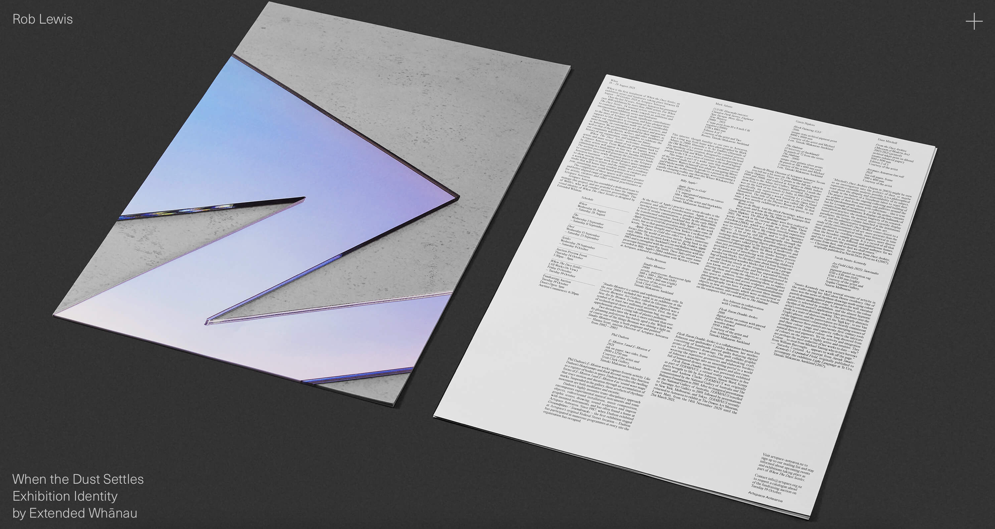
WEBSITE 2 - https://www.roblewis.design

Here is another website, advertising another designers work. I have chosen this as despite it's aesthetically appealing appearance, I found the website to be quite problematic. Unlike the previous website, to move through the site you can not scroll down. I spent a while trying to figure out how to see the rest of the site and images, as it is not clear (no arrow buttons or direction). I eventually figured out that you have to use your mouse to click on the side edges off the site to move on. This is not clear and is definitely a big design flaw for the customers, as the most important web design principle is function. However, despite this the websites aesthetics look very clean and effective. The information is easy to read, as a simple sans serif font has been used.
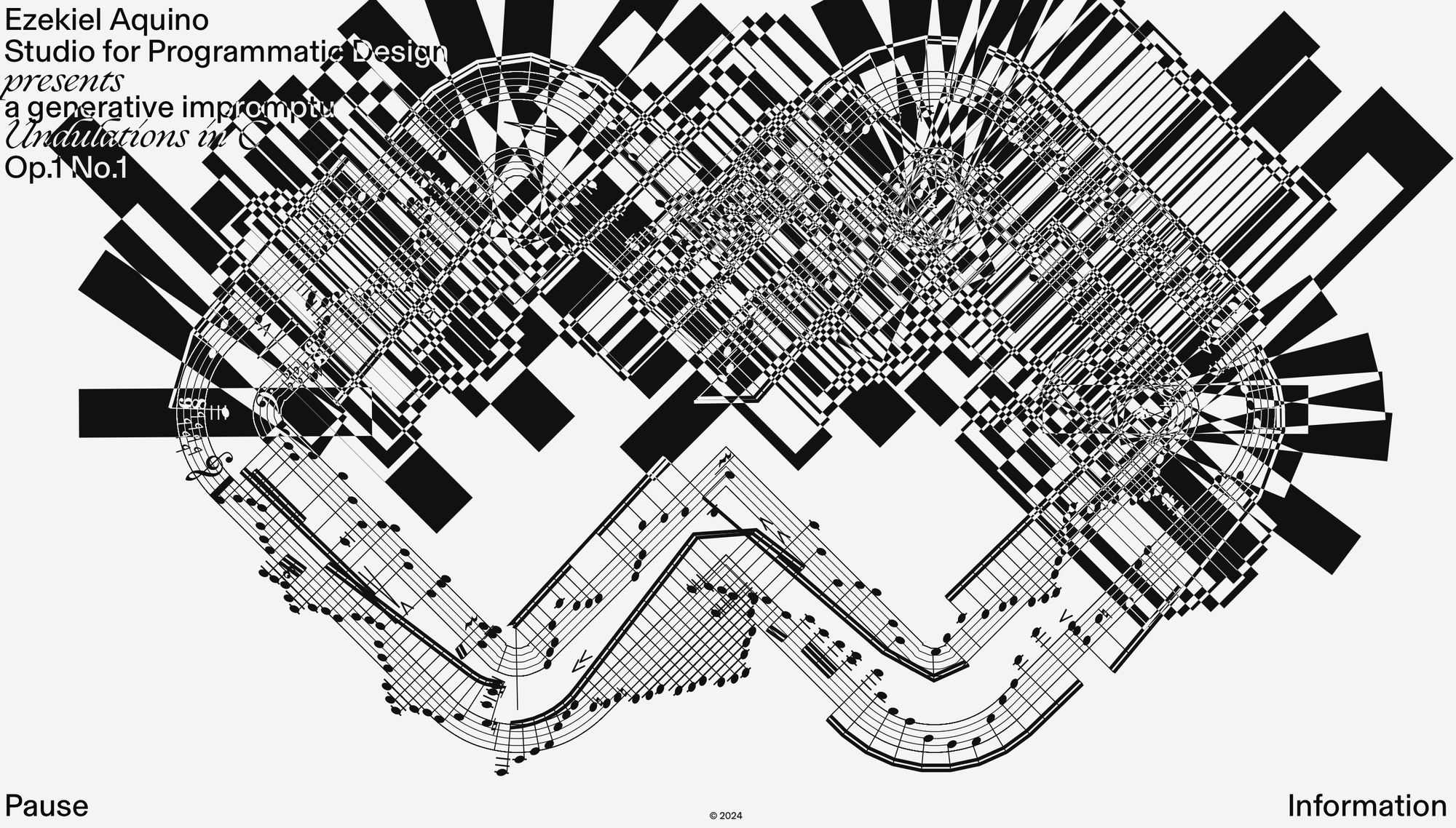
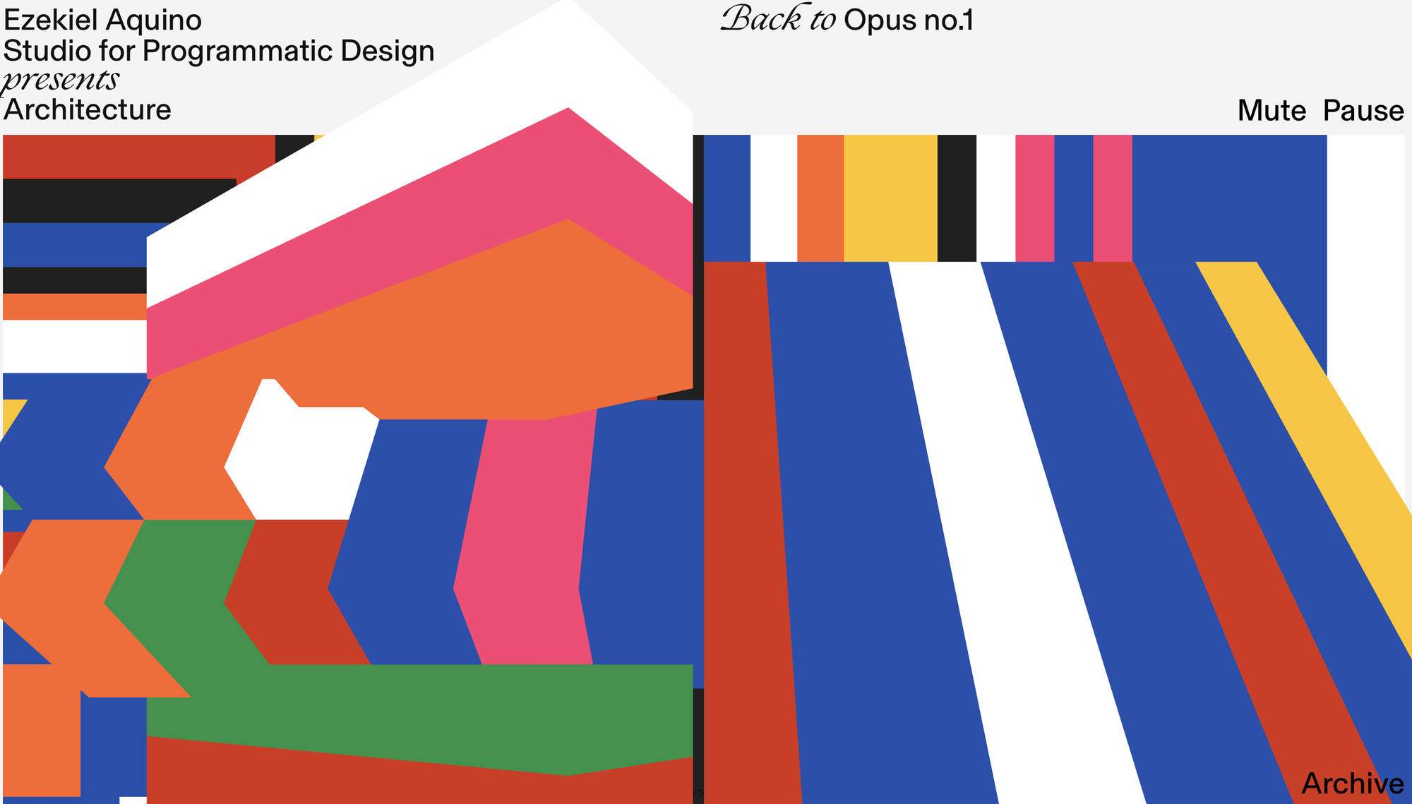
WEBSITE 3 - https://ezekielaquino.com


This website is for a studio that specialises in programmatic design. I love how well their website represents their work and creativeness. I have chosen this website as I was taken back and amazed by how unique it is. It contains multiple moving animations and designs. It incorporates different shapes, colours and even sound, so definitely turn your volume up when visiting this website to get the full experience. Even though this isn't your typical, simplistic, organised website, you can see and feel the emotion within it. Emotion is a law that I previously chose in week 1, which I believe is important when it comes to design and technology. I believe that this website challenges traditional web design principles, but in a good and exciting way. To improve this website, I think they could potentially add more information, or even move the information they have into a clearer place.
After analysing these websites, I have really learnt what is and isn't effective when it comes to websites and the hierarchy of importance in which it should follow to be successful. I really loved how a few of these websites incorporated interactive elements as it definitely helps the audience engage more with the website.
