5.2.5 Research task: Brutalist websites dot com.
The three websites I chose to research were temporarymark.com, phunkstudio.com, and spin.co.uk.
Temporary Mark
My overall impression of the website is that it has a minimalist design, the overall feel is that it is very clean and neat, with interesting features such as the scrolling images and text. The scrolling text works well as it is interactive however the text is harder to read with ease. It aligns with traditional web design with the menu icon and logo in the top corners of the screen. The thumbnails of the clothing also aligns to traditional web design however the horizontal layout subverts these design principles.

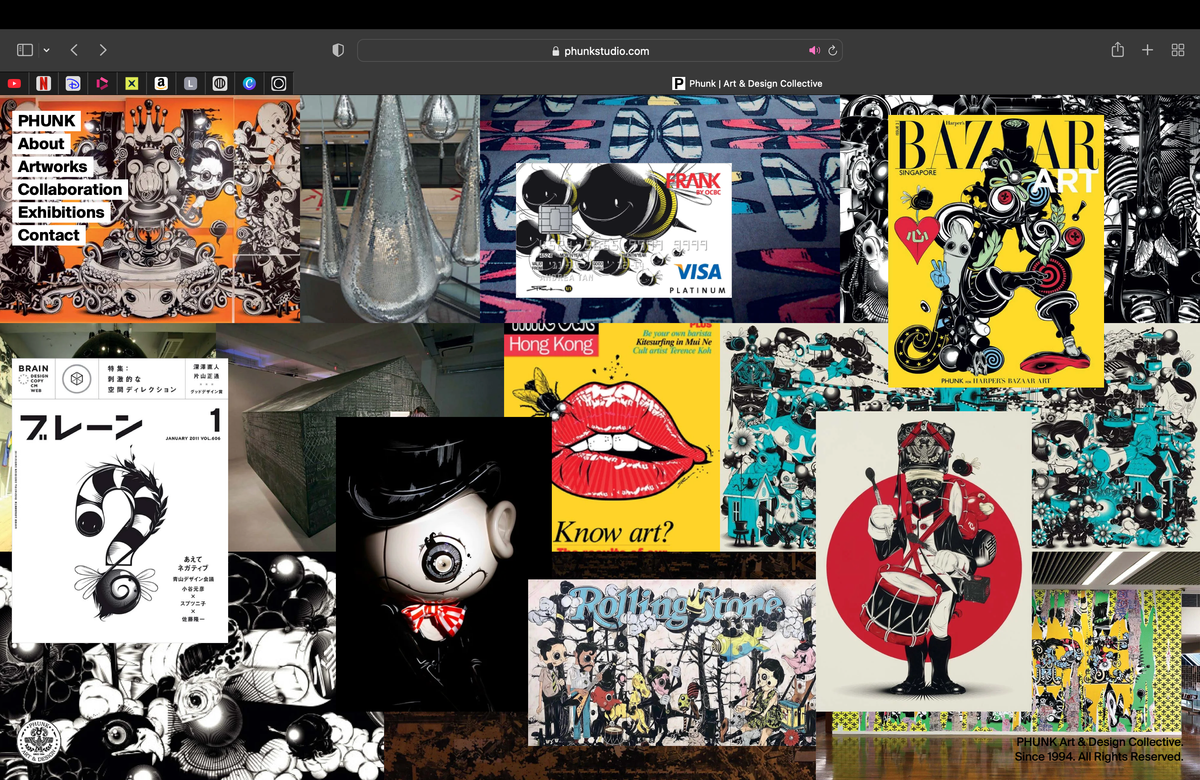
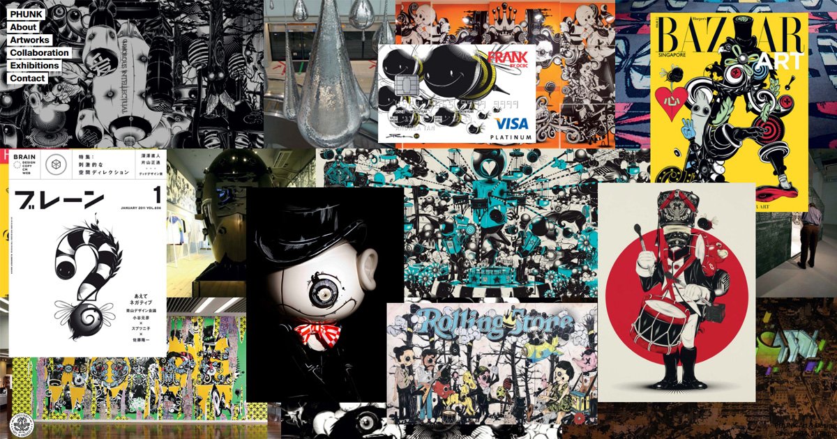
Phunk
The Phunk website is visually engaging with the animation of the 'PHUNK' page collage when you first open the website, this is unconventional for traditional web design. The simplicity of the other pages juxtaposes the more chaotic home page, keeping the audience interested while also letting them read the text without distruption. Although the collage is visually interesting, it makes it harder to see the artwork fully, and different artworks take away from other ones, leaving certain ones ignored. The website menus are conventional for traditional web design.
SPIN Studio
My impression of the web page is that it is visually stimulating with lots of images and animations, this works well as it is engaging for the audience, I personally like the movement of the home page, relating to the website name 'SPIN'. The unconventional motion of the website, for example horizontal scrolling, could be hard for users to navigate. The lack of copy text also makes the website lack context.