5.2.5 Research Task - Brutalist Websites Dot Com

56 Digital
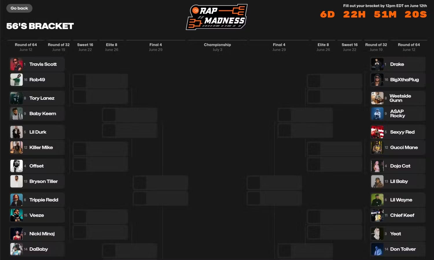
The 56 Digital website embraces brutalist design with bold typography and its hugely unconventional layout. However, the design feels disjointed, it noticeably lacks hierarchy and has minimal navigation tools making it hard for users to locate information efficiently. The heavy emphasis on the brutalist aesthetics sacrifices functionality, visitors who expect clarity and usability may be unimpressed by this design choice. Its overall design prioritizes style over substance. The approach challenges traditional web design principles but risks being more frustrating than engaging for those seeking a seamless user experience.

Take a Walk on the Wild Side
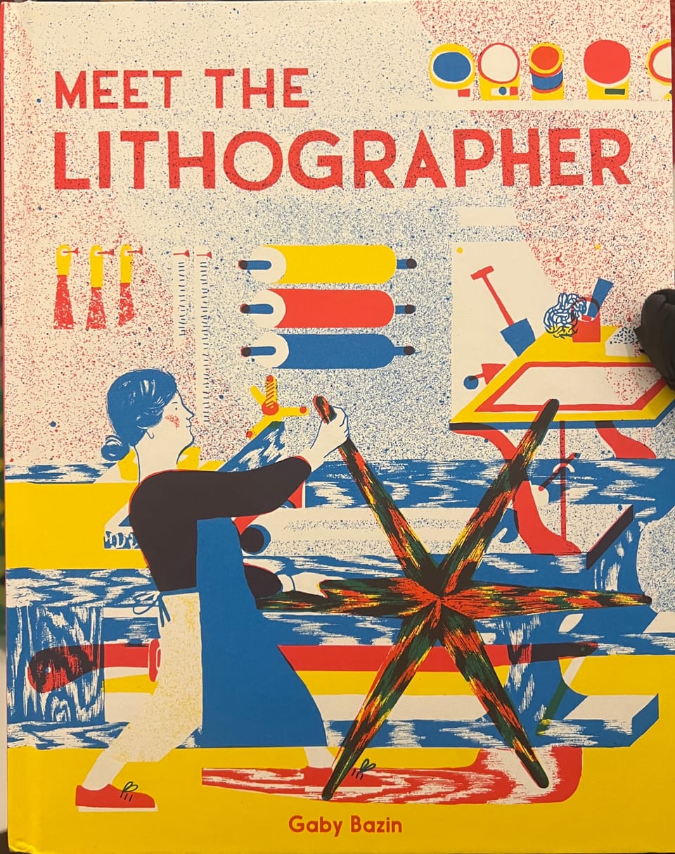
The website Take a Walk on the Wild Side embraces brutalist design with vibrant colours, chaotic layouts, and the use of animations. This unconventional approach creates an engaging, experimental atmosphere within the site. However, its disordered navigation and overwhelming visuals do have an impact on its usability, making it difficult to find specific content. The design captures attention by rejecting traditional web principles like clarity and structure but challenges accessibility. This may also frustrate those users who prioritise functionality over experimentation.
Purho
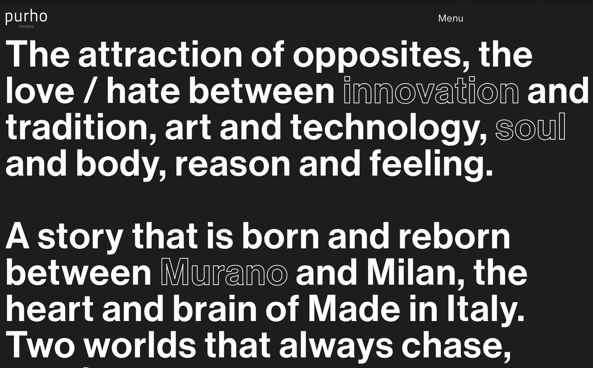
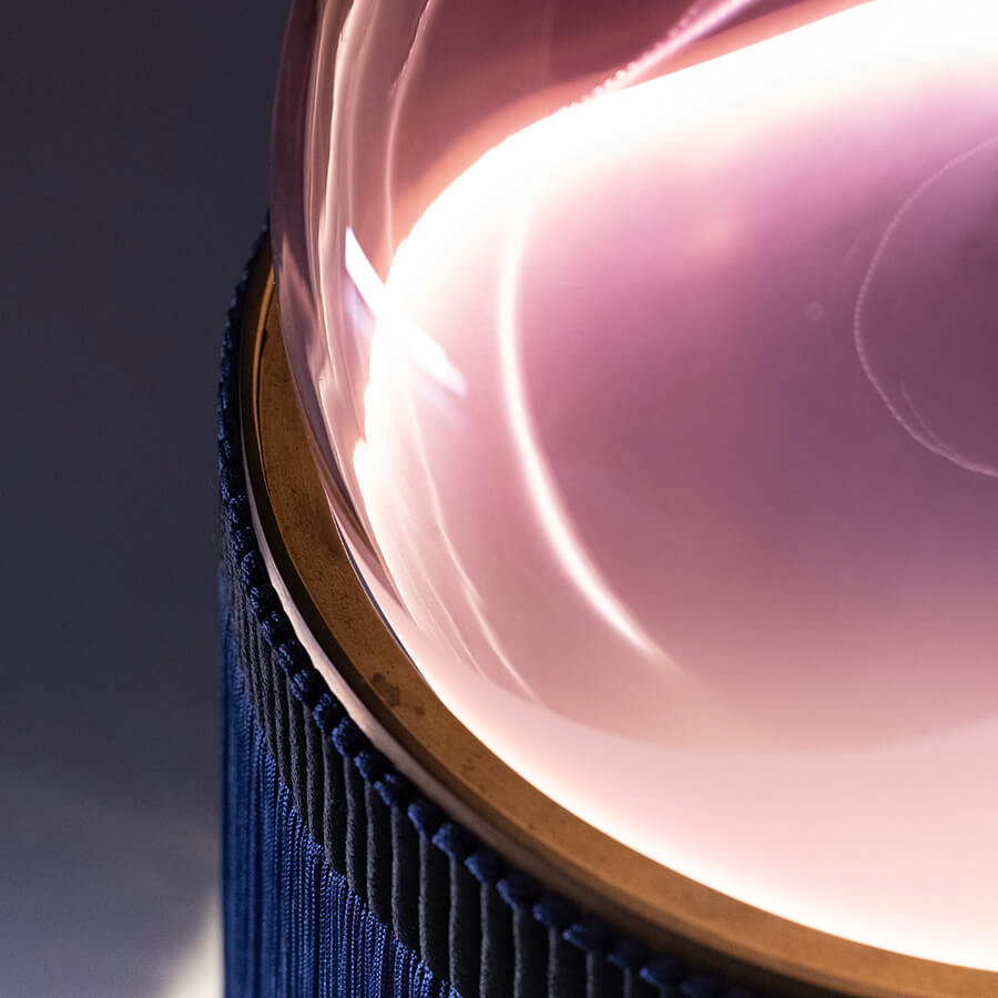
Purho’s website stands out with its polished brutalist design, combining clean typography, bold imagery, and a structured layout. The minimalistic aesthetic aligns with the brand’s focus on modern luxury, letting the products take centre stage. The site navigation is intuitive but stays visually engaging, with a balance between style and usability. However, some pages feel overly simplistic, missing opportunities to engage users in the same way other pages do. By combining traditional principles like clarity with brutalism’s bold look, Purho achieves a refined digital look while maintaining accessibility for the audience throughout.

#fivepoint2 #brutalist


