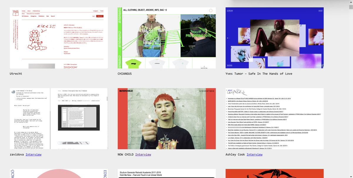
5.2.5 New Technologies Research Task: Brutalist Websites dot com

My overall impression of Dead Alive Magazine is that it's laid out in black and white, giving it a minimalistic look. The design aspect is the interactive icons and messages however you may get lost trying to find what you are looking for as they all look the same. The website challenges the future of the electronic world as its goal is to publish the collaboration process between editors and artists.

My overall impression of TIGHT Magazine is the photography and the way they designed the website layout. The design aspects work well, as they illuminate artists with the message they are trying to convey: to curate a platform for contemporary music and visual art.

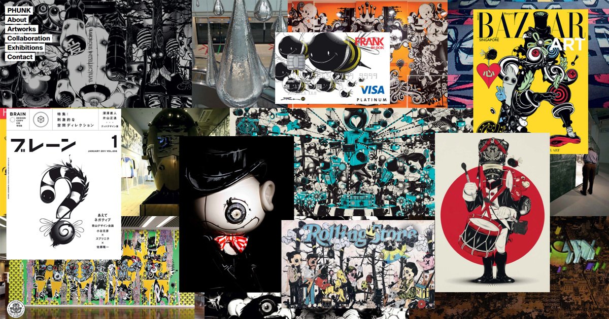
My overall impression of Punk is the chaotic yet impactful images that are shown on the first page. They challenge the conventional notion and definition of the ‘artist’ and ‘commercial design studio’ by constantly blurring the boundaries between both, mixing Neo Pop Art ideology with Post-Modernist design.


