5.2.5.6

My brand is a light festival based on the Granary Wharf area. It combines different elements from its environment. The festival blends old and new together, with the vibrant Atmosphere of canal-side cafes, pubs, and restaurants, which are buzzing after work and on weekends. I also took inspiration from Light Night Leeds
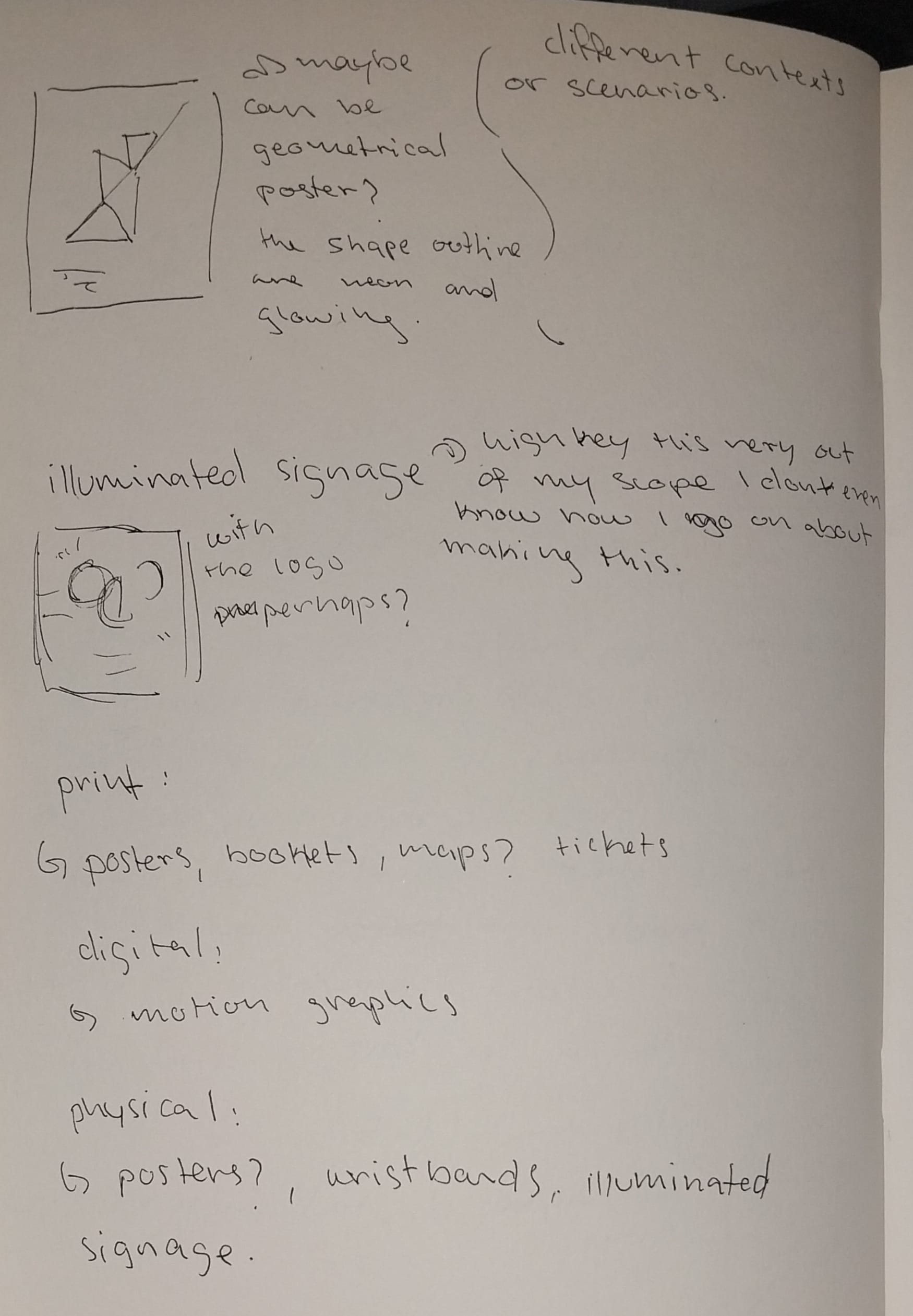
I'm expanding my brand guidelines across different media, through possibly maps, signage, and promotional materials. Overall, it's way more interactive with the festival environment.
Research and Ideas:
I saw this on the Amsterdam Light Festival Canal Cruise website (the animation), and I wanted to create something similar but more playful with my branding, since I feel it's a bit too commercial if that makes sense.
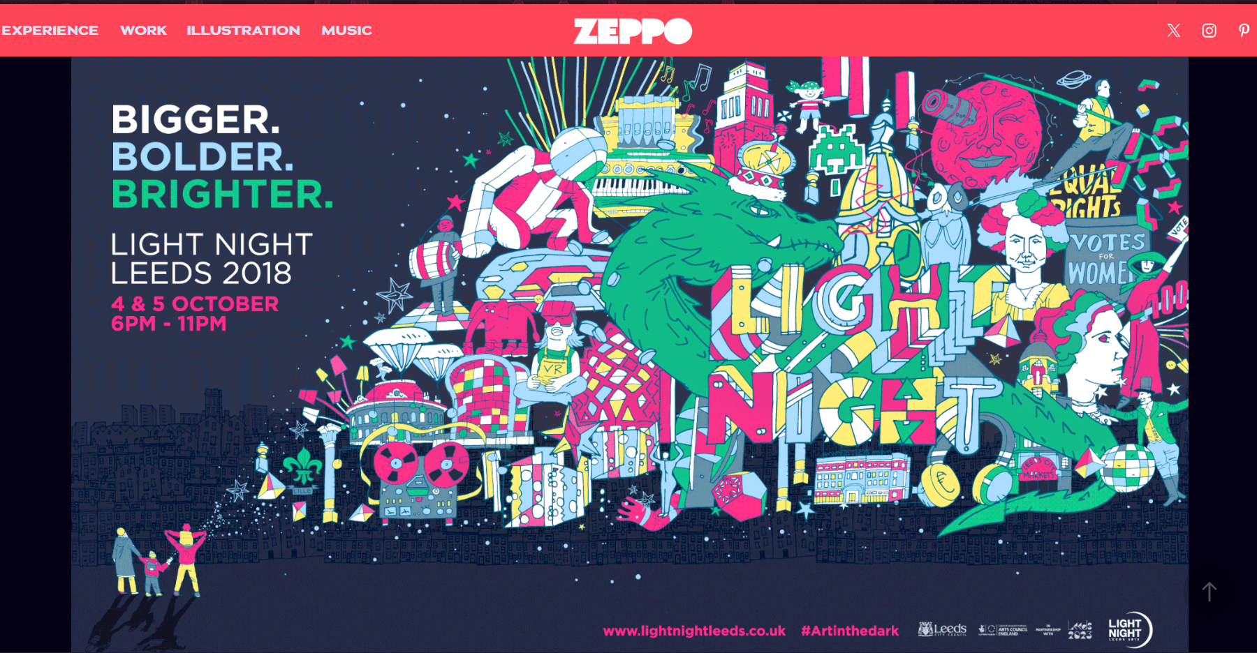
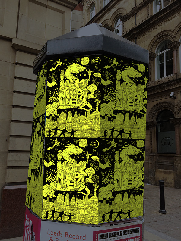
This is from Leeds-based creative agency Zeppo who created the branding for Light Night Leeds. Most of their work for Light Night Leeds involves bright colours and energetic designs to match the aesthetic of the festival. They created all guides, posters, and merchandise for event.
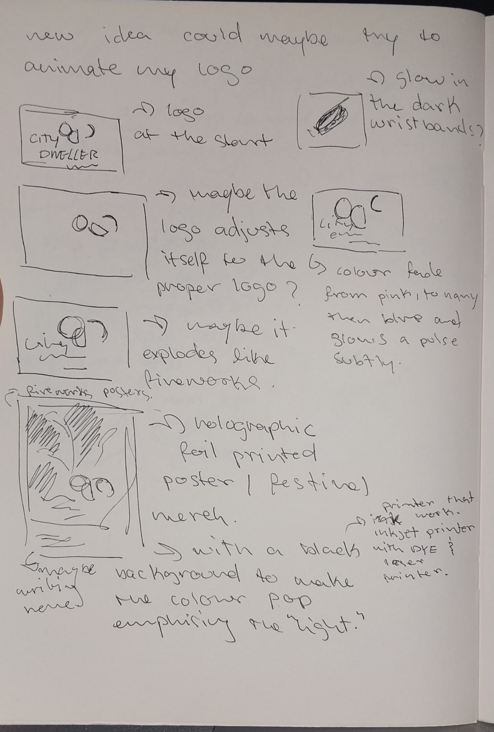
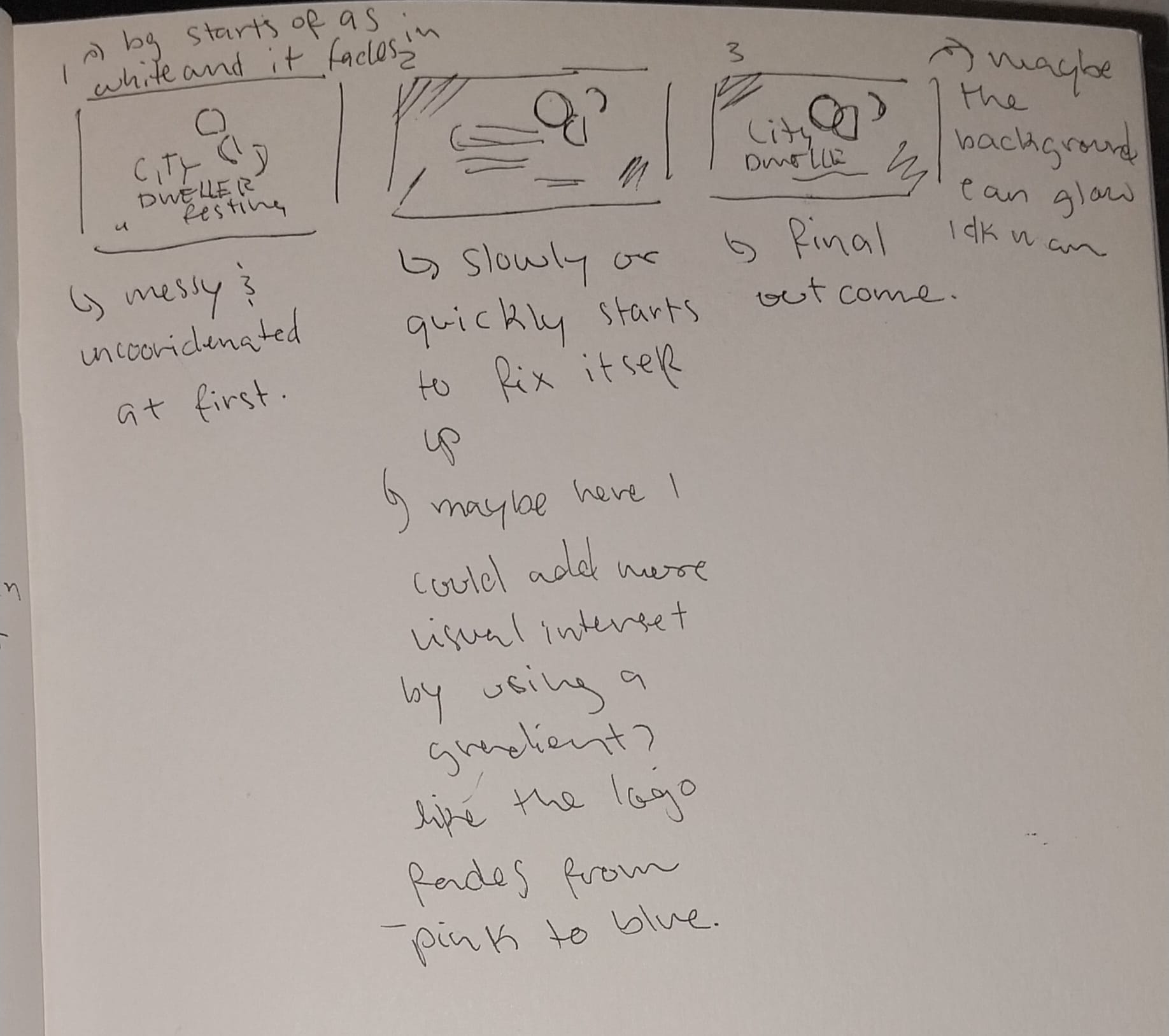
These are some of my initial ideas and some storyboards that I made early on.
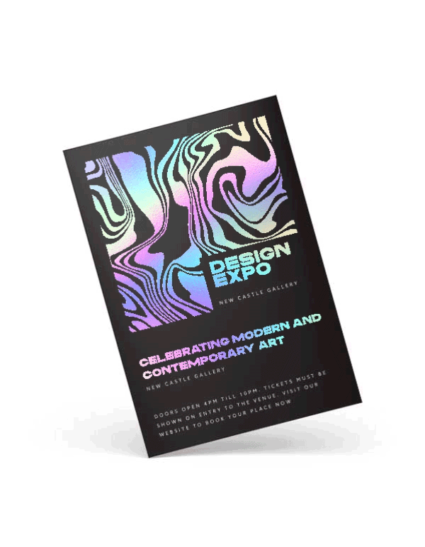
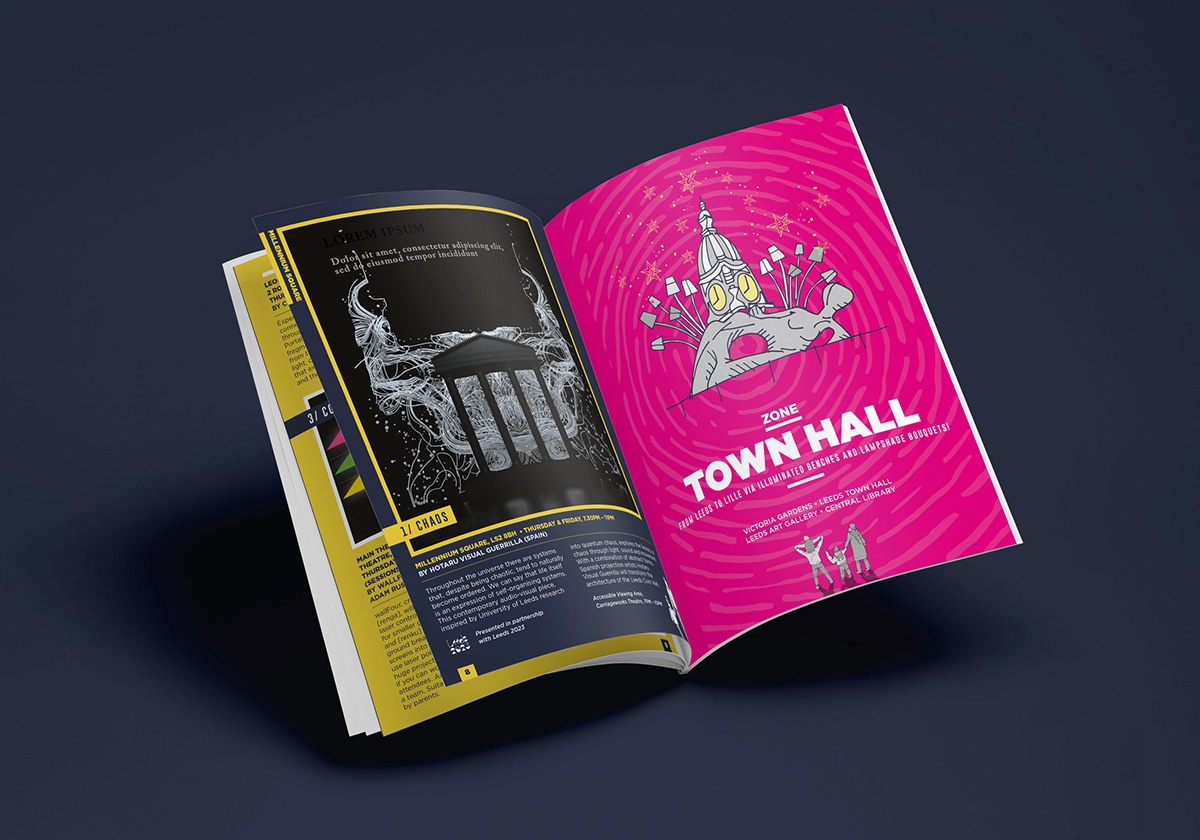
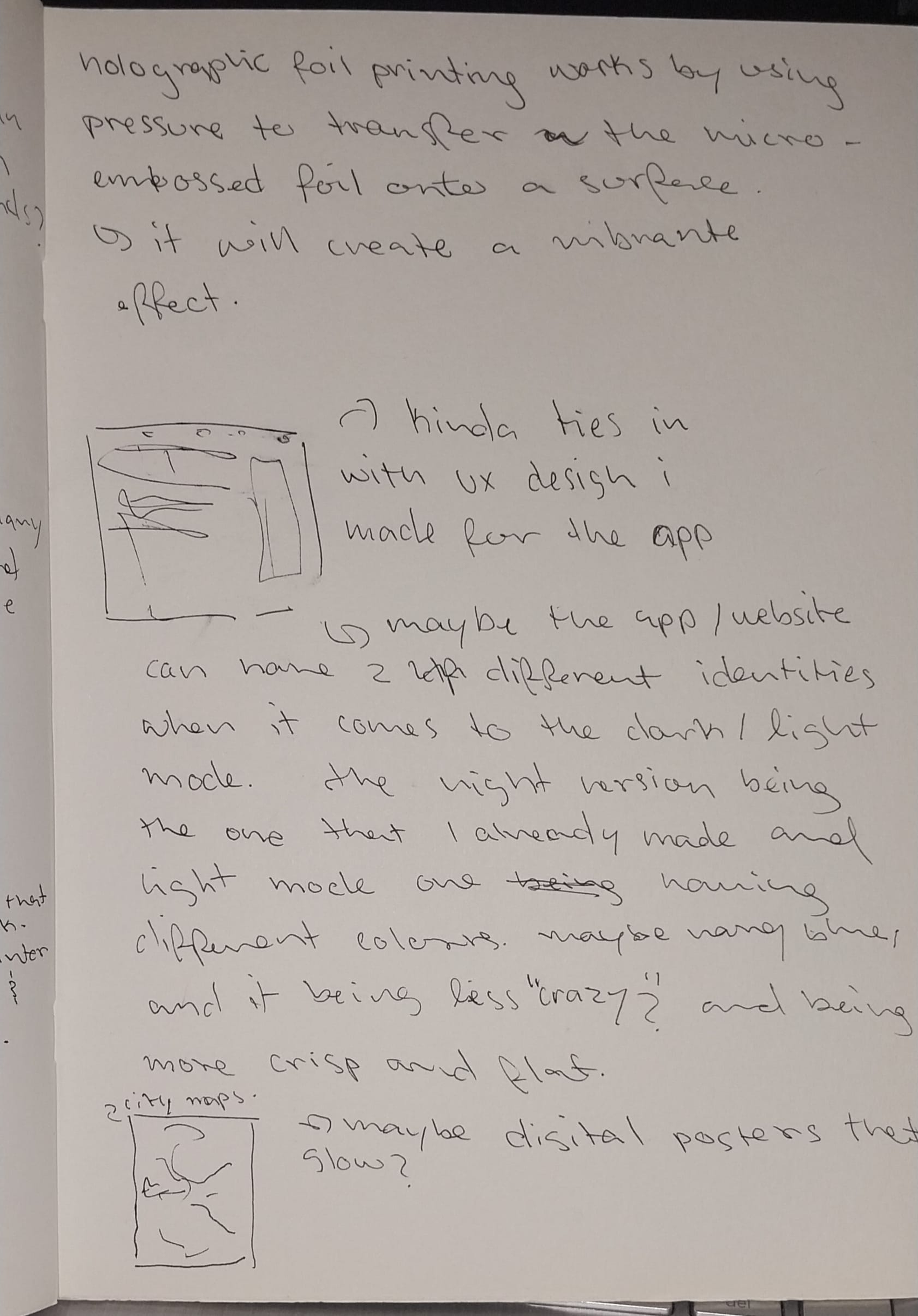
I just thought this flyer mock-up was really cool, and it would fit my overall brand. I might try to create something like this. This requires almost the same steps to make posters, depending on the complexity. The process of designing the poster digitally starts by using Photoshop to add glows and colour shifts, then printing onto special holographic paper.
Experiments:
These aren't really experiments but visualisations that I made using the glitch text tool. It's just a quick way to get an idea down, even though it is not really that well-crafted.
When it comes to these animations, I feel as though they fit my brand aesthetics (not fully, though), but they're missing a little something. I mostly made these to see how they would look if I were to animate them.
I tried using jitter to animate my logo and create something a bit more complex than the previous animations. Clearly, it didn't work because when it comes to importing Illustrator files into Figma, then to Jitter doesn't work; as a result, I couldn't animate the elements separately. Even though the layers worked fine on Figma, they didn't work well on Jitter. I would have recreated my logo on Figma to animate it there.
I had a bit of trouble when it came to importing my logo into After Effects; the quality was bad, so I remade it in there. This took a bit of time.
It was a bit slow and looked very robotic here, so I added Easy Ease to make it smoother.
I attempted to make it more playful, but it didn't really work out here. Once again, I think it's an issue of not knowing how to fully navigate After Effects.
I ended up deviating from my original plan by a lot. Initially, I wanted my animation to look more like a playful advertisement. Even so, the psychedelic theme I went for in the end actually ended up fitting in with my brand image. Personally, the animation reminds me of this specific spot in my area, the area had a lot of neon glowing signs, but the area still looked dark despite that.
I have been using After Effects quite a bit recently. I wish I had used other methods and apps that im not familiar with, I feel like I limited myself to After Effects. I wanted to make it more interactive, but I spent too much time trying to fix my current outcome, which I feel is very vague and is hard to tell what it's meant to convey.