3 brutalists websites.


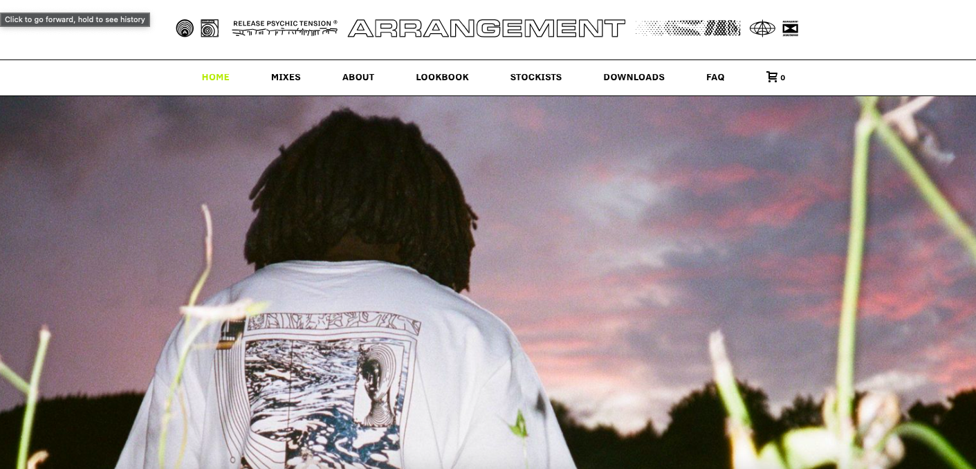
This website really caught my eye, mainly because of the photography elements of it, I thought it was really interesting. The font works really well with the aesthetic of the image and it really makes the website feel professional in its own way. I like the fact that there are hardly any colours used besides from the image, because the image itself has a lot of interesting and abstract colours.

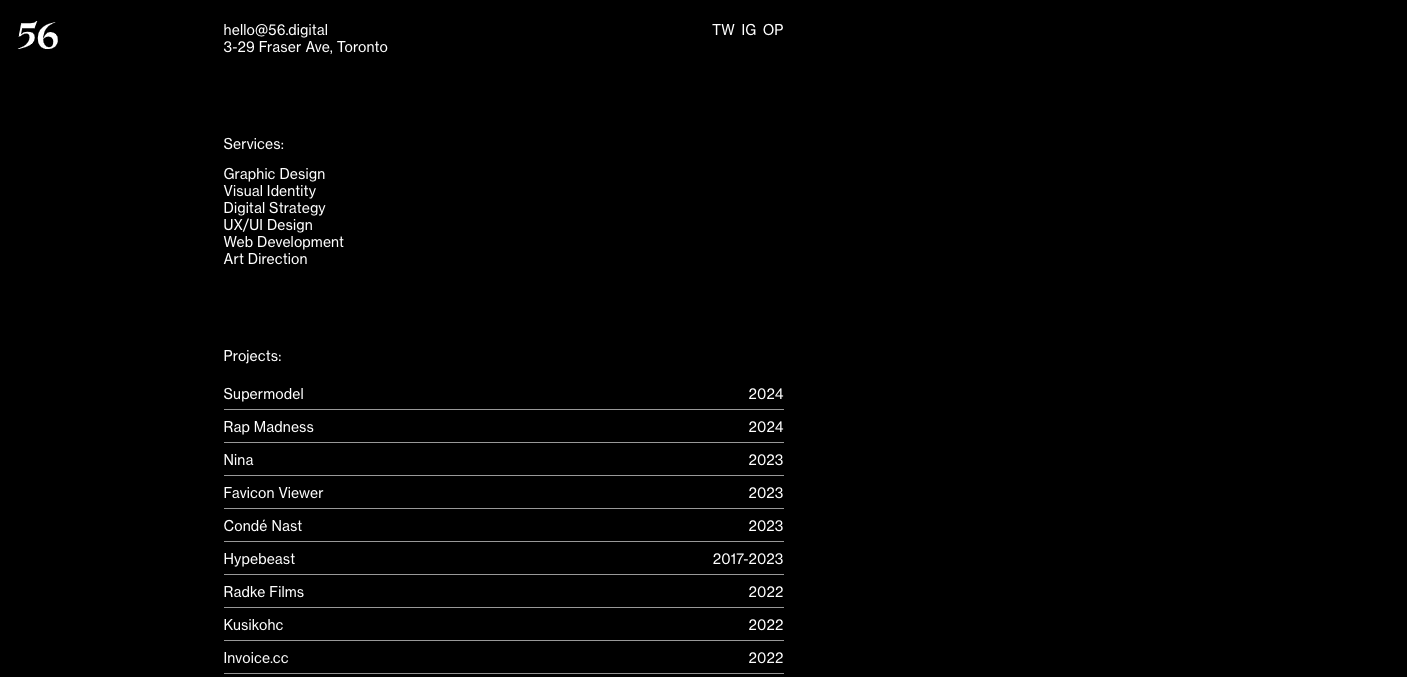
This website really caught my eye because of how minimalistic it is, I don't think I've really seen before, I feel like it is a lot easier to use compared to some websites I've seen. The fact that the background is black and text is white makes the page not feel so empty, even though it is actually quite bare.

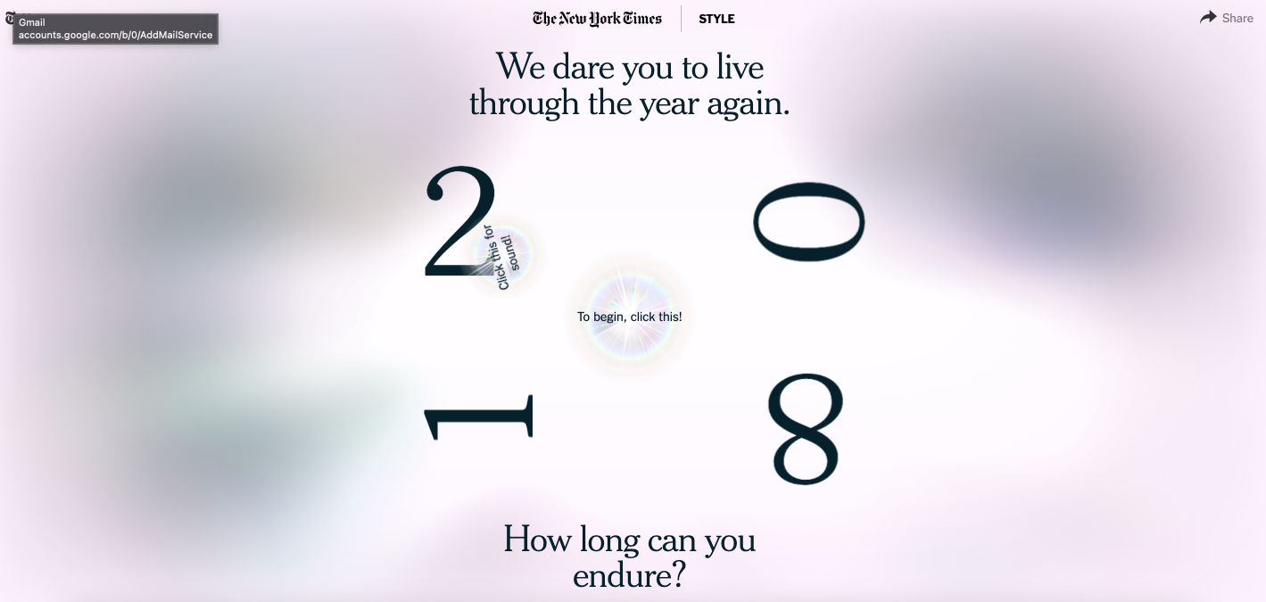
this website, I am not a fan of. I feel like they are using very trendy design which will be looked down on in a year or two and they aren't really trying to create something to last, more just to get attention for a few weeks and then be forgotten about and never seen again.
