3 Brutalist websites

The problem with this website is that it is overwhelming with too many things going on. There is no overall theme of the site as well as having no structure images and GIFs are plastered randomly over the page making it confusing and not understand what is going on. The site is also on one page with a never ending supply of random things that do not make sense for the person viewing the website

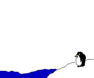
What I like about pokey the penguin is the simple deign layout that understands who its intended target audience is. I also like the typeface that has been used on the site as well it fits the theme of a cartoon that the website is aiming for. I also like how the links that are interactive are highlighted in blue to help direct people around the website and are in a big font size.The simple design of the cartoon as well helps the target auidence.

The reason why I don't like this website is how unorganized the website is with images and text overlaying each other. I also don't like how the website using different typefaces as well. Furthermore, the text isn't contained in its original box and goes over it this in turn is overlapping with the images and over textx that are on the website.

