Data Visualisation - 6x6 Outcome

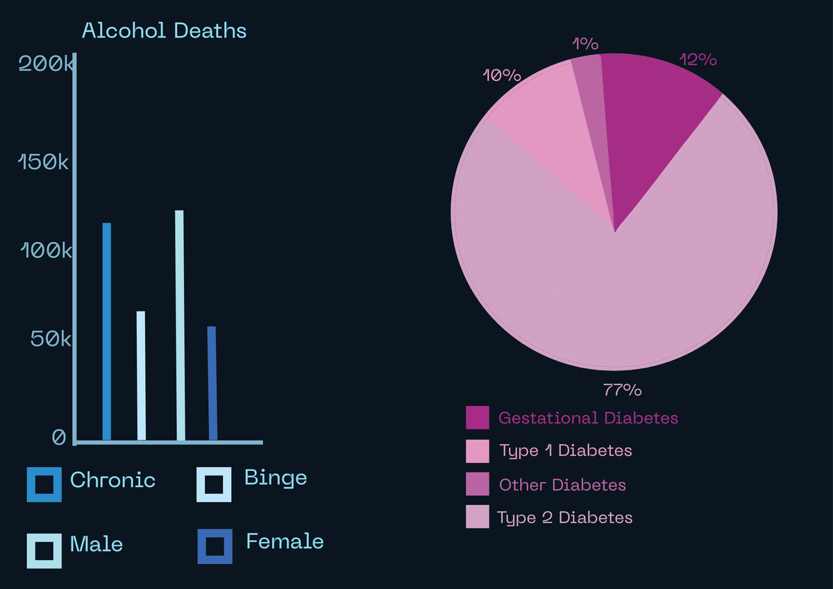
For this brief I want to make visuals about health statistics, I will do some research into how two different health issues affect the population and how populations of those people with health issues differ. I choose this as a project because I am really interested in researching medical data and I think it would make for interesting data visualisation. I will do some research into how to this successful and then I will make a small project showing what I have learnt. I am interested in becoming more adept in Adobe Illustrator so I will use this for the project. I had originally planned to do some this based on statistics of discrimination within healthcare however there wasn’t much information on this and the information which did exist, I found very hard to translate to any successful data visualisation.
Research - Advice I found on Google
Define your purpose and audience: Consider the needs and perspective of your audience, and make sure your visualization has a clear purpose.
Choose the right chart type: Select a chart that's appropriate for your data. For example, you can use line charts to compare values over time, bar charts to compare quantitative data, and scatter charts to visualize the relationship between two variables
Use color and labels effectively: Use color to highlight important information or to differentiate or compare. Use text and labels to clarify, but avoid cluttering the visualization.
- Data visualizations should have a clear purpose and audience.
- Choose the right type of viz or chart for your data.
- Use text and labels to clarify, not clutter.
- Use color to highlight important information or to differentiate or compare.
- Avoid misleading visualizations.
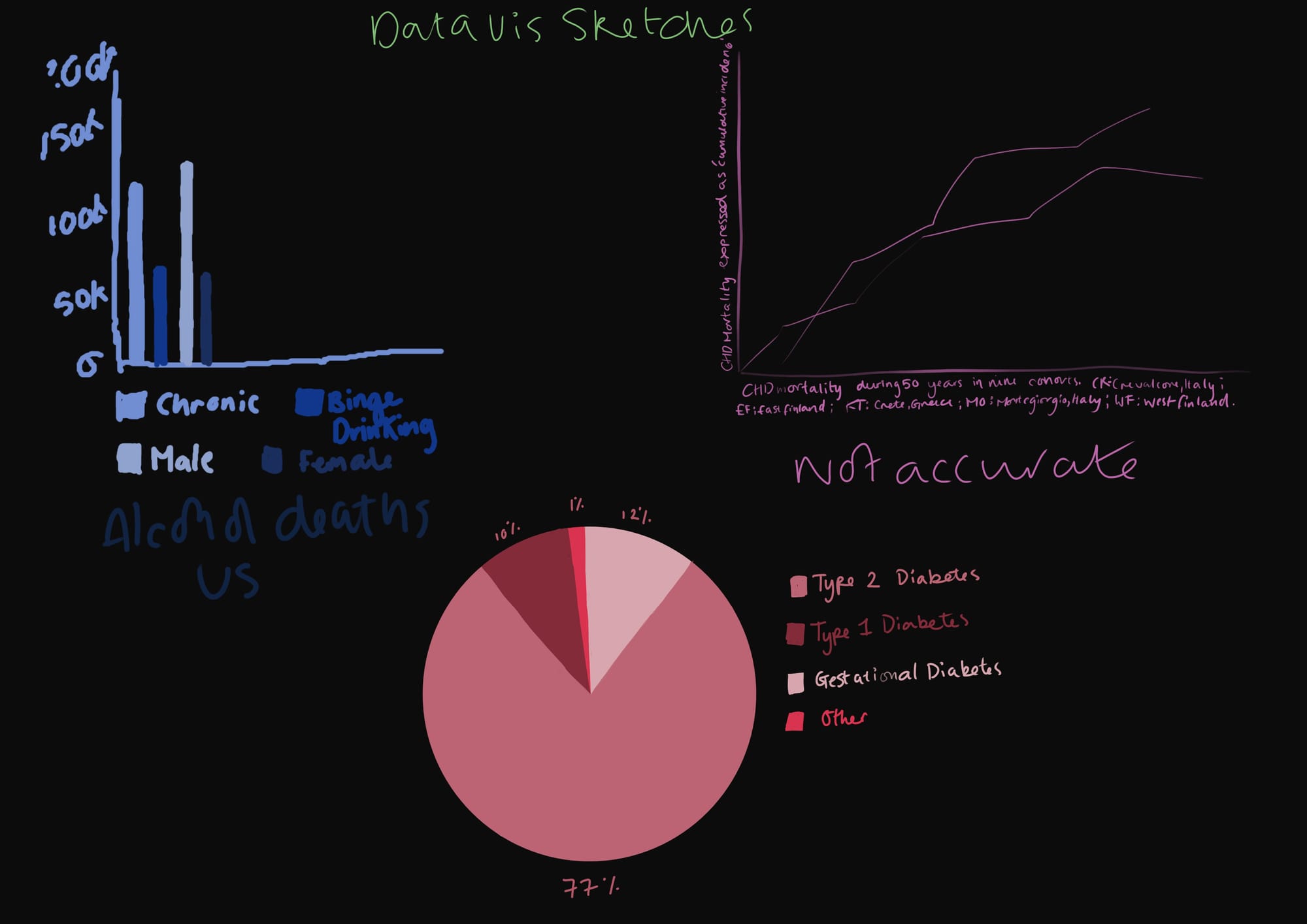
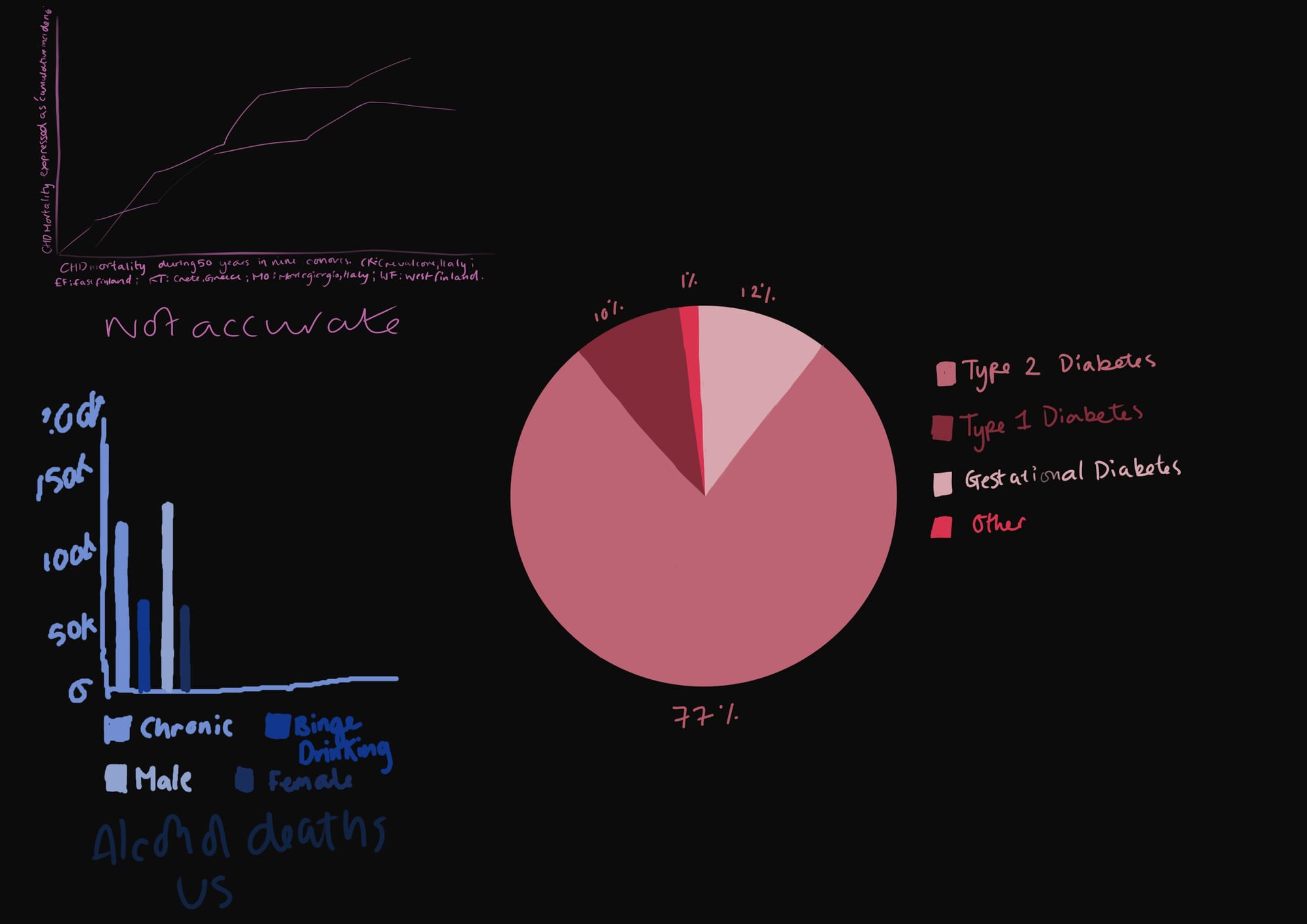
I will use this advice to make a sketch for the data visualisation and I will tweak the layout of the sketch until I find one I am happy with. I will then make the polished final version in Illustrator.


