'Brutally' honest design review.

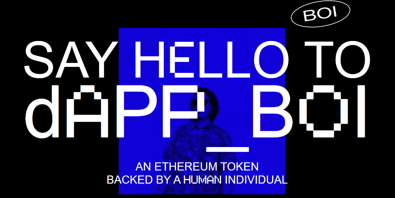
I was taking a look at a selection of brutalist-designed websites and came across this interesting website by a designer with a slightly different approach to cryptocurrency. I like the idea, but let's be honest: Is it a scam? Leaving that aside, DAPP BOI is an Ethereum-based, ERC-20 compliant token that offers a unique proposition: each token can be redeemed for one hour of design work or consultation.
The website employs a minimalist aesthetic, focusing on clarity and user engagement. The colour scheme is consistent, and the typography is clean, enhancing readability. However, the design could benefit from more visual elements or imagery to make it more engaging and to better convey the brand's identity.
It's simple, effective, and an engaging idea, but I feel it lacks the drive to a reader. Yeah, it might look pretty, but what's its real function? Does it scream, "Please fall for this scam?" or does it read, "Look, I was bored and made a coin, buy some so I can pump it, dump it, and vanish to Guatemala?"
In all seriousness the design element needs to reflect the main purpose of the site in my brutally honest opinion i feel it needs more legibility and more elements of trustworthiness, we need a clean aesthetic and a solid base to invite the reader and evoke a sense of trust, to me at the minute it just looks like the product of a very bored weekend. or at least in my eyes. Good try.
