Brutalist websites
David Rudnick http://davidrudnick.org/

What I like about this website is the simple layout. When looking through the website and his display of work, it’s like a neatly set table. You can see everything clearly and nothing is overlapping with one another. The only thing I don’t think works is the directory icons at the top which overlap the work when you scroll down. When you click on these icons though, they open up on the side of the screen which doesn’t cover or get in the way of anything.
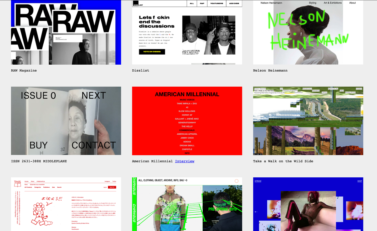
Stefanie Tam https://stefanietam.com/

When opening you’re greeted with a list of projects the creator has done on a bright plain background. Clicking the screen gives a smooth transition to their works in more detail and images. I like how you can click on the pages of a publication and it will flip through like you’re actually reading the book. There's even the page numbers at the top which is a nice touch. Then the website is left on standby, there's screensaver like images. I think the only downside is how plain looking the background to the website is and the font. I find the font quite boring and forgettable but this could be intentional as it could be a way for viewers to focus on the work.
Studio Lucas Hesse http://www.lucas-hesse.de/

As soon as you open this website, the large fonts immediately catch your attention. The large text is the titles of their works and when you hover your mouse over it, you get a glimpse of the project which I find really innovative. When clicked, it opened up a showreel of the project, scrolling down reveals more about the project including the credits and commissioner. I like that it fills the whole page and that there isn’t much negative space.