Week 5 - Brutalist Websites

Upon looking at all the different Brutalist websites on brutaistwebsites.com, I noticed lots of variety, something which I thought did not exist when it came to Brutalism. Here are may favourite websites.
Adam Clarke | Colour
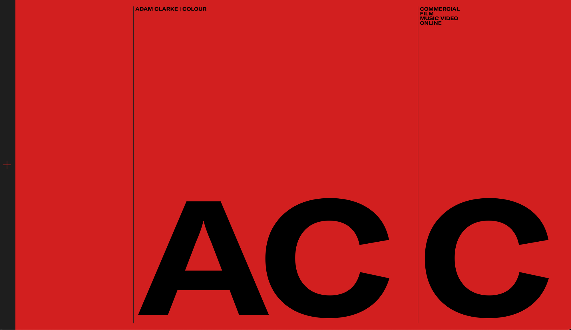
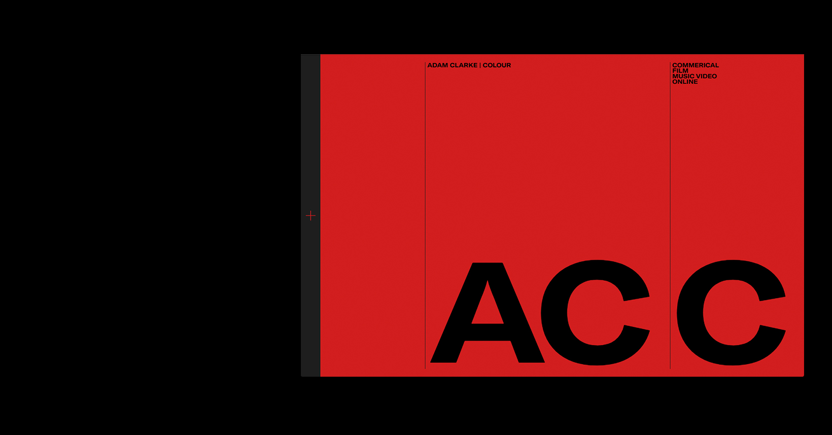
This website intrigued me because of the bold use of a singular striking colour, red. I also found the scale of the 'AC C' type was very loud and works very well in combination with the colour scheme.
Brutalism refers to using the 'raw materials' of something, for example, in architecture, the use of just steel was the main characteristic of a brutalist building. Here with this website, the use of a strong grid combined with a minimalist aesthetic, gives the website that Brutalist look.
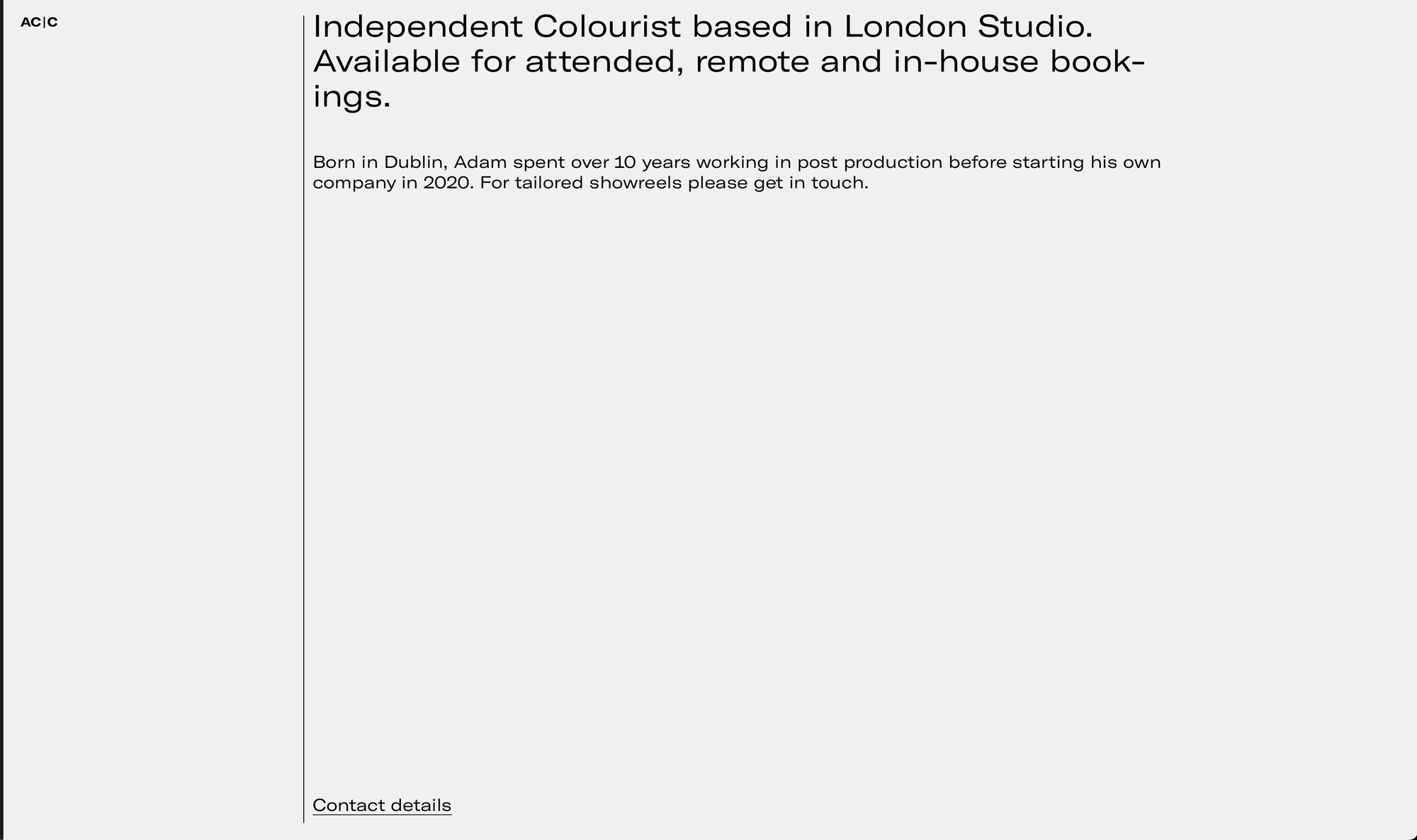
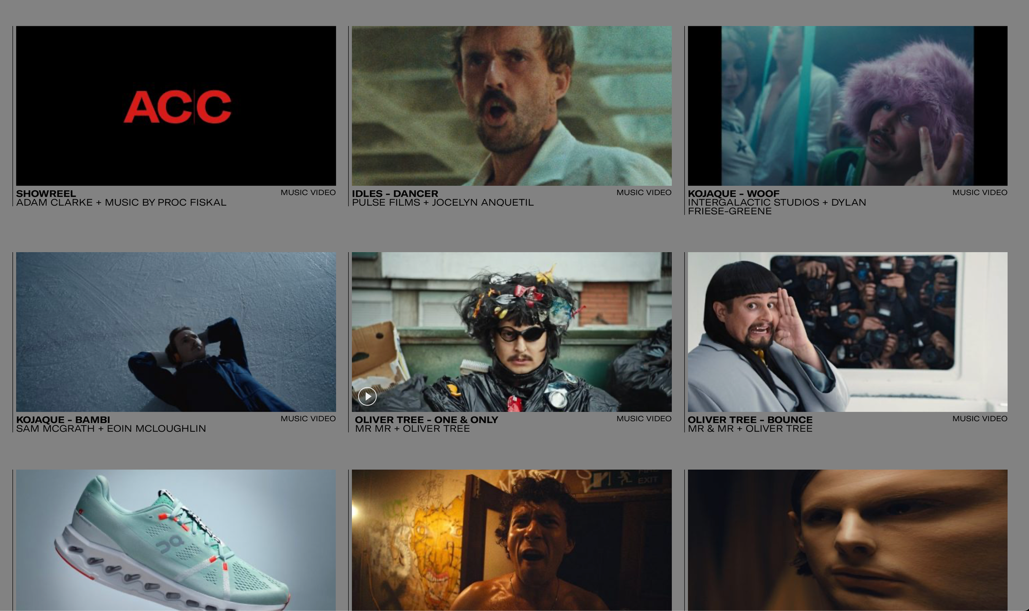
Certain pages such as the 'Archive' page (bottom right) remind me of websites of the early 2000s, as it uses a plain grey background and once again, a very strong grid layout. The fonts used here link heavily to Brutalism, as the main font being used is very bold and structural. The font used on the 'About' page is less bold, but it does have similarities to fonts regularly used in Graphic Design, such as Helvetica.
Overall I really like this website, as the combination of striking colours and bold fonts along with a very structural grid allows for a modern Brutalist aesthetic that stands out and fits well with Clarke's profession, which is Colouring.
Travis Scott | Utopia
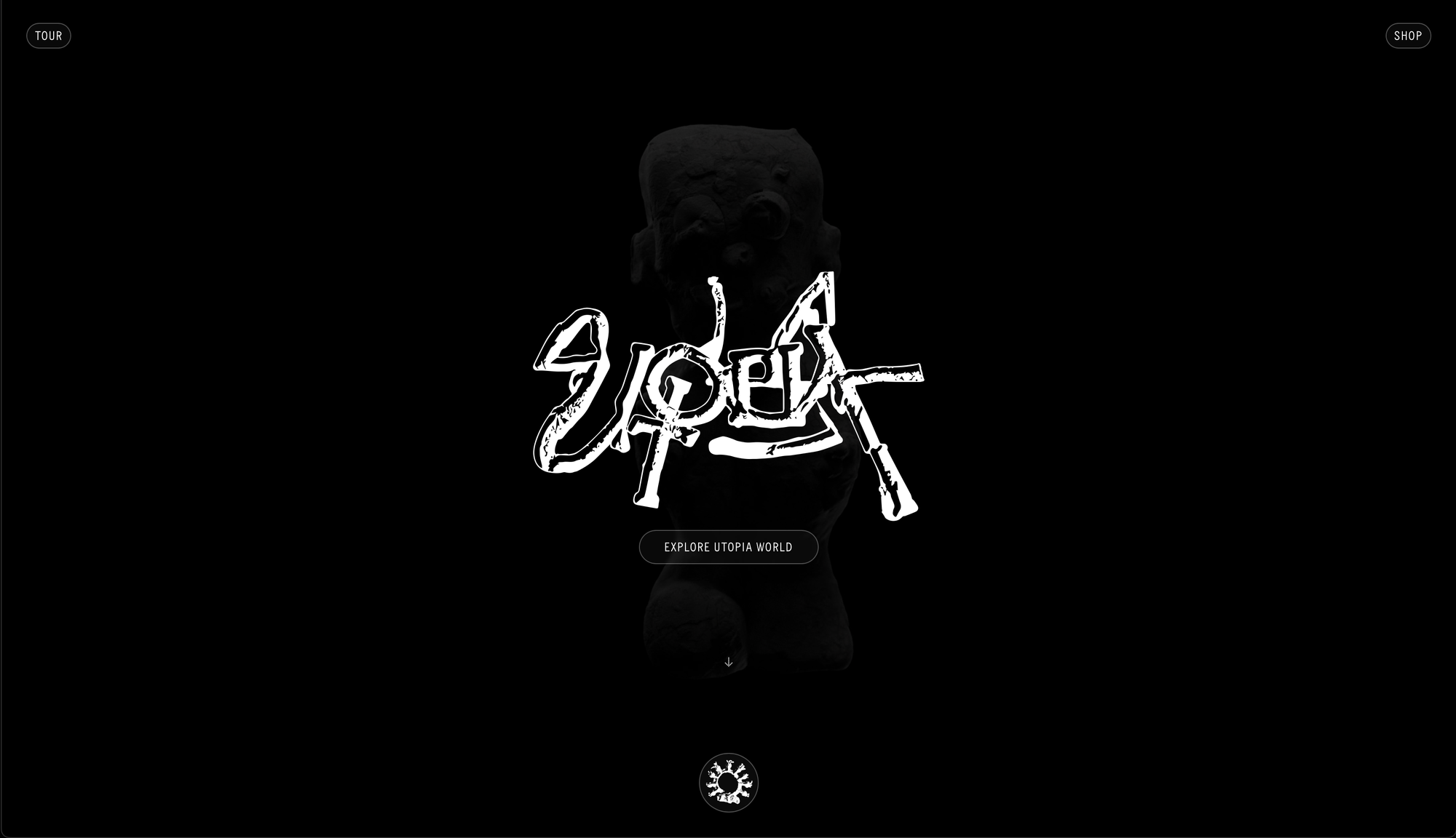
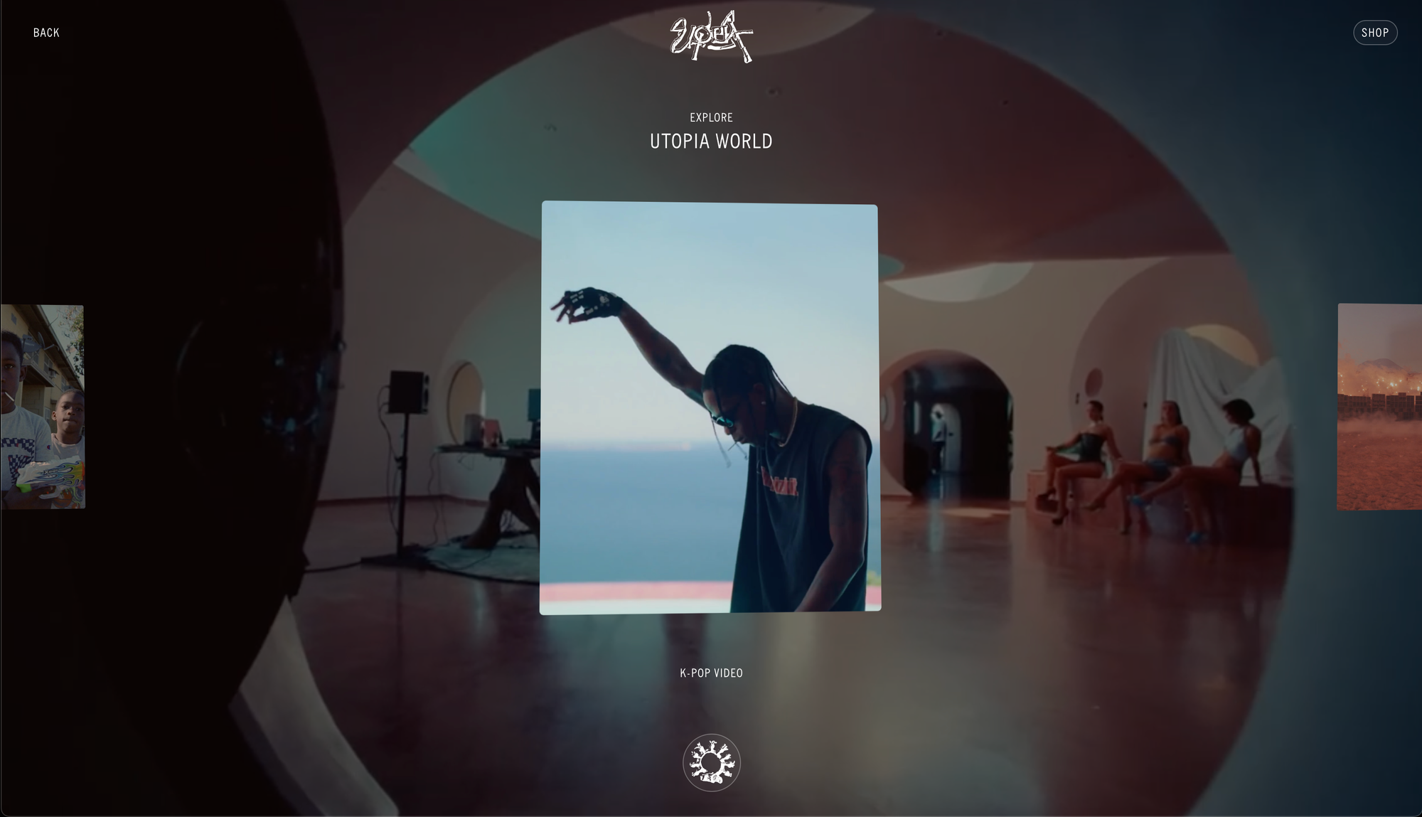
This website interested me a lot as its layout and aesthetic is very minimalist and modern, and utilises mostly pictures as a form of navigation.
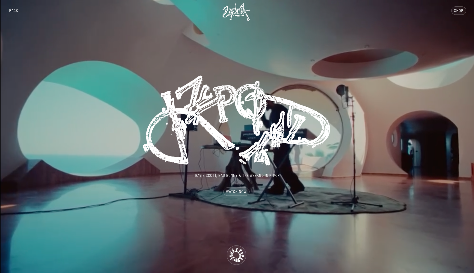
Again, similar to the last, the use of lines creates a simple structure for the website, allowing the simplicity to take over. (image 4) As you open the website, you're greeted by a really nice 'Utopia' customtype, (image 1) and a few simple buttons. As you scroll, imagery of a totem shifts and morphs. I really love this effect on websites and when it comes to me making my portfolio, I want to include something like this.
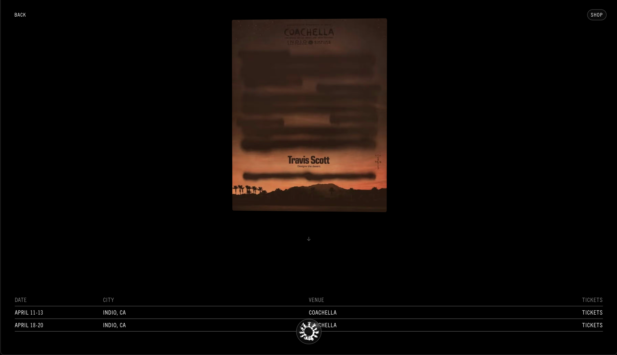
Then, as you explore the website, each album/song has its own square, and as you click on the square it brings you to a page with some more customtype. As you can see in the video, the website is super simplistic but is also very aesthetically pleasing and visual.
Overall, I think this website is less 'Brutalist than the other, however I really like the clean look and modern aesthetic of this website, especially the animations as you explore the website. It is slightly less easy to navigate, as a lot of the navigation is done through images, but I think this matches the aesthetic of Travis Scott well, and is similar to a lot of the trending modern websites out there at the moment.

Crevv Design Studio
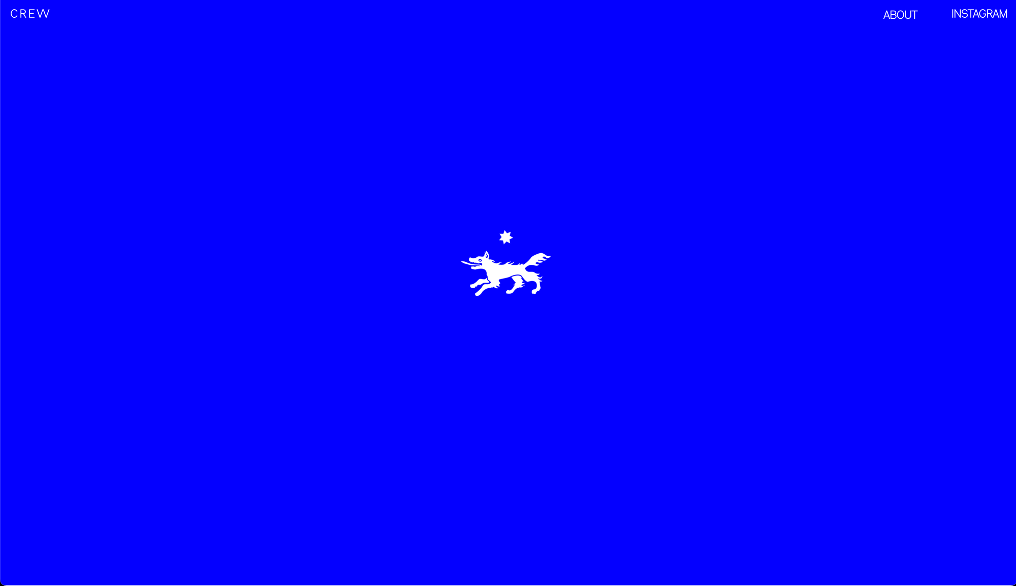
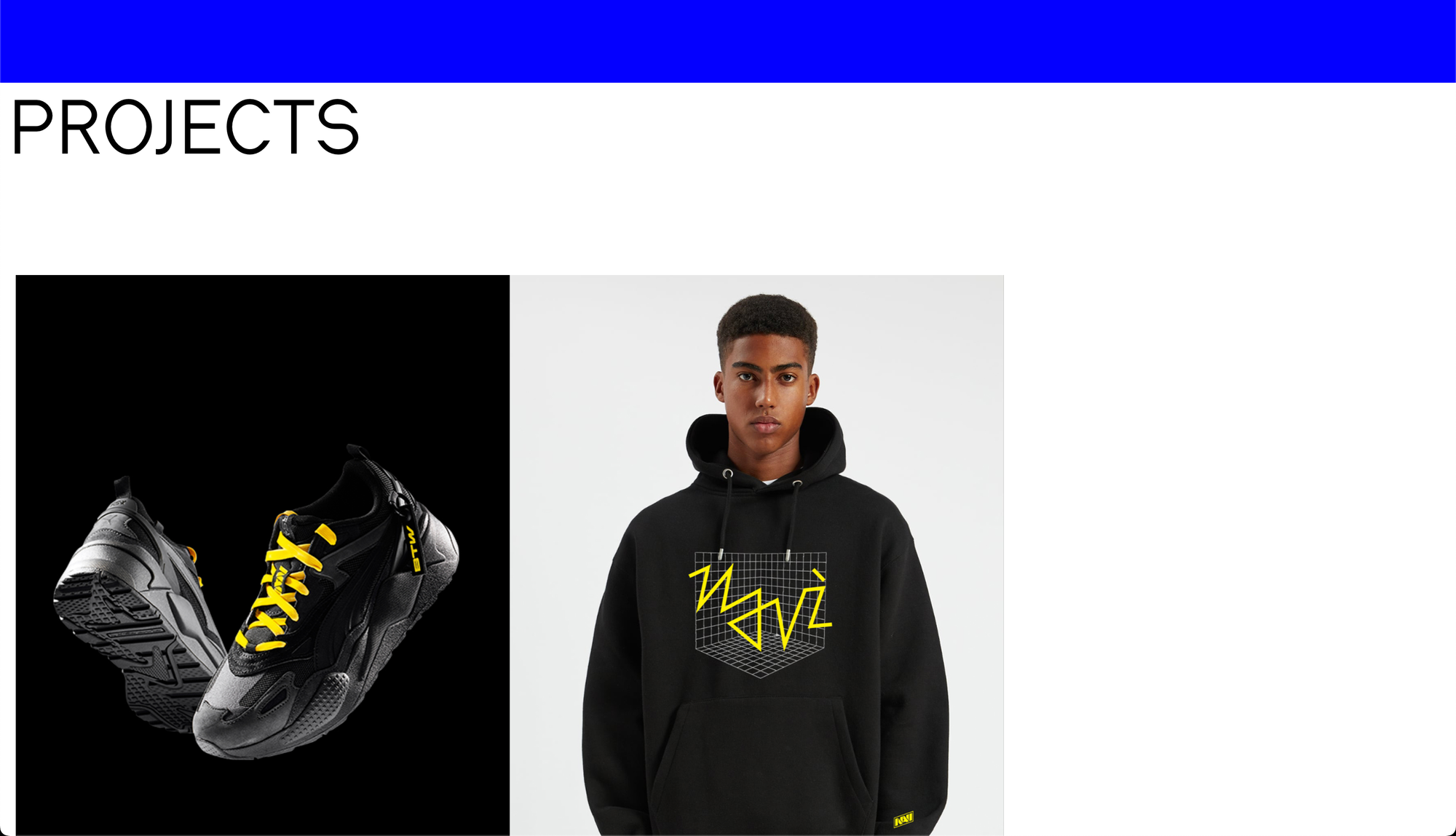
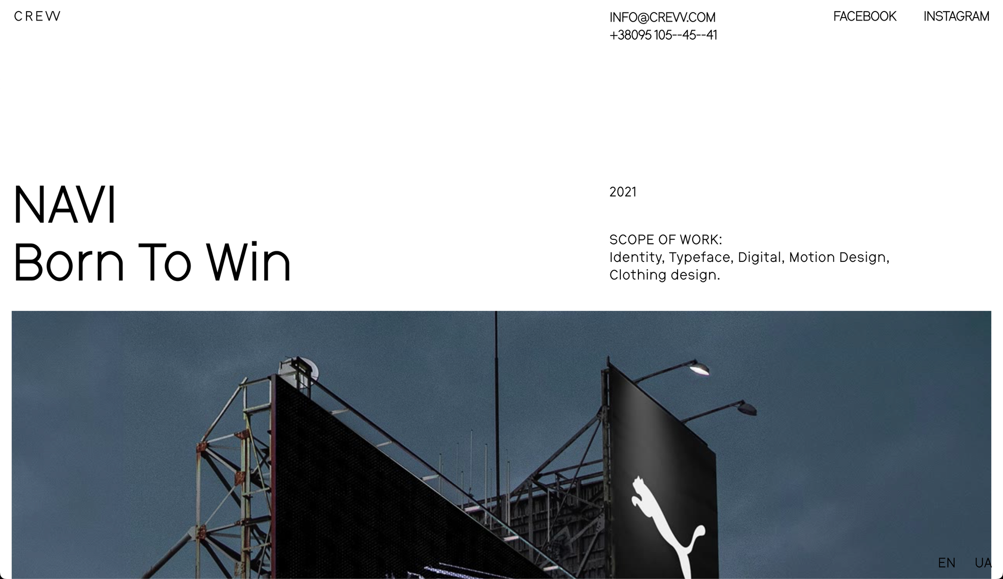
Once again, the striking, bold colours used in this website is what drew me to it. Something about a simplistic colour scheme and minimalist look really intrigues me. This website did not disappoint. As you enter it, you are greeted by what I can only assume is the studios logo, with a simple animation. As you scroll, the websites simple structure appears, one which is very Brutalist.
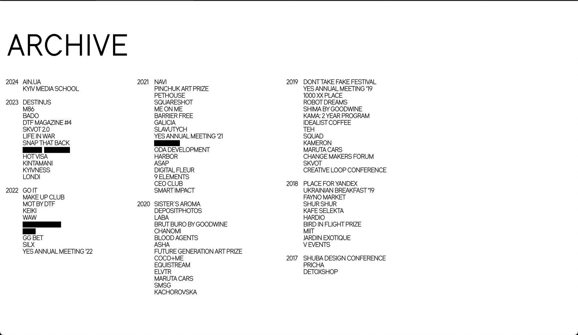
The font used here is very simplistic, and pairs well with simple block colours and the gridded structure. The 'Archive' page strongly reminds me of early 2000s web design, where they used to have a sort of 'list' structure to the layout of the website.
The simplicity of this website along with the raw, minimalist look, creates a great Brutalist feel, one that works well for the studios aesthetic.
