Brutalist website 1

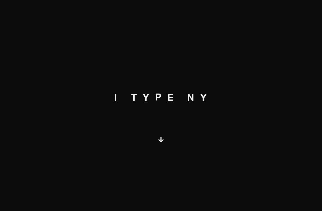
I TYPE NY
I TYPE NY

I find this website intriguing because it explores New York entirely through typography. Navigating the site is enjoyable, resembling an abstract tour of the city. The font is aesthetically pleasing, and its weight effectively represents the objects it replaces. However, I find the colour scheme on some pages unappealing, though this is a personal preference. It challenges norms, as no website I have visited before takes you through a narrative in such a way, focusing solely on the experience of New York through the motion of words and colours.

