6X6 Brief Response.
For my brief Responses I chose to identify a unnoticed behaviour or related and a print outcome.
Originally I was going to use this as an example to complain about people on trains with a more illustrative approach, using it as a chance to explore a new work method using procreate, I took particular inspiration from a designer I found on instagram.
https://www.instagram.com/p/C_W0kjuMx6A/?hl=en
The end goal was to always put this into illustrator to practice and learn how to make designs feel more full and less plastic like as illustrator has never been a strong part of my process, a lot of the time my physical to digital just doesn't line up with it.
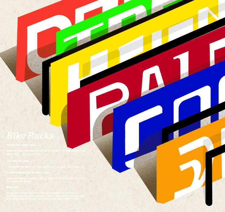
Whilst randomly looking through old work and backing things up, I came across this cover and back cover image originally intended for a 4.4 publication.

At the time it didn't really fit but I always really liked it and the thinking behind it, using blocks of bike typefaces to simulate a bike rack. The errors definitely show as it was hand drawn and hand painted with inks, but I decided to use this and remaster it using illustrator.
I followed parts of this tutorial to learn how to give texture and depth to designs in Illustrator, some were successful some were not.
: https://www.youtube.com/watch?v=dKo1Nr1QdM8&t=1791s&ab_channel=T%26TTutorials
The brief idea in mind being a poster outside the bike racks about etiquette and safety.
Outcomes:

The texture brush didn't quite work out but thats ok at least I tried it.


Annoyingly the white text looks terrible on here thanks to the white background of the blog site, but isolated it reads very well.