5.2 Mini brief 5: 4x6
So for this mini brief we were given some brief and some outcomes and from there we were told to pick a brief and a response to that brief. I was initially torn between expanding on my branding and my motion brief from last year but I eventually chose the motion graphics brief; from that I chose the animation response. Below is some of my initial written notes on the brief; speaking about some of the options I could take and some additional sketches on the animation I may create.
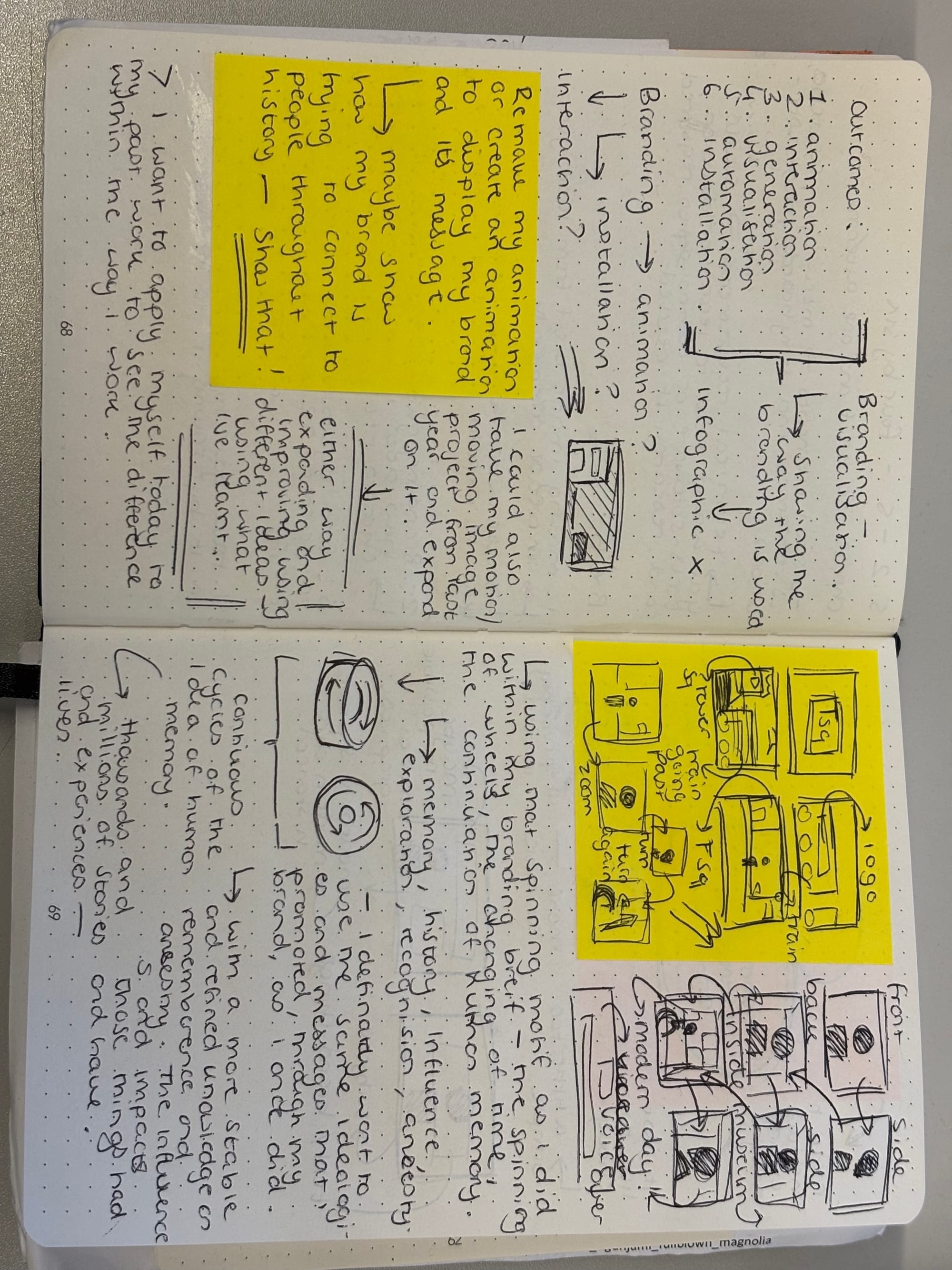
I'm mostly taking inspiration from my past ideas on the motion graphics brief initially. Animation itself can be as broad as illustrations to vector animation and that gives me very different alternate responses. On one hand I could do the illustration idea, pulling in my idea of memory but on the other hand I could animate using vectors, shapes and images to promote the branding.
Does the idea of illustrative animation take away from graphic design? I've always been told that it's one or the other but I'd like to combine it in this mini brief. I speak a lot about animation in a prior post and the connotations tend to be positive but solitary. I like the idea of mixing things to represent something whether that be graphic design and a more modern take or a more traditional input; it personalises something almost.
I moved from the animation idea simply because of time; I moved to an installation based on my branding from that time. Going back to look at my branding, a well as my motion graphic, I didn't want to necessarily merge them more reference the whole idea of my branding and it's message. I am aware that they already have a type of installation to show the history behind the coach lift but I wanted to maybe suggest a fun alternative. Below is the current installation along with some other things about tower square:
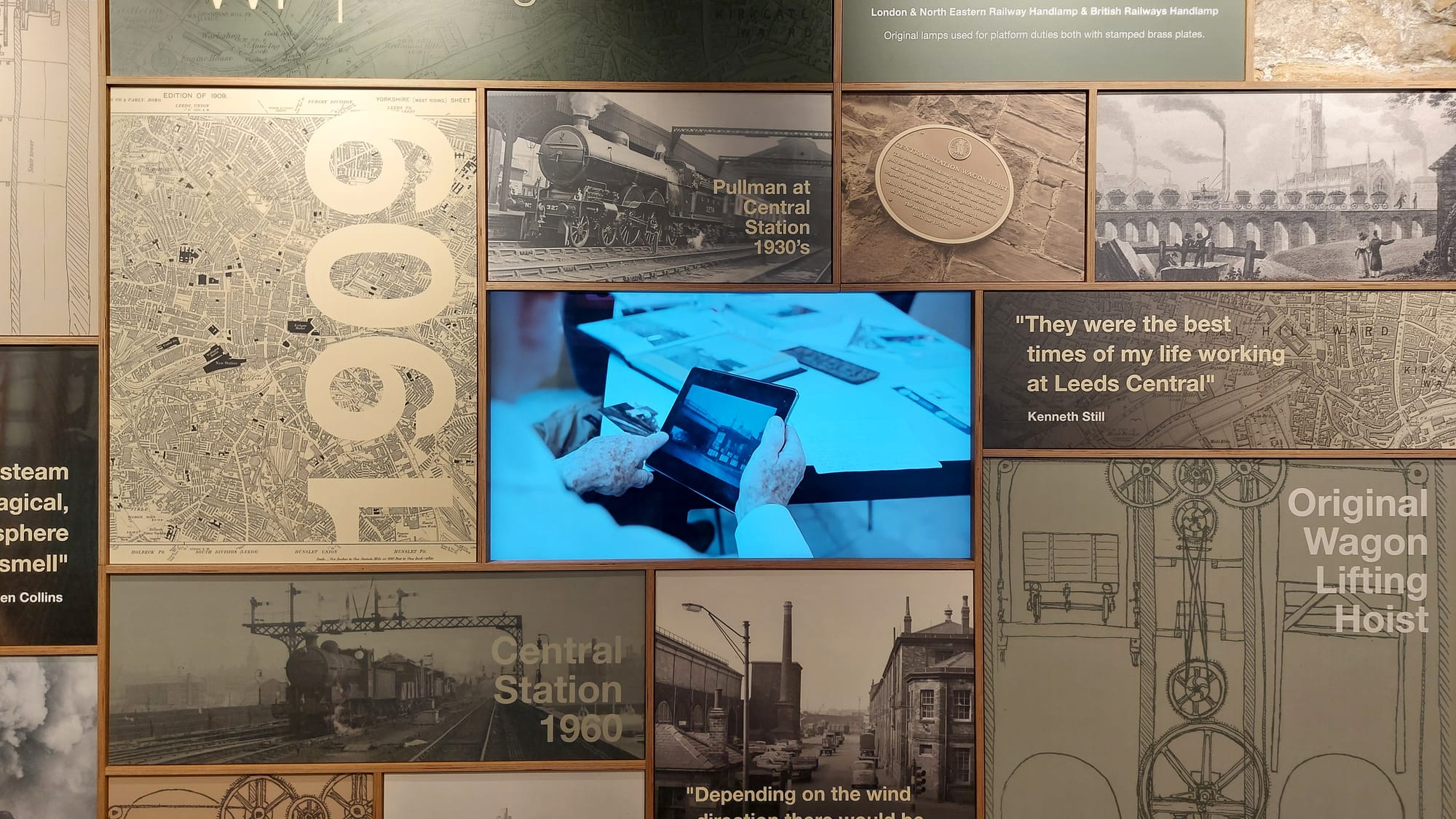
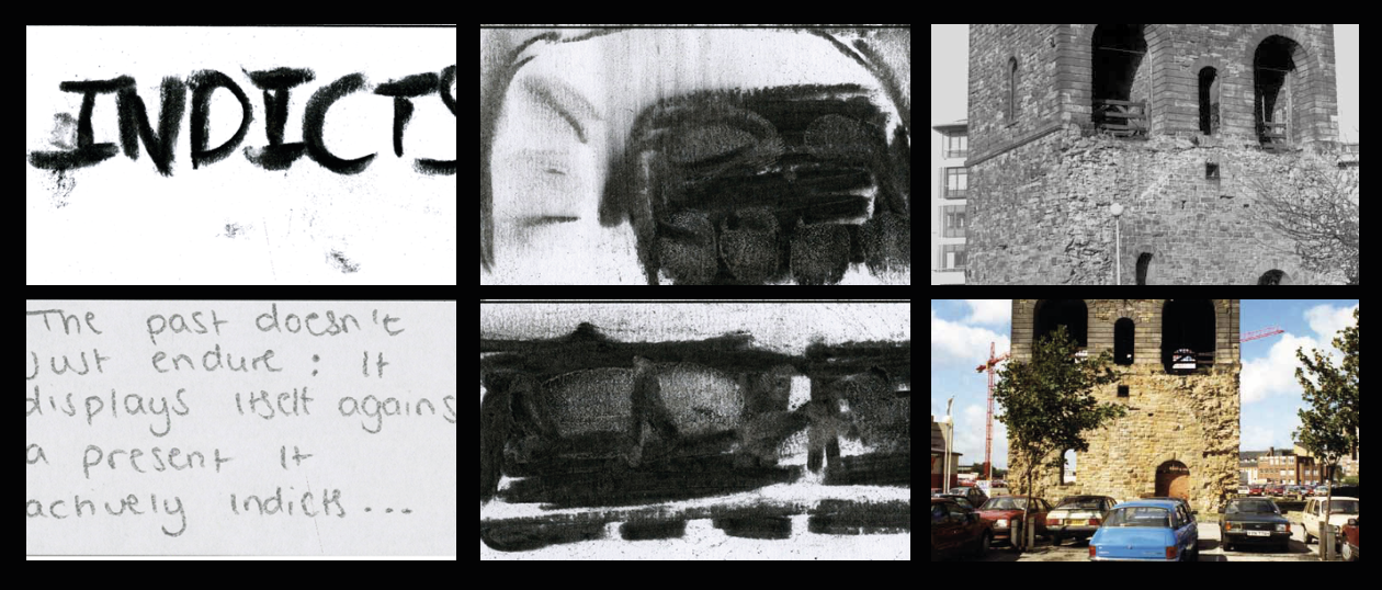
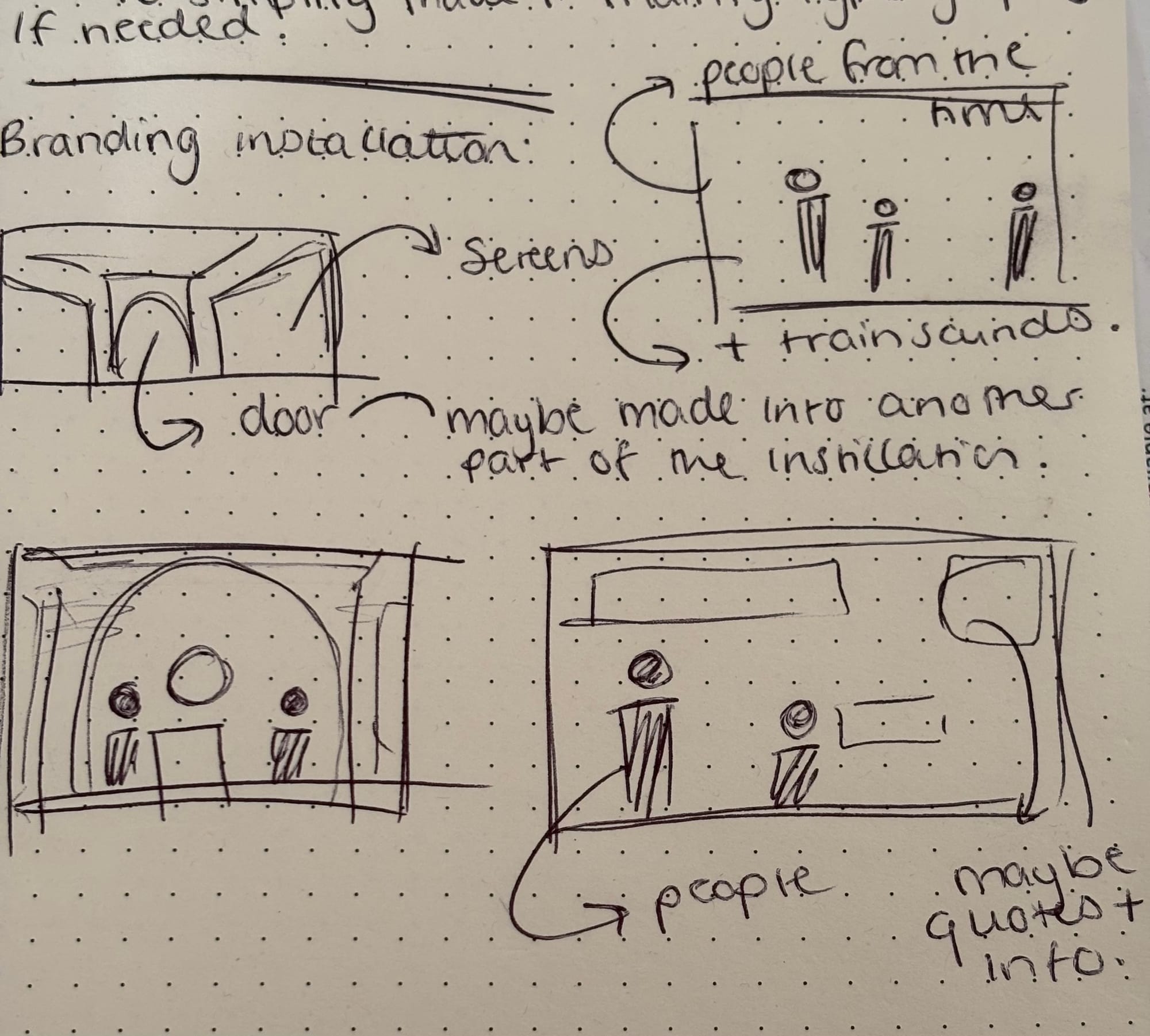
It's a small screen that plays a loop of a documentary on the place as a whole with a lot of the heavy focus on the history of the coach lift. I love the images and photographs of the maps, the trains themselves and the quotes too; it's telling you directly. I wanted to take a different approach, however, I wanted to put the person in it. I wanted to almost show people what I see when I experience something like this. Below are some of my initial sketches:
I went back and forth a lot as I was deciding what to do; so I went back to my motion graphic and focused on that again. Below are some rough drafts:
I took that same spinning idea and used it to transition from one era (1900) to another (modern day) and I'm not sure if I did it correctly but it gets the rough idea across. Below is the rough final:
In some ways, it was a bit frustrating that the thing didn’t end up exactly how I wanted it to, but I have since acknowledged that the result still embodied the concepts I was intending to convey. I can´t say that the final product is a huge change from the original, but I see that the way it was done is still valuable as it forced me to experiment and think about how I could refine my approach.
What I really think I lack is more practice with this kind of work, particularly in the area of making changes that seem more purposeful and have a greater influence rather than just small adjustments. Simultaneously, I am happy that the piece at least communicates the point, even though it wasn’t as neat or as greatly changed as I had expected. To me, this was an experience that served as a reminder of the fact that creative expansion is mostly achieved through trial and error, and that having difficulties with the process is a way of learning how to better articulate your ideas in the future.