5.2.1 Public Space
Create a campaign that raises awareness about neurodiversity in public spaces. Public spaces – streets, parks, transport hubs, shops, community centres – are designed for everyone, but they don’t always work for everyone. Neurodivergent people often face challenges that remain invisible to others: sensory overload from noise and lighting, anxiety in unpredictable environments, difficulties with wayfinding, or social expectations that feel impossible to navigate. Your campaign should make these challenges visible and spark conversation about how public spaces could be more inclusive.
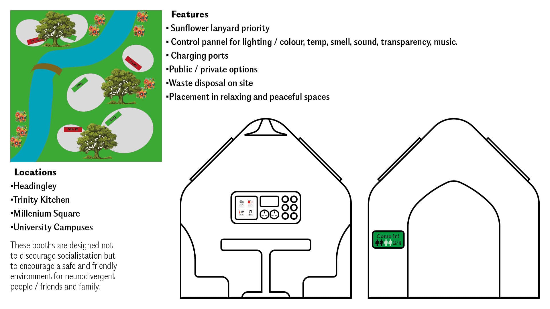
Neuro divergent individuals usually find loud city environments overwhelming. The aim of what we are trying to create is a quiet place where people can go sit to help calm down, eat or focus on work.
Talking Points
Built in features include:
-Soundproofing Options
-A variety of settings to allow booth to be customized to suit the needs of the occupant
-Public and private options
-A safe place where neurodivergent can eat within public spaces
-Anyone can use the pod
We have highlighted the issue of neurodivergent people and how they might struggle to eat in public. It is not an idea to exclude people but to bring them together. That's where our food pods come in designed with built in custom features.
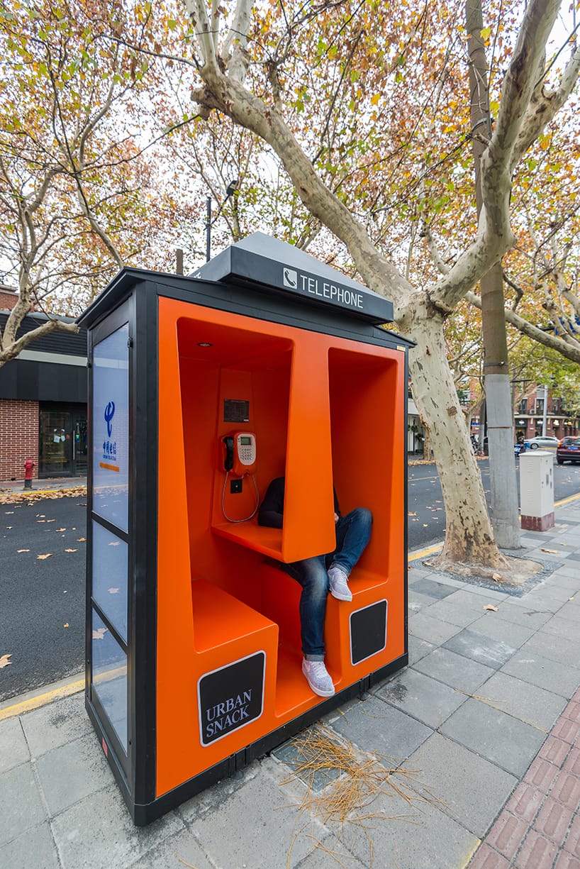
The Phone Booths is a public space intervention powered by MINI China through its platform Urban Matters, which curates and creates design solutions that tackle urban challenges confronting China’s creative class. MINI China, in collaboration with Changning District Government, Anomaly & Assbook, commissioned us the design and production for revamping old phone booths in Yuyuan Road, a very historic road of Shanghai.
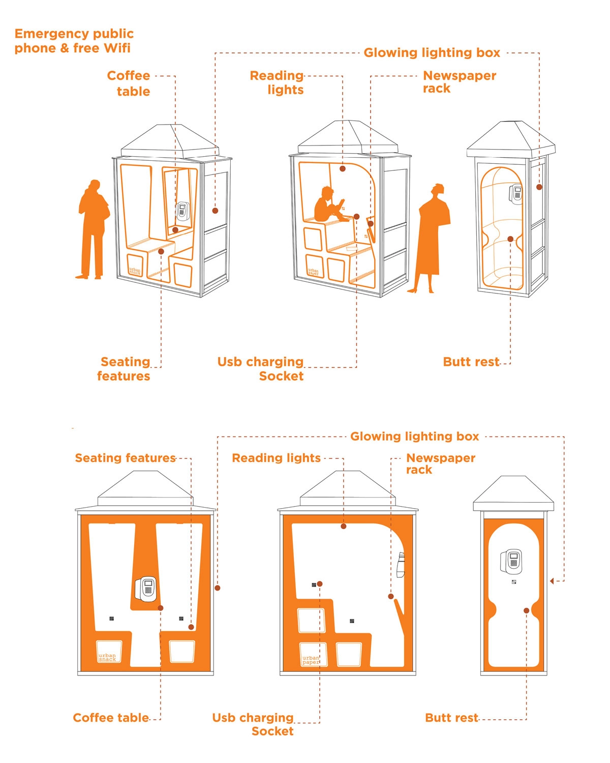
This was our main inspiration behind the booth these were a great starting concept as it had modern features and gave us our concepts for our first sketch.
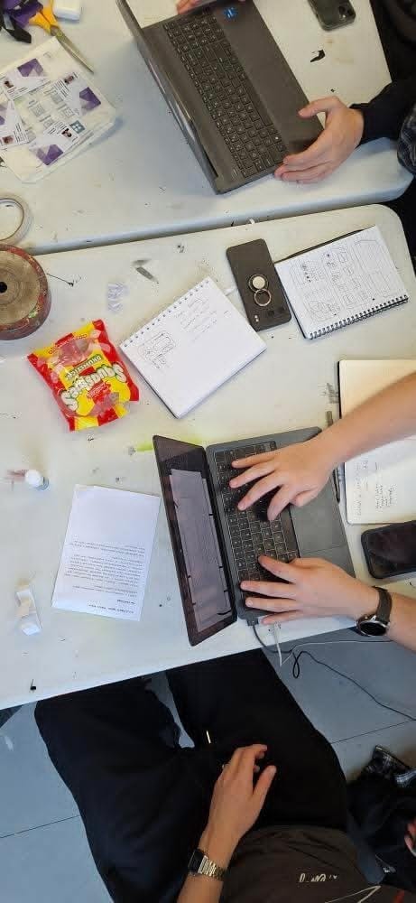
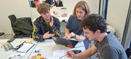
This was the first sketch we put together as a group. We tried to fit in as many features as possible while keeping it clean and minimal. This was designed by Dan Matt, Matthew and Tom within Illustrator.
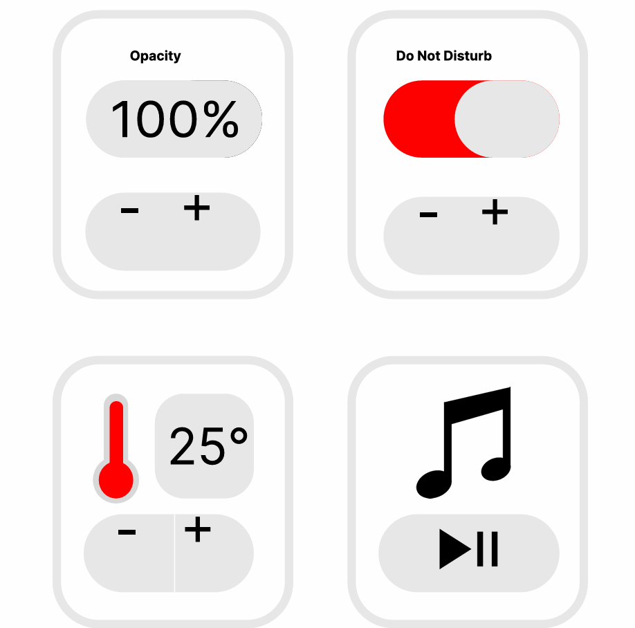
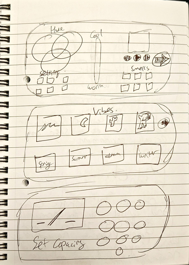
This was one of the control panel screens designed within Figma. The choice behind using Figma is that it is really good for prototyping interfaces and buttons. I did the basic buttons at first like music temperature and screen opacity. One thing I would change is the plus and minus positioning which moved slightly while exporting. Overall though, I think our idea was clear and concise but I think with more time we could greatly improve it by using 3d work to get a more physical outcome of our research.