4×6 PROPOSAL — DRAKE POSTER (Type Activation + Static Motion Frames)
Project Overview
For this 4×6 brief, I chose Type Activation as the brief and Animation as the outcome, but instead of producing a full moving-image animation, I explored how my existing Drake poster could be activated through motion-inspired static frames.
The aim of this project was to take a piece of my real design practice, the Drake poster and investigate how its typography, composition and tone change when reimagined for a digital environment. Instead of animating the poster fully, I created a set of motion-simulation frames that show how the type would behave if it were kinetic. This allowed me to explore movement, depth and rhythm without producing a final video.
The project matters to my practice because a lot of my real creative output happens on platforms like TikTok and Instagram, where digital versions of posters perform better than static print forms. Understanding how to “activate” typography even through simulated motion really expands the range of visuals I can create.
Visual Evidence (Static Motion Frames)
To demonstrate how the Drake poster behaves in a digital environment, I created a sequence of static frames that imply motion:
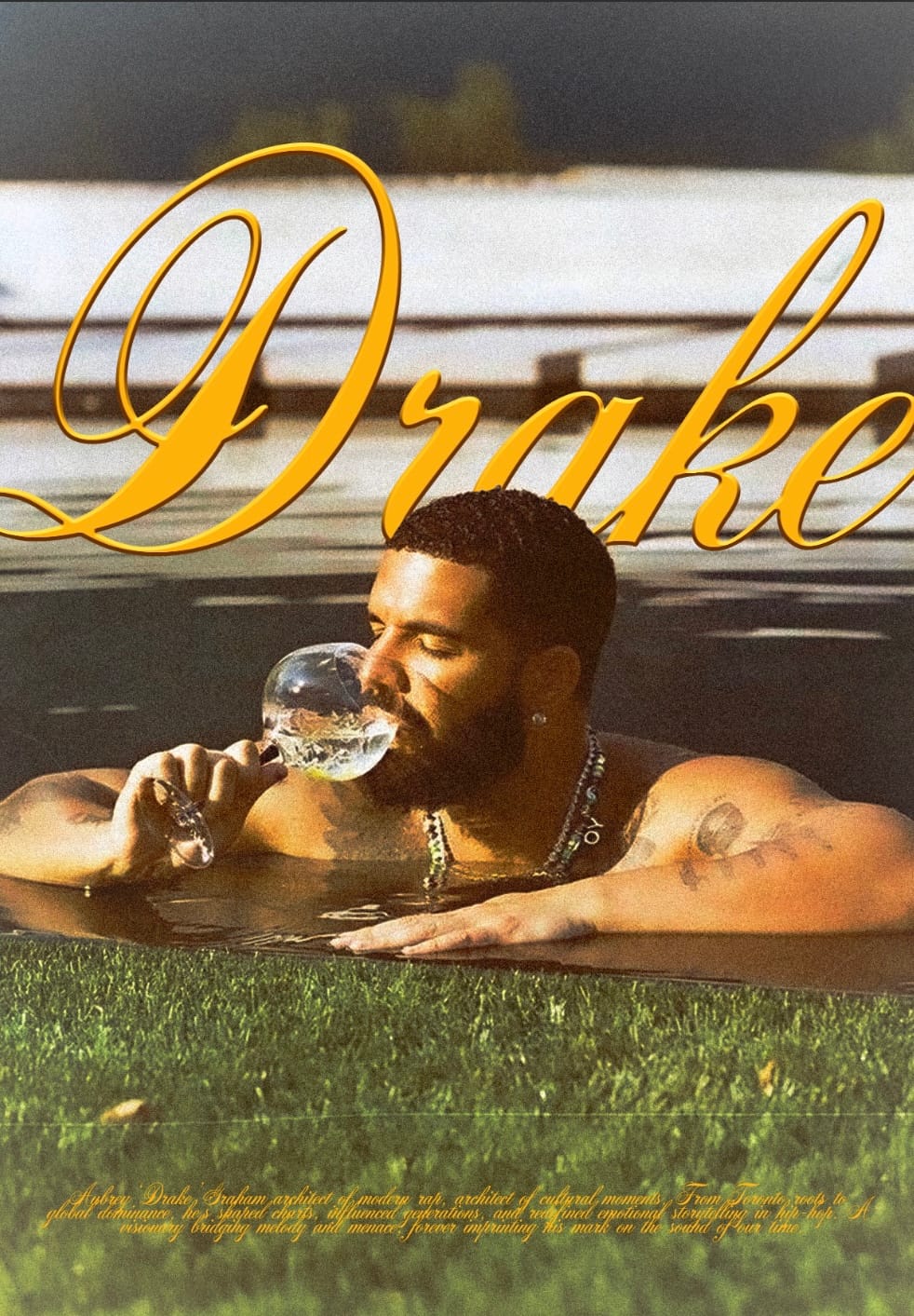
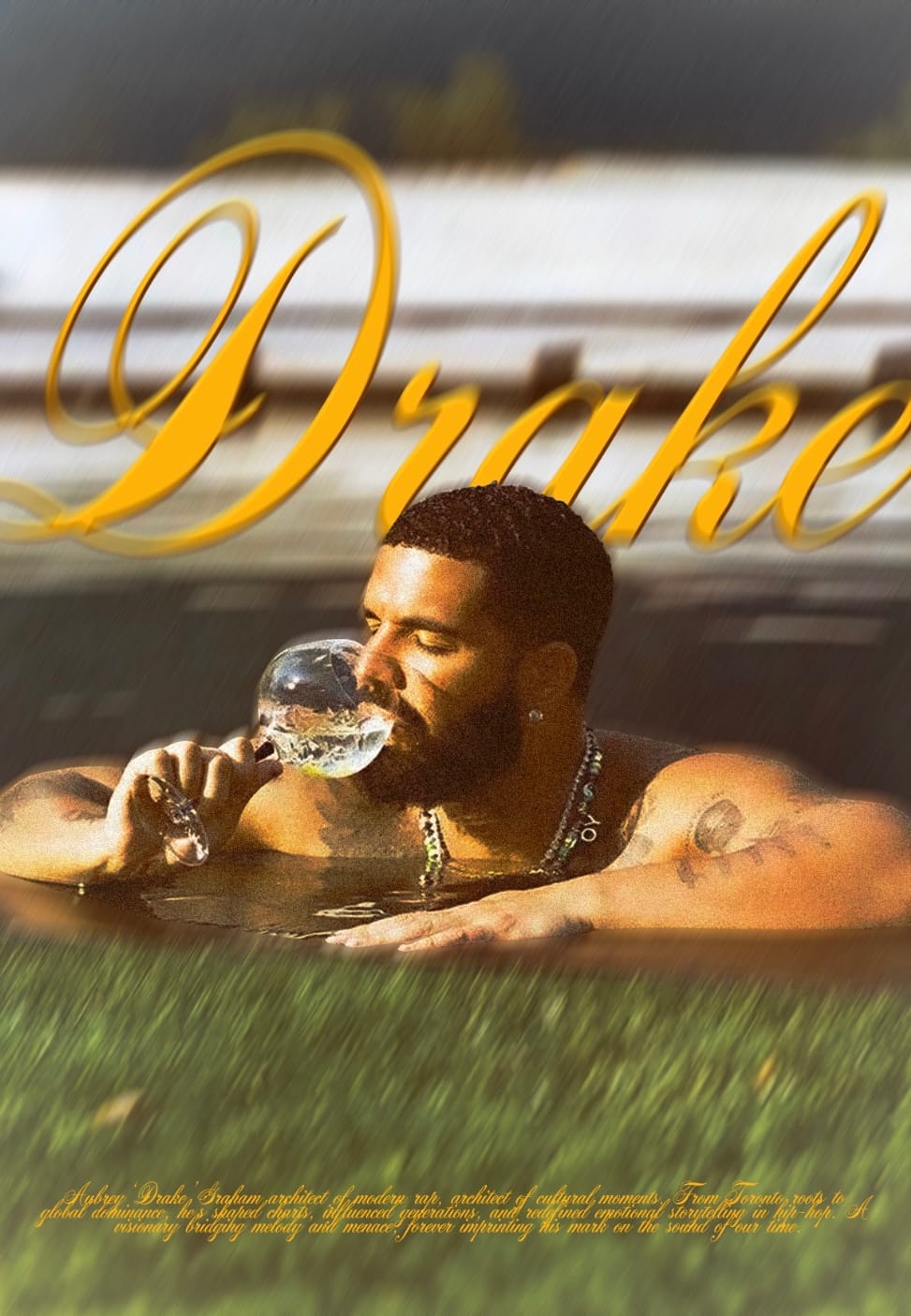
Frame 1 — Original Poster
the base design before digital activation.
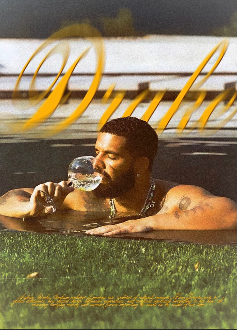
Frame 2 — Motion Blurred text + Displacement
The title text shifts slightly, with a motion blur applied to simulate movement and visual emphasis I tweaked opacity slightly and also used the displacement tool
Frame 3 — Background Blur
Motion Blur applied to the background of the Drake portrait forward slightly
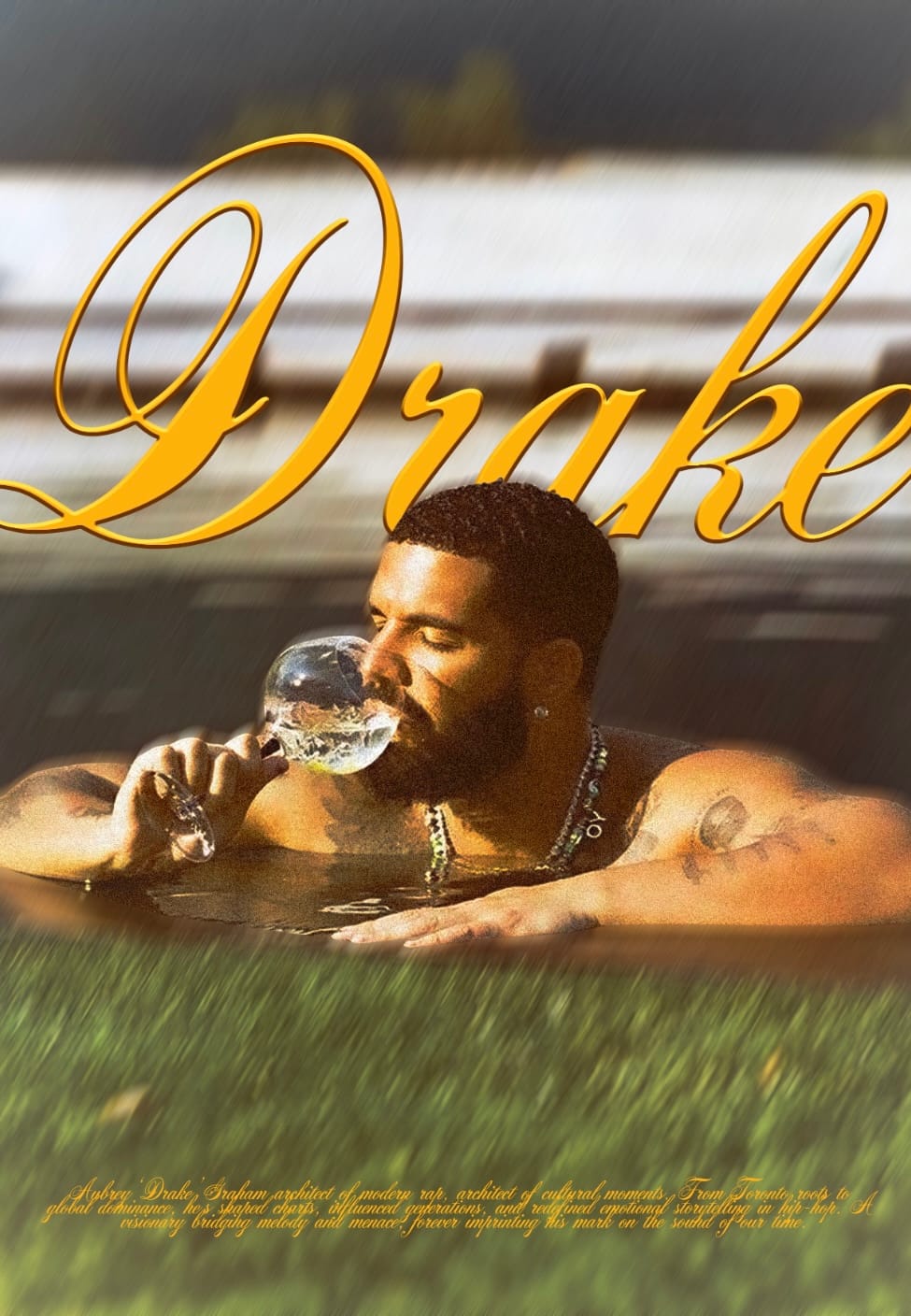
This suggests depth and creates a cinematic feel.
Frame 4 — Both key elements blurred
Typography or background elements blurred to imply movement entering the frame.
Frame 5 — Digital Asset Layer
A subtle digital asset (credits) also blurred for an all together cohesive look (inspired by AE workshops).

This pushes the poster into a more screen-native direction.
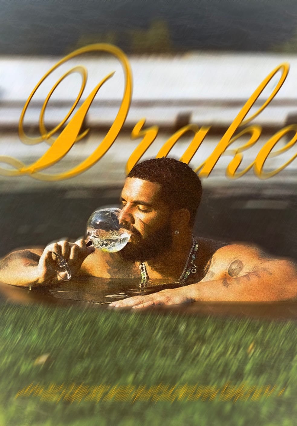
Frame 6 — Final Composite (Digital Kinetic Poster)
All motion-inspired elements applied, revealing how the poster transforms when treated as a digital-first visual. Water texture added to bring more of a fluid look to the poster. It does a very good job
Technical Requirements
Skills Developed
- Understanding how print design translates into screen-based contexts
- Simulating motion through static effects (blur, distortion, layering)
- Building depth through controlled lighting and contrast
- Creating UI-inspired overlays
- Creating visual rhythm through composition changes
Tools Used
- Photoshop (main tool for static effects)
- After Effects (optional, used only for mock-up testing , no actual animation)
- Illustrator (for refining type if needed)
Additional Research
- Kinetic poster examples
- Motion graphics used in music branding
- How blur, light and depth simulate movement
- Drake’s visual identity + his previous album title sequences
Process Documentation
Starting Point
I began with my completed Drake poster, which already had a strong atmosphere. The challenge was to translate that tone into a digital, motion-inspired format.
Exploration
I tested:
- fluid texture effects
- Subtle displacement
- Motion blur
- Type offset variations
- Colour grading for filmic tone
Each test was saved as a separate frame, forming the “motion simulation sequence.”
What I Learned
Even without real animation, movement can be suggested through:
- distortion
- blur
- light shifts
- layering
- compositional rhythm
This project reminded me that motion is not always about literal movement it’s also about atmosphere and energy.
Challenges
- Keeping the type readable while applying motion-inspired effects
- Choosing effects that felt consistent with Drake’s brand tone
- Making sure the poster still felt like part of my visual identity
Outcome
The final result is a motion-inspired static poster sequence that demonstrates how type and imagery from the original design expand when moved into a screen-based context.