3 Brutalist Websites
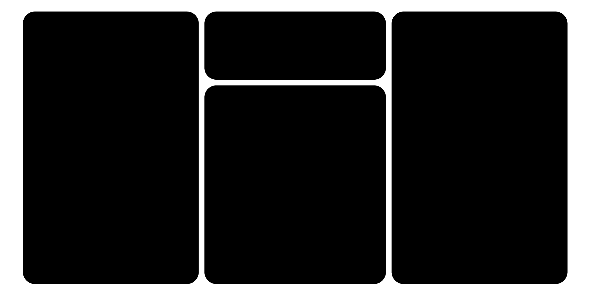
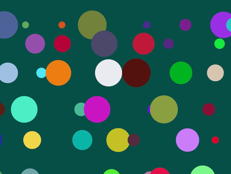
I found this first website really interesting, as it's split into two uneven sections, and when you scroll down the right side, it scrolls the images in the bottom left as well. I thought this was a really unique approach and think it's really effective, even though it looks a little overwhelming.
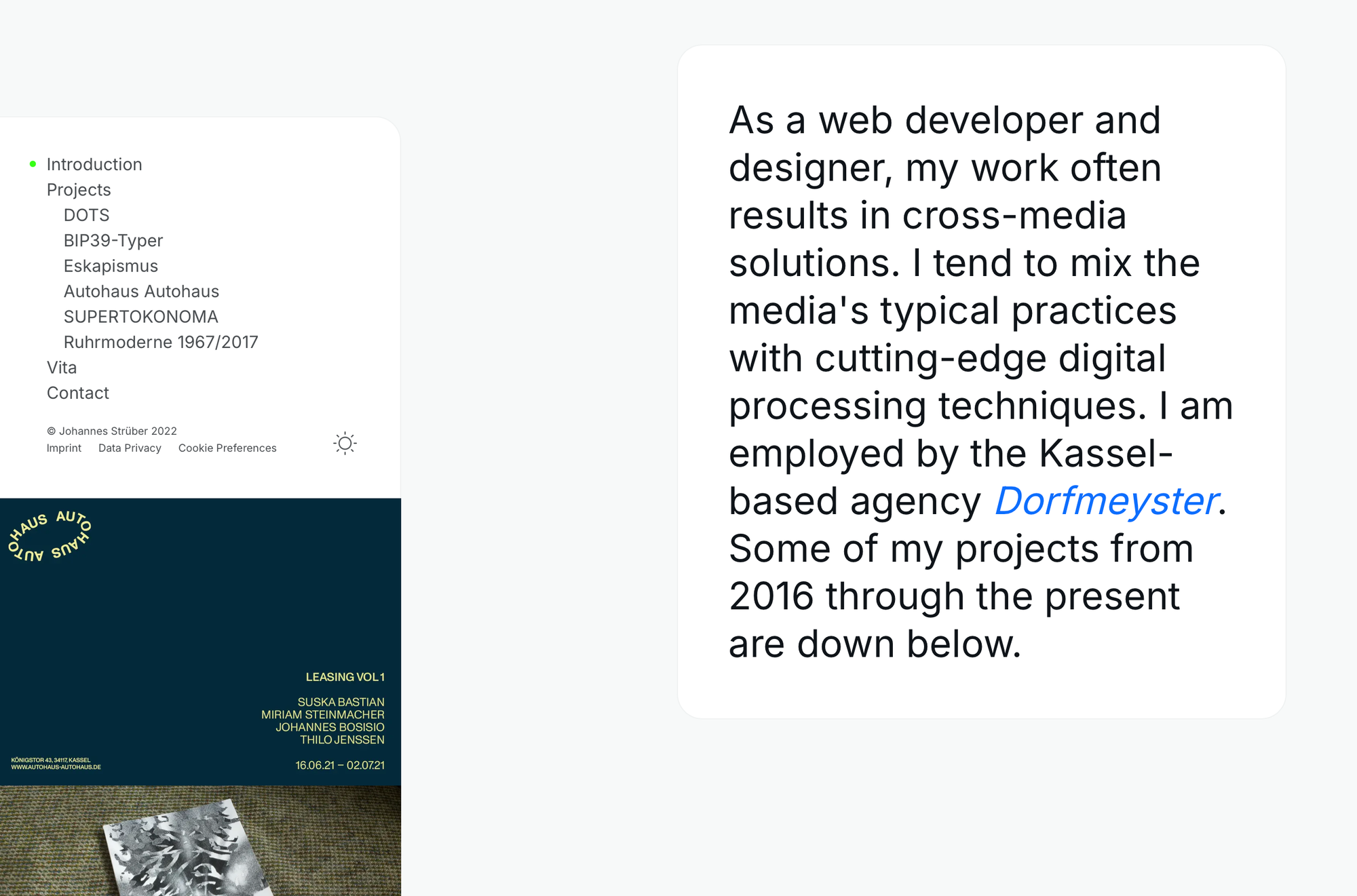
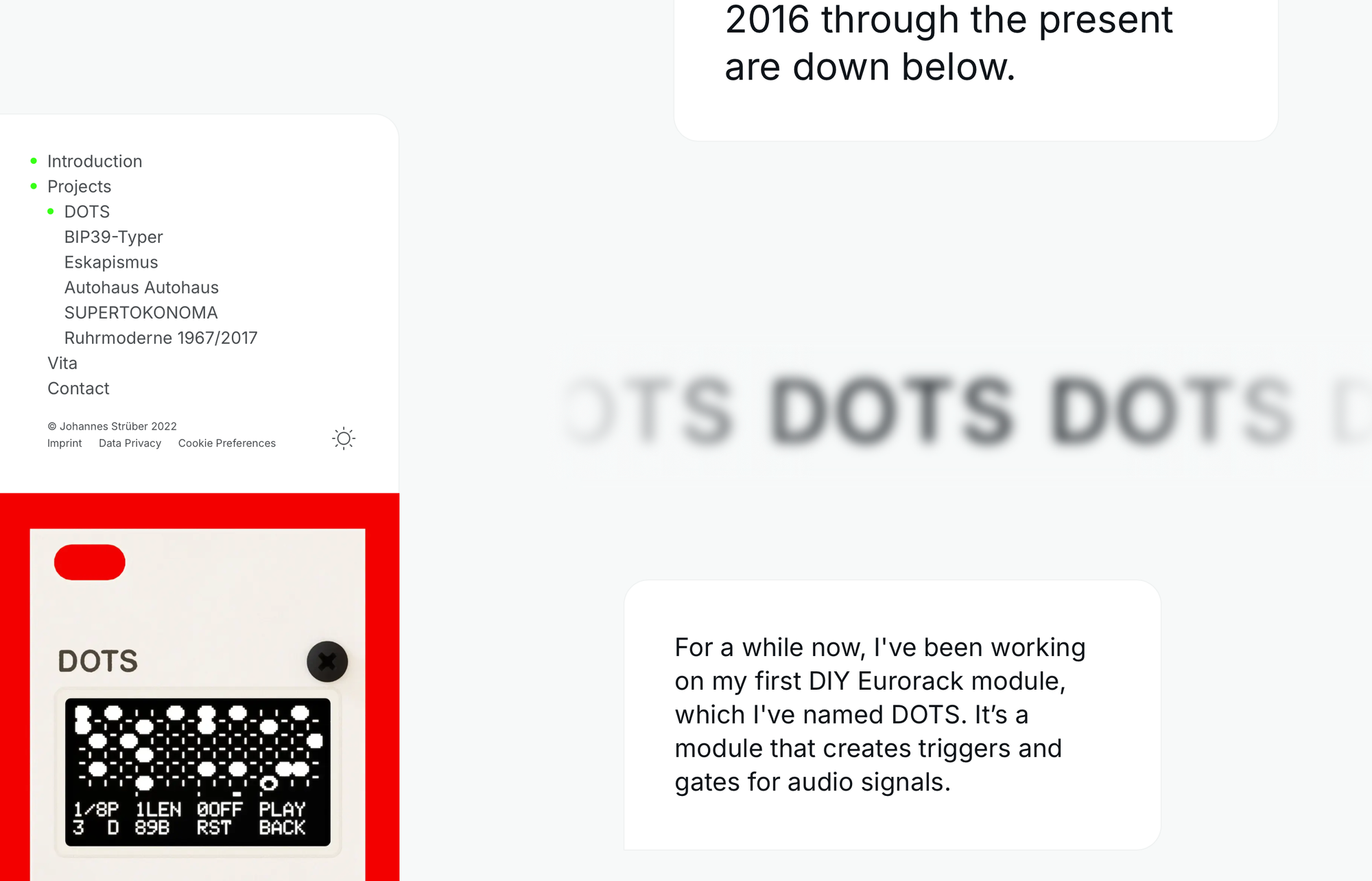
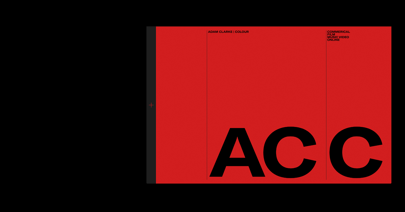
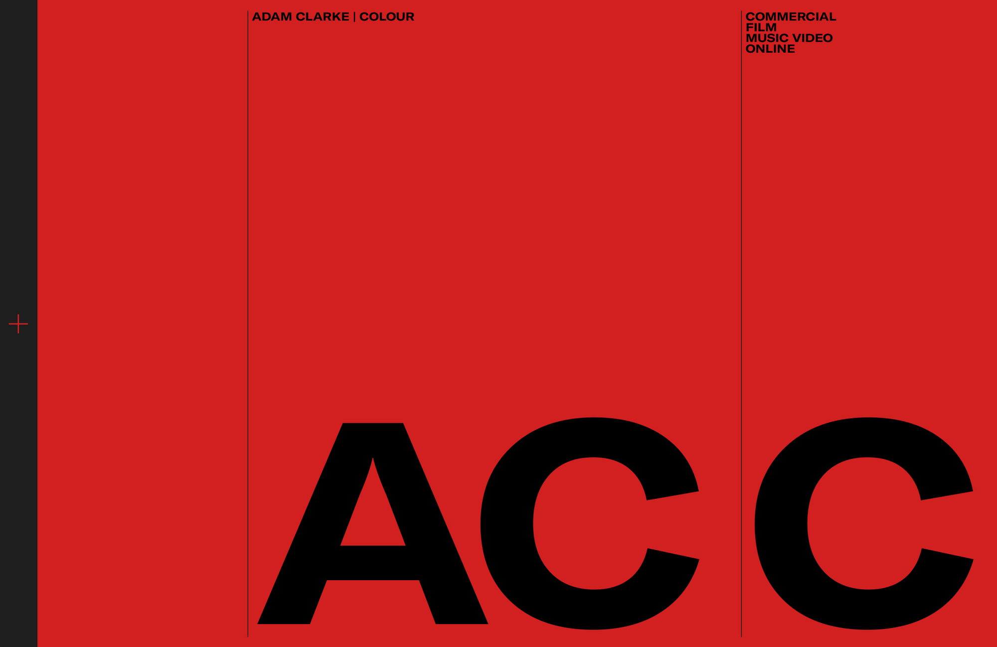
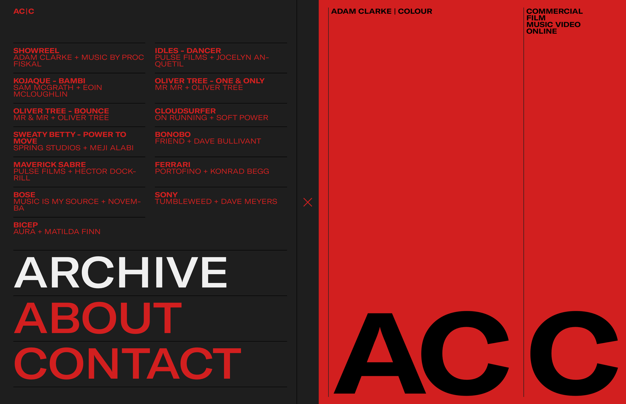
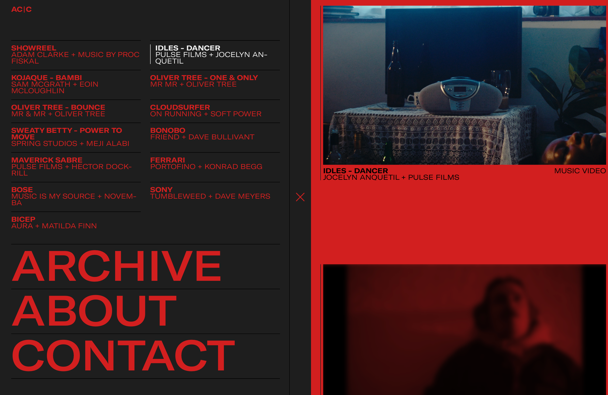
The next website I looked at is really cool and inspiring. I love the bright red colour contrasting with the black, and the animation effects are so unique. You can scroll down to find videos, but if you click to the left black panel with the '+' icon, it allows you to open up a nicely designed menu where you can highlight things, and it scrolls down to the selected video while keeping this menu open. The use of animating on this website and the bold text with contrasting font weights is really effective.
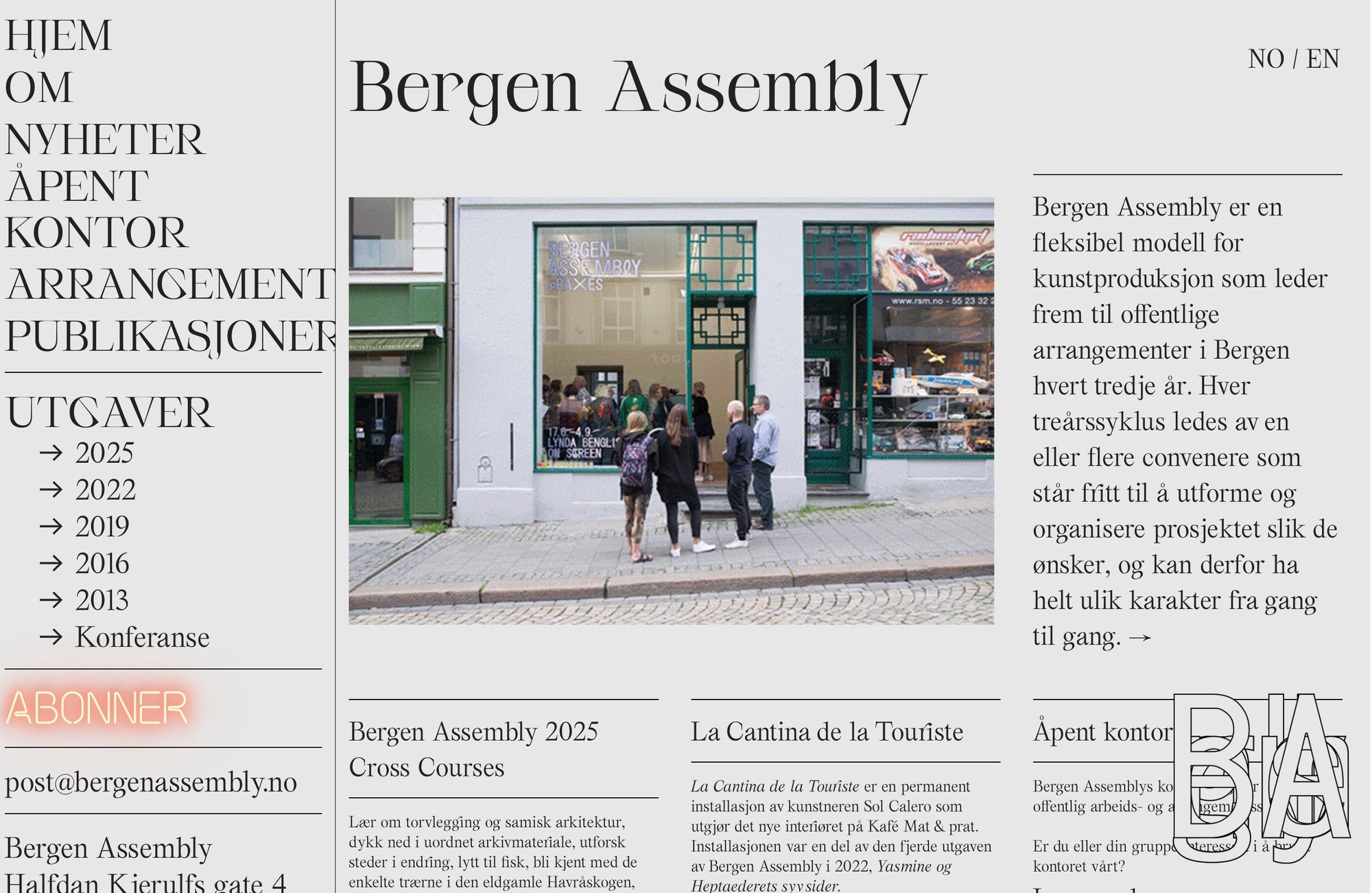
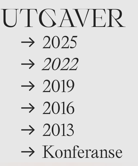
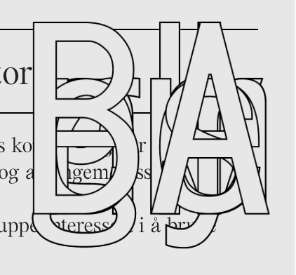
I initially liked the appearance of this website, but am unsure as to whether there's too much information stuffed on one small section of the page. It looks busy and I think it's the sort of thing you either love or hate. The image slideshow in the middle moves a bit too quickly for my liking. I do think it's cool how when you hover over options with your mouse it changes the font to italic. Overall, the design is nice but probably a bit too overwhelming, and the text is a bit too cramped to be very legible. The cluster of letters - which I assume is their logo - overlaying the text in the website is confusing and is another thing that disrupts the flow.
