Studio Charles Villa
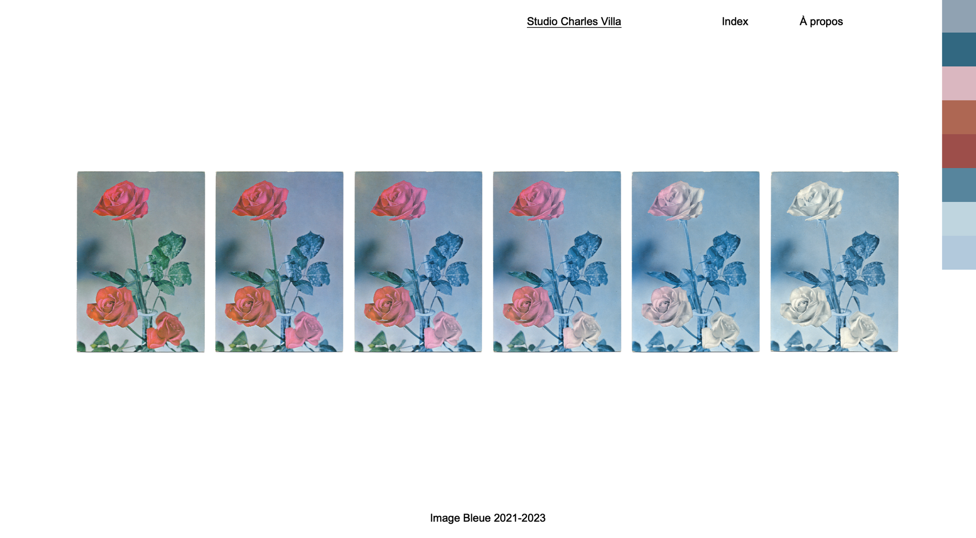
This website made me feel as if I was going through a point and click game where you had to find the right options to progress. Depending on where you pressed the website would show you more images of multiple art books in a loop.
There is also an option to look at a book in much more depth, but without a preview, so you would be going in blind. This design choice is somewhat intriguing, giving less to the audience might compel them to keep searching through, however, if they are not captivated then they might lose interest, not wanting to search through something they can’t see
low tech magazine
http//:solar.lowtechmagazine.com
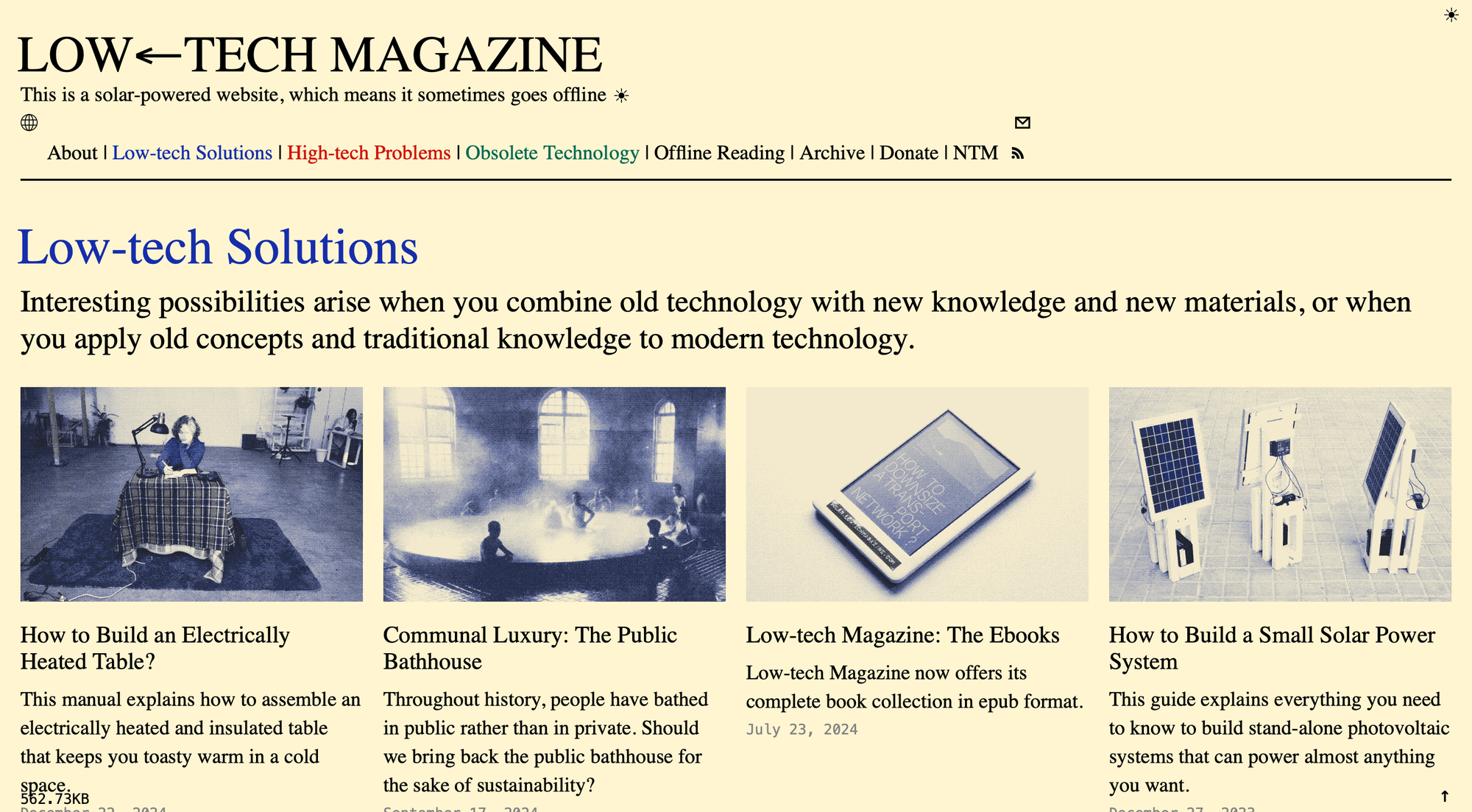
As the name suggests, this website is all about simple, low technology, and is even run on solar panels. As of right now the website has been back online for a week, it tells you this next to a forecast. The colour scheme of the website is only RGB and black with a tan background, it makes it appear like it printed adding to its low tech principle. It's a publisher essentially, posting around 12 researched stories, as they put it, about low-tech, in contrast to high-tech. I like the design choices as it fits with what they are, and is easy to navigate, so it's not unnecessarily bare for the sake of being low-tech.
The road back home
http://www.theroadbackhome.net/#mediumaquamarine-with-lightyellow
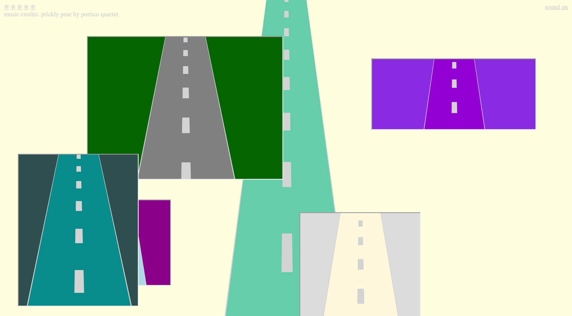
The road back home is a very simple website which simply displays an animation of travelling down an endless road. In the corner of the screen are some asterisks which when pressed can change the colours of the road, create pop up screens of the road in different colours and take you to another website. It is a incredibly simple website, but charming, its only purpose is to travel down a road, a path to show you art as it takes you to Cezar Mocan's portfolio, and to play a cheery tune. It doesn't seem to hope to achieve anything by itself, which is kind of refreshing.

